“Make everything as simple as possible, but not simpler.”—Albert Einstein
Your smart phone would be simpler if it didn’t have a camera. But it would also be a lot less useful. A paint can is a sublimely simple way to store paint. But it’s a dreadful way to interact with paint: It’s hard to open, hard to close, and guaranteed to make a mess every time you pour it.
Simplicity is an obvious virtue, but it is not the ultimate virtue. Sure, the fewer clicks, taps, steps, hurdles, fields, distractions, and doodads in a UI, the better. We UX designers have a whole bag of tricks for simplifying things—consolidating here, eliminating there, shrinking this, submerging that—and 19 times out of 20, the simpler approach is the better approach.
But, ahhh, that twentieth time. In our enthusiasm for making elements, widgets, and products simple, we need to avoid overshooting the target, making them too simple to serve their purpose well. For example:
- An icon without any words attached to it is nice, simple, and clean. It avoids translation problems, but simultaneously runs a high risk of being incomprehensible in many languages.
- The ubiquitous USB plug fits into a port only if you have the top on top. But since both plug and port are simple rectangles, most people can’t tell top from bottom. You have to examine both closely and compare them carefully to get the top on top. Most people don’t, so we routinely need two or more tries to get the damn thing plugged in. If the mating parts were just slightly more complex—say, shaped like a D or an obtuse isosceles triangle, or with a conspicuous dot always marking the top of both plug and port—we would struggle with USB plugs much less.
- A mobile app that depends on users somehow knowing specialized gestures to navigate has the luxury of presenting a wonderfully simple interface, but a high percentage of users will give up on it before ever stumbling upon those secret handshakes.
- There was an early mobile app that consisted simply of the complete text of the King James Bible—all 750,000+ words of it—with no pesky navigation or search functionality to clutter up the UI (uhhh, I mean, to enable you to find anything). You were left to just scroll and scroll and scroll and …
- There is a service (which shall remain nameless) that syncs up your files on multiple devices. It’s designed to automatically and instantly delete a file everywhere if you delete it anywhere. Nice and simple: everything always in sync. And to keep things really simple, there is no warning, no “Are you sure?” and no undo. But 20% of its users view the service as a means of backing up their files. They are in for a nasty surprise when they discover later that their “backup” copy in the cloud has vanished just as soon as any instance of it anywhere else gets deleted, even if that deletion was an accident.
- Many country selector dropdowns consist of a simple list of the world’s 190+ countries in alphabetical order. But such a simple widget will inconvenience every user except those in countries at the top of the alpha list. And chances are most of your users are not in Afghanistan, Albania, or Algeria.
So, yeah, making something too simple can be as problematic as making it too complex, just as making a room too cold can be as uncomfortable as making it too hot.
Scratching the Itch
Simplicity is a one-to-one match between an itch and a scratch. Fine-turning the scratch to the itch usually does mean subtracting, but not always. Sometimes it means a small addition, such as asking users whether they want that file deleted everywhere. To hit the appropriate level of simplicity, we need clarity about exactly what itch we’re trying to scratch.
The goal is not simplicity for its own sake. Simplicity is only a means to an end. The goal is ease. We can admire simplicity as a characteristic, but ease is what we want users to experience.
The goal is not simplicity for its own sake. Simplicity is only a means to an end. The goal is ease.
“Keep it simple” is a great rule of thumb but a poor reflex ideology, because of all the times it shames us into putting simplicity ahead of ease. Naturally, we want both, and they do tend to go together. But we sometimes have to lessen one to achieve the other. When we do, ease should win. As long as the result is to make the thing easier to use and to satisfy users’ actual needs, mission accomplished.
When Brevity Attacks
A prime way we simplify is to reduce verbiage. And sure, all things being equal, the fewer words or elements it takes to communicate something, the better. But all things are not always equal. Like making a room too cold, we sometimes overdo brevity, creating more problems than we solve. Better to use a little more verbiage to communicate clearly than to puzzle users with something concise but cryptic. Consider:
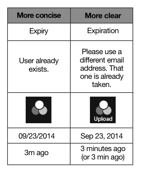
Concise action button verbiage is a particularly sacred cow. You can’t get much more concise than the standard “OK” and “Cancel.” The word “OK” itself is pristinely simple, but that simplicity comes at a price: additional effort and occasional grief. To know what you are consenting to in a dialog box, for example, you have to go to the trouble of reading the rest of the dialog. Users often don’t, so they sometimes suffer by clicking “OK” with regards to things they did not intend to. To spare them a bit of effort and grief, a self-explanatory button is more helpful than a concise button. That tends to mean a tad more verbiage.
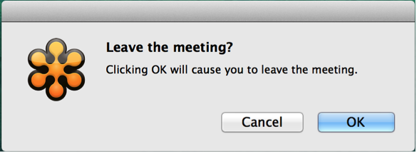
Here’s an example of how our well-meaning insistence on bare-minimum button wording can sometimes do more harm than good:
Making the buttons self-explanatory (though less concise) can actually streamline the whole dialogue:
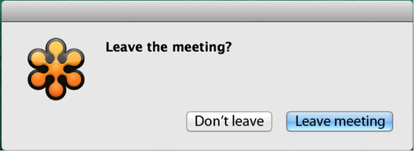
Is this not simpler than the original?
Bottom line: Simplicity is good. Ease is better. Brevity is good. Clarity is better. What are some of your favorite examples of clarity and ease in design? Share your examples in the comments below.
Image of single cell organisms courtesy Shutterstock.