Flag

We stand with Ukraine and our team members from Ukraine. Here are ways you can help

Get exclusive access to thought-provoking articles, bonus podcast content, and cutting-edge whitepapers. Become a member of the UX Magazine community today!

Home ›› Business Value and ROI ›› 6 Key Questions to Guide International UX Research ›› Usability Tip: Don’t Rely on Color to Convey Your Message

Usability Tip: Don’t Rely on Color to Convey Your Message

by Tammy Guy
3 min read
Share this post on
Tweet
Share
Post
Share
Email
Print

Save

Especially where error messages are concerned, you can’t count on colors to make your message clear to everyone.

In general—but particularly in the design world—color is a powerful tool. It conveys moods and emotions, adds presence to designs, and builds brand identities. All too often, however, users who suffer from any color deficiencies struggle to navigate their way through our color-drenched world. For their sake, I often advise designers to have accessibility in mind and test web pages in gray scale format to ensure usability remains in tact when colors aren’t viewed in the intended way.

Users who suffer from any color deficiencies will have difficulties to distinguish the differences between certain colors. The most common type of color deficiency is red-green color-blindness, where red and green are seen as the same color.

Below is an illustration of the most common forms of color-blindness taken from Color Matters.

Search field on Menu Pages

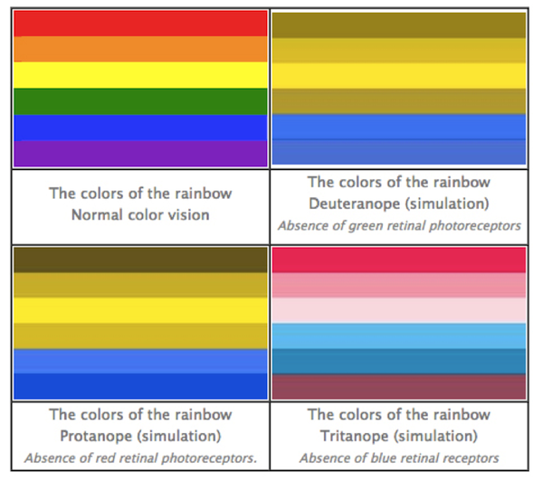
Looking at this chart, one must consider the visibility (or lack of it) of red error messages to users with this type of color-blindness when completing online forms.

Let’s take a look at the home page reservation form Avis gives us. I simply clicked “Continue” without filling anything out, and the error message I received to “Please enter a Pick-up Location” was presented in plain red text.

Search field on Menu Pages

Now, let’s look at the same layout through the eyes of a red-blind user using Colblindor, a color-blindness simulator.

Search field on Menu Pages

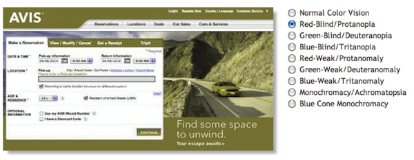
The high contrast of the red error message has been lost and instead, replaced with green color text that nearly blends in with the black content on the page and is very easy to overlook.

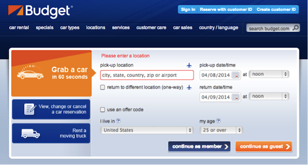
Another example comes from the Budget home page reservation form, where again I simply clicked “Continue as guest” to receive an error message. In this case, the red error message is presented with red copy over the field’s label and a red border around the actual field.

Search field on Menu Pages

Lets view this through the eyes of a green-blind user using our color-blindness simulator.

Search field on Menu Pages

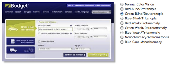
Red colors are lost and replaced with light green colors. The green copy does not carry enough contrast to attract any attention and the field’s border no longer appears highlighted at all.

Conclusion

Don’t rely on color alone to deliver your messages online. Instead, combine color with other design fundamentals such as typography, shapes, grids, and spaces and allocate more weight to important elements.

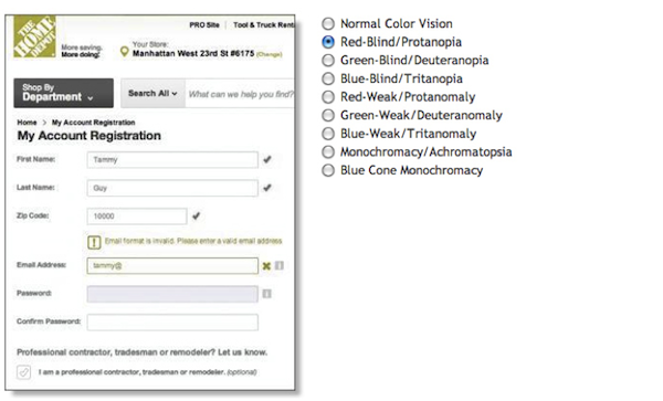
The Home Depot account registration form is utilizing shapes in addition to color to indicate where problems arise. An exclamation point presented in a square shaped box precedes the error message copy in addition to an “x” near the relevant field to indicate an error has taken place.

Search field on Menu Pages

Colblindor’s simulator will again display how all red and green hues are removed, but instead, users may relay on shapes as an indication to actions done right or wrong.

Search field on Menu Pages

Test out your pages with Colblindor or simply change your settings to gray scale to ensure usability does not break when colors go away. Send us before and after shots if you found you had to fix some elements for accessibility on Twitter, Facebook, or Google+ using the hashtag #colorbind (that’s colorb-i-n-d; no “l”). We’ll add our favorite submissions to this article. (Image of “red” traffic light courtesy Shutterstock)

post authorTammy Guy

Tammy Guy
Tammy Guy is the founder of a visual design and usability consulting firm focused on strategic brand planning, creative direction and diffusion of user experience problems by applying design theory and usability best practices in a rapidly changing Web environment. Her firm provides consulting services (e-commerce solutions, mobile apps and tablet experience) to clients from various industries such as fashion retail, commodity retail, pharmaceutical, insurance, financial services, social networking and others. Services include product evaluation, strategy and planning, creative development and direction and usability consulting. With more then 16 years of experience, Tammy previously worked as the Creative Director at LivePerson, Inc. and was a Design Group Manager at the Hertz Corporation where she art-directed all aspects of graphical application development for all customer facing websites. In addition, Tammy has been a frequent guest speaker with the Nielsen Norman Group for the past few years, teaching visual design and usability workshops. She also teaches similar design and usability courses with General Assembly in New York City.

Tweet
Share
Post
Share
Email
Print

Related Articles

Another lesson from studying UX with Laura Klein.

Article by Paivi Salminen
The Agile Trap Designers Fall into: Feeding the Beast
  • Agile teams are fast, but designers get stuck in an infinite loop of visual work: redesigning the same components over and over instead of solving real UX problems.
  • Design systems break that cycle, defining the building blocks once, freeing designers to focus on how the product works, not how it looks.
  • When the basics are in place, teams can start working together sooner, prototype faster, and release incremental features without the interface falling apart.
Share:The Agile Trap Designers Fall into: Feeding the Beast
4 min read

Real engagement is about designing experiences that people want to have. Here are some things that games do well that most apps don’t.

Article by Montgomery Singman
Gamification 2.0. Beyond Points and Badges: Designing for Players, Not Metrics. Conclusion
  • Most apps use gamification as a manipulation layer to drive metrics, but people engage with things that are truly worthy of their time, not points or streak guilt.
  • Apps that people stick with do this by designing for intrinsic motivation, making the experience itself rewarding.
  • The true measure of success is whether users feel more capable, accomplished, and enriched for having used your app.
Share:Gamification 2.0. Beyond Points and Badges: Designing for Players, Not Metrics. Conclusion
8 min read

For researchers, AI tools are making the move from advising to building easier than ever. But the real obstacle was never technical. Meet the researchers who allowed themselves to create — and what the cost was.

Article by James Lang
The New Makers
  • The article says that becoming a maker as a researcher is less about learning new tools or skills and more about giving yourself a new identity, and that without fixing the internal permission structures that define your swim lane, even the most democratized AI tools won’t turn a researcher into a maker — you don’t have a founder; you have a frustrated advisor with a prototype.
Share:The New Makers
20 min read

Join the UX Magazine community!

Stay informed with exclusive content on the intersection of UX, AI agents, and agentic automation—essential reading for future-focused professionals.

Hello!

You're officially a member of the UX Magazine Community.
We're excited to have you with us!

Thank you!

To begin viewing member content, please verify your email.

Get Paid to Test AI Products

Earn an average of $100 per test by reviewing AI-first product experiences and sharing your feedback.

    Tell us about you. Enroll in the course.

      This website uses cookies to ensure you get the best experience on our website. Check our privacy policy and