“Responsive” has become a bit of a buzzword since being coined by Ethan Marcotte in 2010. Marcotte showcased how elements on a page can dynamically change their layout to better suit smaller displays. Today, responsive design is more-or-less fully integrated into the web. It has grown with businesses buying into the principles of creating mobile optimized and flexible layouts for their websites. But it seems that the essence of what responsive design is all about has been somewhat lost. Although layout is considered the most important factor, responsive design is much broader than simply arranging content.
Responsive design is about context. Therefore, just shrinking or streamlining content on a page isn’t enough. Smaller design details such as icons and logos should follow similar contextual principles to create a truly responsive system.
Icons have become a native language for modern day devices, and we cannot simply assume that they will “slot” into responsive frameworks without certain considerations. They are incredibly effective at communicating something in a very small space, and can transcend language, communicating functionality and purpose to a global audience. They need to constantly evolve and change with users, technology, and design.
The Challenge is In the Detail
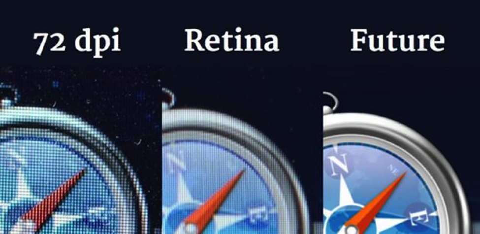
The ubiquity of high resolution displays means the quality of icons needs to be addressed. 72dpi icons just won’t cut it on today’s retina displays, so vector-based solutions need to be adopted.
The multitude of devices also poses challenges when displaying icons. We no longer have control over how our icons will look due to the diverse range of screen sizes, from wearables to cinema displays and everything in between. Creating a single icon that works across all these sizes can be a challenge, particularly if an icon is scaled to a very small size, because it can lose both its impact and legibility.
It seems that there is a gap in the thinking between responsive layouts and the actual design detail of the elements within the layout itself.
There are some solutions that have been devised to combat these challenges. One example is using Icon fonts, an effective but somewhat hacky technique of using web fonts to display symbols. Icon fonts allow designers to display crisp and legible icons across various devices. The problem is that the level of detail icon fonts can include is limited.
Another solution is using only CSS to display icons, meaning they, too, will render without pixelation. Again, the problem with this technique is that the icon style is limited to what we can create in code, and can also be tedious to update.
The bottom line is that both these solutions still restrict designers. Often the style of icon—such as color or level of detail—is dictated by the restrictions of the implementation method. This is not in keeping with good user experience, and current techniques do not factor in how icons are read at very large and very small sizes. So there must be a better solution?
A Responsive Solution
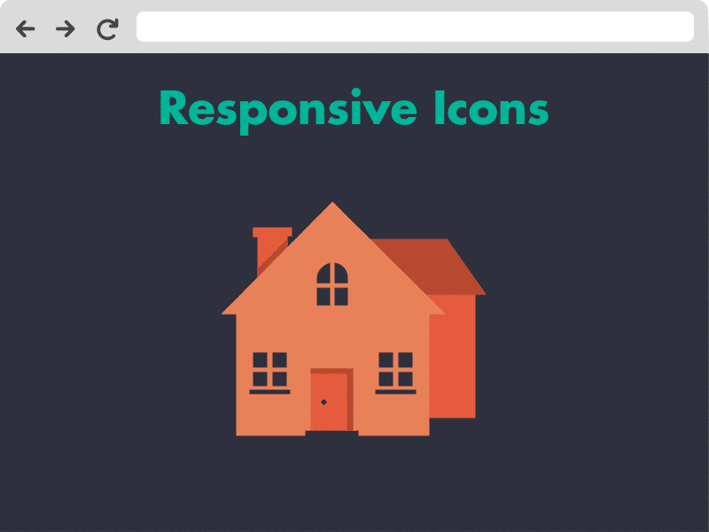
What if we could combine the principles of responsive design with the craft of iconography to find the perfect balance of simplicity in relation to screen size? What if the detail of an icon could change proportionately in relation to the screen width? What if icons could become responsive, adapting to the size of a device?
You can see a visual representation of responsive icons at Responsiveicons.co.uk. The concept interrogates the complexity of icons, and the way in which they are displayed across different devices. By creating icons in SVG image format (Scalable Vector Graphic) and utilizing media queries, different icons can be displayed at different screen sizes without loss of quality or legibility. The result is a dynamically changing responsive icon, which is perfectly optimized for the size and context in which it is displayed.
What if the detail of an icon could change proportionately in relation to the screen width?
The Pros
- Legibility: Icons are more readable at small sizes without being constrained to an ultra-minimal style when displayed at a larger size. With responsive icons, designers have the ability to fine-tune icons to display the “sweet spot” in terms of legibility across multiple sizes.
- Flexibility: The icons will display varieties of detail depending on screen size. This is particularly useful as there is such a range of screen sizes. I used the example range earlier of cinema screens to wearables—there are huge differences! Designers may want icons to be more illustrative on larger screens.
- Future-proof: the fluid nature of responsive icons means that icons are already optimized for new devices.
The Cons
- Time: Responsive icons take longer to design. You could argue that iconography is already a time-consuming process, so why add extra work? Responsive web design is extra work, but the benefits of flexible solutions are becoming readily apparent on a global scale.
- Recognition: One of the more frequent questions that I’ve been asked is how responsive icons affect user experience. If an icon changes in style, does this make it more difficult to remember? The answer is initially, perhaps. But optimization will always require differences in appearance of design, and as users become more attuned to icons on different devices within a particular brand, this problem will disappear. If anything, the changing icon may attract a user’s attention, creating a more engaged user.
The Future is Contextual
Icons are only a small aspect of a larger shift in thinking from responsive layouts to responsive design that incorporates all elements. Responsive typography is also something that is being explored, allowing web fonts to become fine-tuned for various displays and devices.
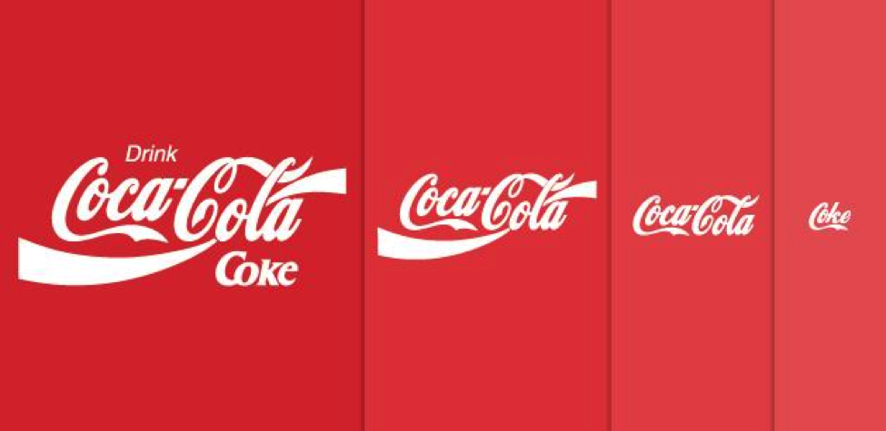
Branding could also start moving away from traditional, static and print-based principles to a more scalable future, with responsive logos and marks being used in design. We may start to see brands and designers loosen their grip on strict guidelines to allow more flexible logo solutions to be put in place.
There are even more exciting avenues yet to be explored. Creating systems that are aware of a user’s age or culture could allow icons to be displayed based on what a user understands. For example, somebody who is 60 may not understand the same things as somebody in their teens, meaning that two different icons could be displayed based on fingerprint identification or facial recognition. This could help people through a complex process in a way that suits them best.
Another example is thinking about responsive design in relation to ergonomics. What if icons could change in complexity based on how far away a person is from a device or display? What other tasks may they be performing at that time? Watching TV? Pushing a stroller or sitting on the bus? These contexts need to be considered if we are to create a truly effective experience when using icons.
Conclusion
Whether the concept of responsive icons is a valid technique for the future is uncertain. But it’s safe to say that creating flexible and scalable solutions that are optimized for today and considered for tomorrow can only benefit users, and the products and services that are designed for them.