We only understand things in relationship to something else. The frame around a painting changes how we perceive it, and the place the frame is hanging in changes it even more: we understand an image displayed in New York’s Museum of Modern Art differently than one hanging in a shared bathroom in a ratty hotel. Context matters.
When designing an information architecture, we are engaging in a new type of placemaking: one that alters how we perceive and understand information. As with (building) architects, information architects are concerned with creating environments that are understandable and usable by human beings, and which can grow and adapt over time to meet the needs of users and their organizations.
A Sense of Place
You get out of bed. You stumble clumsily to the bathroom, use the toilet, then walk to the kitchen to brew a cup of coffee and toast some bread. It’s not even 6:00 a.m. yet, and you have already traversed three distinct places with different uses and configurations: bedroom, bathroom, and kitchen.
Humans—perceptive, self-ambulatory organisms that we are—have a complex, symbiotic relationship with our surroundings. We have senses that allow us to detect where we are at any given moment, and to move around from place to place. We can also change these places to suit our needs. The differences between places play a critical role in how we understand one another and the things we can (or can’t) do in each of those places: this is where we get food, this is where we sleep, this is where we defecate. As a result, our ability to perceive and make places has been very important in our evolution as a species, and is deeply ingrained in who we are. Over time, our ability to set apart and reconfigure places for special use has evolved along with us: we have gone from “this is the clearing where we worship” to building Chartres Cathedral in a relatively short amount of time (Figure 4-1).
We bring this awareness of place—and the placemaking drive—to information environments as well. When we talk about digital media, we use metaphors that betray a sense of place: we “go” online, “visit” a website,“browse” Amazon.com. Increasingly, these environments are also taking over many of the functions we’ve traditionally associated with physical places: we meet with our friends in WhatsApp, pay our bills in our bank’s website, learn in Khan Academy. As with physical places, we experience them as contexts that differ from one another, supporting different needs.
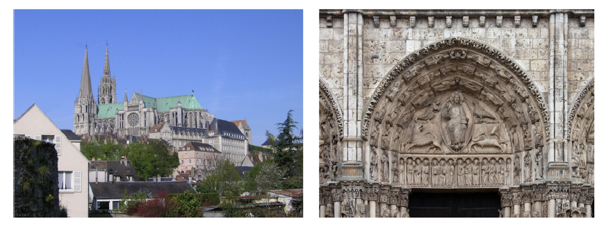
Figure 4-1. Chartres Cathedral is a place that communicates at more than one level: at a base level, it appeals to our animal nature: “here is shelter from the elements”; at a higher level, it communicates “place of worship”; at an even higher level, it tells stories about the Christian religion (images: Wikipedia, https://bit.ly/chartres_cathedral and https://bit.ly/Chartres_central_tympanum)
The Architecture of (Real-World) Places
We go from one place to another in our day-to-day lives without paying too much attention to where we are: we subconsciously know when we’re in the bedroom, and that it is a place for resting, and we know when we’re in the kitchen, and that it is a place for nourishing. The kitchen has a refrigerator, sink, stovetop, and counter, set in a particular configuration,1 while the bedroom has a bed and dresser in a configuration specific to it. Our senses and nervous systems pick up environmental cues that let us know the difference between one and the other.
Finding and understanding are not really separate goals: they are flip sides of the same coin
The world outside our home is also made up of a variety of different places, with configurations and signs of their own that give us clues to their use. Churches are different from banks, which are different from police stations, which are different from fast food restaurants, and so on. Over time, cultural convention and patterns of use have led to the evolution of these spaces, objects, and forms into the structures we recognize today. The differences between them make it possible for us to navigate and make sense of the world around us; we learn them when we are very young, and they become second nature.
In the “real” world, the discipline of (building) architecture has advanced and guided this cultural evolution of placemaking forms. Working from historical models, architects—both trained and untrained—adapt building and urban models that work well to new contexts and uses as required by the needs of society at a particular moment in time. Architects must make sure that a bank’s building functions well as a bank. This means they must accommodate both the things that all buildings must have in common to make them usable by human beings (e.g., ceilings with enough height clearance to allow people to walk around) and those that are specific to banks and which make them different from other building types (e.g., having a large, secure vault in the middle of the space).
Places Made of Information
We also experience information environments as types of places. When you visit a bank’s website and peruse its navigation structures, headlines, section headings, images, and other information elements, your senses and nervous system are picking up semantic cues that tell you that you are now “in a bank.” You would be hardpressed to confuse the bank’s site with that of a teaching hospital; just as you can tell the difference between a bank and a hospital in the real world by picking up on features of their respective physical environments, you can tell the difference between a bank’s website and a hospital’s website by picking up on semantic elements of their user interfaces (Figure 4-2). You understand the information presented in the site differently because you perceive it as “a bank.”

Figure 4-2. Banks and hospitals serve different information needs; their website navigation structures highlight the differences between them, and you understand the information they present in the context of the roles and functions these organizations serve in society
It’s worth noting that because banks are also places in the real world, and because their information needs tend to be transactional, we think of their information environments as more place-like than we would a collection of recipes, as shown in Figure 4-3, which we perceive as being more analogous to a book or magazine.
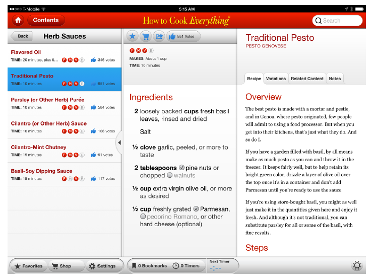
Figure 4-3. The content-centric “How to Cook Everything” iPad app feels more like a recipe book than like a place
Some information environments exist primarily to allow people to interact and socialize with one another. Facebook, for example, serves to bring together people who already know one another in an information environment where they can share pictures/videos/stories, play games, chat in real time, and more. We perceive these social information environments as places as well. Like their realworld counterparts, they also offer places within places—subenvironments—for groups of people to congregate around shared interests that may not be of interest to everyone else. For example, there is a Facebook group for people who are interested in information architecture (Figure 4-4).
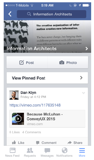
Figure 4-4. The Information Architects Facebook group
Building architecture aims to produce physical environments that can serve and communicate their social functions effectively, and information architecture aims to do the same for information environments. The main difference is that instead of defining compositions of forms, spaces, and objects such as walls, roofs, and furniture, information architecture defines compositions of semantic elements such as navigation labels, section headings, and keywords, and produces the design principles, goals, and guidelines that capture the intended feeling of the place (e.g., is this a serious, solitary place, or a fun, social space?).
Organizing Principles
Architects employ a variety of time-tested organizing principles to give physical environments structure and narrative. Information environments, too, have organizing principles that help bring coherence and structure to the whole.
One important difference between information architecture and building architecture is that the products of the latter are exclusive instances of a particular design in space and time. There is only one Guggenheim Museum like the one Frank Gehry designed for Bilbao, and although it is experienced quite differently by different people (e.g., children, people in wheelchairs, blind people), its structure and other formal elements are unique to it, as is its relationship with its context.
Information environments, on the other hand, can be manifested in various different ways. For example, a website can look and feel very differently when accessed using a desktop browser with a mouse and a large screen than when it is accessed on the four-inch touchscreen of a mobile phone. However, navigation and structural elements such as section headers tend to use the same terminology in both cases.
As a result, the semantic structures that information architecture produces are more abstract than the products of other design disciplines. Coherence between different instances of the architecture is achieved by consistent use of language, and by establishing a particular relationship, or order, between the linguistic elements that comprise it.
Structure and Order
The hierarchy and order of elements in an information architecture infuse the resulting products with meaning and a sense of place. It is an important part of what makes them different from other products or services in the same industry.
In buildings, hierarchy and order are conveyed using various compositional and structural patterns that have evolved over time. For example, building entrances are often highlighted with porticos that serve as visual indicators pointing to the way in (Figure 4-5). Changes in the roof, as well as the deep shadows and colonnades that characterize porticos, serve as signs that say to people, “this opening is more important than others in the skin of this building.”
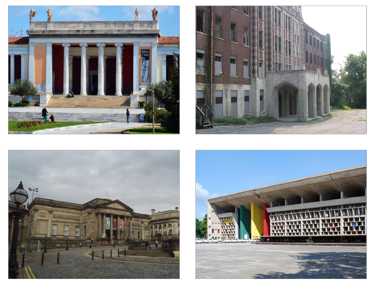
Figure 4-5. Buildings using common patterns to let users know where their entrances are (images: https://bit.ly/greek_nat_archaeological, https://bit.ly/building_front, https://bit.ly/walker_art_gallery, https://bit.ly/capitol_high_court)
The semantic structures in an information architecture also have hierarchies that indicate the relative importance of individual components within the whole. For example, navigation structures for large-scale websites or content-rich apps usually have “top-level” links that are limited to the highest-level elements in a hierarchical structure. (When discussing these structures conceptually, we often render them in diagrams such as sitemaps.) This first-level order plays a large role in defining the conceptual boundaries and overall perceived “form” of the information environment, much as the primary structural supports of a building tend to define its physical form, use, and adaptability over time
Another common ordering principle in buildings is rhythm, usually the result of patterns evident in the structural grid, skin ornamentation, or both. These patterns can add interest, dynamism, and scale, and help smooth the transition between the street and the interior of the building. Rhythms and patterns are also important ordering principles in information environments, which change the way we perceive information. For example, how search results are presented can suggest different “beats,” with some environments requiring denser patterns than others (Figure 4-6).
We also experience a strong sense of rhythm in information environments that show a constant feed or stream of similar information nuggets, such as Twitter and Flipboard (shown in Figure 4-7). This sense of rhythm is not just the result of the interaction design of these products, but a manifestation of architectural decisions that affect how they are experienced across various different platforms.

Figure 4-6. When you “choose a department to sort,” the rhythm of Amazon’s search results changes
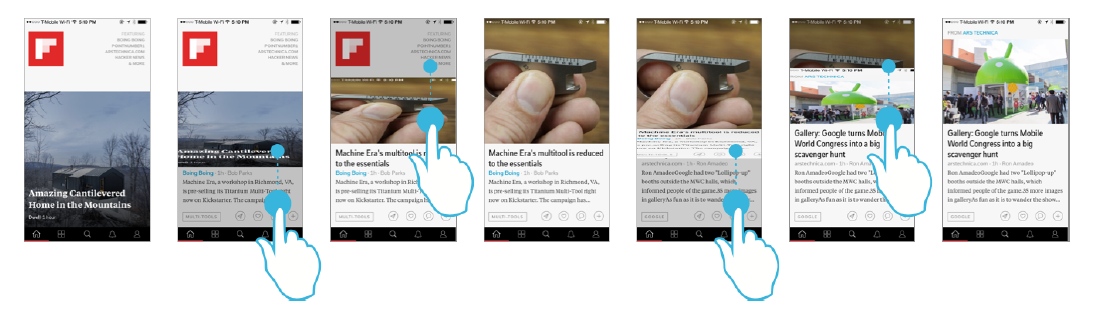
Figure 4-7. Flipboard users experience a clear sense of rhythm as they flip through stories with their finger, one at a time; in this example, we show the iPhone app, but this is true in the other systems in which Flipboard is available as well
Recap
As you may have surmised at this point, finding and understanding are not really separate goals: they are flip sides of the same coin. The way we understand an information environment—the context it sets information in—influences how we find information in it, and vice versa. The organizational structure of the environment is a critical factor in influencing how people make sense of what they can do there, and the information they hope to find and produce when participating in the environment.
To learn more about designing for understanding in information architecture, pick up a copy of Information Architecture, 4th Edition from O’Reilly.
Image of binary code skyscrapers courtesy of Shutterstock.