I’m a big indie music fan and Spotify provides my daily soundtrack. I use it happily all the time, but, as with any great product, there’s still room for improvement. As a quick usability test revealed, people run into critical issues using some Spotify features.
My Objective
Identify the pain points of finding, organizing, and sharing music within the Spotify web application on the desktop.
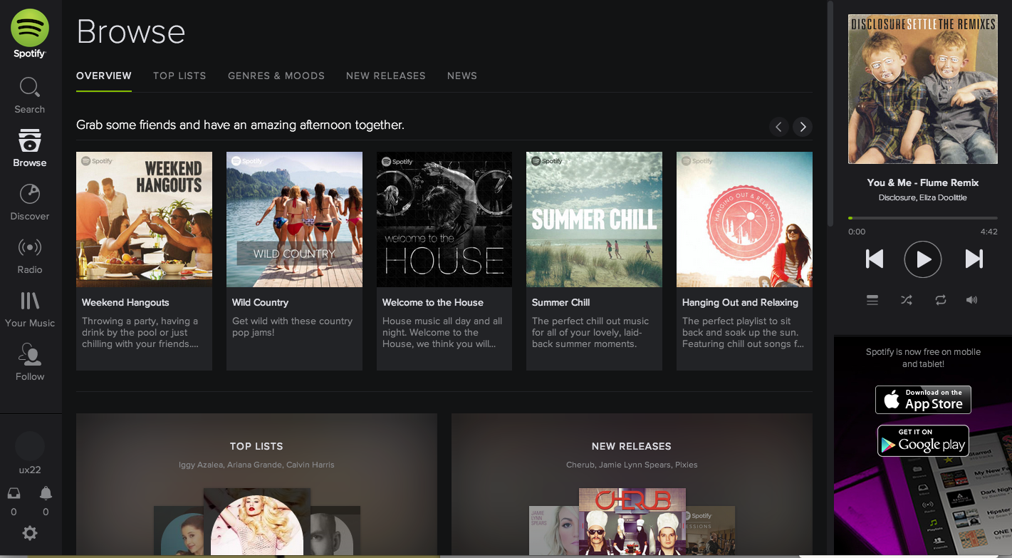
Current Spotify web application landing page user interface (as of May 24th, 2014)
What: Spotify web app
Who: Eight existing Spotify users who listen to music everyday, though not necessarily using Spotify
Where: San Francisco
Participant Selection
I created a persona before I conducted my user tests and used the persona to screen my participants. For example, I posted on Craigslist with the criteria listed below. It helped me filter for the right participants. Meet my persona, Nick!

Nick is an iOS developer who loves music
Test Tasks
- Create a personal playlist
- Add song(s) to the playlist
- Edit the playlist and share it
- Subscribe to (follow) artists
I determined these tasks based on the essential needs of using online music streaming services. I phrased the tasks as open-ended scenarios to avoid leading the participants to complete any task in a predetermined way.
Processing
The eight usability tests were recorded using QuickTime. I reviewed the recordings, took notes, and identified and prioritized usability issues.

Notes taken at each session with major pain points reflected from users
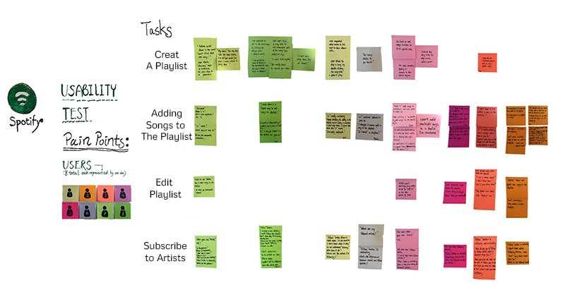
Pain points bucketed according to user actions
As you can see, there are a lot of issues going on here and I am not going to address them all here. Instead, let’s take a look at some of the focused changes that could make using Spotify a more enjoyable experience.
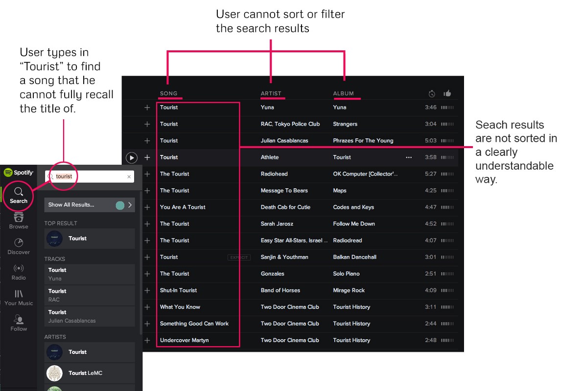
Issue 1: Search Results are Hard to Filter
Users expect to be able to customize their search results. As one of my users said, “The reason I don’t use Spotify is that it is so hard for me to find anything.”
By running @Spotify through a usability test, I found easy fixes that could make it more rewarding
The picture below demonstrates that the user wanted to find a song that contained “tourist” in the title. The user typed “tourist” into the search bar, but the results were impossible to sort or filter. The user could not find the intended song.
How about we try this?
Allow users to sort/filter song lists by artist or album or even date of release?

As talented and respected designer Daniel Burka pointed out, “… users aren’t trying to sort results better … they’re trying to filter the results.”
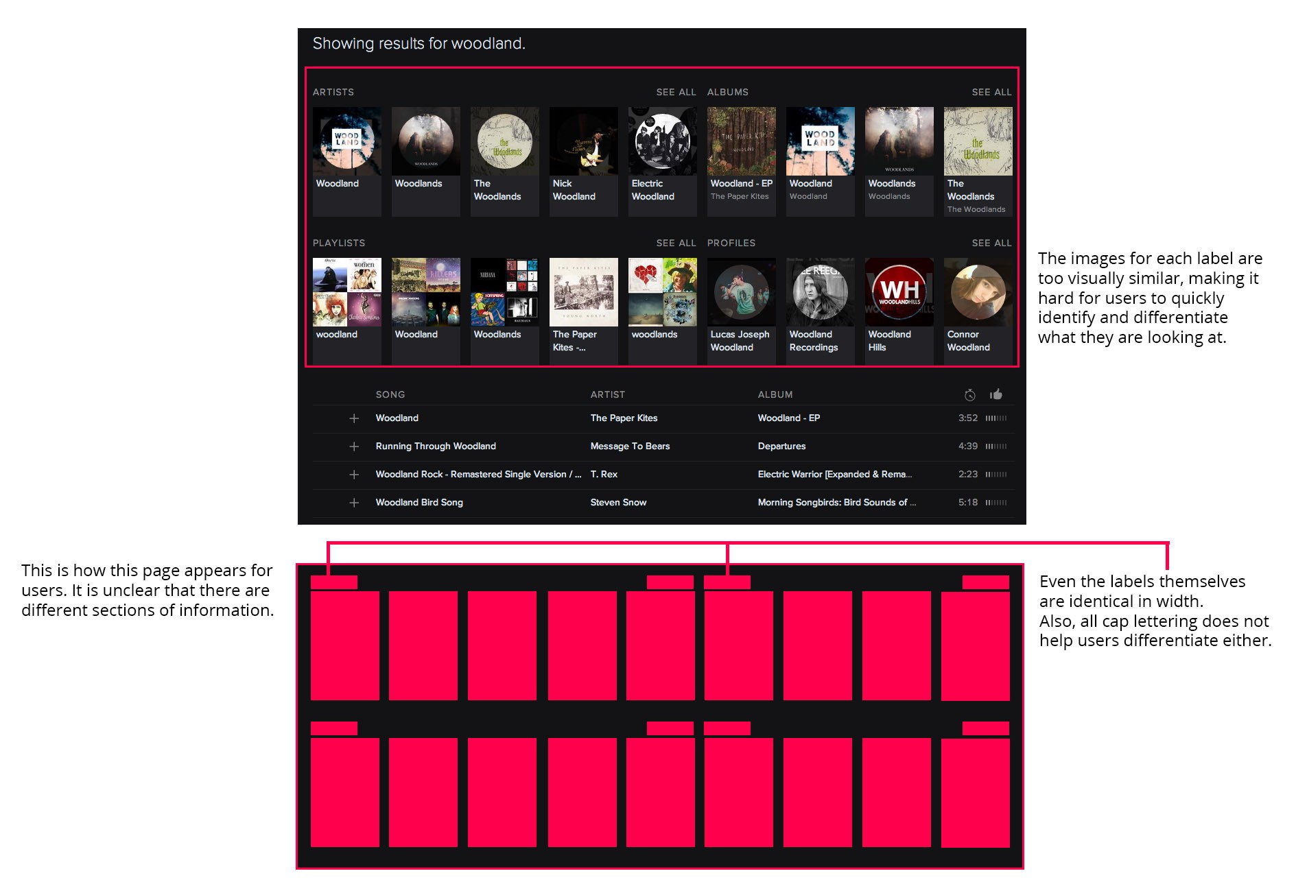
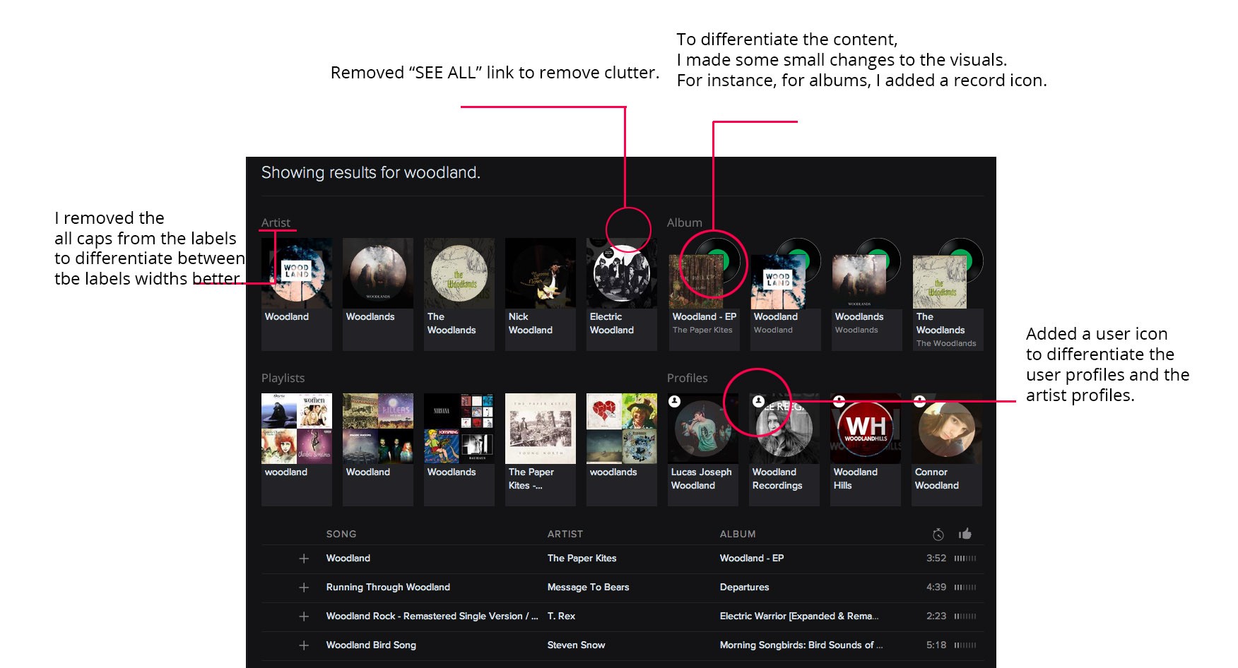
In the case of Spotify’s filtering system (shown below), there are filters—such as “Albums,” “Artists,” “Profiles,” “Playlists,” and “Songs”—but the way Spotify lays them out confuses users: they are visually too similar.
How about we try this?
There is an opportunity to subtly differentiate these kinds of results that I’ve detailed below.
Issue 2: The Tooltips Are Confusing
Users expect the “+” to mean “add to,” instead of “save,” “follow,” or “blank,” and Spotify’s “+” was confusing to my users:
- “By clicking on it, I thought it would add the song to my playlist. Where does it save to?”
- “Gosh, this is confusing!”
- “Why is there such a function?”
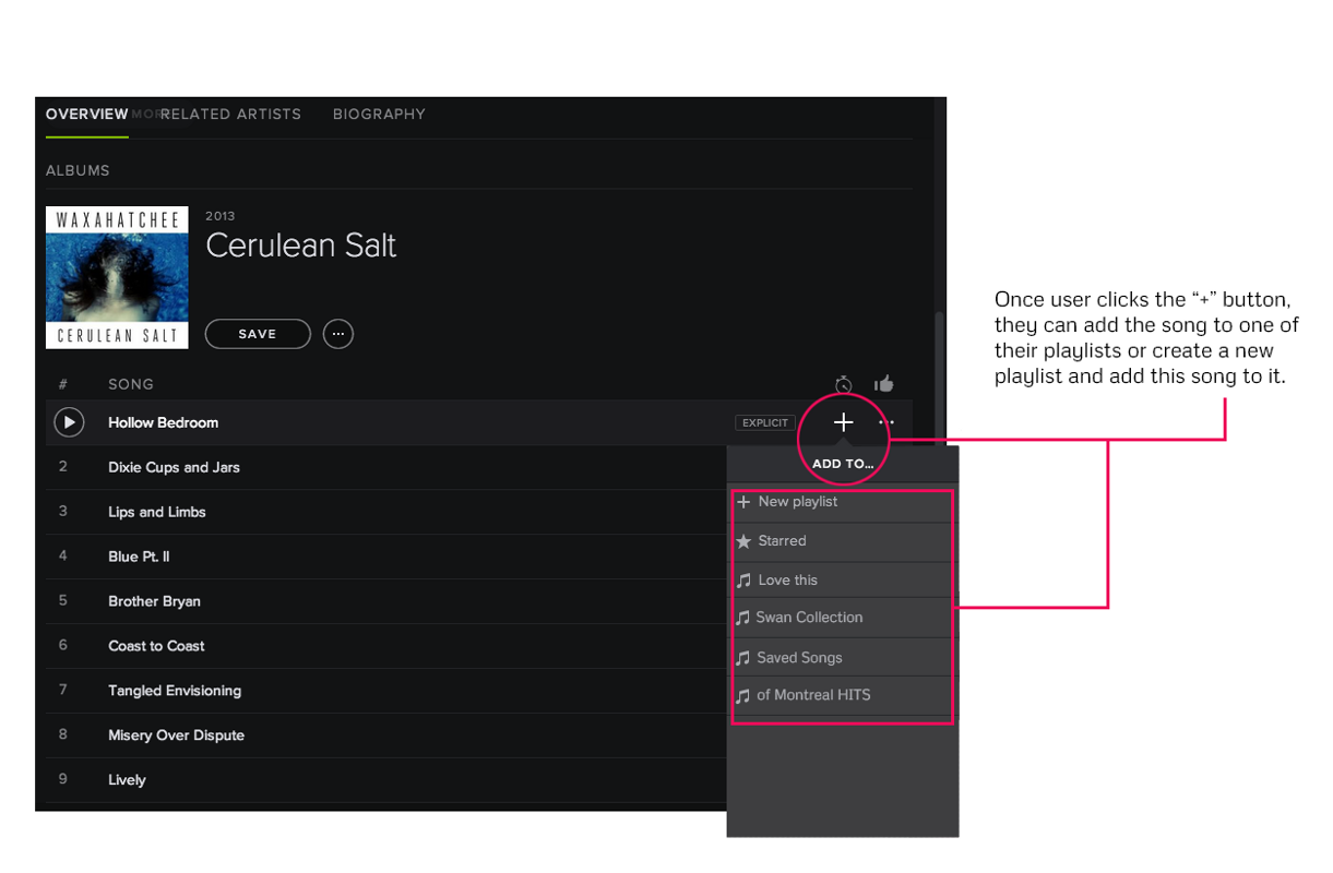
Every participant clicked the “+” sign to add their first song to their playlist. Half of the participants still accidentally clicked on it even after they realized that it was wrong. This icon also appears to be “follow” and “null” on different pages, as shown below. The inconsistency confused the participants.
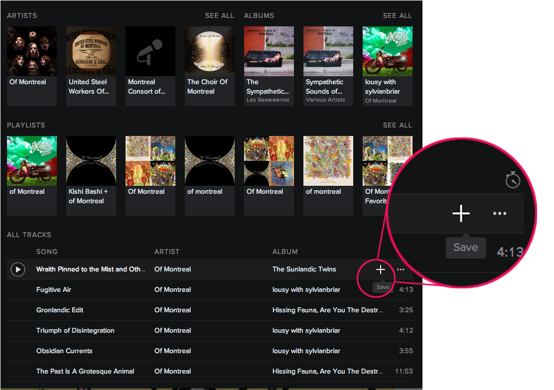
When moused over, the “+” says “save” but no one knew what this meant or where the song was saved to (As of May 21st, 2014)
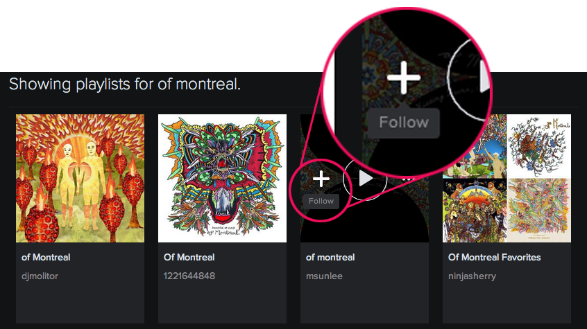
Here, however, “+” means “Follow,” which is confusing because it previously meant “save”
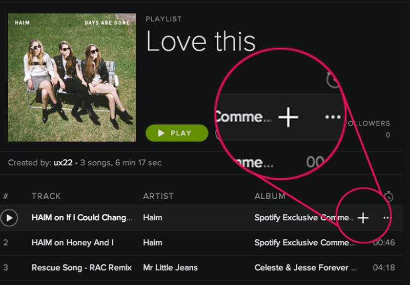
On the playlist page, this button has no tool tip, which is obviously not helpful
How about we try this?
Give the “+” icon an “add to” function, which enables users to choose which playlist they want to “save” the song to.
Issue 3: Why Am I Following?
The “Follow” button confused all the participants. Each one thought the artists they followed should be listed under the “Follow” button on the left panel, but they are not.
- “Where are my followed artists?”
- “What does ‘following’ mean?”
- “I’d still just use Search to find the artist instead of using this ‘following’ thing.”
The participants expected the “Follow” page to show them a list of the artists they are already following. Instead, the page has only the three options illustrated below.
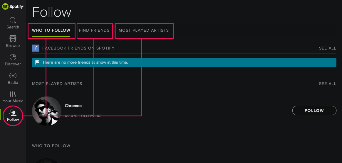
The Follow button on the left panel actually takes users to a page to do the action “follow”
How about we try this?
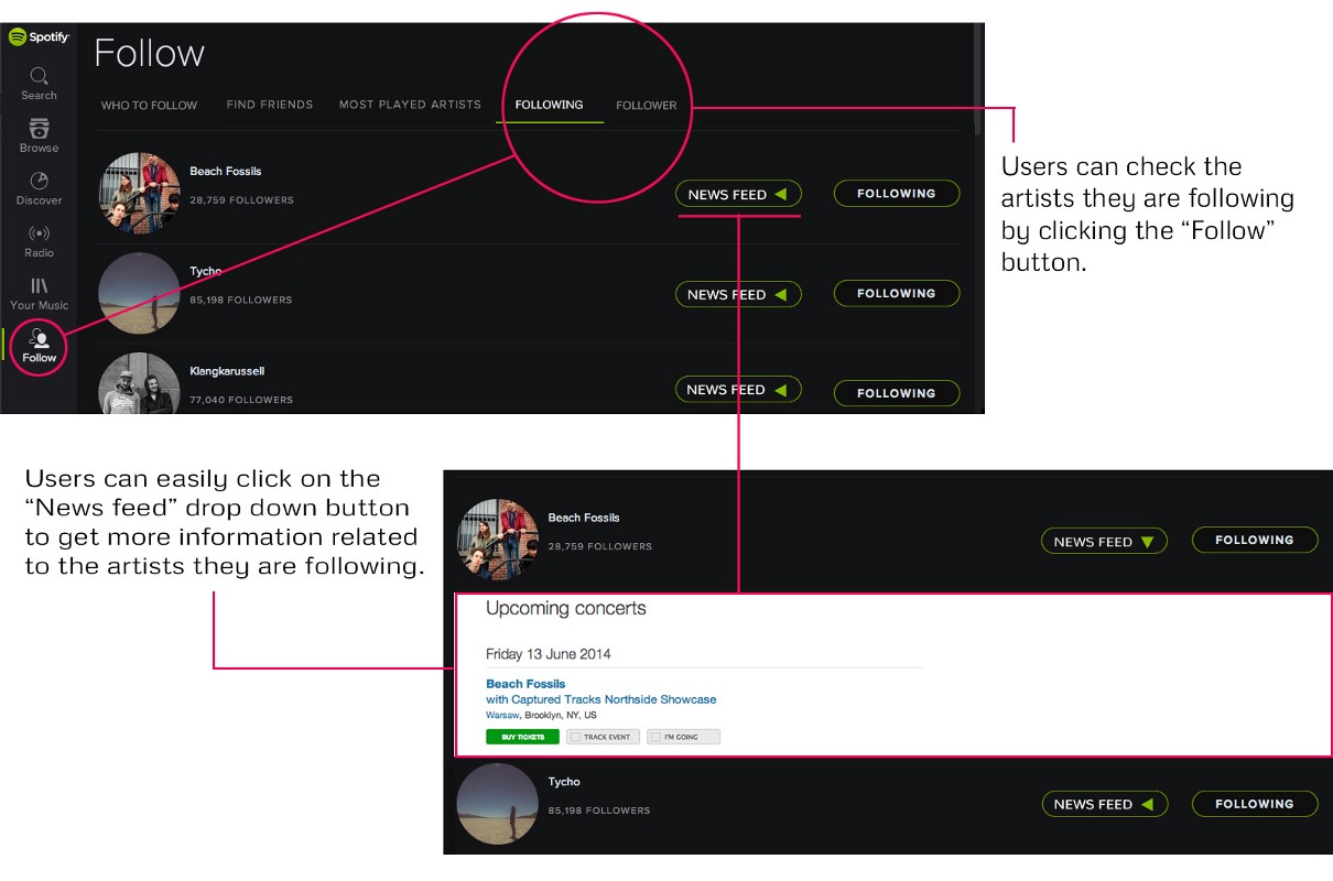
Add the “followed artists” section into the “Follow” page. Show news feed, tour dates, and merchandise information as a clear option. A design recommendation is shown be-low.
There’s no doubt Spotify’s current design is clean, but is it informative enough? At this point, could replacing icons with named features benefit the UX without damaging the visual elegance? As Burka reminds us: “Having to hover over a button to deduce its purpose is poor UI even if it’s super compact.”
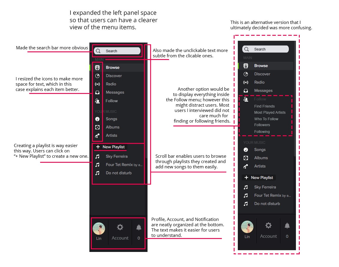
I did additional user interviews around this concept and found a few problematic organizational problems in the navigation panel.

The original Spotify navigation panel
I also think the big buttons are more appropriate for the touch-screen devices, and a more traditional desktop application (e.g., iTunes) approach would make it easier for users to understand on desktops.
So in an attempt to bring more information to the surface of the interface , I made some design suggestions as shown below:
Conclusion
The goal of user research is to understand the target user’s needs and motivations so that we can develop products that they truly love. By running one of my favorite apps through a usability test, I was able to find some relatively easy fixes that could make Spotify even more rewarding for users. (The suggestions still need more validation and testing).
Do you have any suggestions for changes that could improve the Spotify experience? Have you ever run a usability test on one of your favorite products? I’d love to read your thoughts in the comments below.