Traits of a successful design system
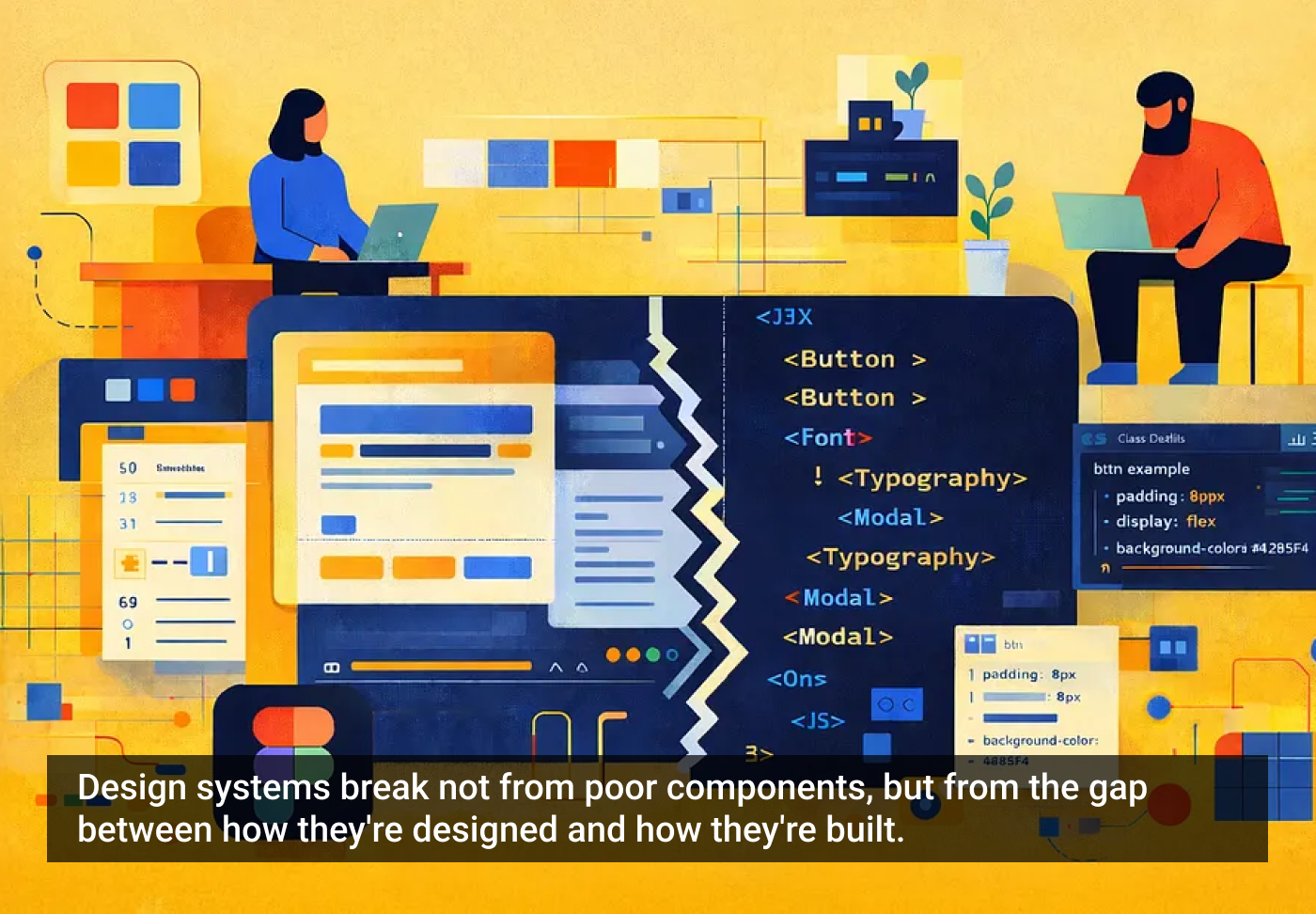
Great design systems have one thing in common: they work equally well in design tools and in code. Most fail not because of poor components, but because of what happens in translation. Designers create in Figma, developers receive files that require interpretation and rebuilding. This friction is all too common — and entirely avoidable.
The solution isn’t more components or stricter rules — it’s building systems that speak the same language across disciplines. When design files mirror code structure, the system becomes self-explanatory and easier for everyone.

1. Design service
Thoughtful component structure enables faster product design. Well-designed systems provide tools that let designers create new patterns without breaking conventions — with smart guardrails (not constraints), and system logic that accelerates design while ensuring brand stewardship.
2. Development service
The main success metric: how closely design models are developed. When frames are minimized, auto-layouts streamlined, and component properties align with coding logic, translation becomes routine. Common nomenclature and structure matter — a lot. Designers don’t need to code, but systems need to embody how code works.
3. Future-proofing service
Systems built with clear logic and consistent conventions position teams for AI-assisted workflows. When the structure is logical and the naming is semantic, LLMs can interpret your system. Build now for unknown future collaborators — whether they’re human, AI, or hybrid.
Why systems fail at handoff
The disconnect is structural. Designers organize frames visually; developers need logical hierarchies and semantics based on function. If your variants multiply without any real taxonomy, and objects are named subjectively, your system will be hard for anyone to understand. And your auto-layouts don’t flex right, components may look perfect in fixed artboards — but fall apart when made responsive.
Bridging this gap doesn’t require designers to learn code. It requires building practices into your system that make design files readable as development blueprints — and perform a better design service to your teammates.
Five core practices for success
1. Treat frames as code structures
Frames in Figma are often used by designers as a means to an end — to display UI — they “work” in Figma no matter how they’re pinned together, nested, named, gapped, or padded. While a design may look high-fidelity, random frames make for poor engineering drawings.
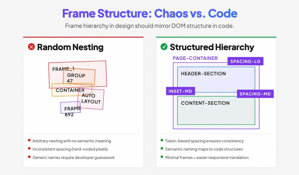
Treat frames as engineering structures from day one. A mature system will have variable spacing tokens for page sections and containers, as well as properly structured inset frames to work automatically. Respect page-level structures, reduce the number of inset frames to their minimum, name them consistently, and treat them as part of the code.
This approach makes your creative decisions portable to production. When a developer receives a design with clear container hierarchy and token-based spacing, they’re not guessing. They’re building.
2. Build through composition, not proliferation
Design systems often balloon to hundreds of components because each new pattern gets its own dedicated component. This becomes unmaintainable fast.
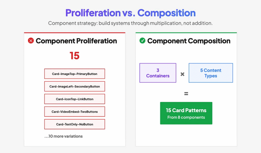
Use slot components embedded inside container components. Instead of making components that cover single bespoke patterns, create a system of content/container swaps. A content component (with variants) swapped for a slot inside a container component (with variants) increases system extensibility through permutation — multiplication, not addition.
For example, one card container component with three layout variants, combined with five content-type components, creates fifteen possible card patterns. That’s fifteen solutions from five content components instead of fifteen separate components.
Separating content and containers also mirrors how developers compose components in code, making the translation from design to implementation more direct.
3. Organize components by decision flow
The difference between variants and separate components is often arbitrary, creating bloated component libraries with poor workflows.
Fewer components with more variants beat the opposite — if they are truly variants. Ask yourself: what’s the primary decision a designer makes when using this component?
True variants describe how something with a core function behaves, how it’s expressed, what meaning it conveys, or how it is styled. They’re different expressions of the same thing — not different things.
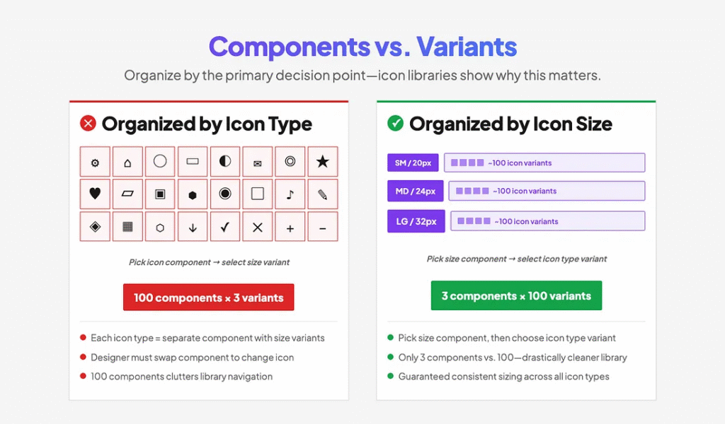
A clear example is an icon library. Rather than having ~100 icon types each in 3 sizes, have 3 size components, each with ~100 icon variants. A designer starts with an icon size (the primary decision), then chooses the type of icon (the variation). Doing the opposite — swapping a component to select an icon creates both a poor workflow and a bloated library.
4. Use AI to validate your decisions
Designers commonly name things by how they look rather than how they function. Without a development background, it’s hard to know if your structure aligns with common coding patterns.
Use AI as a proofreader early and often. Describe your components or upload screenshots with their annotations and ask AI to evaluate your naming, structure, and token organization against development conventions.

I was surprised to discover how many of my “logical” decisions misaligned with the common developer strategy. AI helped me transform my system from random best guesses to proven, commonly accepted criteria that major systems align on. After consistent feedback, I simply learned enough to make better decisions moving forward.
Second-guessing your intuition with AI validation accelerates learning and catches misalignments before they’re baked into your system.
5. Make documentation part of design
Annotation is often treated as an afterthought. Files are scattered, inconsistent, and force developers to hunt for information or make assumptions.
Create internal design components to accelerate documentation and make it part of your daily practice. Build tools that make annotation fast and easy with a predictable structure.
In addition to creating a shorthand cheat sheet for your component library, make sure to embed robust guidance directly into the component descriptions in Figma. I use Generative AI to help me craft proper code annotation that serves both developers and AI assistants — so my source of truth in Figma becomes a better, single source of truth in code.

Another by-product of prioritizing documentation: I’ve found that annotation also helps me QA, troubleshoot, and rationalize system decisions when they’re expressed in words. Writing forces clarity: Is your nomenclature standard? Are your properties logical? Are you missing anything?
When annotation is systematic, developers can focus on implementation instead of interpretation. Your system becomes self-documenting.
Token strategy: beyond the basics
By 2026, using tokens is table stakes — there’s extensive documentation on primitive and semantic token structures, so I won’t rehash the fundamentals. But consider this: tokens aren’t just about consistency, they’re your system’s API for change.

When you inevitably need to support dark mode, rebrand, or adapt to a new platform, tokens determine whether that’s a two-week sprint or a six-month nightmare. The real test of token architecture isn’t whether it works today — it’s whether it can absorb future requirements without breaking existing implementations.
Go beyond the standard color and spacing tokens. Add breakpoint tokens so designers can prototype responsive behavior that matches development constraints. Include platform-specific tokens (iOS safe areas, Android density buckets) that help designers work within real implementation boundaries. Create modifier tokens for states and interactions that map directly to CSS or component props.
The goal: when requirements change, you update tokens, not components. That’s the difference between a design system that scales and one that collapses under its own complexity.
Preparing for AI workflows
Once your system follows these practices, you unlock emerging capabilities: marking components as ready for dev allows you to upload your system to Figma’s MCP server and Code Connect. This enables AI coding assistants to understand your system, suggest appropriate components, and generate implementation code that actually matches your design patterns.

As AI-assisted development becomes standard, having your design system available as structured, semantic data means these tools can work with your system instead of around it. The investment in a clear structure pays off every time a human or AI agent needs to understand and extend your work.
Final thoughts
Doing it right isn’t harder than doing it wrong — it just requires intention. These practices work smarter by building shared understanding into your system’s foundation. The friction you eliminate in handoff, the hours you save in translation, the consistency you gain across platforms — these benefits compound with every component you build and every product feature you ship.
I hope these lessons from my firsthand trial and error save you some time and frustration. Here’s to building systems that truly serve everyone who touches them.
The article originally appeared on Medium.
Featured image courtesy: Jim Gulsen.