The general public seems to be kind of shallow when it comes to user interfaces. They think “prettier = better.” A couple of gradients here, some fancy translucent buttons and there you go: an interface that’s just overflowing with awesomeness.
Fact is though, fancier graphics do not equal a better interface. Most UI/UX professionals agree that graphics should be kept firmly in check or they’ll take over the entire application, sacrificing usability over eye candy. Should we then abandon eye candy altogether? Ban all gradients and icons and go with a bare-bones version of the application? Going bare-bones would focus the user purely on the task or goal the application is designed to do. Sounds like exactly the thing we want to achieve.
Either approach, when designed without care, will yield the same result: decreased usability. Eye candy distracts, whereas bare-bones fails to attract. So which one is the lesser of two evils? What are the pros and cons of both? Are graphics even important? That last one is easy: we’re (usually) designing graphical user interfaces. The very presence of the word “graphical” indicates graphics are a big aspect of the interface. But graphics aren’t important simply because the term GUI mentions it; graphics largely define the application’s appeal for the user. If the application doesn’t have some kind of aesthetic value, it will not only fail to attract the user’s attention, it will also fail to hold the user’s attention.
Attracting attention by having a pretty front-end is important, as it makes the user want to use the product. They are attracted to it just as they are attracted to a beautiful person. The first glance establishes a relationship with the user. Pretty graphics seem to say, “Hi, I appeal to your senses; don’t you want to interact with me?” They make the first experience with the application a pleasant one.
Note: by “first experience” I don’t mean the very first time you ever laid eyes on the application. By first experience I mean the first few seconds after starting the application, when you are only looking at it, prior to actually doing stuff with it.
The saying goes: “Don’t judge a book by its cover”. We all know this to be true, as the cover’s quality is no indication of the quality of the book’s content. But even though we know to judge a book by its cover, we do anyway. We are attracted by pretty covers, so we are more likely to pick a book with a fancy cover from the shelf for further investigation. Books with “humble” (or downright ugly) covers have a larger chance of remaining unnoticed or even knowingly ignored.

So once we’ve got the user’s attention, we need to hold it. Keeping him distraction-free will allow him to reach a state of flow: a state in which he is immersed into his work with the application and in which he feels happy just by doing the task. When in a state of flow, you leave self-consciousness for what it is and no longer think of your individual self but are fully focused on your task. A sense of joy takes over, your mind is entirely devoted to the task, time seems to go slower and everything around you fades into the background.
So where do graphics fit into this story? Do they help in facilitating a state of flow?
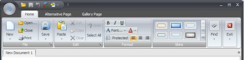
Why yes, they do! One example of this is the rounded rectangle. Often considered as “mere decoration” when used in a UI, they apparently also have a lower cognitive impact than regular rectangles. Credit for uncovering this to the greater public goes to Keith Lang in this article on rounded rectangles. Windows 3.1 style graphics, which are still used in some applications to this day, are harsh, full of visual obstacles and hard to scan. The obstacles, like big borders with sharp edges, constantly interrupt the eyes’ movement across the screen, making it hard to navigate the application.
Subtle gradients and “soft edges” (created by subtle drop shadows or embossing) lighten the visual impact of the screen on the user, making it actually easier to use. But that’s just one small part of the whole.

Bare-bones GUIs prioritize the task at hand and all variables that it has to deal with. They say: “Users use me because they have some task to accomplish, and I want to help them reach that goal ASAP”. A commendable approach.
Unfortunately, by focusing on handling the task, they neglect to spend some tender love and care on handling the GUI itself. They may succeed in facilitating fast task-completion times; they fail at being pleasurable to use. And because they fail at being pleasurable, the user has a hard time entering a state of flow. Emotion plays a big role here. If the user has a negative state of mind, he or she will also have a harder time using the application. This state of mind might not have been induced by the bare-bones UI, but it won’t be alleviated by it either.

As Donald Norman pointed out in his book Emotional Design, prettier things are actually easier to use, or are at least are perceived to be. This book is all about the relationship between aesthetics and experience, and is a mandatory read for those interested in any kind of design.
So, a level of aesthetic appeal (i.e., eye candy) is definitely recommended for usable interfaces. But it’s easy to get carried away when implementing awesomeness into your UI. Most code libraries feature some effects like “Fade,” “Move,” or “Glow” that only need an argument to use, and it’s all too tempting to add them to spice things up quickly. But these features are exactly the things that distract when not implemented properly (or implemented when they shouldn’t be implemented at all). Remember the <blink> tag?
Another example is using photographs or other fancy imagery as the backdrop for a graph. I’ve actually seen this being done: a picture of a coral reef with a line-graph (with a 1px yellow line) superimposed. It might be fancy, it might be exactly what the customer wanted; it is not usable.

With the advent of the iPhone and ever-increasing processing power, graphically rich UIs are far more prevalent than they have ever been. Gradients in applications used to be a rare thing, now it’s rare to see an application without one. The gradient is just an example of how eye-candy is quickly becoming standard practice in UI design. But there’s a fine line between helpful and harmful eye candy. Analyzing whether the eye candy is either helpful or harmful requires constant vigilance but also, every once in a while, some time off. Looking at your awesome-looking UI after a good night’s sleep allows you to look at it objectively, and determine whether the eye candy additions are truly awesome and helpful, or quite the opposite.
Some recommended reading