Flag

We stand with Ukraine and our team members from Ukraine. Here are ways you can help

Get exclusive access to thought-provoking articles, bonus podcast content, and cutting-edge whitepapers. Become a member of the UX Magazine community today!

Home ›› Business Value and ROI ›› 6 Key Questions to Guide International UX Research ›› Usability Tip: No Dead-Ends, Please

Usability Tip: No Dead-Ends, Please

by Tammy Guy
2 min read
Share this post on
Tweet
Share
Post
Share
Email
Print

Save

Don’t confuse and annoy your users by leading them to dead ends.

One of the best ways to learn what works and what doesn’t work when it comes to UI and usability is to look at as many samples as possible, testing out pages and evaluating how certain elements are being treated.

Wanting to pay my cable bill, I tried to sign in to the Time Warner Cable website and realized I’d forgotten my username. I clicked the “Forgot Username?” link and advanced through the username retrieval process. Everything worked great up to the point where I received my username and found myself at a dead end.

Considering that I originally tried to login, it would’ve been nice to see the login screen below my retrieved information and to be allowed to login immediately. Instead, I had to click on the logo to go back to the home page, then the Login link to arrive to the original login screen I started on on. Dead ends create confusion and lead to additional and unnecessary clicks.

Search field on Menu Pages

1. Time Warner Cable sign in page

Search field on Menu Pages

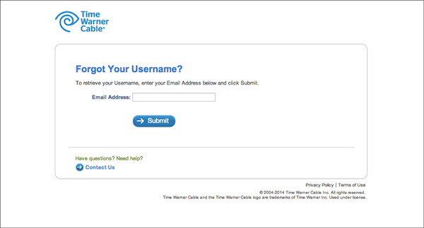
2. Time Warner Cable Forgot Username page

Search field on Menu Pages

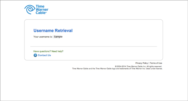
3. Username Retrieval page (dead-end screen)

By comparison, Verizon’s user’s ID retrieval process—while four steps long—ends with an option to login, which is intuitive and thoughtful.

Search field on Menu Pages

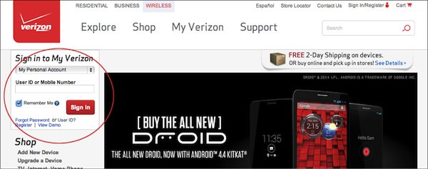
1. Verizon.com home page with Sign in area:

Search field on Menu Pages

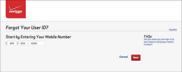
2. Step 1 of User ID retrieval process:

Search field on Menu Pages

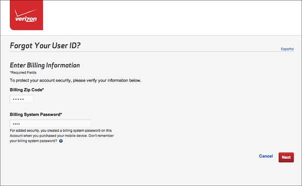
3. Step 2 of User ID retrieval process:

Search field on Menu Pages

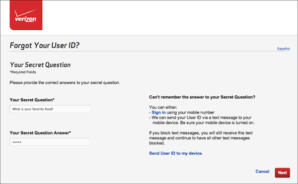
4. Step 3 of User ID retrieval process:

Search field on Menu Pages

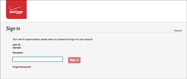
5. Final step of User ID retrieval process (with an option to Sign in immediately)

Build your users a yellow brick road by making it easy and intuitive to get back to the main task, even when they decide to take a turn.

Share your screenshots of dead-ends and yellow brick roads on Twitter, Facebook, or Google+ using the hashtag #nodeadends. Include a brief explanation of why your example frustrates users or rewards them. We’ll add our favorite submissions to the gallery below. (Image of dead end courtesy Shutterstock)

post authorTammy Guy

Tammy Guy
Tammy Guy is the founder of a visual design and usability consulting firm focused on strategic brand planning, creative direction and diffusion of user experience problems by applying design theory and usability best practices in a rapidly changing Web environment. Her firm provides consulting services (e-commerce solutions, mobile apps and tablet experience) to clients from various industries such as fashion retail, commodity retail, pharmaceutical, insurance, financial services, social networking and others. Services include product evaluation, strategy and planning, creative development and direction and usability consulting. With more then 16 years of experience, Tammy previously worked as the Creative Director at LivePerson, Inc. and was a Design Group Manager at the Hertz Corporation where she art-directed all aspects of graphical application development for all customer facing websites. In addition, Tammy has been a frequent guest speaker with the Nielsen Norman Group for the past few years, teaching visual design and usability workshops. She also teaches similar design and usability courses with General Assembly in New York City.

Tweet
Share
Post
Share
Email
Print

Related Articles

Discover how to design a website that truly serves diverse user needs. This article reveals the power of combining user-focused design with data-driven insights to create impactful, goal-oriented digital experiences.

Article by Aalap Doshi
Creating a User-Focused, Metrics-Backed Website for an Organization that Has Diverse Offerings
  • The article explores creating a user-centric website for organizations with diverse offerings, focusing on aligning design with user needs and goals.
  • It emphasizes the role of analytics and user research in validating assumptions and continuously refining the user experience.
  • In this piece, practical steps are provided to integrate metrics-backed insights with user-focused design for impactful digital experiences.
Share:Creating a User-Focused, Metrics-Backed Website for an Organization that Has Diverse Offerings
13 min read

In an industry where clarity is key, why can’t we agree on the language to define what we do? Dive into the evolution of UX, UI, and Product Design — from pioneering generalists of the early web to today’s specialized roles — and discover how our industry’s struggle with terminology may be holding us back.

Article by Andy Budd
The Historical Context of UX, UI, and Product Design
  • This article delves into the historical evolution of UX, UI, and Product Design, tracing their journey from the early days of web design to modern hybrid roles.
  • It examines how the industry’s struggle with clear terminology has impacted its growth, potentially ceding authority to other professions like project management.
Share:The Historical Context of UX, UI, and Product Design
5 min read

The article discusses how we use maturity models in design and argues that “immaturity” frequently reflects smart strategic choices. Instead of trying to reach ideal standards, we should focus on how design aligns with business objectives.

Article by Andy Budd
Just Grow Up: Why Design Maturity Models Might Be Harming Our Industry!
  • The article questions how mature a design is. It states It states that some strategic decisions are called immature.
  • The piece uses budget airlines and luxury carriers as examples. These examples demonstrate that design decisions are based on business strategies, rather than universal standards.
  • The article says we should judge design based on how well it matches business goals, not by strict rules.
Share:Just Grow Up: Why Design Maturity Models Might Be Harming Our Industry!
3 min read

Join the UX Magazine community!

Stay informed with exclusive content on the intersection of UX, AI agents, and agentic automation—essential reading for future-focused professionals.

Hello!

You're officially a member of the UX Magazine Community.
We're excited to have you with us!

Thank you!

To begin viewing member content, please verify your email.

Tell us about you. Enroll in the course.

    This website uses cookies to ensure you get the best experience on our website. Check our privacy policy and