As a child, I loved building and playing with scale models of all kinds: planes, trains, and automobiles. These replicas taught me about aspects of their real counterparts and sparked many questions about their design—providing a great way to fully understand objects or processes by building them up and breaking them down.
The same basic idea can apply to designing scientific visualizations, and even physical representations, of everything from the chemical processes inside living cells to the gravitational dances of stars and galaxies.
UX designers can learn useful, generally applicable ideas about representing data from people who are trying to visualize models. With that knowledge in hand, UX designers can participate in creating effective and novel interfaces. In a sense, UX design is about taking mental models of different kinds of users and recasting them in visual/verbal frameworks.
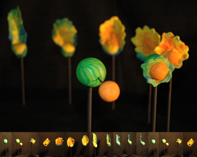
The model shown above, called “Moon Splat,” from UC Santa Cruz OpenLab’s 3D stroboscopic zoetrope, is a series of physical models created by sculptor Leslie Thompson from computer simulations of an impact between the moon and a smaller companion. The model is not necessarily designed to portray an exact correspondence to reality, but to help researchers perceive concepts in novel, interesting, and useful ways.
UX designers can play an active role in the process of creating novel interactive visualizations of models that can be used for either research or outreach to the public. We can help to develop new ways of making the abstract tangible for users.
Scientific models are essentially simplified encapsulations of complex systems and/or objects that are not on a human scale. While these models may be far from perfect in capturing every aspect in exact detail, they can still be good enough in helping people better understand and test ideas about the way something works. In data-rich, research-driven environments, helping to create new interfaces that enable users to work with various kinds of models could be an increasingly important element of a UX designer’s repertoire.
Model Makeovers
Scientific models are often transformed into simulations and visualizations for various reasons, such as:
- Investigating theories that are very difficult, if not impossible, to observe directly
- Accelerating the initial testing process in areas such as drug discovery
- Providing a way for laboratory scientists to use visual representations instead of equations and computer code to explore complex systems
- Highlighting different aspects of a system using different kinds of visualizations
- Revealing the potential missing pieces and hidden connections in the data
- Enabling better collaborations between researchers
- Conveying scientific concepts to general audiences
- Providing literal “hands-on” experience with conceptual models
Many of these issues, such as collaboration and communicating complex ideas in simplified forms, are broadly relevant to UX work.
Model Behavior—Representative Versus Exact
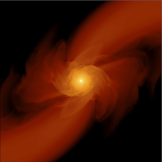
Morgan MacLeod, a graduate student in the Department of Astronomy and Astrophysics at UC Santa Cruz, has been working with visualizations of physics models to help researchers and the general public develop a sense of what happens during certain interactions between stars and super massive black holes (SMBHs). For example, if a star strays too near to an SMBH, it can be ripped apart by gravitational forces and the stellar material stretched into two tails, as shown in the image above. These are big (but rare) events that occur very far from Earth, so scientists can benefit from models and simulations to get a good view of these epic encounters.
One of the choices that astrophysicists have to make regularly, MacLeod says, is whether to use representative or exact system models and simulations. He explains that in an exact system approach, the scientist tries to recreate the entire system with every known element included. However, this may not always be the best and most direct road to gain a clear understanding.
“There are many times when humans can only show or take in one slice at a time,” MacLeod says. Choosing between working with a representative model or an exact system is an issue that astrophysicists wrestle with regularly, he says. He adds, “It should not be the ambition of a visualization to always be complete.” It just has to be able to clarify a point.
Galactic Bowling is a game, based on the Wii platform, that a team in UC Santa Cruz’s OpenLab created to help the public get a feel for how rare but spectacular it can be for a star to become entrapped and destroyed by an SMBH. With bowling-like gestures, players “roll” stars into the galactic center, attempting to get them caught by gravity.
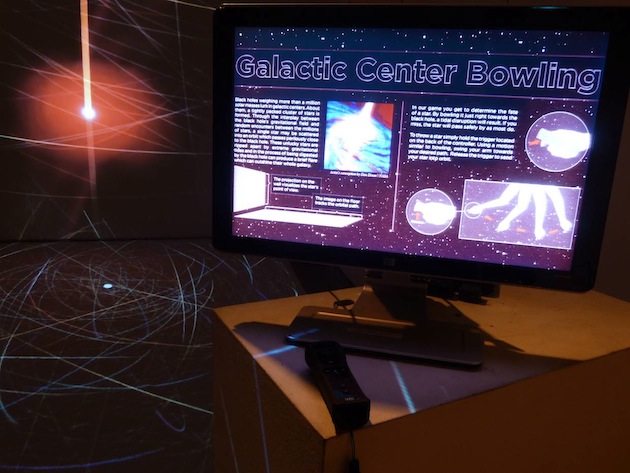
“What we were hoping people would walk away with is that there are many stars that orbit around the black hole, but only a rare few meet a violent and spectacular end,” MacLeod says. “We struggled with how best to convey this idea through the interaction design [eventually deciding to] warp the reality to give the user some control and boost the chances of something happening.”
One reason this design is instructive for the UX community is that it offers a “full-body” experience of an event that is far from the human scales of time, distance, and magnitude. This type of approach can help people better engage with the subject, internalize it, and remember the key concepts.
While making scientific concepts and models more concrete for general audiences is a great use of interactive visualizations, experts, too, can benefit from making certain processes more tangible to the senses.
Below are representations of a star’s encounter with an SMBH that are geared more for a scientist. Think of stars as spherical seas of hot, dense gas. Just as the earth’s oceans are pulled by the gravitational tug of the moon, stars’ hot gasses are warped by the black holes. There are different ways to display these resulting stellar tides and currents.
For example, this visualization of a star slice looks like a rotating gelatinous disc, but it is depicting a full sphere of hot plasma that is flowing and rippling. Although this display can be useful, if could be misleading if viewed too literally and without sufficient context. Using another visual approach, we can look at the directionality of the fluid motions in a representation of a “3D” sphere rather than a disc. Taken together, these two visualizations reveal aspects of the process that would be very difficult to capture in only one form or the other.

This approach can be useful, but it is important to be mindful of the possibility that the viewer might be led toward oversimplifying conclusions based on the images. Isolating and presenting key variables without oversimplification is a growing challenge for the design of UIs geared for large, complex data sets.
Visualizations can help users trace back the processes that the original researchers employed in coming to their conclusions. They can help users gain insights into unimaginably vast and powerful events while also revealing the mechanics of microscopic interactions.
More People Should Get Into Modeling
Some of the models representing the biological processes of health and disease are so complex that constructing them requires a group effort. The image of a lone scientist laboring away in a lab for the great breakthrough may become supplanted by the idea of highly collaborative interactions between people with different skill sets (a scenario that very much applies to the multifaceted collaborative direction of UX).
Computational biologist and entrepreneur Tomas Helikar notes that advanced mathematics and coding—not necessarily part of the background of scientific experts—may be the best ways to express complex chemical interactions inside the cell. To bridge this gap, he has led development of the “Cell Collective,” a software platform that has been in beta for the past year. The interface allows users to visualize and test aspects of biochemical models without having to work with equations or code. Helikar believes it can also be a useful educational tool—rather than having college students memorize the static biochemical pathways in textbooks, he them students about complex biochemical/biological processes by building those processes up and then breaking them down.
Helikar says some computational methods and tools are relatively new in biology, and ways to visualize these networks are being borrowed from other disciplines, such as engineering. Eventually, new forms of visualizations may emerge from the life sciences. “Visualization will play a huge role in the future, because there are too many moving parts to keep track of in a spreadsheet format,” Helikar says. “We need to come up with better tools to represent new models.”
Making “Failure” Part of the Model
Whether it’s a physical or conceptual model, sometimes you may discover that several of the pieces are missing or the assembly guides are not clear (as often happened to me as a young boy). The process becomes more challenging, but the model can still be well worth constructing. A holistic view of biological systems that incorporates advanced mathematics, computation, and, above all, more collaboration will need new models and interfaces.
For example, experiments that are perceived as “failures” and data that show “negative” results will not be relegated to locked file cabinets or forced to languish on backup hard drives. These results may not mean a “failed” experiment at all; rather, they may suggest a “positive” result to something unexpected but related. Data visualizations may help reveal hidden connections.
“It may not have been an expected result in the pathway but [it] may be important to another network with a less obvious connection,” Helikar observes.
It can be just as important to see the empty places as well as what’s filled in. “We are not always aware of the gaps in the knowledge, but we need to show them, too,” Helikar adds. Because biochemical pathways are nonlinear networks, many interesting aspects may not show up on static displays. This is just one example of a non-linear network that might best represented by more dynamic visualizations that UX designers can help create.
Models and Reality
At the end of the day, a model is still just a model and it needs to be tested and used against what happens in reality. When I built my model planes, I’d play with them for a while, but they’d eventually break. A model doesn’t have to be indestructible to provide a highly worthwhile experience. It simply offers a way to get a “hands-on” sense of things in the world that are not always at an accessible scale.
That’s a boyhood lesson I carry with me still as a UX designer.