Save
Complexity is a two-liter bottle of soda.
Doled out in reasonable quantities and at appropriate times, it’s not bad. In fact, it can be pleasant as an occasional accompaniment to a balanced meal or as a refreshing treat on a hot day. Unfortunately, we’re guzzling gallons of the stuff every day and it’s killing us.
The fact that humans have a taste for sweetness is neither a genetic flaw nor a psychological disorder. It’s a survival trait, passed down from our ancestors who needed to find high concentrations of calories in order to stay alive and thus developed an affinity for sugar. This preference became a problem in the modern era, where we have easy access to unlimited quantities of cheap, industrial-strength concentrations of carbonated high-fructose corn syrup, packaged in attractively colored cans and bottles. Instead of survival, we ended up with obesity and diabetes.
Similarly, humans gravitate toward complexity, in our technologies and religions, our laws and relationships, because simplicity is so often inadequate to our needs. We require a certain degree of complexity in our lives, just as we require a certain number of calories each day. Accordingly, we add layers, gizmos, features, functions, connections, and rules to the things we create in an attempt to make them more exciting, more effective, or otherwise better. This preference, too, becomes a problem when it spirals out of control and produces industrial-strength concentrations of complexity that surpass our needs by multiple orders of magnitude. Press 1 if you agree. Press 2 for a list of other options. Press 3 to return to the main menu. Please note, the options have changed.
As with using fancified sugar water to satisfy a sweet tooth, our otherwise healthy predisposition toward complexity goes awry when it is manipulated by marketers or thoughtlessly indulged by designers and engineers who fail to foresee the unproductive consequences of their actions.
The ill-advised ubercomplexity we so often encounter is more than a time-wasting nuisance. In some cases, it has life-and-death consequences. In the medical field unnecessary complexity leads to wasted resources, ballooning costs, delayed treatments, and entirely avoidable complications (both medical and procedural). As Dr. Atul Gawande explains in his book The Checklist Manifesto, “[T]he source of our greatest difficulties and stresses in medicine … is the complexity that science has dropped upon us and the enormous strains we are encountering in making good on its promise.” He goes on to observe that “defeat under conditions of complexity occurs far more often despite great effort rather than from a lack of it.”
The problem isn’t that we aren’t straining enough. It’s that even our best efforts cannot overcome the weight of complexity. The solution may not require pushing harder. Instead, it may require rethinking our approach to complexity in the first place.
Comparable problems can be found in education, where the formalized complexity of educational policies actively interferes with scholarship and makes it harder for Johnny to learn how to read, while overengineered (and underdesigned) technical tools provide teachers and students with shiny objects that distract more than they help. The result is an expensive rush toward less learning, not more. In contrast, the entirely unofficial Kahn Academy provides an online repository of free educational videos, powerfully simple resources used by 10 million students each month (including my kids!).
The same thing happens in fields as diverse as law, engineering, energy production, and social services. Time and again, excessively complicated tools reduce our aptitude, and well-intentioned increases in complexity make things predictably worse. Even when the consequences are not medically dire, complexity reduces transparency and makes it difficult to see what is really going on. When effective alternatives like the Kahn Academy exist, they tend to be less industrial and more organic.
What can be done about it? Banning complexity outright would be both unwise and impossible. Frankly, we’d have an easier time forbidding the sale of sixty-four-ounce sodas in New York City. But while most of us cannot directly simplify things like the tax code or the iTunes End User License Agreement, we do not need to resign ourselves to the confusion, frustration, and waste that come from overcomplexification. There are things we can do to improve our lives and the lives of those around us.
Complexity reduces transparency and makes it difficult to see what is really going on
This is particularly true when we design something, whether the thing is as ephemeral as an email or as enduring as a skyscraper. We can refuse to accept high levels of complexity as inevitable and refuse to view these levels as desirable. But even as consumers we have an opportunity to make things better by voting with our funds and purchasing simpler, more elegant alternatives whenever possible. Such alternatives sometimes cost less to purchase but almost always cost less to own, because they perform more reliably and effectively than the more complex options. Plus, these simpler alternatives make us happier, and that counts for something.
In The Book of Five Rings, the great sixteenth-century Japanese swordsman Miyamoto Musashi wrote, “From one thing, know ten thousand things.” There is powerful simplicity in the idea that one truth can illuminate ten thousand other truths, and I’m sure our ronin friend is correct. The challenge is to identify and express a single foundational concept upon which “ten thousand things” rely.
In the spirit of Musashi I would like to offer one such truth for your consideration, a principle that provides a touchstone for subsequent decision-making and design approaches. The great truth that will equip us with wisdom for our journey and help us find our way—or ten thousand ways—through the labyrinth of complexity can be expressed in five words: simplicity is not the point.
Yes, in a world of ever-increasing complications, it is tempting to hold up simplicity as a cardinal virtue, a universally desirable attribute for all designed things. This perspective is understandable and excusable, and it often produces good results in the short term. However, it’s also wrongheaded by about 90 degrees and contains the seeds of much subsequent failure.
Simplicity is great and important, to be sure, but let me say it again: simplicity is not the point. What is the point? In a word, goodness. Whether we are designing software or spacecraft, presentations or pizzas, the objective is to create something “good.” Simplicity matters because it affects goodness, but it turns out that the relationship between simplicity and goodness does not follow a straight line. This means an increase in one does not always correspond with an increase in the other. Sometimes making things simpler is indeed an improvement. Sometimes not. Life is tricky that way.
Ultimately, it does not matter how simple or complex something is. The only question is whether the thing is any good. For example, my favorite homemade bread recipe has just four ingredients—water, flour, salt, and yeast. It’s yummy and remarkably easy to make, and there is nothing I could add to the dough that would make it better. In its simplicity, it is just about perfect.
Having said that, I also love a good multigrain loaf, with five, seven, or even twelve different grains, plus a scattering of sunflower seeds and other tasty ingredients. This more complex bread is also yummy, although instead of baking it myself, I buy it from a shop. When I eat these two types of bread, thoughts of simplicity and complexity are the last thing on my mind. I just enjoy them because they are both so very good. The simplicity or complexity contribute to the quality, but the quality is the appealing factor. Again, simplicity is not the point. Goodness is the point.
Who gets to define goodness? The customer, of course. Sure, the engineers, inventors, chefs, and designers all have a say, and their informed opinion matters greatly. Same goes for the business leaders and visionaries responsible for guiding the effort. But the customer has the last word on whether or not the design is good, and that is an important truth to keep in mind.
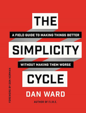
So goodness matters more than simplicity, but the two attributes are connected in important ways. As we seek to make things “more gooder,” it helps to understand how goodness and simplicity are related. Specifically, it helps to recognize a few critical pivot points where activities that previously drove improvements begin to instead make things worse, where complexity becomes counterproductive, or where simplicity is inadequate. That’s where my book, The Simplicity Cycle comes in.
The pages that follow aim to identify some of these points, providing a road map that highlights the good paths and identifies the dead ends we might encounter on a journey of design. Think of it as an atlas, showing a wide swath of geography from various perspectives and explaining that a left turn in Albuquerque will take us toward a certain place, while a right turn will take us somewhere else.
Which turn should you take? That depends on where you’re coming from and where you want to go. An atlas can point out nice places to visit and identify the fastest or most scenic way to get there, but it can’t pick your destination for you, nor can it dictate which route you should take. Such decisions rightly belong to the traveler. That’s part of the job, and it’s also a big part of the fun.
As you read, keep in mind that the map is not the territory, and studying a map is no substitute for an actual expedition. The only way to really know what is out there is to go see for yourself. If you choose to set out on some sort of design adventure, don’t be surprised when you encounter bumps in the road, unexpected twists, and various landscape features that escaped the attention of your humble cartographer. But as you head out into unknown territory—and design is always unknown—it may be helpful to bring a map along and consult it from time to time. It may also be wise to spend some time with the map before the journey begins, to get an idea of how long the trip might be, what gear to pack, and what to expect along the way.
How we use a map depends on who we are, where we are trying to go, and how we plan to get there. Thus, a biker, a hiker, and a truck driver might all use the same map but in vastly different ways, paying attention to different features and arriving at different destinations. Those traveling by foot may pay more attention to the space between roads, looking for dotted lines that indicate casual trails through wooded areas. Meanwhile, the people who rely on two-wheeled, self-powered vehicles to travel short distances would be wise to avoid the four-lane interstates and instead stick to the smaller, slower byways. But for the people who drive a big rig on eighteen wheels, those major highways are just about perfect.
Even people with a common transportation mode may approach the same map with diverse interests, because when you’re driving in a street race your needs and objectives are not the same as when it’s your turn to drive the car pool. Or maybe I’m wrong about that—I don’t know much about your car-pool arrangements.
If The Simplicity Cycle is a map, who is the map for? It is for anyone who designs things, and that is pretty much all of us. As Henry Petroski explained in his book Small Things Considered, “We think, therefore we design. Indeed, there is barely anything we do, much less use, that does not have a design component to it.”
Thus, the book is also for anyone who buys, consumes, or otherwise uses things, which is also all of us. Petroski argues that simply using a product often involves a number of design decisions. So, if you’re interested in reducing confusion, frustration, and waste—yours or someone else’s—whether as a designer or a consumer, dealing with hardware or software, services, or processes, then this map is for you.
The specifics of how you might use the map will vary depending on your needs. Coders, engineers, and other technologists may find it useful to guide technical design decisions and to shape the framework of their system architectures. Writers may discover that the process of literary creation is subject to many of the same complexity-related pitfalls and opportunities as a technical design project and thus may find familiar territory in the map. So, too, with people who prepare food, give presentations, or make plans.
If your business is business, you almost certainly face situations where complexity threatens to overwhelm value, where you must make decisions about a process, a customer, or an organizational structure that strike a balance between too much and not enough, between needs and wants and do-not-wants. These decisions require an understanding of how complexity affects quality and performance. This book is for you.
And finally, a word about leadership. A leader’s job is in some sense to see the future, to cast a vision of what could be. While looking ahead to tomorrow’s challenges and opportunities, leaders must simultaneously guide their teams along the path today, toward a finish line that may be invisible to most others. A good map is indispensable in such a situation, both to help the leader make good decisions about how to proceed and also to help discuss the plan with the rest of the team.
“See, we are here,” the leader might say to her followers as she points to a spot on the map. “In order to get over there, we could go this way or that way.” A map provides context for her words and gestures, making it easier for followers to engage with, understand, and embrace the vision.
All of this begs the question of whether anyone really needs a map. Can’t we solve the problem of complexity by following the KISS principle of “Keep it simple, stupid”? What could be easier than that, right? And yet, maintaining simplicity is not only difficult, it is often ill-advised. In virtually any context—business planning, software development, pizza making—the immature simplicity associated with first drafts, early prototypes, and initial versions tends to be unsatisfyingly empty. Such partial solutions are necessary starting points but inadequate as final products because they lack the essential qualities found in more mature versions. Keeping things simple impedes progress, which is why we add things to our designs. We make them more complicated in order to make them better. It is only when we go too far that an epic level of complexity makes the final product unusable.
And this is where things can get a little tricky. Just because there is such a thing as too simple and such a thing as too complex does not mean the best solution sits in a mythical sweet spot between simplistic and complicated, as if the territory in question could be represented by a single straight line. Reality is more complicated than that, and straight lines seldom make for interesting journeys. There are bends in the road we need to be aware of. If we overlook them we’ll either end up following the road to a bad part of town or jumping off the tracks entirely. Thus, the map.
I encountered one of these bends in the road in 2002, as I pitched my latest project to the U.S. Navy. Before I launched into my demonstration, the lieutenant commander across the table held up her hand and made a comment that changed my life.
“Wait. Before you begin, I want to say something. I don’t care how good this thing is. If it isn’t easy to use, I don’t want it.”
I sat back in my chair for a moment and thought about what I had just heard. She doesn’t care how good the project is? What a remarkable statement! All the cool features and functions in the world wouldn’t be interesting to her team, would not qualify as desirable qualities, unless the overall system was simple. She was saying complexity trumps goodness, a sentiment that resonated with me as much as it challenged, surprised, and confused me.
Neither of us knew it at the time, but her comment led me to embark on a long investigation into the relationship between complexity and goodness in engineering and design. How do complexity and goodness really affect each other? Is simplicity the point after all? My Navy friend certainly seemed to think so, but was she correct? Did I even understand her comment? What did it really mean? Clearly, I had more research to do.
Shortly after that meeting, a number of other things came together, converging into the ideas that eventually became the Simplicity Cycle. I encountered the works of poet Cliff Crego, which we’ll take a look at shortly. I had some hallway conversations with engineers, and conference-room discussions with senior managers. At some point it occurred to me that simplicity and ease of use aren’t necessarily the same thing.
Through it all, I felt I was on the verge of understanding something about design, complexity, and utility. I made a few attempts to represent the idea visually and sketched out a series of little diagrams, none of which looked quite right. Something was still missing.
The Simplicity Cycle
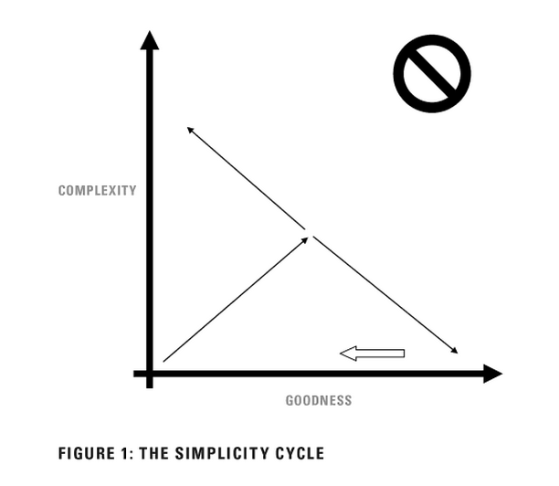
The journey continued long after that conversation. I talked with more people, read more books, and experimented with different design approaches, and things began to fall into place. I learned things. I unlearned things. I gathered new pieces of information. I set pieces aside and put others together. I can’t point to a single breakthrough moment where the lightbulb came on, but I eventually sketched out the diagram below. As I reflected on the drawing, I realized it not only described the process of designing something—an airplane, an outfit, a computer program, a presentation, a book; it also described the intellectual path I’d traveled in producing the diagram itself.
Want to learn how The Simplicity Cycle works? Pick up a copy. You can also check out our conversation with Dan Ward below.
Excerpt from The Simplicity Cycle by Dan Ward © 2015 by Dan Ward. Excerpt provided courtesy of Harper Business, an imprint of HarperCollins Publishers. Image of swordsman courtesy Shutterstock.
Dan Ward
Dan Ward is the author of F.I.R.E.: How Fast, Inexpensive, Restrained and Elegant Methods Ignite Innovation (HarperBusiness, 2014) and The Simplicity Cycle: A Field Guide To Making Things Better Without Making Them Worse (HarperBusiness, 2015). Prior to launching Dan Ward Consulting, he served for more than 20 years as an acquisition officer in the US Air Force, where he specialized in leading high-speed, low-cost technology development programs and retired at the rank of Lieutenant Colonel. For more information please visit thedanward.com and follow the author on Facebook and Twitter


