Save
Long gone are the days of crowded layouts, blocky, text-filled pages, and flash-heavy, slow-loading websites. Outside of the oddball 90s throwback, the World Wide Web of the present is increasingly an optical pleasure to peruse.
Today, with interesting and exotic front-end visual effects such as parallax scrolling, 3D models, and ambient video, the average website visitor is treated to progressively enticing UX. Another visually rapturous innovation that will soon be making big waves in the world of web design is the advent of CSS Shapes.
A Brief History of CSS Shapes
In the fairly recent past, multinational software conglomerate Adobe decided that the current state of rectangular affairs was no longer shapely enough to suit the needs of design-hungry masses. Thus, an effort to create a method of wrapping text around a greater variety of geometric patterns was born. The final result of which, the CSS Shapes specification, was released in demo form in July of 2012. CSS Shapes was then in its infancy, but now it’s in the final stages of widespread implementation.
This innovation was created to emulate the way text hugs the edges of illustrations in print media—a simple idea, but quite difficult to reproduce in web design.
Until now, that is.
What is It?
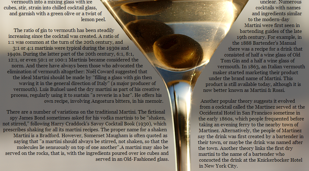
Put simply, CSS shapes is the wrapping of text around or within complex images.
Most websites stick to a simple mold: fitting content inside rectangles within other, larger rectangles, something that most users are likely to find more boring than mind-blowing. CSS shapes, on the other hand, allow greater freedom to designers looking to contour their content within or around interesting and visually appealing parameters.
These new borders might be octagonal, polygonal, circular, triangular, and so forth. Of course, web designers aren’t exactly cavemen. The ability to code shapes into websites has been around quite a while, and it isn’t insanely difficult—it’s mostly just tedious.
The true struggle arising from the older method lies in the positioning of text content in relation to the shapes. Though coding these shapes has been possible, it never effected the content within or around the shapes, forever damning any frame that didn’t follow a standard four-corner format to the obscurity of background visual impact. The CSS Shapes specification takes the more diverse contours into the spotlight of the fore.
Of course, the obvious question is: why should designers utilize this new specification at all? The rectangular model has been so successful for so long, what’s the point of trying something new?
Why Should CSS Shapes Be Utilized?
Aside from the obvious answer (because experimentation is fun), there are a select group of very persuasive reasons to start playing around with CSS Shapes.
There are some very persuasive reasons to start playing around with CSS Shapes
1. Novelty
To put it bluntly, CSS Shapes is a shiny new toy, and everyone is going to be playing with it sooner or later. The ability to alter text to squeeze into tight spaces or, alternatively, expand into wider ranges, will offer greater freedom to designers putting together their layouts. For the first time, designers will actually be able to experiment with interactions between imagery and content in rich ways. It’s likely to become quite popular.
The excitement around the specification is palpable, and you don’t want to be the only kid in school without the newest toy to show off to your friends. The power of novelty will make CSS Shapes very prevalent in its early stages after release. It’s preferable to be in on the ground level in cases like this, so you can cite your “bleeding-edge” achievements to clients and admirers alike.
2. Advanced Control of User Flows
Directing user flow is a highly sought-after attribute of any web design. Using CSS Shapes to frame your imagery with text gives designers increased ability to focus user attention. This can be accomplished in several ways:
- By shaping the content into figures which subtly direct user attention, such as triangular arrows
- Decreasing text line by line, creating a “funneling effect”
- Or by using text shape to emphasize other on page elements, like images or CTAs
You can even manipulate the shape of the content to respond to scrolling, which lends itself nicely to the next point.
3. Shaping Content Facilitates Visual Storytelling
Using cleverly wrapped text, you can complement your webpage’s imagery, and vice versa. The imagery can be used to emphasize the content as a sexy asymmetrical border. The options for variability once you ditch the idea of a walled in structure for your written content are staggering.
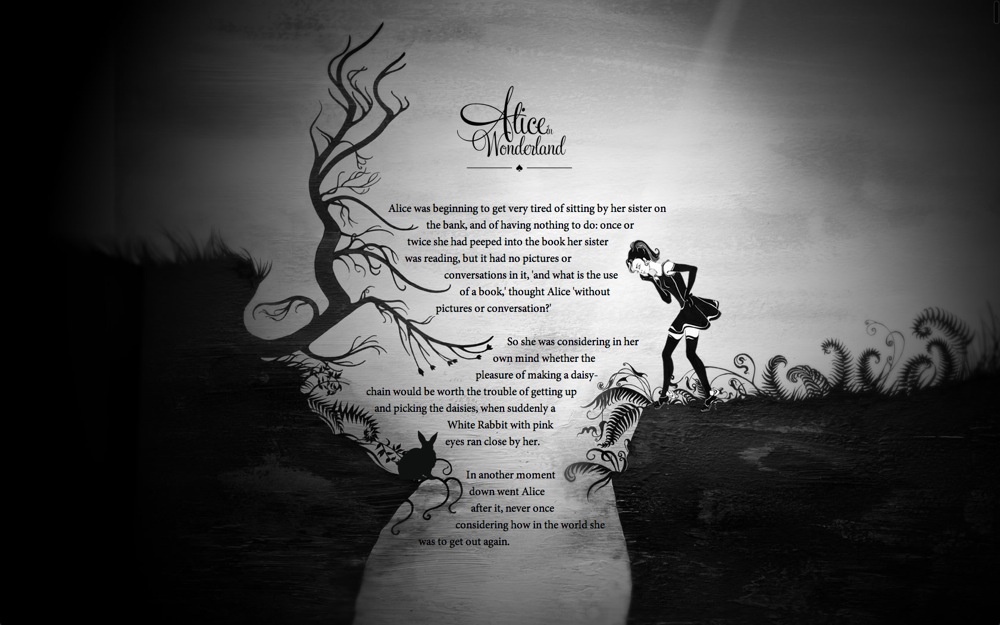
Adobe has already laid out a fantastic example of how CSS Shapes can be used to improve the storytelling aspect of a website, by shaping text from Alice in Wonderland, around breathtakingly original artwork.
Of particular note is their manipulation of the top margin in response to scrolling. By adjusting this attribute, they created a dynamic effect of text flowing down the rabbit hole, for both users and Alice to follow.
4. Symmetry, Size, and Speed
CSS shapes can be utilized to maintain your content’s shape regardless of viewport, making it universally symmetrical, not to mention RWD friendly. Adjusting the browser size can trigger breakpoints within a website design that will alter the words in order to maintain a pleasing visual aesthetic in your typography. Assuring that your text will always display attractively.
Not only that, but the directions for CSS Shapes will load up from the browser, rather than the server. This decreases your website’s weight, and increases its speed. Page load times are key to user experience. It’s generally deemed unacceptable for load times to exceed four seconds. With requirements as stringent as that, it’s vital for designers to streamline their websites as much as possible.
How Can CSS Shapes Be Implemented?
First off, you should understand that, at present, CSS Shapes is not widely supported among browsers. In fact, it’s only functional in three, the latest versions of Chrome, Safari, and Safari iOS. More are on their way, but there currently isn’t much information as to when that might happen.
In the meantime, if you have one of the three supported browsers, you’ll still need to enable the CSS Shapes specification in your settings. Follow the above link for step-by-step instructions.
But for now you’re probably wondering what a CSS Shape element looks like when coded. Here’s a simple breakdown.
To flow content around a shape, you use the shape-outside property. If you want content to fit within a certain shape, you use the shape-inside property. Either property can be applied to any shape by putting the shape function of your choice within the .element.
Here’s a simple example:
.element{ shape-outside: circle(radius at cx, cy,) }
In this example, “cx” and “cy” represent the points along the x and y axis of your grid where the radius lies. It’s important to note also that shape-outside can only be utilized on floating elements, and these elements must have a set height and width. There are likewise holdups with the shape-inside property, as it hasn’t been implemented in its entirety yet.
For more comprehensive tutorials on how these and other shapes can be initiated within your layouts, check out any of the following:
- Comprehensive article on AListApart
- Extensive tutorial by Sara Soueidan
- Adobe’s own exhaustive chronicling of the topic
- A particularly helpful Adobe offering
Conclusion
CSS Shapes is certainly a trend to watch in the coming years. The web design world is aflutter with excitement over the possibilities of being able to emphasize, complement, and adjust content on the fly with this unique and versatile version of text wrapping.
With a renewed emphasis on textual content and the increasingly pivotal demands of responsive website design, the added functionality CSS Shapes promises control of structure and flow concerning imagery, typography, and layout design, making it one of the most intriguing upcoming features. As the design world waits with baited breath for further updates, the intelligent designers and developers are already educating themselves as to the ins and outs of this shiny new toy.
What do you think about the upcoming impact of CSS Shapes? Overhyped and underwhelming? Understated and incredible? Share your opinions in the comments.
Image of car wheel courtesy Shutterstock.
Zack Rutherford
Zack Rutherford is a freelance copywriter, with an invested interest in UX and web design. A combat sports enthusiast and poetic soul, Zack endeavors to create beauty through syntax, sentence structure, and the liberal use of hyperbole. Follow him on Twitter (@zack_rutherford) or visit his website (Zackrex.com) to read all of his innermost thoughts.


