Save
When Apple finally released the Apple Watch this past spring, they launched a series of commercials touting how useful the device could be in our lives. One of the commercials depicted a young tourist on a trip to Berlin. While dancing at a club, she glances at her Apple Watch to read lyrics to a song that the DJ is playing. The use case was such a stretch that if I had significant cash reserves, I would be compelled to short sell Apple stock. This was the clearest evidence yet that despite the very strong importance of and interest in great experience design, the UX industry is about to endure a thorough shakedown.
The Era of Obvious UX Design Needs Is Over
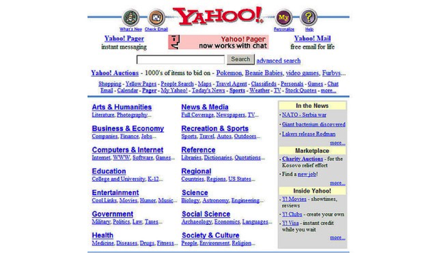
So if the era of obvious UX design needs is over, you ask, when did it begin? Although the concept and practice of UX in relation to interface design has been around for a few decades, this bonanza I speak of didn’t really kick in until Web 2.0 arrived around 2004. The convergence of web design standards (W3C!), front-end development techniques (ajax!), user-generated content (reviews!), and an understanding of the need for usability led redesign efforts across the web. Additionally, startups and big business alike began to truly see the importance of good design as a key differentiator thanks in large part to Apple’s resurgence through design leadership. It’s hard to imagine now, but before this time, most websites looked like this:
Compared to other design disciplines with conceptually similar skill sets (ahem, architecture) UX was quite lucrative, even for folks who were new to the field. Universities began to beef up UX programs to supply a stream of young “design thinkers” eager to make their marks and cash in. Traditional advertising and IT companies began to transition to interactive agencies to capitalize on the gold rush by redefining themselves and hiring like mad or acquiring smaller design firms to get talent.
Along Came the Smartphone in 2007 and Apps in 2008
Holy Aladdin. Quite literally a whole new world to design for and a form factor that had clear projections to be more important in the global context than even desktop experiences.
In 2010, Throw in Mobile Web Versions of Websites beyond Apps, and How about a Frickin’ Tablet Too?
Just Shamwow. The juices of the fruits are literally streaming down our collective faces. But it’s beginning to dry on our ruby cheeks and get sticky fast. Tablets aren’t nearly as important or contextually useful in most cases as smartphones. Mobile website design should generally be as consistent as possible with the app that was designed by us the year before. Heck, it should even be as consistent as possible with the website we designed even earlier.
I Swear I Saw You Coming All along, Responsive Design
Sorry client, all that stuff we designed or redesigned for you over the past several years should basically be scrapped. There’s a new design approach that will lead to true consistency across all these devices through which you interact with your customers. It’s really in your best interest not only from a customer experience perspective but also in terms of reducing ongoing digital management costs and complexity. Cha-ching.
Hey Look up in the Sky! It’s a Wearable! This Is Going to Be Great Right? Riiiiight?
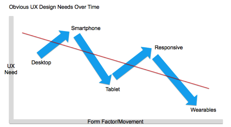
Cue the graph.
So Where Does This Leave Us? Here Are Five Realities Facing Our Field
We’re rapidly running out of compelling form factors to design for
We’re simply over-deviced, over-connected, and over-contented. Yes wearables are here to stay, but their ubiquity is long off and true usefulness seems quite limited at this point. There’s a reason my Fitbit is in a drawer somewhere. And let’s not get started with gestural or virtual Minority Report interfaces. Designing for these experiences is generally still fantasy at best and dystopian at worst. Either way, the inherent usability of gestural and virtual interfaces is in the dumps.
Standardization and templatization is here to stay
Although there will always be a need for bespoke experiences, UI standardization and templatization with OOTB usability is happening across all digital channels, and rightly so. It’s frankly essential to establish conventions that breed interactive familiarity and speed. Hamburger menu, check. Product details page with suggestive pairings, check. Large agencies are particularly vulnerable to this reality. Designs that agencies once charged clients tens or even hundreds of thousands of dollars for only a short time ago can now be realized with a $69 WordPress template.
Brand “digital storytelling” or whatever every agency wants to call it is an overhyped wonder pill to realize market differentiation
I wish it weren’t true. After all, who doesn’t love a good story? The concept of brand storytelling is indeed critical, but the notion that digital/UX plays a significant lead role is exceedingly rare. And deploying a parallax effect for long scroll narrative pages is the hipster beard of web design. Which brings me to the next point.
It’s the content, stupid
We’ve been drinking our own Kool-Aid for so long that we’ve actually come to believe that great UX is something people want in and of itself. Great UX is actually the art of invisibility. UX has always simply been about the seamless delivery of great content or functionality.
Big data isn’t going to save us
The convergence of data and design is overhyped in terms of needing new UX. Say your client is a credit card company that wants to roll out a new app that suggests enticing products and services to users of its card, based on an analysis of a user’s purchase history, combined with merchant data. Is there a need for new UX significantly beyond what we’ve already solved for e-commerce? Another assumption I would like to question is the notion that more data visualization will automatically lead to more meaningful and enjoyable experiences. Sorry, Tufte fans, the story data tells is way more often a novelty than we’d like to admit.
So there you have a few realities to mull over. But before I’m labeled a heretic, a cynic or just a good ol’ fashioned hater, I have some great news to share.
We’re rapidly running out of compelling form factors to design for
Non-Obvious Design Challenges Are Here to Stay
The bonanza may be over but I say good riddance. Unless you worked at a startup, the work during this period was often way too much about applying a layer of UX to existing products and services to simply get to designs that were decent enough, even when there was solid user research. This simply didn’t work the full spectrum of our skill set and passions, nor did it drive true innovation. But the realization that great design is not only a competitive differentiator but also essential to the DNA of any product or service means that we’ve won C-suite hearts and minds across companies around the globe. And because of this, experience design will increasingly lead the conversation.
In other words, work is about to get a whole lot more exciting. At least for those that survive the Great Interactive Agency Layoff of 2016-2018.
Image of old wood courtesy Shutterstock.
Ara J. Berberian
Ara J. Berberian first caught the UX bug while working in Tokyo for a software company during the dot-com boom. His current work in the field of experience design ranges from finance to fashion. He’s also had the pleasures and pains of trying to launch startups with big visions in local search, personal finance, and even interactive clothing; landofberberia.com.


