The manual: possibly the most awkward part of a user’s experience with a product. People avoid manuals whenever possible and designers try to build interfaces that need not rely on them. And yet, users and designers would certainly agree that you simply must provide a proper manual.
The manual can be a powerful tool for unleashing the full potential of an application, something of benefit to users and vendors. Why is it, then, that manuals so often seem to confuse users rather than help them?
Let’s look at the most common difficulties faced by technical writers, and how to best deal with them to improve the user experience of manuals.
The Style: Book vs. Booklet
Before even touching the content of the manual, stylistic attributes can be decisive in convincing users to pick up and read the manual rather than trying to figure out the interface on their own (and calling customer service if they can’t).
If the manual remotely resembles a telephone book in size, chances are that users won’t bother reading it. Still, you shouldn’t sacrifice content for brevity. Manuals have to be comprehensive for a reason. If users accidentally click on a button that triggers a possibly dangerous process that is not covered in your manual, questions of security and liability will arise.
If you feel that the functionality of the product requires a very big manual, it’s worth providing a quick start guide along with it. Give users a general map of the interface and explain its basic functions so they can explore without a risk of breaking things.
Something that will add pages to your manual is white space. There is value in line-spacing in between paragraphs or as margins. Used properly, white space can increase both reading performance and comprehension, but be careful not use too much of it.
Consider the fonts, too. A common practice is to use serif font types for print, and sans-serif fonts for online body text, but when it comes to font types and sizes, personal preferences simply vary. Know what has worked well in the past and be open to experimenting. Most importantly, test your choices with users.
The Table of Contents: Logical vs. Consistent
Technical writers usually recommend structuring the table of contents in a clear hierarchical manner. Good advice, but it requires a little more elaboration.
The table of contents in the manual and in the product interface need to maintain a complementary information architecture. The manual structures the functionality thematically while the interface structures it visually. If the thematic structure of the table of contents is not consistent with the visual structure of the interface, it can confuse users.
For example, in versions of Microsoft Word prior to 2007, in order to add a header or footer, you had to go to the View menu and check the Header or Footer entries to format the page accordingly. Headers and footers were treated by the interface as a formative part of a page. With the introduction of the Ribbon Interface in 2007, this changed slightly. In order to add a header or footer in Word 2007 and later, the standard way is to click on the Insert tab within the Ribbon and then the Header or Footer icon.
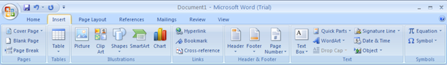
Headers and footers are now treated as external items and grouped in the same tab with other external items, like pictures, charts, tables, and symbols, that are typically viewed as additional (not formative) elements of a page.
The question is how and whether to reflect this change in the table of contents. Logically, it would seem perfectly fine to set up a chapter called “Formatting the Page” with subsections for Headers and Footers, and a chapter called “Inserting Items” with the subsections Pictures, Charts, and Tables. This, however, would contradict the visual structure of the interface at hand.
It would be better to include subsections in the chapter “Inserting Items” that accurately correspond to the interface, namely Pages, Tables, Illustrations, Links, Headers and Footers, Text, Symbols, etc… This would avoid confusion and strengthen the users ability to create a mental map of where to access a certain kind of functionality.
The Instructions: Goal-oriented vs. Descriptive
Usually, the idea behind instruction manuals is to present a specific goal to the users guide them, step by step, toward it. While this approach works well for some workflows or even entire applications, sometimes a more descriptive approach may be more appropriate when goals are less clearly defined.
For example, the classic case of a goal-oriented workflow is the installation process. The goal, installing the application successfully, is clearly defined, and there is likely very little deviation along the way. The interfaces of many installation wizards are indeed designed to take you through a fixed, chronological sequence of steps.
Goal-oriented workflows are often communicated by the application itself with success messages like “installation successful” or “transfer complete.” Other workflows are best for products and services with goals that are not as clearly defined, like productivity applications.
Users working with productivity applications often have the goal of creating great looking documents, videos, presentations, etc, which is a fuzzier concept to break down. Using smaller sub-goals won’t help very much either. When writing a manual for a productivity application, you will have to teach users about the different functionalities the program provides and how to easily control them.
Take, for example, the color picker in Photoshop.
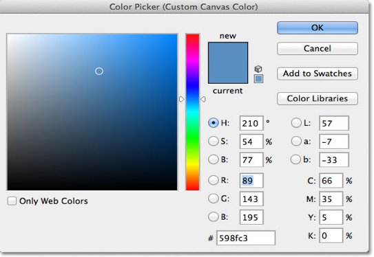
The interface itself does not communicate any particular goal other than the ability to manipulate the color properties of the selected area in one way or the other. You will have to break down or chunk the interface element at hand into areas that represent different types of functionality and sub-functionality. In the case of the color picker above, you would have to explain what the color field to the left represents and how it relates to the color slider in the middle. The color notation or color values (Hue, Saturation, RGB, CYMK, etc …) to the right also need to be explained.
In situations where a goal is pretty much up to the users to define, a more descriptive instructional method will allow them to better find their way around in the application and experiment with all the available tools and settings until they achieve a result they are happy with.
The Language: Technical vs. Colloquial
Technical writers often suggest using simple language devoid of technical jargon that users may not be familiar with. Very good advice, but a couple of things should be considered.
Often, the interface itself may use a very technical language. In this situation, in order to maintain consistency, the best thing you can do is to explain the technical terms in a glossary. Although cross-referencing can become tedious to users, this is usually the most acceptable solution. It’s not to hard to navigate a glossary and the alternative—explaining the technical terms wherever they fall in the text—can easily clutter your instructions and simply get in the way if users happen to be familiar with the term or concept.
Using a language that is too casual can also work against you. Some technical writers, such as David Pogue, use a rather conversational style, and while it’s not impossible to be both entertaining and instructive, be aware of the risks involved.
Being entertaining is great, but users will probably want to read your manual to simply get their work done as quickly and efficiently as possible. They will have to follow sequences of commands and results, a fundamental principle of human-computer interaction that holds true irrespective of the instructional method you choose.
Anything that goes beyond teaching users in these easy-to-understand sequences of commands and results entails the risk of distracting them, especially if your remarks are quite entertaining. With everything you write, entertaining or not, try to always keep it closely related to either the command or result you are trying to explain. This will ensure that your writing is engrossing and efficient.
The Structure: Uniform vs. Segmented
A novel is supposed to be read from the first line straight through to the last. A manual, by contrast, should allow users to quickly find what they want while skipping past undesired information. If your manual is consistently divided into meaningful segments, it can increase user comprehension while making it easier to skip unwanted information.
Headers are necessarily short and may not always give users enough of a clue as to whether a chapter or section contains information they are looking for. It makes sense, then, to always include a short summary of a couple of lines at the beginning of a chapter or section, preferably indicated with a bold “Summary:”. This way, users will not have to read the entire chapter. This is also a good place to make users aware of possible dangers attached to certain functions or how they relate to other functions.
You can also use the principle of meaningful consistency to further structure and refine the instructions. For example, always put commands and results in separate sentences. Always make commands, and only commands, bold. Always indent your instructions. Always use bulleted lists for options and numbered lists for chronologically fixed steps. Always place pictures beneath the respective instruction, never above.
Lastly, consider your appendices. Sections such as indices, FAQs, troubleshooting sections, and glossaries are popular among users because they have a familiar and consistent structure (Q&A, alphabetical, error & solution, etc.), which makes them easy to scan and to navigate. Interestingly enough, this is the one area where you should deliberately deviate from the principle of maintaining consistency with your interface. Instead, work with the users to find the keywords, synonyms, and questions they are most likely to look up first.
Final Thoughts
User manuals play a crucial role in user experience—not just with the manual itself, but also with the product. Unfortunately, manuals are often a source of frustration rather than assistance. Every application is different and requires a different approach. Although there are many useful tips for technical writers, the difficulty is to knowing which advice to follow and when to follow it.
Technical writers need to be involved in the development of an application right from the outset, so that they truly understand how it works. This will yield better results than handing them a finished product and a deadline. Only then will they be able to use their analytic and linguistic skills to simplify these processes for the users and turn the manual into the powerful tool it was always meant to be.
Image of garden labyrinth courtesy Shutterstock