In the pre-digital era, data was a subject for mathematicians and scientists. Now, one way or another, we can’t escape it.
Our constant use of online services not only relies on data, we are also a continuous source of data, generating information about all aspects of our lives.
Whether it’s data about the human body—thanks to the rise of wearables—our energy consumption at home, or data tied to our personal finance: we’re creating mountains of data, and now we need to find ways to make sense of it.
The rise of personalized data is poised to be a hot topic as companies seek to deliver real benefits from the information gathered on consumers. The challenge for designers lies in finding a way to reduce the complexity posed by such vast amounts of data and give data a human shape.
Data has to be accessible to the average person. It also has to provide the user with actionable insight in a way that is meaningful and accessible. This is where the true power of design can really make a difference: by using visualizations to help people navigate the confusing world of data we can improve lives.
Data visualization has come a long way since its formative days as the basic pie chart invented over 200 years ago. Now, thanks to the huge upsurge we’ve seen in data and the discourse around its usage, a new design language is emerging that is elegantly simplifying the big data mess into beautiful and meaningful visualizations.
So regardless of whether you’re bringing shape to data on health and wellbeing, shopping habits, or in editorial, Fjord has identified five core principals to follow when embarking on a data visualization challenge:
1. Understand the Source
Make sure you know the data you’re working with. This is the crucial first step in making sense of data. You need to understand the bigger picture: Why has it been collected? What value does the organization put on it? Who is the user? How can it be used to greatest effect? This insight will lay important foundations for the creation of a visualization that’s both meaningful and human.
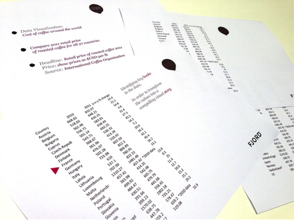
2. Identify the Narrative
Good data visualization is so much more than a beautiful picture, it tells a story that can be understood by anyone. It’s therefore essential that you identify the story you want to tell first and then use the data as way of bringing that story to life.
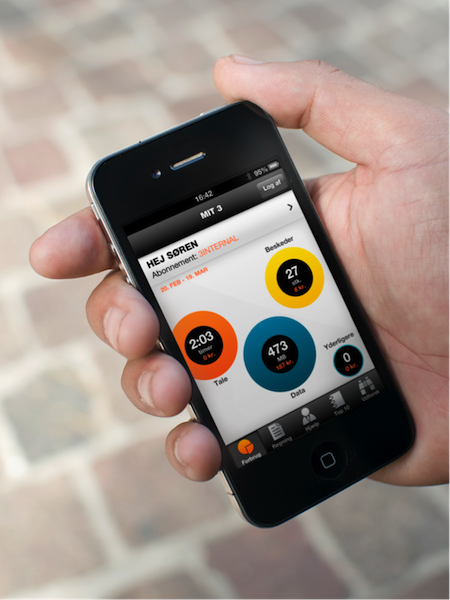
For example, we recently helped mobile operator 3 Sweden become more customer-centric and transparent by re-designing the often-confusing monthly phone bill. Instead of continuing to present their customers with an incomprehensible list of numbers, they wanted to create something much more helpful and transparent.
Good data visualization tells a story that can be understood by anyone.
The result is My 3, an app that lets customers see their usage data in real-time so they know exactly where they are with respect to their plan. By using data visualizations we have been able to create a beautiful and innovative way to give customers access to their data that also demonstrates 3’s commitment to customer care.
3.Define the User Experience
Ensure you use data to guide but not dictate the overall experience. Data should act as a backdrop of understanding and learning that allows the user to create his or her own experience. It’s also worth exploring ways to deepen the insight you can share with the visualization and give people the flexibility to interpret the data in the most meaningful way to them. After all, an experience that delights is an experience that people will remember and use again and again.
4. Simplicity Rules
Data visualizations exist to inform the user, they’re not an excuse to overload someone with information they don’t need to know. As a designer, it’s your role to focus on simplicity, taking complex or disparate information and making it tangible, understandable, and, importantly, more human. Remember, where simplicity reigns, the user understands.
5. Avoid Reinventing the Wheel
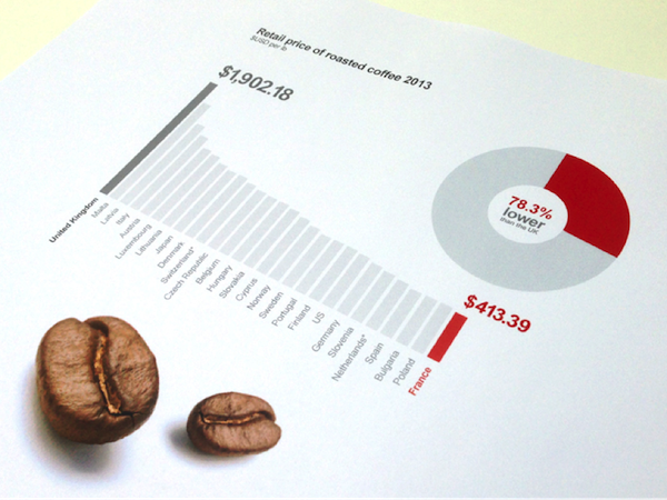
Try to tap into existing behaviors and understandings around data visualizations. It will make your design more accessible to a broader range of people. There’s a reason why the pie chart is so widely used: people understand what it shows. There’s an innate elegance in designing visualizations this way, as they’ll have a greater impact and be immediately understood.
A Design-Led Approach
Good data visualizations are not only masterpieces of design, they are valuable tools helping us to interpret previously inaccessible content as something much more meaningful and actionable. As increasing numbers of organizations wake up the power and potential in their data, design will play an even bigger role translating something confusing into something that helps people. The trick is to take a design-led approach that puts the user first and focuses on simplicity in order to create an experience that never ceases to delight.