Save

Designers aim to create products that are evocative of their guidelines at first glance to their customers. To do so, they first need to fathom a significant principle of affordances — the definition and the purpose. We are hemmed in with affordances but knowing how they impact user experience design is necessary for producing high-quality, user-friendly products.
“When affordances are taken advantage of, the user knows what to do just by looking: no picture, label, or instruction needed.”
— Don Norman, Grand Old Man of User Experience
Psychologist James Gibson created the “Affordance” in 1977, which refers to the possibilities of all action with an object based on the physical capabilities of the consumer. For example, the chair has facilities such as sitting, standing, throwing, etc. The ensuing epoch carried the term to the design community and slightly modified the meaning to make it more convenient for designers to use by Don Norman in 1988.
Affordances and Signifiers
Dan Norman also introduced “Signifier”, a term widely used in his 2013 The Design of Everyday Things edition. “Signifier” is a kind of natural gesture about eligibility, set forth to indicate a vivid distinction between the context in which it was presented and the way it signals an affordance it might provide to a person; design has no bond with affordances but with signifiers. Signifiers can exist on their own just as affordances can exist without any signifier — the signifier part of an affordance may be invisible (or misleading).
1. What is Affordance?
Affordances are deciphered as perceivable action possibilities — actions which users deem possible. It is used as a compelling indicator of how an object works and how it conceives both its perceived and actual function.
2. Types of Affordance?
Before diving into the general principles of affordances for UX design, here are the six most celebrated types:
Obvious Affordance
Obvious affordances are the perceptual properties of an object, giving you an idea of how it will be used.
Hidden Affordance
Hidden affordances are inherent properties of an object. Evidence indicating the performance of an item may not be obvious and may not even appear until action is taken. A simple example of a hidden affordance is the drop-down menu or other clickable features in the UI that only appears when the user hovers over it.
Pattern Affordance
Affordance models are based on already set up conferences that represent a function. These are widely used or agreed upon protocols on how things work. Take the camera for example. For the most part, all cameras have a shutter button in the upper right. Another example is underline, italic or contrasting text, which refers to the hyperlink in the text body.
Metaphorical Affordance
Illustration affordances are based on images of real or original objects used to convey intent. For example a shopping cart icon to indicate your online purchases, a microphone image showing the option to envelop or record to send an email or message.
Wrong Affordance
False affordance occurs when an attribute of an object indicates that the object is not actually working. An example of this is the unlinked underline text by clicking the button or a TV remote that turns on your lights but not the TV. False affordances are often unintentional or because of a lack of effective design techniques.
Negative Affordance
Negative affordance is used when expressing a lack of work or interactivity. This type of expense is usually used when you need more information from the customer and you want to prevent them from going to the next step.
3. How are affordances used in UX design?
Affordance is a relationship between a person and a physical or digital object. In user interface (UI) designs affordances are very apparent. Based on users’ current expectations and previous experiences, the users observe through available options or actions in the UI and decide which actions are possible.
Now that we have covered the major types of affordances, we will delve a little deeper into how to use additives in UI design.
Buttons
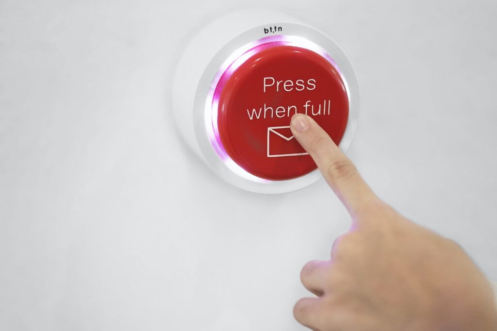
Buttons are one of the key elements used to indicate interactions in the interface. Size, color, shading, contrast, and related copies play a huge role in creating a clear and effective button.
Animations
Animated expressions often mimic actions or movements in the real world (swiping, pushing, pulling, pulling, etc.) and range from simple to very complex. Toggle buttons are simple animated displays that show any change in appearance or color when the user drags the toggle.
Notifications
Notifications can be used to draw the attention of any user or to indicate a change. For example, suppose the user has not finished setting up their profile, a red dot may appear next to the profile icon in the menu bar. Another good example is the number that appears next to the shopping cart icon when you add something to your cart.
Input fields
Input fields indicate where user data can be entered. These are often indicated by the difference between the size and area of the field and its background.
Icons
Icons often rely on a pattern or metaphor capable of navigating through a user interface. Traditional designs use the ability to use the heart or star symbol to indicate the “Favorites” page, while the floppy disk icon is metaphorically served as a “save” button.
Photos
Like icons, photos, or using images are quick visual codes that help consumers understand what they can do with the product.
4. How to design for the best affordance?
Designing any interface, information, or system with good affordance is about minimizing customer errors and friction. Your design should not mislead or surprise your customer due to lack of action or unwanted results.
Follow the meanings
Users expect specific visual cues when it comes to using any digital interface. For example, the “Search” option on the left side of the desktop or the magnifying glass, or the brand logo that can be clicked on the search bar.
Follow the design principles
Design principles are embedded in technologies that help create intuitive and easy-to-use designs. From designers to sociologists to psychologists, many professionals have come up with simple principles that you can follow to reduce confusion in your clients. The laws of UX provide you with a comprehensive set of laws and principles that you must abide by, Or you can create formulas to suit your company and product.
Use effective copy
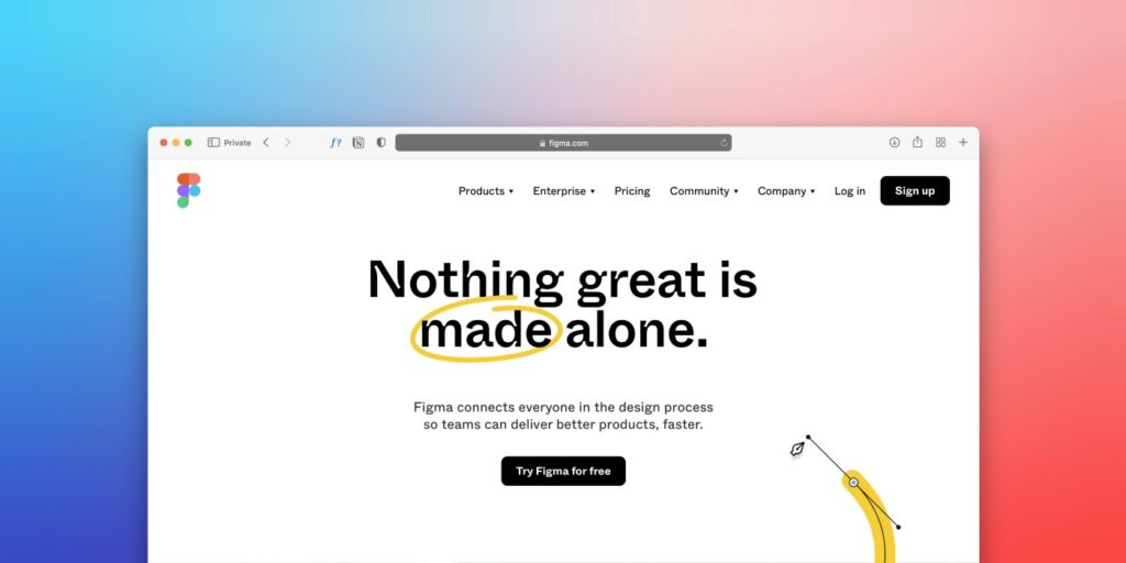
If you cannot create something low affordance using visual design due to color limitations, software limitations, budget, etc. then adding content with useful text will help keep your customers or users on track.
Sometimes making this copy is in the hands of UX writers, but no matter who writes it, there are many practical ways to hone your skills in UX writing.
Google’s Material Design is an Android-based design language that optimizes the user’s on-screen touch experience with intuitive yet innovative features. Material design uses the physical world and its textures, meaningful motion, and deliberate graphics to help you create high-quality, user-friendly interfaces.
Understand your customers
Do meaningful UX research and find out what your customers want to see when they interact with your product in context.
Final thought
Affordance is an effective concept in UX design. Quality customer testing is the best method to discern whether your designs have good potential. When your customers are able to complete their tasks quickly with minimal amounts of clutter and errors with the right interactions as intended, you know you are moving in the right direction.
Using good spending can reduce the time your customers think and explore so they can achieve their goals faster and easier. This is an important factor in any universal and comprehensive design.
Product & services development and design experience. Product management & Design strategist, applications Architect who loves solving complex analytical problems, designing highly usable and equally delightful user experiences.
- Knowing how affordance impact user experience design is necessary for producing high-quality, user-friendly products.
- The article covers:
-
- The definitions of affordances and signifiers
- Types of affordances
- How affordances can be used in UX design
- How to design for the best affordance
- Using affordances well can reduce the time your customers think and explore so they can achieve their goals faster and easier.


