Save
Part one of this article can be found here.
A man could write for days and not say all there is to say about optimizing a UI for multitouch and tablet use. So I’ll limit my observations for now to a few specific cases having to do with the mouse, which has influenced UIs so deeply, and for so long, that it’s hard for people to imagine how to do anything substantial without one. This is, in fact, one of the reasons it is taking so long for a tablet to emerge. And although a tablet OS must be more than a touch-enabled desktop OS, it makes more sense to start with more and pare it down, if one cannot start from scratch.
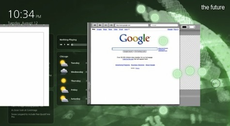
A lot of what I want to say was actually nicely summed up in this video by Clayton Miller, author of 10/GUI, a prototype gesture-based multitouch interface. I had been mulling over many of these design ideas when I saw the video, at which point I spent some time cursing myself for not proposing such a GUI myself. Please watch, if you haven’t seen this already:
Of course, he assumes a bit of an ideal situation. If ten fingers are interacting with the device, what’s holding it? What if I need to switch the left and right windows but I’m standing up, holding this thing in my hand? Not only that, but there is a huge amount of noise when you have multiple inputs on a capacitive device. Fingers are resting here and there—is that garbage data, or is the user holding that window down with his little finger? These are problems that the Microsoft Surface team assures me are not easily solved with thoughtful design, but in fact take hundreds and hundreds of hours of user-based testing and experimentation. 10/GUI has some very interesting proposals, but raises questions as well.
On with my own recommendations:
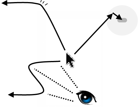
One of the well-known facts about mouse-driven interfaces is that the corners are the easiest places to go to. The mouse moves easily along the edges of the display and gets “trapped” there. It’s the reason we have our menus, start buttons, and so on in those places. They’re even optimized for right-handed people: you usually have more freedom of movement in the leftward direction since that’s the way a right hand and arm grasping a mouse will naturally curl.
Furthermore, in mouse-based UI, it is safe to assume that if something is being interacted with (a window being moved, an icon being dragged), it is happening with a fair amount of precision and care. There is no need to put the trash can in the corner, really, except to keep it out of the way; once I pick up a folder to throw it away, a visual feedback loops lets me guide it easily to wherever the trash can is.
Last, because the mouse stays in the same place if you don’t touch it, you can make the tiny adjustments necessary to, say, grab a one-pixel border to resize a window. If you miss with your initial mouse movement, you can instantly and easily adjust. It’s a bit like the way we our visual system looks at things: you “cast” your eye into the general area of what you’re going to look at, and then you more or less automatically seek out the specific object you were aiming for with a second movement. This tendency has been borne out in countless experiences, and can be relied on as a sort of axiomatic user behavior.
Note of these UI principles—principles which have informed the development and control method in a whole generation of OSes—works in a multi-touch, tablet-oriented OS, or else is not nearly as effective.
First, the corners on tablets are actually the least-accessible places. This is not so with the Surface, actually, because it’s gigantic, but with smartphones and anything under ~12″, the corners are no good. For one thing, edges are generally bad on capacitive touchscreens and there are of course two edges in a corner. If you can’t count on precision input, it’s best to assume it won’t be there and plan around it. Even if you could, your control implement (finger or fingers) don’t automatically skirt the edge of the display. This makes getting to a corner a precision affair—not a great one to be sure, but a far cry from the automatic cornering of a bounded mouse cursor. This hasn’t stopped a lot of people from putting things in the corners of tiny screens; sometimes there’s not enough real estate to do anything else. Sad, but true.
Second, precision in general is not to be relied upon when you are dealing with differently sized fingers, shaky hands, and perhaps most important of all, occluded visual feedback. I can’t see where I’m putting a file if my finger’s on it. I may only be able to reliably drop it within a circle of diameter x, and depending on whether you use your pinky, thumb, or what have you, x may be quite large. Humans can, however, be counted on to move things in some direction—if we must move something left, then left it goes.
Third, there can be no secondary movement with coarse touch input. Sure, you can try again and again, but there’s no way of telling where you’re touching until you touch it. There’s no passive cursor, in other words, that lets you place your pointer precisely and then touch down only when you’re exactly on target. Moving your finger after you’ve put it down can tell you where you need to be, but if you think about it, you just performed a drag, and forcing users to perform an unrelated action in order to execute their intended one is plain bad design.
The consequences to a UI are clear: de-emphasize corners, implement natural gestures everywhere, and make actions intuitive enough that precision is unnecessary. Easier said than done, of course, but still one asks oneself: why hasn’t anyone done this? Well, the ready answer is that consumers aren’t asking for it. But as I believe I’ve shown, consumers aren’t asking for it because no one has done it yet! It’s a common enough story in tech, and has led to the creation of many now-familiar device classes. Game consoles, MP3 players, laptops, and smartphones all got off to a slow start because for years people were making them poorly and thinking that was the extent of the device’s potential. The breakout device is rarely the first in its class. Certainly that is the case with tablets, and whether the Apple Tablet is the breakout device or not, I believe that the potential is huge and almost completely untapped. With luck that will change soon.
[At this point I stopped writing and woke early the next day to cover the Apple Tablet, which I would soon know as the iPad. That part of this story you’re probably familiar with.]
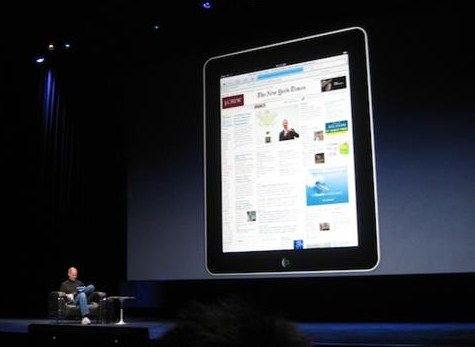
Unfortunately, the iPad was a bit of a letdown. No surprise there; anything less than a winged iPod that lays golden eggs would be a letdown considering the hype this device has engendered. But it was more of a letdown to me, since I secretly hoped they would shock us all with something truly new and not merely grow the iPhone interface in such a practical and predictable way.
However, it is still an effective tablet device, even if it’s not the full-scale, full-power tablet OS we all wanted. Giving a tour of the iPad interface right now would be both useless and sort of ridiculous, since I haven’t even touched one. But there are many cues in the videos and screenshots that suggest that this is a definite step towards a real tablet OS. Not as many as I’d have liked, but enough to warrant description.
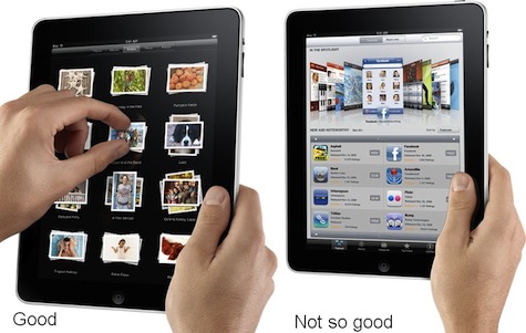
The similarity of the iPad’s interface to the iPhone‘s is no accident, and it’s a good thing in some ways. The buttons are the size of “real” buttons, have a regular shape, and rarely touch each other. And Apple’s avoidance of windows means they get to use the screen real estate very effectively (if inefficiently, for would-be multitaskers). The relaxed feel of the email, contacts, and calendar apps, with their big, distinct touch areas and natural interface show how good an app can be on a touch-based device of this size. Maps, similarly, shows how by removing all the buttons and scrollbars results in a more intuitive app when you use your fingers to manipulate it. Steve Jobs has repeatedly said that Google Maps is better on an iPhone than on your computer, and it’s even better on the iPad.
There are exceptions. Really information-rich things like iTunes or the YouTube app, as well as, I’m sure, some web pages, have borderless interactive areas and tiny buttons shoved into corners.
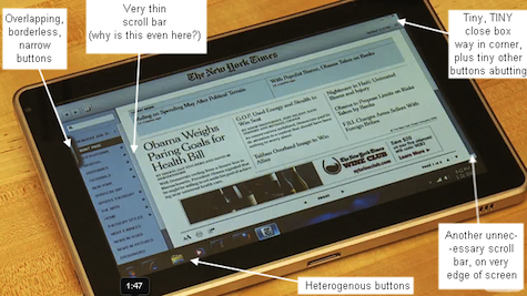
Apple has been careful to limit the device to things they know it can do well, though, so few real gaffes were on display. Compare to the HP tablet shown here. It’s a veritable gallery of elementary (so to speak) mistakes.
Why are there two very thin scroll bars on a touchscreen device? Did no one tell them that the whole reason we desire touchscreens is to escape things like scroll bars? Microsoft has a lot of work to do. If they’re smart, they’ll quadruple the budget of Surface and the Zune and Windows Mobile teams and tell them to make something amazing.
Thus far I’ve discussed the actual UI elements, but what about the way you interact with them? This was the truly disappointing part for me. The ability to use two, three, and four-finger gestures, short and long taps, and other benefits of direct digital interaction are pretty scarce. Sure, there are some specific gestures in, say, Keynote, but come on… I have more multitouch capability on the laptop I’m writing this piece on, so I know that Apple has the imagination for it a piece here on UX Magazine showed many intriguing proposals), but they decided to phone it in here. To be fair, many of these gestures lose their meaning when applied to a monoprocess device like the iPad (I just made the word up, do you like it? It means you’re limited more or less to a single action or application at a time), but that doesn’t mean they can’t find a use for them. How come I can’t hold four fingers on the screen to pull up my favorites? Three fingers up and down always controls volume, maybe? Where are the widgets I can summon by using both thumbs and forefingers to draw a square?
The fact is that what Apple has done is merely make an extremely elegant last-generation tablet. The larger screen, which elevates the device to a new kind of object that is interacted with in a fundamentally different way, is simply used to show more of the same interface they’ve used for years. They haven’t advanced one inch, but rather satisfied themselves with keeping it simple and making a nice little device on which to browse the Web. We can’t really blame them for this; they never said it would do any of the things we convinced ourselves it would. And to be perfectly honest, I want one, and I’m betting anybody who handles one will want one too.
As I finalize the edits on this piece, I read rumors that Apple is preparing a second, more powerful device like the iPad but better and more powerful. That sounds like the desperate fantasy of a despondent fanboy to me. Apple is too savvy to put out such an underwhelming product when they have another coming down the pipe, one closer to what they knew was expected. Not only that, but their stated goal (to put something out that is, in capability and price, between a mobile and laptop device) shows that such a device would violate the parameters they set for themselves.
As Jobs said at the beginning of the presentation, though, there is a third class of portable device between phones and laptops. Alas, the iPad does not exemplify it. It may, however, alert people to the existence, and more importantly, the potential of the position it was meant to fill.
Devin Coldewey
Devin Coldewey is a Seattle-based freelance writer and photographer. He primarily writes for CrunchGear and TechCrunch. Devin's personal website is coldewey.cc.


