I use TuneIn to listen to local radio stations on my Android smartphone when I’m on the go or exercising, scenarios I presume are typical for many other users. All I want is to open the app and choose one of my favorite local radio station—it’s as simple as that, but let me put it into a formal workflow diagram.
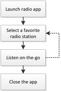
This is, of course, the daily scenario after a user has already chosen his or her favorite stations in a longer but infrequent process, which I’ll comment on later.
Note that in this daily scenario there are two major cognitive steps:
- Users want to listen to the radio and so they launch the radio app
- They select the station they want to listen to from their favorite stations.
In the old TuneIn (I was previously running version 11.3) the app opened on the “Browse” tab, and I had to select the “Favorites” tab and then select a station; one gratuitous step, but nothing too grueling.
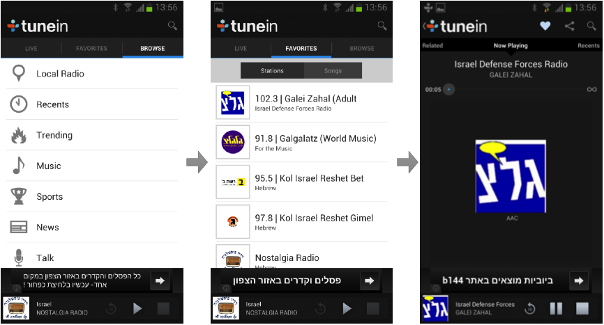
A tap on the favorite station and would start buffering and then playing, while the screen displayed the station’s information.
Opening TuneIn after updating to version 12, however, I was confused. Where the f%@& were my favorites? Let’s see: “browse” and “explore” were not reasonable choices, so I tried “home”—which took me to a constantly updating screen with a mixture of suggested radio stations and songs that are playing now in stations.
This felt nothing like home, where I expect things to feel familiar or at least predictable. Eventually, I found my old favorites under the “My Profile” screen in the “Following” section (see the screenshot). So, according to TuneIn, I’m not a radio listener anymore, but a follower of stations and shows, and guess what—I can be followed as well.
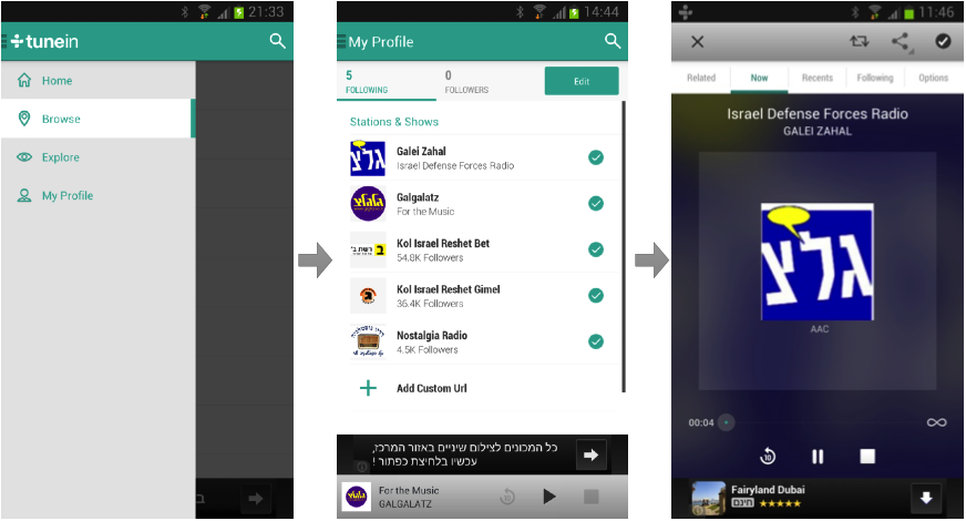
Finally, I could tap one of my favorite stations and get it playing.
The next time I launched the app, it remembered which of the four “main” screens I was on previously, as well as the last station played, so if you usually use, say, the “following” section, it comes right up. Still, you have to choose your station (second tap; launching the app is the first) and tap the play button (third tap), which becomes gratuitous.
TuneIn users are not followers, they are listeners, and their “real life” metaphor is radio
So what’s not working with version 12? Let’s recap:
- My initial encounter with version 12 of TuneIn was really confusing, especially as I was accustomed to the older version—not a smooth migration!
- The location of My Profile as the last out of four items was confusing. Also, the term “my profile” implies settings controls—like username, email address, or profile picture—and not the most frequently used screen (at least in the long run) where my favorite stations are located.
- Using the social networks’ terminology of “following” and “followers” is not a good idea. TuneIn users are not followers, they are listeners, and their “real life” metaphor is radio or television which use (for good reasons) the term “favorites.” Also, most of the radio listeners won’t expect to have any followers. I don’t see why TuneIn should try to be a social network, when it’s obviously not one.
- Tapping a station on the favorites (or “following”) screen means that the user wants to play it. Don’t make me tap again; it’s annoying.
- The “home” screen is actually a kind of exploration arena, as it displays suggested stations and currently playing songs (that leads to the relevant stations) and it gets updated dynamically. In addition to that, there are two more exploration arenas: “Browse”, where stations are ordered according to subjects, locations and languages; and “Explore” with subject, yet again, but the display is more visual and the navigation is bidirectional—scroll and swipe—thus, quite complex. Having three exploration arenas is too much and I suspect it reflects design indecision rather than a robust concept that can leads the user to the right place.
- Navigation—the fact the you treat any of the four screens (“Home,” “Browse,” “Explore,” and “My Profile”) as a main screen, leads to counterintuitive phenomenon for Android users. When the app is on any of these main screens, tapping the native <back> button of the Android systems, closes the app. The user expects that to happen only on the main screen of an app, i.e. on one screen of the app and not on four of them. In other cases the <back> button should take the user to the previous screen, of course.
- If you want the user to use the app functionality to discover new content, don’t use the side drawer design pattern. (Here is why.)
Have you tried to new version of TuneIn? Please share your thoughts and experiences below.