“Design for the probable case; provide for the possible case.” – Alan Cooper
Las Vegas was built by people who understand probability – and paid for by people who don’t.
In UX design, applying a solid sense of probability often determines whether we come out ahead or behind. So, if a solid command of the facts is a UX designer’s best friend, then a solid sense of probability is our second-best friend.
Our innate sense of probability
Probability is basically a matter of making (educated) guesses about the future. The best predictor of what will happen in the future is what has happened lately. So, the better informed we are about what users have done lately – how many purchasers have used gift cards, which options users choose the most and the least, at what points they are dropping off in some process, etc. – the better we can anticipate what they will do tomorrow and how best to accommodate them.
But even without research, we all have an innate sense of probability. That is why most of us – though clearly not all of us – know that this is a bad idea:

The problem is that we tend to forget to apply our innate sense of probability. For example, on one of my projects that included a minor file-sharing feature, the developers tied themselves in knots trying to decide what to do if two users were both to upload different versions of the same shared file at precisely the same instant.
It could happen. But one of the most important questions any UX person can ask about anything is, “How often does that happen?” In other words, what are the chances? In the case of uploading the same file at the same instant, the chances are infinitesimal. I recommended that the developers not waste their time addressing that problem at all.
Developers, security experts, and lawyers are indispensable, but their sense of probability must be taken with a boulder of salt. Why? They are trained to anticipate everything that could conceivably happen. And they are right: All the edge cases they anticipate could happen. But a UX designer’s responsibility often is to apply a more realistic sense of probability and decline to inconvenience everyone all the time for the sake of the one-in-a-hundred.
Improbable defaults
A lot of bad design is a direct result of failing to factor in probability. Bad design fails to honor how likely users are to pick a certain path, action, or option over other possibilities. So it doesn’t default to that one, offer it first, make it the most prominent, and/or give it the most loving care.
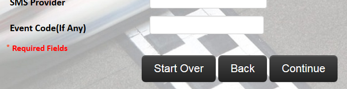
Here are a few examples. The first gives the two least likely options the identical size and color treatment as the most likely option. The design thus deprives the user of any helpful visual hint about what their best/most likely option is. (I’m assuming the “Continue” button is the most likely option here. If it’s not, then something is seriously wrong with this workflow…)
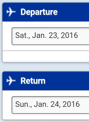
Even worse than the absence of a helpful (i.e. probable) default is the presence of an improbable default. For example, any default selection in a date widget for a credit card’s expiration, a hotel reservation, a flight selection, or a calendar app is all but guaranteed to be wrong, like guessing a stranger’s birthday. Case in point: how often do you book a flight for the same day with the intention of returning the next day? I never have. Yet that’s what United Airlines defaults to. Here’s what was prepopulated when I arrived at their site January 23.
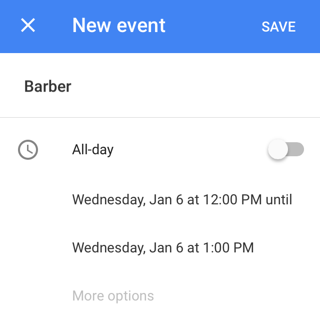
I don’t think Google Calendar’s iOS app has ever yet correctly prepopulated the date or time I intended.
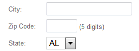
Defaulting to the beginning of the alphabet is a particularly brain-dead practice. For example, unless the vast majority of your users are in Alabama, defaulting a state selector widget to the first listing alphabetically will be wrong far more often than it will be right.
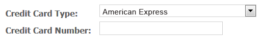
Defaulting a credit card type widget to the first listing alphabetically preselects American Express. Since AmEx has about 10% of the American credit card market and about half that share worldwide, that default will be wrong at least 90% of the time. (Defaulting to Visa may seem more helpful. After all, Visa has way more credit cards in circulation than anyone else. But even Visa has a little less than half of the market. The American market, that is: in the rest of the world, there are actually more MasterCards in circulation.)
Improbable defaults like these actually do harm. At best, users who don’t notice an incorrect default and fail to correct it will probably get an error message. At worst, they may show up at the hotel check-in desk with no reservation.
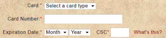
Unless you know for sure what applies to the vast majority of your users (e.g., that they live in the United States), it’s nearly always best to default such widgets to “Please select.”
Putting 2 and 2 together
Statisticians and engineers use complex formulas to calculate probability. But for the rest of us, probability is just a seat-of-the-pants way of saying how much we expect/believe/fear something might occur in the future.
Even without research, we all have an innate sense of probability
UX designers rarely need to actually quantify the likelihood of anything. But once in a while, it is useful to do some very simple arithmetic to put a number behind our seat-of-the-pants sense of probability. In addition verifying our instincts, this can help persuade some stakeholders.
For example, I once redesigned an insurance shopping process that had surprisingly high dropoff at one particular step. That was surprising because one of the few things users could do at that step was to enter their birthdate.
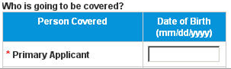
I recommended that we replace the birthdate widget with a simple text entry field in which users would type their age.
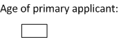
My rationale: Typing a two-digit age (say, 31) is easier and less prone to error than entering and correctly formatting a birthdate like 06/09/1984, especially on a mobile device. Less error, less dropoff, more sales.
My client was horrified at the suggestion. “But without the date of birth,” they said, “we couldn’t quote an accurate premium.” So I did some very simple arithmetic based on three facts.
Fact 1: Your premium depended on your age at the moment coverage began.
Fact 2: It would take about a month between the time you applied and the time the company would finish its processing for coverage to begin. What are the chances your age would change during that month? Assuming a reasonably even birthrate over the course of 12 months in a year, the chances are 1 in 12.
Fact 3: Even if your age did change during that month, your premium wouldn’t necessarily go up. This client’s insurance was priced in five-year tiers. It went up only when you turned 30 or 35 or 40, for example. But if you turned 32 or 38 or 44, for example, your premium would stay the same. So there was only a 1 in 5 chance that a change of age would mean a change of premium.
Here then is the simple arithmetic:
a 1 in 12 chance of an age change before coverage began
multiplied by a 1 in 5 chance that an age change would affect the premium
works out to a 1 in 60 chance that anyone applying today would see a premium change
That’s less than 2% of users. By replacing the birthdate widget with a text-entry box for age, we would satisfy the 98% rather than inconvenience everyone for the sake of the 2%. Hardly any users would get error messages, more would continue beyond this step, and we would sell more insurance. And we could easily get their birthdate later in the process.
Sure, it could happen – but what are the chances?
Here are a few more practical ways that probability has played into some projects I’ve worked on.
SCENARIO: In one shopping flow, the system distressed users by waiting 10 seconds after they clicked/tapped “Add to cart” before displaying a confirmation message. Why? Because sometimes the system actually failed to put an item into the cart at all. The company didn’t want to confirm that it was there in case it wasn’t.
PROBABILITY: “How often does that happen?” “About 1% of the time.”
RECOMMENDATION: I recommended that we satisfy the 99% by displaying the confirmation instantly every time and deal with the disappointed 1% with ad hoc messaging.
* * *
SCENARIO: I worked on a product whose whole raison d’être was that it let you go easily back and forth between two operating systems. That was its sole selling point. But some key team members insisted that we prominently offer the ability to nuke one of those operating systems entirely.
PROBABILITY: “How often would someone want to delete the very thing that made this product worth buying in the first place?” “It could happen.” “Yeah, but how often?” “Well, not very.”
RECOMMENDATION: I buried that capability in a dark corner, with two “Are you sure?” steps, each defaulting to “Cancel.”
* * *
SCENARIO: A client wanted to increase their enrollment of people who could provide certain critical content. Very few people completed the enrollment process. Why? I believed it was because the form asked for their Social Security number. Why did it ask? Because the company would be paying these content creators $25 per contribution, and it had to report payments to the IRS.
PROBABILITY: But you only have to report payments of $600 per year or more. At $25 a pop, that would be 24 contributions in a calendar year. “How often does anyone contribute 24 in a year?” “Well, no one has yet. But they might.”
RECOMMENDATION: So my design removed SSN from the enrollment form. I recommended asking for it by email sent only if and when a particular contributor reached their 20th contribution in a calendar year.
* * *
SCENARIO: A high percentage of prospects in an application process were very hesitant to proceed without a certain key assurance. The screen actually did contain that assurance, just beneath the action button.
PROBABILITY: Users are less likely to pay close attention to material below an action button than to material above it. In usability testing, 3/4 of participants did not notice the assurance.
RECOMMENDATION: I recommended moving the assurance to immediately above the action button.
Abusing probability
Probability can be misapplied. For example, car rental companies, like Vegas casinos, shamelessly exploit their customers’ naïveté about probability. One way is to pressure renters to take the company’s prepaid refueling option. This is one company’s counter sign:
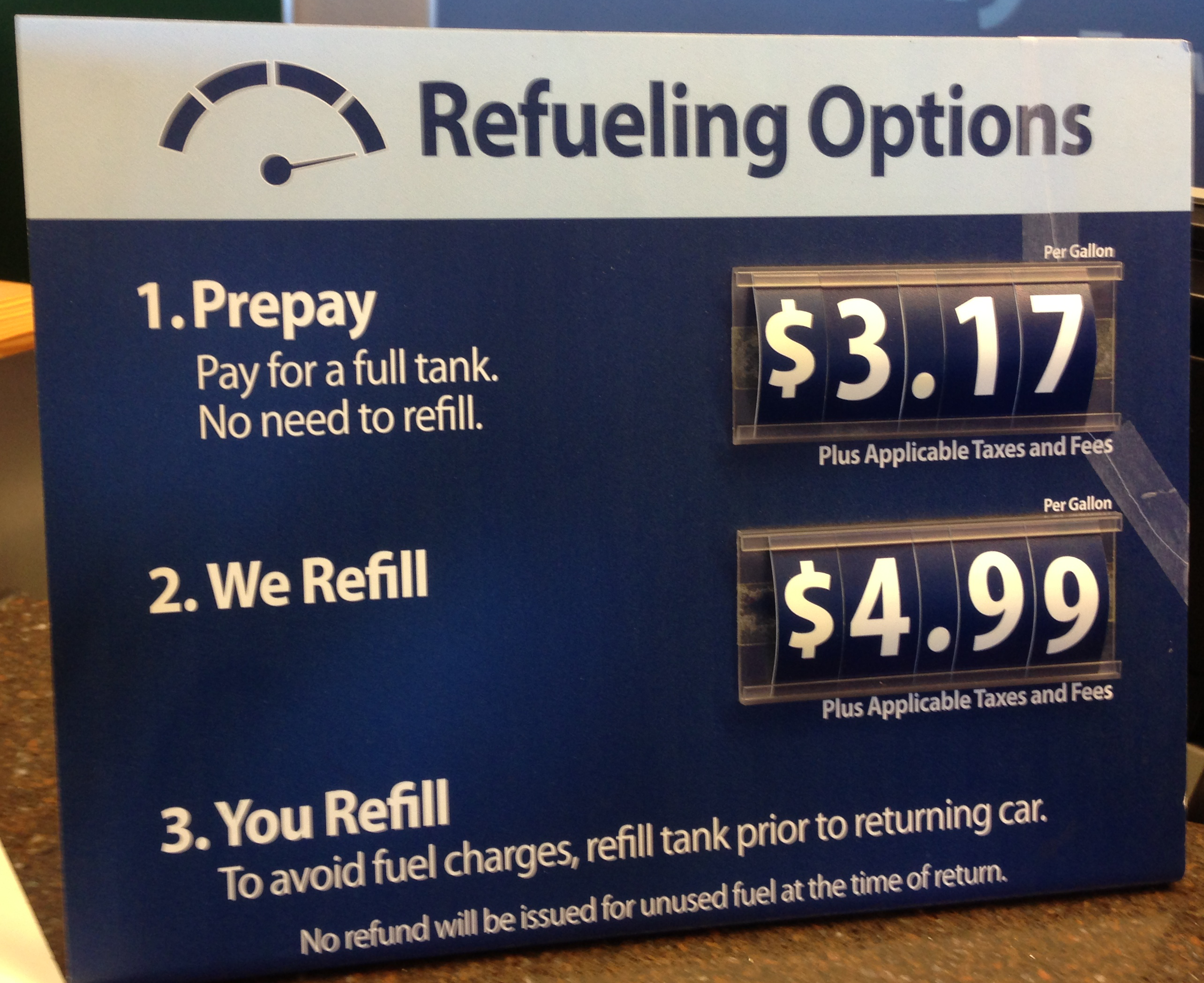
It looks like a no-brainer. Who wouldn’t prefer to pay $3.17 per gallon rather than $4.99 per gallon?
But as one former car rental agent put it, “Prepaid gas is purely for suckers. Unless you are desperate to save a few seconds, you are wasting money.”
Why? When you looked at the photo of the sign above, did you notice that little line under option 1: “Pay for a full tank”? How about the smaller line at the bottom: “No refund will be issued for unused fuel at the time of return”? No? Well, that’s the kicker. You’re paying for the entire tank of gas, even though the car rental company knows you probably won’t return the car anywhere close to empty.
Sure, prepay’s nominal price per gallon is lower than your other options per gallon. But you’re not paying per gallon. You’re paying per tank. The rental company cynically counts on the probability that you, standing at the counter impatient to get going, will not notice or appreciate the significance of that small print or do the math that they have done.
Ka-ching. You lose. Bad customer experience.
10 articles of faith to inform your sense of probability
In addition to (or in the absence of) known facts about your specific users, here are 10 articles of faith to inform your sense of probability. When you have nothing else to go on, expect that users will probably:
- expend as little time and effort as they think they can get away with to scratch their immediate itch
- do only what is in their own interest right now
- pay only half-attention
- prefer the familiar unless the new is obviously better for them
- default to inaction unless their own desire overcomes inertia and prompts them to act
- guard their anonymity until it is in their own interest to give it up
- misinterpret things that were perfectly clear inside your echo chamber
- bail out over even the slightest irritants
- avoid taking steps that they know or suspect will get them marketed to
- resist making premature commitments, even small ones
Designing on the basis of these articles of faith is one of the closest things we have to a sure bet.
Image of stuntman under passing car courtesy of Pavel L Photo and Video / Shutterstock.com.