Evolutionary psychology tells us that humans are programmed to prefer bright colors, sweet flavors, and roundness of shapes. We are attuned to these things for survival: awareness of danger or safety, sources of energy, and choosing a healthy mate. We also find them pleasant. In his work on emotion in design, Don Norman says, “pleasant things work better.” Beyond the base expectation that a design should be usable, people enjoy using things that are pleasing to look at, touch, and listen to. Norman focuses on objects like juicers and cars, but the principle applies to all kinds of design.
Going Beyond Making Designs Usable
There’s a vast difference between making a design that doesn’t suck and creating one that people will love to use. UX as a discipline is pretty good at making things not painful to use, although there are plenty of sub-optimal designs out there that people tolerate every day just to get the things done. But the UX community isn’t good at systematically creating consistently pleasurable designs. Creating pleasurable designs is different from eliminating frustration. This is where designing an experience—not just a product—begins.
In my UX research practice, I learn about what people experience in real life and try to draw parallels to interactions with technology. Is there a way for designers to elicit raw positive feeling in the person who is using a design? Perhaps there are design patterns that UXers can look to as they develop the next great software products and web apps.
Nurturing Interaction
The skills needed to make a pleasing design are different from the skills needed to create a usable design. The designer who has skills for creating designs that people are happy to use will go very far in her career.
Design is about stimulus and response. The designer makes a design to get the person using it or viewing it to do something: feel, see, smell, act. On teams working on UIs, we’re usually thinking about how to get people to take the action: write, edit, save, create, delete, review, buy, install, sign up, sign in, stay, come back. The focus is on making sure people can use a design to take the action we want them to. We conduct tests to measure how close we’ve come to making the design usable in performing those actions.
In debriefs from usability tests, it’s not uncommon to hear from teams, “If we change it this way, will it break?” As Jason Fried, principal of 37Signals, said in a recent tweet, “The design works when the problem goes away.” But some teams are asking instead, “If we incorporate this psychological/linguistic/behavioral cue, will the person using it take the action and smile?”
Kissing Users
Think of the first time you kissed a sweetheart. Remember the warmth, the pressure of skin on skin, the breath commingling. The heightened sensitivity of… everything. Afterward, maybe you were giddy. Certainly, you smiled.
As part of my research, I asked people how they felt when they first knew they were in love with the person they’re in love with now. One woman said, “I just smiled all the time.” People used words like “light,” “floaty,” and “bouncy.” Physically, they were energized. Mentally, they felt supercharged—more creative and hopeful than before. As they experienced more of the right kind of behavioral feedback—a word, a touch, a feeling—from their new lover, the more confident in the relationship they felt. Don Norman puts these feelings in the visceral category. Martin Seligman, researcher and professor of psychology at University of Pennsylvania and author of Authentic Happiness, calls these the bodily pleasures. They’re sweet moments, unfiltered.
The higher pleasures, as Seligman refers to them, are more cognitive. It might be unreasonable to hope to create rapture or bliss through the use of an enterprise web app, but we could build in harmony, relaxation, contentment, completion, control, and freedom.
Some teams are building a “kiss” or two into experiences, with some successes. But sometimes the smooch is more like the kind you get from your elderly aunt: sloppy, embarrassing, and unwanted.
Beware of Inappropriate Flirting
Account for the context, frequency, and importance of the activity that the design supports. Displays of affection are not always appropriate. Too much kissing or kissing at the wrong time could be annoying or embarrassing. The wrong kind of kiss at the right time can send the wrong message. In the wise words of the Flight of the Conchords, a couple of funny singers from New Zealand, “A kiss is not a contract, but it’s very nice.”
A recent example I encountered was a retirement planning tool called Me, Inc. The design team wanted to create a way to make what could be a stressful, intimidating exercise into something fun (yes, fun) and productive. They wanted users of the tool to feel they had control of their futures because they would know from using Me, inc. what specific steps they could take to reach their goals. People would leave the tool with a plan of action.
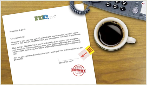
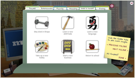
The opening sections of the tool were indeed delightful to look at and pleasant to use. First, there’s an encouraging pep talk from a faceless voice as we overlook our new desk at Me, inc. The next step as CEO of Me, Inc. is to set goals.
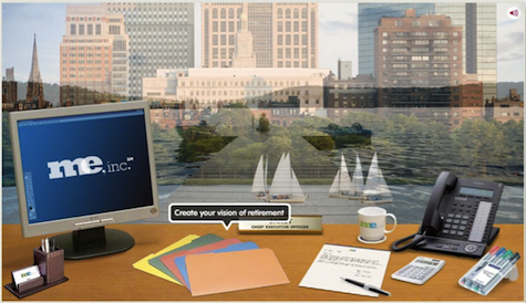
The goals are organized in bright folders with cheery icons that have peppy, affirmational hover descriptions. Participants in a usability study enjoyed the activity of choosing and prioritizing goals. They said that it helped them think about their future in a constructive, organized way, which they hadn’t done before.
Participants also often said Me, inc. was “cute,” and they meant it as a compliment. The visual treatment made the retirement planning task more approachable, and the exercise of setting goals made people mindful of their aspirations for themselves and their loved ones.
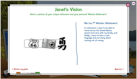
Unfortunately, the experience fell apart when participants went from goals to budgeting and financial forecasting. The flirting was over. Worse, after participants had used a fairly detailed calculator to determine how much more they needed to save to retire in the style to which they aspired, several wanted to go back to adjust their goal set. They wanted to remove goals or reprioritize, or both. The sweet kiss of the cute graphics and the cinematic dissolves got in the way of creating a realistic plan of action for reaching and enjoying retirement. The feeling participants were left with was something like realizing that the person flirting with you wants a one-night stand when you want a relationship.
Incorporating Pleasure
There were some good things about the Me, Inc. design that the team should definitely keep. There was a place for pleasure in that tool; we could see that some of the cuteness helped people relax and experiment. But the design was incomplete. There was still a lot of room for comfort (“I know what I’m doing,“ ”I’m on the right track financially”), and joy (“Wow, I’m closer to my goal than I thought,“ ”It is possible!”), as well as sweet moments unfiltered through positive, encouraging, or reinforcing messaging that includes comparisons or examples.
How are other teams doing it? To show that it’s possible for nearly any design to be pleasurable to users, I looked for a few sources of inspiration. What if everyday designs made people feel energized or hopeful? Were there examples that purposely make people smile like they’ve just been kissed?
Pleasing simplicity: Umbrella Today and Accuweather
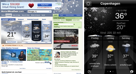
Which coat should I wear today? Is it going to rain? There are many weather services online. One of the most popular is Accuweather. Accuweather’s website is dense, cluttered, and loaded with advertising—it’s a media outlet. But users can find what they’re looking for since the current weather info is prominent. The animation on the precipitation is nice; it’s a quick dazzle that is actually helpful in processing the information in the forecast. The design of the graphics is actually quite pretty. However, it’s one of those novelties that users often become quickly habituated to.
There’s still some processing the user has to do, though. What does it mean that it’s 21 degrees out and that there’s a chance of flurries? The iPhone app from Accuweather is simpler, but also shows the forecast for the next few days. But what do I do as I’m going out the door, right now?
A minimalist alternative answers one question: Do I need to take an umbrella with me today? On umbrellatoday.com, just enter a zip code and…
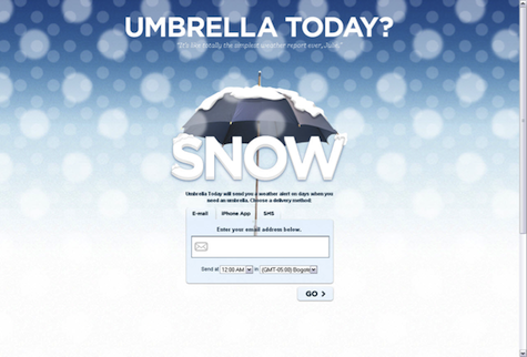
On an iPhone, if location-based services are activated, the mobile app finds the location automatically. The answer to the question is apparent and unequivocal, with simple, clean graphics and type, and quick response time. It does one thing and does it well.
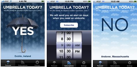
Users can follow Accuweather on Twitter or Facebook, but if you have a mobile phone and aren’t using those services, there’s no way to get weather alerts. Users of Umbrella Today can sign up for alerts sent via email or SMS when they should take an umbrella with them (but not when they don’t need one). It’s as if your loved one is saying as you’re on the way out the door, “Take a brolly with you, dear!”
Pleasing conversation: Zipcar or Hertz
Hertz delivers one of the best experiences of any of the car rental companies in the U.S. However, using hertz.com to make a reservation is a poor contributor to that overall good experience. The human touch that a customer feels when they get to their car is missing on the website. If I were to conduct usability tests on the site with a success criterion of completing a reservation efficiently and effectively, I bet there would be a satisfactory result. But there’s no joy here. The conversation that hertz.com is having is fairly mundane. You might say that’s appropriate for a car rental company—until you look at Zipcar.
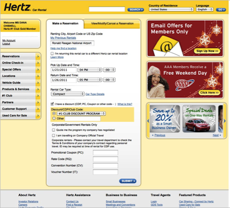
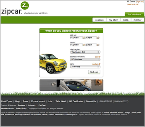
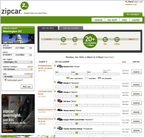
On both hertz.com and zipcar.com, the user fills out the database fields, the system runs a query, and then it displays search results. But Zipcar, a service for renting cars by the hour, lightens the cognitive load by opening up space on the query page, but also by using more personal language. Where Hertz has a tab called “Make a reservation,” Zipcar asks, “When do you want to reserve your Zipcar?” Hertz offers “customer support,” where Zipcar offers “help.” Even the use of capitalization in the information architecture is a design decision that affects the voice of each site. Zipcar is cheerful. Hertz is all business.

Nothing says more about the conversation than the emails sent by each company. From the greetings to the recaps of what is included in the reservations, to where the link is for changing a reservation, the feeling is completely different. The only pleasant thing about the Hertz confirmation is simply that you received it. It’s factual and straightforward, but takes some work to skim and see what is there. It is also quite long. The Zipcar confirmation email seems to come from an actual person, and is signed by the “team at Zipcar.” They’re delighted that I’m using their service, and it shows. The Zipcar email is short and friendly. Even the rules are non-threatening, taking the position of helping the driver be considerate of the next person to use the car. (The rule about Fido and Fluffy gets a bonus smile.)
Pleasing service: Virgin America versus US Airways
Service is a key component of an overall experience, and how that service happens is as much a design decision as it is a business decision. There are two areas in the marketplace about which I, as an experience researcher, hear the most complaints about service: technical support and airlines.
Airlines have a lot of problems, not least that they don’t control every part of the experience of traveling. For example, passengers must go through extensive security checks before boarding. This can be stressful. Weather is a huge factor in the timeliness of flights, which is another point of stress as delays cause missed connections.
So there’s the passenger, in a tiny, crowded seat. After the repeated announcements about how to use the overhead storage bins, everyone is buckled in and the plane takes off. Finally, it’s time for beverage service. The timing coincides with this passenger needing to use the restroom. But now there’s a cart and two flight attendants in the narrow aisle. As pleasant and polite as those flight attendants might be, they now control your ability to move through the plane. Some passengers describe feeling claustrophobic during this restricted period.
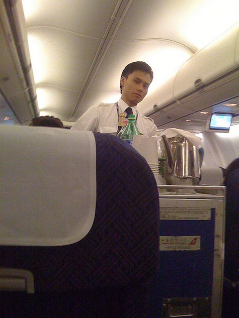
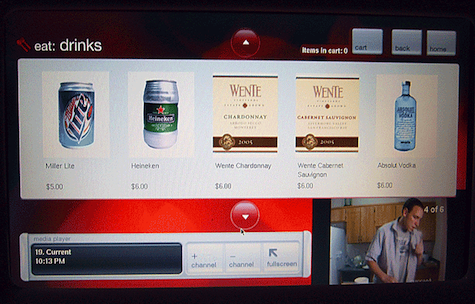
I’ve named US Airways in the heading, but nearly every airline conducts in-flight service this way. Virgin America doesn’t. There are many pleasing elements of flying a Virgin America (VA) flight that make the experience lovely: comfortable seats, lavender lighting, flight attendants helping with baggage rather than just making announcements about it. In addition, VA addressed the drink cart problem by implementing a seat-back touchscreen system.
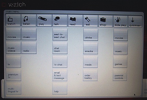
This system is mainly about entertainment. But the really beautiful thing is that passengers can order food and drinks whenever they want to and pay for it by swiping a credit or debit card in the touchscreen.
And then the order appears, usually on a tray, delivered by a smiling flight attendant. Even though the passenger placed the order through a piece of technology, a human gets to do the best part, which is providing this sustenance or treat. Traffic in the aisle is free and open. Flight attendants don’t have to push around heavy carts. It almost feels like magic.
Plan a Beautiful Experience
As one of the assignments for his psych classes, Professor Seligman asks his students to plan a beautiful day for themselves. They should set aside a day to indulge in their favorite pleasures. Imagine a world in which every design were subjected to a similar assignment and designers were expected to deliver the best possible outcomes for users of their designs. What would that world look like?
The designers of Me, Inc. imagined a wonderful outcome. It was the execution that was the problem. But they learned through testing was really was pleasurable about the design and what didn’t work. Umbrella Today, Zipcar, and Virgin America are delivering delight in subtle, integrated ways. With a design principle of make it pleasant, make it pleasing, every product has the potential to bring a smile or even make users feel as if they’re being kissed.