“Observe due measure, for right timing is in all things the most important factor.”-Hesiod
Most of us don’t spend much time thinking about time, but there are instances when we should. Consider Eos, goddess of the dawn in Greek myth, who fell in love with a man named Tithonus. She implored Zeus, ruler of the gods, to grant her human lover immortality. Her wish was granted, but over the years, a flaw in her request became tragically apparent: Eos had neglected to ask for eternal youth along with eternal life. This omission meant Tithonus would wither away with age forever. This ancient cast of characters offer lessons that are still relevant today: based on their respective vantage points, individuals can have blind spots about something as seemingly familiar as time. As a goddess, Eos overlooked a critical factor that she didn’t face herself: aging. As a mortal, Tithonus, was not in a position to either fully appreciate or influence a decision about his own life’s trajectory. Zeus granted precisely what was requested, but not the true intent of the question. Then, as now, the ability to perceive time from different perspectives and outside familiar frames of reference can be valuable and sometimes crucial. Visualizations can help extend our ability to recognize important features about time that we might have otherwise overlooked. They provide a kind of lens on temporal data that can reveal patterns, prompt questions, and tell stories. In much the same way as cameras and telescopes can reveal aspects of time and space that we can’t perceive directly, visualizations can be adjusted to reveal interesting patterns and anomalies.
Licensed under Creative Commons Attribution-Share Alike 3.0 via Wikimedia Commons
In areas ranging from medicine and cyber security to finance and sports, the ability to explore the temporal dimension offers many opportunities for new insights. However, there’s no single best solution for all purposes and contexts and each kind of visualization has its own set of strengths and weaknesses. The intent here is to present a few concepts, considerations, techniques, and examples to spark your own thoughts about the subject. The first part of this article presents a small sampler of temporal visualizations. The second part focuses on a specific type of temporal data challenge and an application being developed to address the issue. Note: This article was written in conjunction with a webcast done for O’Reilly about visualizing temporal data. For more details, please visit O’Reily’s site.Part 1: Show Time – Approaches to Visualizing Temporal Data
Countless charts and visualizations represent time in essentially the same manner: a horizontal line—the “x” axis, divided by temporal units that progress from left to right. The vertical “y” axis has quantitative measures. The “x” axis provides an anchoring point for the “independent variable” while “y” is the mast for unfurling “dependent variables.” Time has a strong independent streak. For example, outside air temperature can depend considerably on the time of day it’s measured but the time of day doesn’t depend on the weather conditions. The “x” axis is clearly not the end of the line for incorporating the time dimension in graphical representations of data. Temporal information can form rich tapestries of patterns that need to be visualized in various ways to be fully understood and appreciated. Temporal information forms rich patterns that need to be visualized in various ways to be understood There are many possibilities for representing time and techniques to make interesting temporal patterns perceptible. As always, creating the best design involves considerations of goals, audiences, context, the nature of the data, and the capabilities and constraints of the systems being used. Often, it isn’t possible or desirable to show all the data that has been captured in a given span of time. The key is to use transformations and representations of data and that reveal important but otherwise hidden patterns. As Megan Monroe, an IBM researcher who worked on temporal visualization displays at the University of Maryland notes, “The pieces of the data that get abstracted or removed should depend on the types of questions that you’re going to be asking. Different tools are designed to support different types of questions.”The Power of the Line Graph
In the late 1700s, William Playfair set the stage for how many of us automatically think about representing the temporal dimension: the line graph.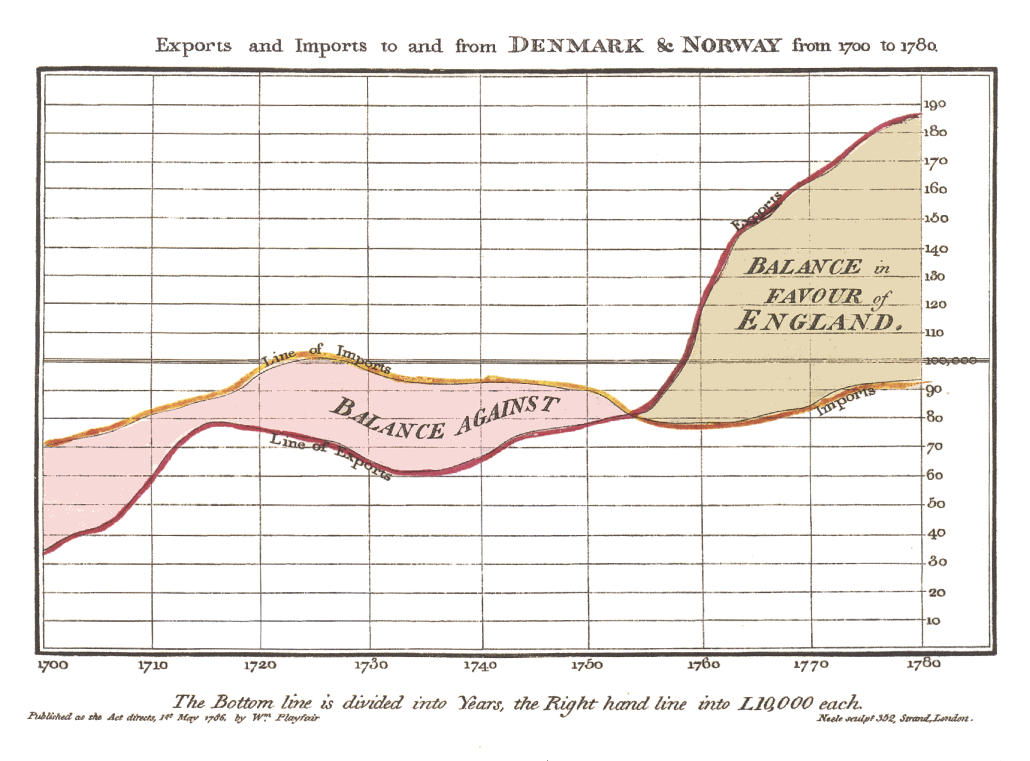 Line graphs are ubiquitous because they are a simple, precise, and powerful way to represent temporal data. Although displaying time as a progression from left to right along a horizontal line has become ingrained in many people’s thinking, there are notable exceptions.
Going with the Flow
In his iconic flow map of Napoleon’s catastrophic 1812 invasion of Russia, Charles Joseph Minard blends and bends temporal and spatial representations. The path and number of outward-bound soldiers is represented by an initially thick tan ribbon while the dwindling numbers of retreating survivors are represented by a narrowing black band. In this visualization, the time it took to march into Russia is not clear. The only time stamps shown are for the return trip and progressing from right to left. In a sense, time is “bent” to advance the impact of the visual narrative.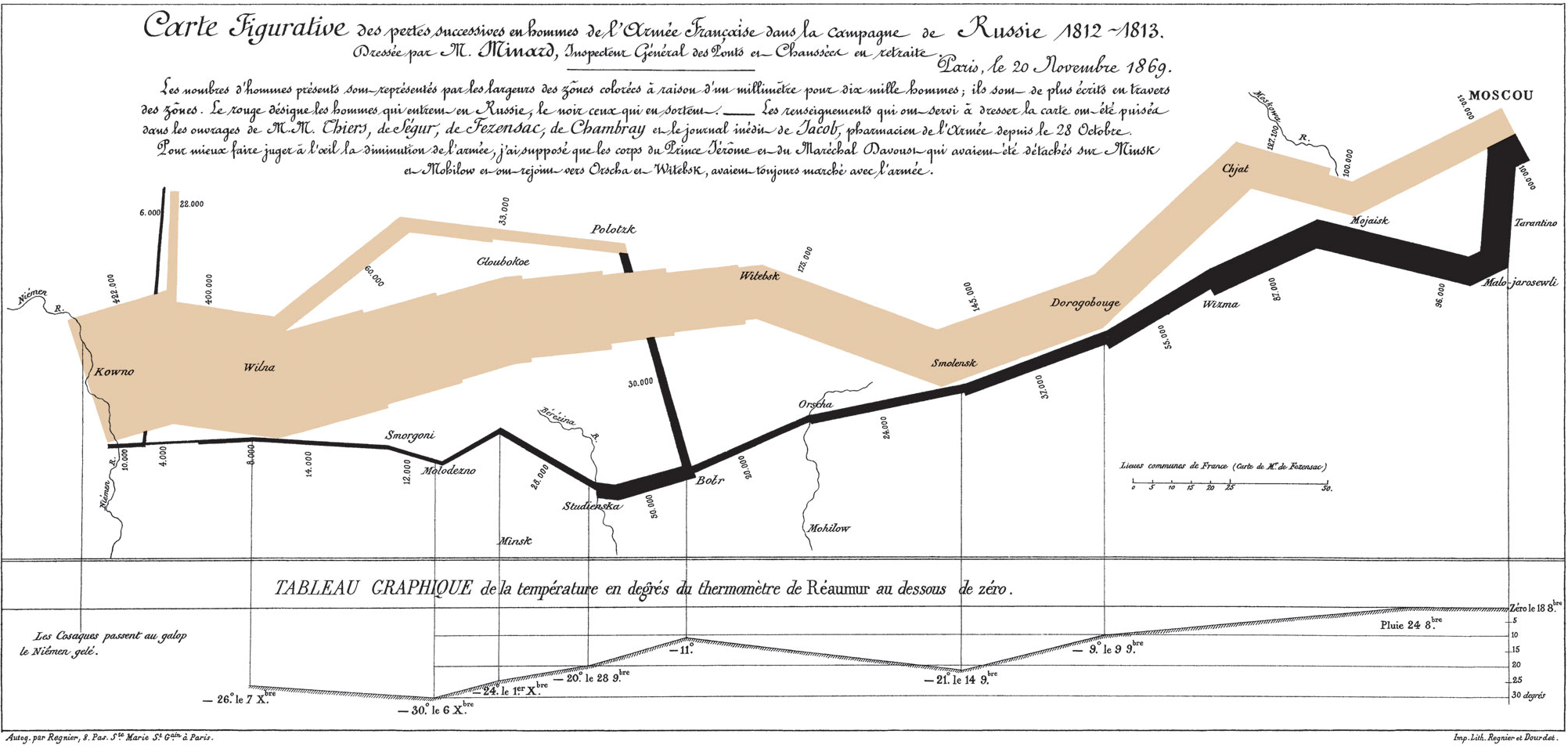
Nightingale’s Rose
Although people often tend to describe time in linear terms, such as “the arrow of time”, many aspects of temporal data can be cyclical in nature. Highlighting this cyclicity can mean taking a different approach to representation. For example, Minard showed mortalities in the French army due, in large part, to factors other than combat. In a somewhat similalarger thematic vein, Florence Nightingale showed seasonal fluctuations in mortality of the British military, using a “polar area” or a “rose” diagram. Although there are some drawbacks to this type of diagram, (i.e., using the area to show data in this manner can have a distorting effect on how we interpret the quantities), this example is a reminder that there are other design choices for temporal data beyond the straight line.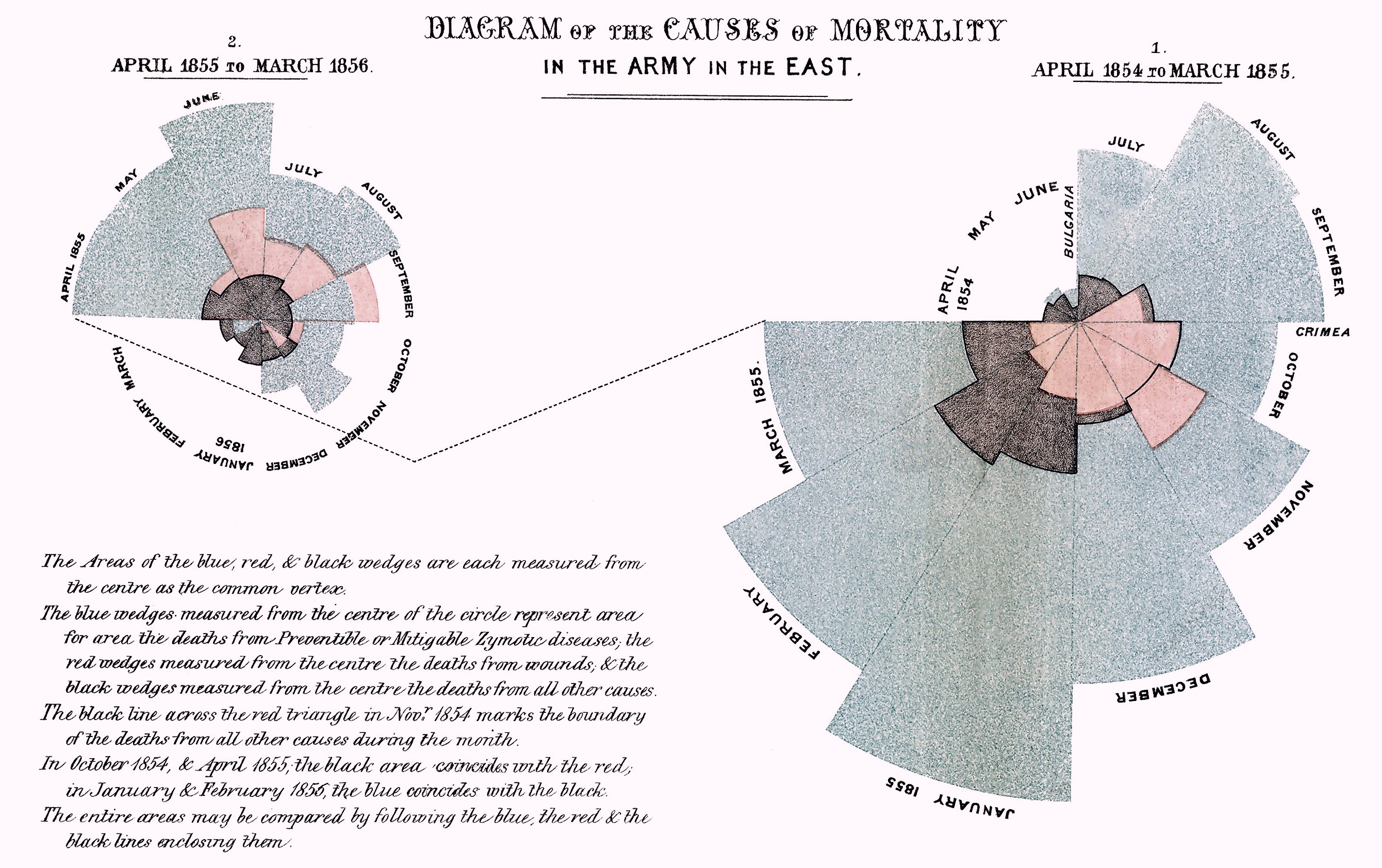
Interactive Heat Map
In the heat map below, Trulia (an online residential real estate resource) took a three-month snapshot of all the window-shopping on Trulia.com and their mobile app to see when most prospective buyers are looking at homes for sale. They then plotted their findings in an interactive graphic where purple indicates lower levels of activity and red shows peak hours of home searches.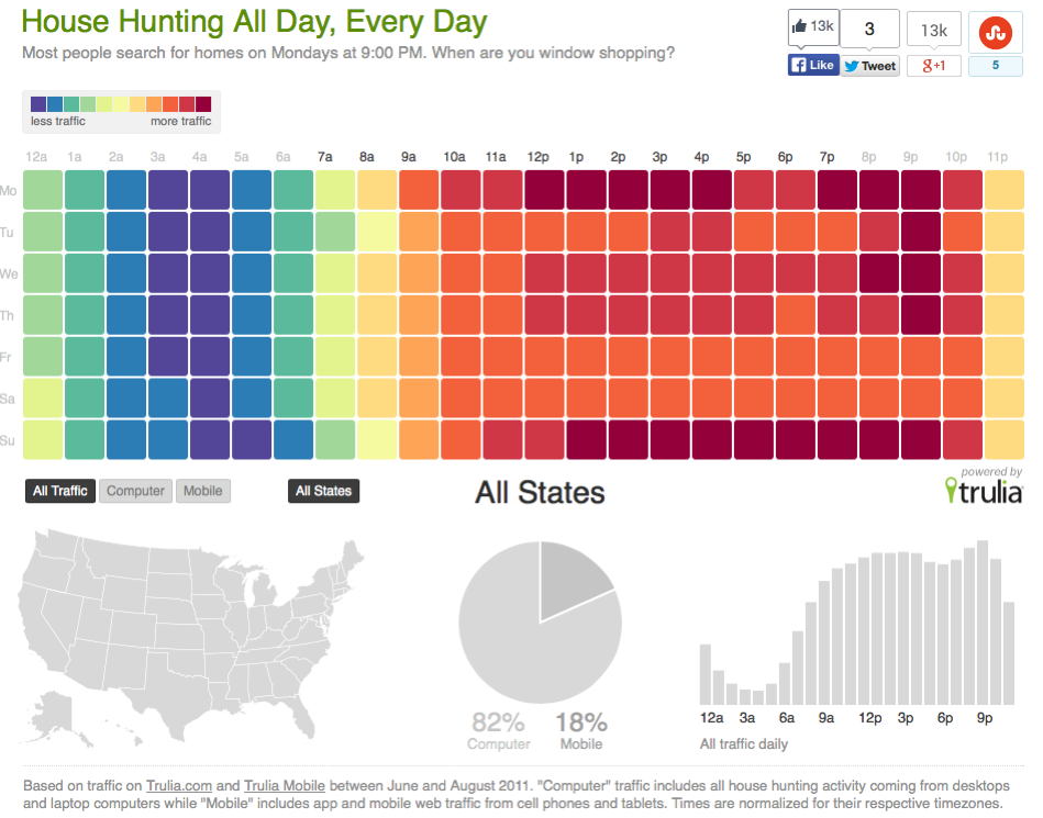
Animated Bubble Graph
Many important events unfold at much faster or slower rates than we can possibly perceive. Animations can compress or expand these events. The Gapminder Foundation and Hans Rosling, it’s exuberant Chairman, are able to tell a compelling story about changes in global life expectancy and per-person income by skillfully using animations in their data visualization software. By pressing the “Play” button, users can see patterns emerge that take decades to unfold in the world.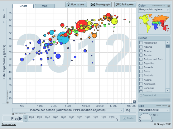
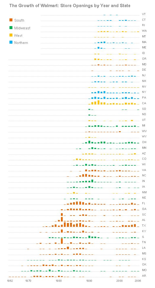
Small Multiples and a Big Store Chain
If animated visualizations are highly compressed movies showing change over time, small multiples are sequences of freeze-frame images in which we can discern overall patterns and also focus on individual elements. The visualizations below show the growth patterns in the expansion of the Walmart store chain in the US over time.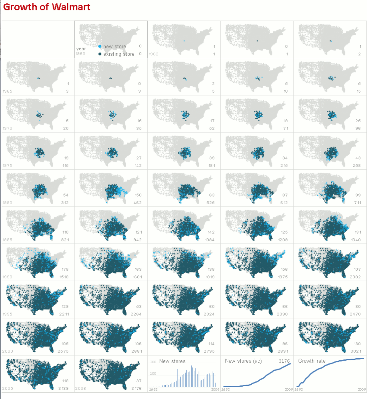
Near Real-Time
At any given time, we are only able to a take in a limited amount of information about the world around us. Generally, that view is narrowly focused on our immediate surroundings. Some visualizations can distill and reveal otherwise hidden patterns of activity occurring in near real-time. The uses of these displays can range from a defined practical purposes to a more experiential and thought-provoking quality. Here’s an example of the latter showing the ever-changing wind patterns moving across the US in near real-time—the lighter the lines, the higher the wind speed.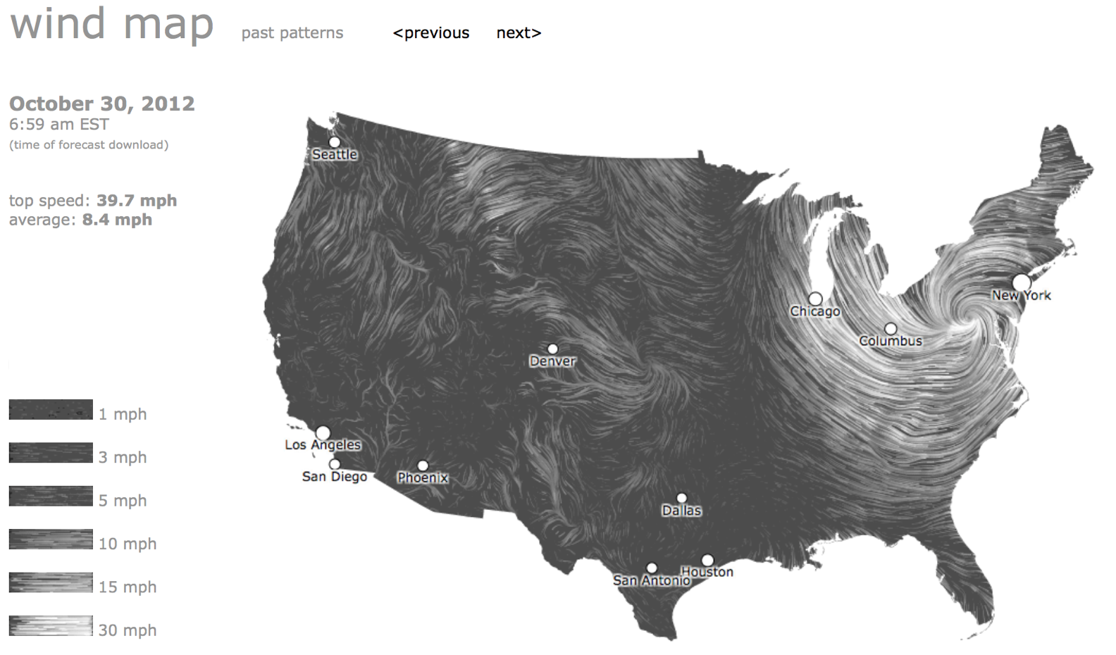
Interactive Streamgraph
The streamgraph is a kind of stacked area graph that shows changes over time. It can be an appealing way to display temporal features, but it can also be difficult to investigate details if it is presented in a static way. However, making the streamgraph interactive can overcome some of the difficulties of using this form of temporal visualization.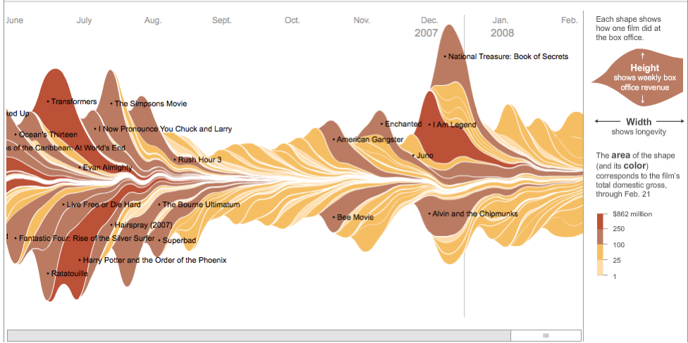 The next section will focus on a specific kind of temporal data visualization challenge and one approach to addressing it. This is an excerpt of the larger temporal visualization presentation.
Part 2: Chrono-Logic – Visualizing Relationships of Events Over Time
There’s a logical order and typical timing for many of our daily activities. For example, we undress before taking a shower—not during or after. The intervening period between disrobing and bathing generally spans minutes, not hours. Beyond the familiar routines, there are many other kinds of chronologies that can have an impact on our lives, but can be hard to discern. Increasingly, we are able to collect and analyze many patterns of actions and events in data that would be otherwise imperceptible. Ben Shneiderman and Catherine Plaisant with their colleagues at the Human-Computer Interaction Lab (HCIL) at the University of Maryland have been grappling with the challenges of visualizing various kinds of temporal patterns contained within large aggregations of data. The HCIL team’s approach to this kind of analysis was to build an application called EventFlow and then apply it to analyzing data, including collections of electronic health records. In order to understand the way their application works, there are two key terms to know: 1. Point Events have a single timestamp. Examples: a. Online shopping transactions b. Hospital admittance
 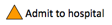 2. Interval Events take place over periods of time; durations with starting and ending points. Examples: a. The time an online shopper spends on a site
  b. The duration of the third quarter in a football game
  Investigating patterns and relationships in both point events and interval events over time can quickly become a complex task.
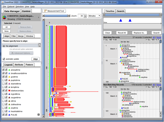
 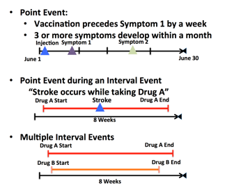 This task becomes even more demanding if the goal is to compare and investigate similar sequences of events in many hundreds or thousands of records, as is partially shown in the screen shot below. Even in this case, with only five of the 215 records showing, it is difficult to make any kind of meaningful comparisons in the timing and sequence of events. However, making these kinds of comparisons can be useful in gaining insights about processes and procedures in a hospital.
Use Case: Analyzing the Golden Hour
 There are times life or death can hinge on the timing and sequence of a specific set of steps (point events) that occur over a certain period of time (an interval). Giving critical medical care to a seriously injured patient is one such instance. During the first 60 minutes post injury, known as the “golden hour”, there’s a medical evaluation process known as the “ABCDE”s (Airway, Breathing, Circulation, Disability, and Exposure) that should be followed in a certain order. For a variety of reasons, it can be useful to track and analyze how often “ABCDEs” are followed—and where there might be deviations—for example, in the trauma bay of a children’s hospital. The challenge is how to organize and visualize these patterns from the aggregation of thousands of patient records. The central pane of the EventFlow interface shown below displays a visualization of aggregated “ABCDE” data from anonymized electronic health records. This article has covered some of the foundation concepts for building this visualization, but continued discussion can be found here and here: