As previously said best by Steve Jobs, “The broader one’s understanding of the human experience, the better designs we will have.” And the better the design, the more your company will thrive.
But how can we clarify some basics of User Experience for the masses? The easiest and obvious point of reference is pop culture; something to which we all can relate. My first inclination was to make this article “Five User Experience Lessons from Star Wars” since, at my core, I am a geek. But that’s like wearing a “KICK ME” sign at recess, so I thought better of it. Instead, I looked to a source of some surprisingly fantastic examples: movie characters played by Tom Cruise. I know, I’m playing up to my female readers, but hey, they represent 51% of the population … so I’m simply demonstrating that understanding your customer persona is part of designing a good user experience!
Lesson #1: Social Media Ratings of User Experiences Can Be Powerful

“I get my boxer shorts at K-Mart in Cincinnati.”
In the 1988 movie, Rain Main, Cruise plays an impatient, selfish young professional named Charlie Babbitt who finds out via his father’s demise and subsequent will that he has an older, autistic-savant brother, Raymond (played by Dustin Hoffman). Charlie quasi-leads his brother through several adventures while trying to operate fortune in his own favor, but is frequently road-blocked by Raymond’s ritualistic schedule and predefined structure. Amongst these obstacles is Raymond’s need for new underwear which he insists must be purchased at K-Mart. After several verbal explosions, Charlie announces into cinematic history, “I’m gonna let ‘ya in on a little secret, Ray. K-Mart sucks.” Later in the movie after the two characters have bonded, Raymond’s primary care physician, Dr. Bronner, tries to lure Raymond away from the manipulative Charlie by asking him if he’d be “… more relaxed in [his] favorite K-Mart clothes” to which Raymond parrots the “K-Mart sucks” sentiment.
In the theatre, this seemed like a powerful emotional moment where the two brothers have connected, but in reality some have argued that it was a powerful economic moment. K-Mart has closed hundreds of stores since that time, and was eventually bought by a Blue-Light Clearance shopper named Sears Holding Corporation. This cannot be correlated to one movie quote alone and is more likely caused by competitors like WalMart creating innovative and lower-cost distribution methods, but that notorious line has not been forgotten by the American buying public. Dozens of blog entries across the Internet mention it as subscripts to news stories depicting the failing K-Mart stock or closing stores. There was even a seemingly-real news story published by The Larely Beagle, a Californian newspaper, in 2009 (eleven years after Rain Man’s release!) where K-Mart supposedly sued Raymond Babbit for slander citing “… their stock and sales headed into a downward spiral” after his disparaging comments.
Before dismissing this as Tom Cruise alone flexing his muscles (sorry, I put that in to make sure my female readers were still listening), realize that according to a 2011 Nielsen study, social networks and blogs account for about 22.5% of time spent online. Couple that with a 2012 online advertising study by ClearSaleing where social media was presented in the Purchase Path and showed a 20-84% increase in revenue over other search patterns and it seems that enabling word-of-mouth critiques of your user experience may amplify a trend, good or bad. Trying to ensure that the Charlie Babbits of the world like your user experience before they have the chance to opine publically makes good business sense.
Lesson #2: Arrange Your User Interface around the Urgent Tasks
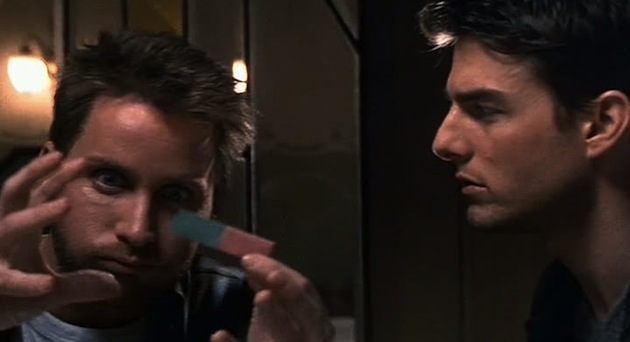
“Stick of gum, right? Red light, green light. Come up against a lock you can’t pick, you mash them together… *boom*. Hasta lasagna, don’t get any on ya. You’ll have about 5 seconds…”
Ethan Hunt, played by—you guessed it—Tom Cruise, is hanging on to the caboose of a high-speed train by his fingernails toward the end of the original Mission: Impossible, while baring down on him in a helicopter is his once-mentor-turned-villain. You, the enthralled-yet-experienced moviegoer, are filled simultaneously with the anticipatory adrenaline of danger and the wisdom that, as in to most action flicks, Hunt will find some unfathomable way to escape. Nevertheless, he’s apparently stuck between a hard place and a slice-you-into-roast-beef place, so this is as urgent a situation as they come.
And then it happens: he recalls his handily-accessible, explosive gum which has a simple user interface that requires him to pinch together two, large halves (one red, one green). Before you know it, the villain is a splatter painting and Hunt is propelled back to a safe and heroic ending.
Ethan and his engineer (played by Emilio Estevez) quoted above put to use Fitts’s Law—a basic principle of Human Factors Engineering—which predicts the time needed to move quickly and accurately to a specific target. The algorithm boils down to a simple standard: make the user interface for an urgent task nearby and make it larger. For instance, if I were designing an emergency button for a driver that he could easily function, I should make it a big ol’ button in the middle of the steering wheel rather than a small button at the far end of his mirror.
Ethan stored that destructive gum at close range (i.e. he didn’t stick the gum to the bottom of his shoe), and the large target of a 3-inch stick was easily accessed, even under duress. Therein, Ethan lived to see other day and several sequels.
Lesson #3: Design Your System with a Multimodal Interface
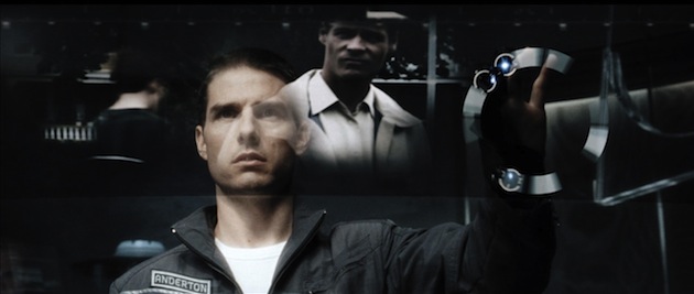
“It’s like my Daddy used to say… in the Land of the Blind, the one-eyed man is king.”
Chief John Anderton (played by Tom Cruise in the 2002 flick, Minority Report) runs the elite law-enforcement squad in the Washington D.C. of 2054 called “Precrime.” Here, he sorts through the mental images of “Pre-Cogs”—three psychics who see murders before they happen. Anderton’s job is to understand the situation, the players (the perpetrator and the victim), the location, and the predicted time when this supposed crime will occur with the expressed goal of stopping the perpetrator before the murder occurs. The difficult part: these visions are truncated, ghostly, blurry, piecemeal, and coming from three sources, so arranging and sorting them in the short time allotted requires fantastic manipulation. In this high-action thriller, Anderton makes it happen by using a computerized interface that combines gesture swipes with a transparent display and a networked audio-visual conferencing system.
These days, systems with various methods of inputs and outputs are termed “multimodal” since they have more than one mode of interaction. Yes, traditionally there have been winning products that are unimodal (The Clapper), but there are several reasons why multimodal systems have become advantageous for user experiences:
- User Satisfaction: Providing more than one method of interaction allows the user to select the most comfortable, efficient, or timely technique as the situation dictates. For example, in a Virginia Tech Transportation Institute study (Perez et al, 2011), five different navigation systems were compared with the highest user satisfaction going to the one that offered multiple modalities (touch screen plus audible Advisor). The worst (and most distracting!) was the unimodal printed directions.
- Improved Usability: Sometimes the task is quicker with one modality as the primary and a second modality as a natural compliment. For instance, a study within Health Imaging (Dec, 2007) showed medical transcription errors reduced from a 2% average for traditional transcription to 0.6% using speech recognition technology as the primary modality. Supporting that, when discoursing about that same impact via speech recognition at SpeechTek 2006, Nick van Terheyden (then the Chief Medical Officer of Philips Speech Recognition Systems) said “Speech recognition can reduce [transcription] costs by 30% to 40%.”
- Heighted Accessibility: The Americans with Disabilities Act of 1990 declares that “physical or mental disabilities in no way diminish a person’s right to fully participate in all aspects of society.” Herein, product developers were charged with attempting to make everyday products “accessible,” which meant any consumer could engage in the user experience regardless of physical limitations. Given information from the last Census and the CDC, an accessible user interface within the United States must account for the some 25 million deaf or hard of hearing users and the 3.4 million legally blind or visually-impaired users. Not to mention, they’ll additionally want to accommodate the estimated 56 million users who speak a language other than English at home.
So what Anderton’s fancy Precrime interface showed us was he could efficiently access Pre-Cog’s images with a primary modality (gesture), but he could still use the system if, let’s say, his once-mentor-turned-villain had Anderton’s eyeballs removed from their sockets. (Maybe Tom’s characters should stop trusting their mentors!)
Lesson #4: You Must Design For Human Error Upfront For Usability
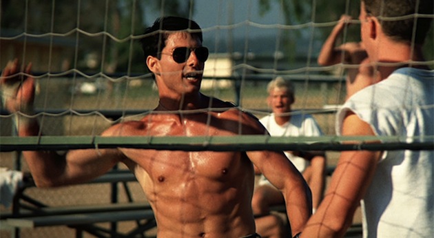
“That was some of the best flying I’ve seen to date—right up to the part where you got killed.”
Lieutenant Pete Mitchell is the character’s real name, but almost everyone knows him by his call sign: “Maverick.” In the 1986 drama, (which will be re-released later this year in 3D), Cruise’s call sign is, in fact, aptly named since his cavalier attitude has him pushing the envelope of “genius flying” and dangerous close-calls until his hubris stumbles during a training exercise. While piloting too close to another jet, the jet wash (a.k.a. turbulence that forms behind an aircraft) causes a flame out on his plane, therein causing the accidental deaths of his Radar Intercept Officer (“Goose”) and his own confidence.
Regardless of the real-life dangers of in-flight jet wash—there are some who will cry that no evidence suggests such dangers exist at cruising altitudes—the movie demonstrates a simple point: human error is possible even among the best of us. (In fact, in Minority Report, Colin Farrell’s character lectures Anderton by saying, “But there’s a flaw. It’s human. It always is.”). Where Top Gun may fail on accuracy in many spots (like who brings in a PhD, non-pilot, civilian hottie to command a bunch of testosterone-fueled egomaniacs?), it is accurate on this count: a 2004 study (ISASI, Shappell et al.) found upwards of 80% of aviation accidents were attributed to, at least in part, human error.
Even if your user experience has no safety-related aspects, it is worth considering the possibility of significant operational opportunity costs when human error isn’t accounted for in the user experience (e.g. incremental sales, lost recapture of customer). So the question becomes, what can you to mitigate all of this? If you adequately test your system—model it, put it on reference hardware, drive test it with users—you can learn where human error creeps in even if you are unable to predict it. In Maverick’s case, a flight simulator could have predicted his “crazy” maneuvers, which should have dictated design precautions such as auto-pilot override when getting within jet wash range or emergency overrides like engine re-spark and auto-tail-spin correction during failures. Designing those features would’ve cost less in the long run and avoided the great balls of fire.
Lesson #5: Style Captures the Attention
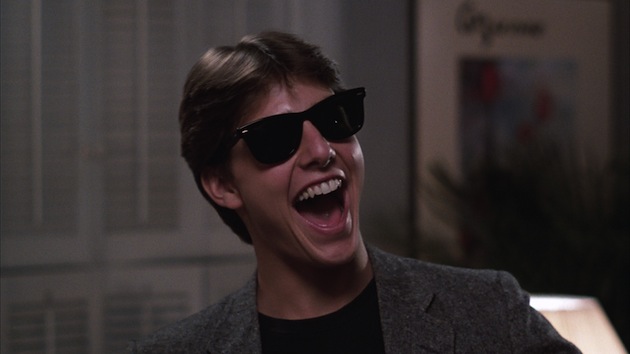
“It was great the way her mind worked. No guilt, no doubts, no fear. None of my specialties. Just the shameless pursuit of immediate gratification. What a capitalist.”
Few of you probably knew of Tom Cruise when he was Billy in Endless Love, and you may have gone back and seen Taps and thought, “Hey, wait, that cadet captain with the red hat. That’s Tom Cruise, isn’t it?!” But looking back on his early films, there is no question in your mind’s eye that Joel Goodsen of Risky Business was played by Tom Cruise. Why is that? Why did that product capture the buying public’s attention so clearly? The answer: style. Tom sported a pair of sunglasses still known as “Risky Business Shades” (Google it if you don’t believe me), and made a very memorable and stylish entry despite wearing only a collared shirt and tighty-whities (that probably were not purchased at K-Mart).
Usability absolutely helps a product, but providing a unique style that captures the eyes of consumers also has its benefits. As noted by Bill Buxton, writing on Apple’s rise in Sketching User Experiences, “The design that led to success was largely in the realm of styling, bordering on the superficial … I don’t mean this in a pejorative sense. The style of these machines gave them character that clearly resonated with people, and help reshape their perception of what a computer might be for.”
In many interviews, Bob Lutz (the former head of product design for General Motors as well as several other automotive companies) has stated that a key lesson GM needed to relearn in order to recover market share was that “Styling is the great differentiator.” And in a Bloomsburg BusinessWeek article entitled “How to Sell More Than a Product”, Carmine Gallo cites Starbucks as providing a “… true strategy for entrepreneurs: Don’t sell products. Sell an ‘experience’”—one which includes creating a style that matches your brand.
If you follow this as well as all of the paths set forth for you by Tom Cruise for user experience, you’ll have a product your customer will love, and you won’t have to scream, “Show me the money!”
Tom Cruise red carpet image courtesy Jaguar PS/Shutterstock