The late, great co-founder of NFL Films, Steve Sabol, said “Tell me a fact and I’ll remember it. Tell me a truth, and I’ll believe you. Tell me a story, and it will live in my heart forever.” And for some user experience professionals, stories are needed in the hearts of management and coworkers to which they can relate and understand the craft.
Hence, we turn to pop culture.
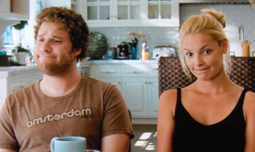
I know what you’re thinking: “OK, I was onboard when you said there were lessons from people like Tom Hanks and Laura Dern—I imagine wisdom emanating from them. But Seth Rogen? Yeah, great comedian, but not oozing with sage-like insight.” That said, even the Peter Principle management folks thrust into UX oversight positions can relate to Seth Rogen.
“You know … sometimes I find less is more,” Rogen prophetically uttered in the movie Paul. We can use these words as the backdrop to the following user experience lessons Mr. Rogen has imparted.
Lesson #1: Failed Novice Task Completion Can Be Disastrous

“I can see by that stupid expression you’ve had on your face for past five minutes that you’re trying to piece this together, but it’s no good.”
In Green Hornet, Rogen plays a trust-fund 30-something named Britt Reid, based very loosely on the wealthy young publisher-turned-vigilante first featured in the eponymous radio programs from the 1930s. In the 2011 big-screen comedy, Reid stumbles into being a superhero thanks to the diverse capabilities of his father’s former houseman, Kato, who has Jedi-like reflexes and incredible engineering prowess. In the midst of reviewing some outlandish gadgets created by Kato, Britt picks up the “Hornet [Gas] Gun” and, thinking the interface is intuitive, accidentally shoots himself in the face, thereby putting him into a self-induced, 11-day coma.
Certainly Britt Reid’s experience was the slapstick extreme of what can happen when novice task completion goes sour, but I have seen other disastrous outcomes for novices that affected their interest in continued usage. For example, at one point a woman spoke into an automotive microphone and requested to “add new contact.” The voice recognition system heard “delete all contacts.” As you can well imagine, her reaction was extreme fear and stress, thereby creating a wall of technophobia such that further usability testing was essentially worthless.
And she is not alone. Initial customer confusion or frustration can easily lead to abandonment of the product or website. According to Arthur Anderson (2001) and Forrester Research (1999), more than 83% of users will leave a website if they aren’t figuring it out quickly, which equates to an opportunity cost of half the potential sales. Losing 50% of revenue certainly isn’t an 11-day coma, but it’s nearly as disastrous, so making sure that initial engagement is intuitive is crucial.
Lesson #2: Only Go Below the Fold If You Must

“If you can’t see, hear or feel something it doesn’t exist.”
Pulling yet another lesson from Horton Hears a Who! (see Five User Experience Lessons from Jim Carey), let’s focus this time on Morton, Horton’s Technicolor rodent friend voiced by Rogen. Morton, just like most of the creatures in the jungle, doesn’t see or particularly believe Horton regarding a supposed miniscule town that exists on a dust particle on a flower. Horton is being threatened with expulsion from the jungle by a peer-pressuring kangaroo if he doesn’t relent in his insistence that the town exists, but ignores the near and present urgency.
Morton, however, is a type-A personality with an understanding of the near-term danger and, in desperation, pleads with Horton to stop banking upon the unseen.
Dr. Seuss’s successful allegory is “faith” and the audience is led to the conclusion that sticking to faith 100% of the time can be both difficult and rewarding. However, it’s a (pardon the pun) leap of faith to assume that people will be willing to endure a burden and persist to the end. Most of the time, this isn’t true of real-world user experiences; the user is impatient like Morton.
Putting critical information in plain sight doesn’t require your users to have faith in the unseen.
How does that translate to your business? The same is true for that which isn’t immediately seen. Jakob Nielsen showed that users spend 80% of their time above the fold for webistes. A 2011 study of 8 million click-throughs on Google showed only 6% of users proceeding to the 2nd page and a 143% drop in click-through rate from the bottom of the first page to the top of the second page. These findings also match embedded testing I’ve done where vertical menus go off the screen: the majority of users do not find the hidden choices.
Yes, the KISSmetrics 2012 article “Why the Fold is a Myth” eloquently argues that Calls to Action (CTAs) are more correlated to how motivated your users have generally been by your inspiring content rather than to whether the CTA is below the fold, but the same article accurately cites Ogilvy’s research dating back a half of a century stating that only 20% of readers make it beyond the headline. Play it safe. Putting critical information in plain sight doesn’t require your users to have faith in the unseen.
Lesson #3: Use What You Have At Hand … As Long As It’s Solid

“I hope this turns out better than your plan to cook rice in your stomach by eating it raw and then drinking boiling water.”
In Kung Fu Panda 2 Rogen reprised his role as the voice of Mantis, the smallest of the Furious Five warriors. At one point near the beginning of the story, the Dragon Warrior (Po the Panda) is fighting alongside the Furious Five to defend a village of musicians against theiving invaders. Po wasn’t expecting the fight and is essentially weaponless. Mantis adlibs by throwing Po a set of cymbals to use as weapons. Pardon another pun, but this improvision proves so instrumental that Po keeps grabbing for musical implements during the melee until, in Jackie Chan-esque slapstick style, he accidentally grabs a rabbit.
The user experience analogy is this: use what’s at hand as long as it’s solid. Sometimes engineers don’t want to use data gathered internally to evaluate a design, since the cohort’s demographics and/or desired outcome may be skewed. These scientists are often purists, and given unlimited budget and time it is tough to argue with always testing the usability of your designs externally. But sometimes the urgency of the moment doesn’t allow for the ideal solution, and you must choose between no data or some internal testing.
Why chose the latter? If you don’t, you will have A) fewer eyes looking for obvious mistakes the designers were too close to see, and B) no data with which to fight off the opinions of the loud minority (e.g. management, marketing, sales) who believe intuitive to them equals intuitive to all. Not to mention, when you eventually take your usability testing to external participants for validation (which you should eventually do), your archives of internal data can be compared to external results to examine how skewed your internal sampling is. This comparison will help with acquiring budget and time in the future for recruiting participants.
The caveat—as stated above—is “… as long as it’s solid.” When doing cheap-and-quick, informal testing, make sure not to recruit people already assigned to the project. They have a vested interest in the results and already know the functions of the system. Also, attempt to get a sampling across work groups using both sides of the brain. For instance, don’t solicit participants only from IT and finance who mostly use their left brains. Gather from IT architects, administrative assistants, HR specialists, and security officers. Last but not least: never ask a loved one for an opinion. Depending upon your relationship, [s]he will either soften the response to not hurt your feelings or be extra snarky since you didn’t take out the trash yesterday.
Lesson #4: Overly-Agile Development Can Lead To Accidents
“Life doesn’t care about your vision. You just gotta roll with it.”
In the 2007 comedy Knocked Up, Alison Scott goes to a nightclub to celebrate a promotion and meets a reckless, immature pothead, Ben Stone (Rogen). After drinking and dancing together all night, they end up completely wasted and fumbling through a one night stand sans birth control. In the classic sex scene, Ben struggles with the condom (Plan A) and, when not keeping up with the urgency of the moment, communication errors and a desire to proceed lead to bad judgment (Plan B). Eight weeks later, BOOM—Allison discovers that she is pregnant and the plot thickens.
As crude as the analogy may seem, the agile development process can easily proceed in the same manner: urgency overrules proceeding in a logical, serial manner. For those who are not familiar with agile, there are many online resources but it is essentially like a greyhound race: the user experience engineer is the electronic rabbit providing the vision of where to run, and each software engineer is the sleek dog taking individual steps that eventually lead toward the shortest, prioritized path to success. But here’s where this particular analogy fails: if the user experience engineer doesn’t keep up with the urgency, the greyhounds keep running and determine a path of their own.
The agile evangelist’s argument for proceeding with the race is that each individual step is, by definition, easy to back-out or iterate, but that rarely happens without significant data, which is difficult to provide when the clock is already ticking. So, instead, management or the agile coach becomes the equivalent of Alison’s character screaming, “Just go for it,” and an accident is born.
How does one prevent this from happening and still enjoy the fruits of agile development? I have found two keys to success: 1) providing smaller models, and 2) invoking the backlog.
Giving the design studio and UX team a slight head-start permits them to imagine, sketch, iterate, etc., but the key to staying ahead of the software programmers is to produce smaller modeling prototypes. These are not only essential elements for usability testing, but they may serve as the majority of the specification for the production software generators.
The efficiency of not having to write, check, rewrite, re-check, etc. allows the right-brained folks to stay ahead in the race. But there will inevitably come a time where usability testing of those models shall unearth a design failure which impacts the just-in-time engineering. Invoking the backlog of software bugs or minor improvements allows the software team to be productive while the user experience professionals rework the design.
No matter what, though, don’t just allow the software engineers to “go for it,” which will likely give birth to unintended consequences.
Lesson #5: What You Pay For Great UX Is Miniscule
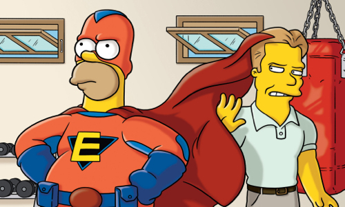
LISA: “There were a lot of holes in your story.”
STUDIO EXEC: “That’s the problem when you have 17 writers. But don’t worry, we have two fresh ones working on it.”
[cuts to Maggie and monkey banging at typewriters]
In one episode of The Simpsons, a Hollywood studio wants to make the movie Everyman, where Homer plays the overweight, middle-aged protagonist who can absorb superpowers of comic book characters he touches. But the studio executives realize audiences want a physically fit superhero to project onto themselves as the ideal “everyman” rather than the everyman they truly are. So the execs hire a fitness trainer, Lyle McCarthy (voiced by Rogen), to whip Homer into shape.
Many corporations see the upfront costs of user experience in the same fashion: only employ resources and budget after customers express their displeasure. They believe hiring the electrical, software, and mechanical engineers upfront can lead to a sufficient product (“Gen 1.0”) since much of human factors is common sense.
This couldn’t be further from the truth. As eloquently said by Sanders and McCormick, “Human Factors is not just common sense. [Otherwise], given the number of human factors deficiencies in the things we use, [we would have to] conclude that common sense is not very common.” And studies support this pronouncement with revenue going up anywhere from 80% (Bias & Mayhew, 1994) to 400% (Battey, 1999) after employing usability engineering. Considering a bad design can cost a corporation 40% of repeat customers (Kalin, 1999), the future opportunity losses combined with unrealized revenue can quickly approach billions of dollars. Whereas, hiring the UX-equivalent of Lyle McCarthy upfront is several orders of magnitude lower.
Spend the UX money at the beginning. The cost of a great user experience is much smaller than the cost of not providing it.
Conclusion
All-in-all, Seth Rogen has provided a colorful collection of user experience lessons. Expounding these lessons during the daily struggles within corporate walls can help lead to a market-driven, user-centric product. As Rogen uttered in Paul, “You have to spin a good yarn before you can weave a great dream.”
Image of Seth Rogen courtesy Helga Esteb/Shutterstock