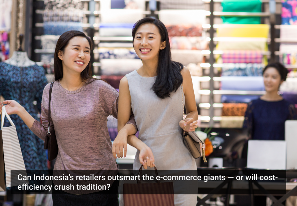
Imagine shopping in a store where the displays never change. Customers select items by browsing through monolithic aisles of products. Store displays are minimal and uninteresting. Items in the displays are hard to find or even unavailable. This doesn’t seem like a great shopping experience, does it? Yet this is what online shoppers experience (and accept as standard) on many large e-commerce sites.
Imagine shopping in a store where the displays never change. Customers select items by browsing through monolithic aisles of products. Store displays are minimal and uninteresting. Items in the displays are hard to find or even unavailable. This doesn’t seem like a great shopping experience, does it? Yet this is what online shoppers experience (and accept as standard) on many large e-commerce sites.
At Allurent, our multi-disciplinary team of designers, information architects, user interface and visual designers are passionate about transforming online shopping from a utilitarian activity into an engaging, dynamic experience. We are convinced that online shopping can be infinitely more exciting and rewarding than the banal, page-and-scroll environment many of us settle for today. Improving the shopping experience can lead to the kind of metrics retailers dream about: increased consumer loyalty, better brand differentiation, higher conversion rates, greater customer satisfaction, and higher profits.
Online shopping should be a fluid, visually exciting and immersive experience. By designing great shopping experiences free from the constraints of HTML, we can fully exploit the rich audio, video, animation and user interface capabilities of modern personal computing.
Agility to respond
Traditionally, retailers need to plan to build new features, redesign, and merchandise their sites far in advance. The time-to-market cycle can be surprisingly slow. Today’s merchandising tools are surprisingly primitive. At Allurent, we’ve been working on a set of solutions that enable companies to update and improve their sites quickly and easily.
For Borders, we recently built a feature called The Magic Shelf, which was an interesting challenge. Borders came to us with an interactive bookshelf that had already been built in Flash by an outside agency. Essentially, Borders populates the shelf with books and CDs, and customers can scroll horizontally and vertically across it. But Borders wasn’t able to easily maintain the shelf or easily update the merchandise—and it was not commerce-enabled.
We rebuilt and redesigned the shelf and connected it to the Borders product catalog. Using our Visual Merchandiser, Borders is now able to change the bookshelves and merchandise on-the-fly with WYSWIG drag-and-drop simplicity. After Sydney Pollack passed away, Borders was able to populate a retrospective shelf of his work by the next morning. The time to go live was cut to only a few hours.
Catering gracefully to lifestyles
It’s essential for retailers to come up with innovative approaches and multiple access points that cater to shifting lifestyles. Similar to having multiple brick-and-mortar locations, the online store needn’t have just one location. Soon, there might not just be one Borders site. Rather, there may be a mobile site, an iPhone site, and a downloadable AIR application connected to all of the above. You will likely be able shop through your home entertainment system, via satellite applications, and on blogs through microsites.
Certain vertical markets are experimenting with new shopping experiences more deeply than others. The fashion industry, for example, with its increasing seasonal demands, is apt to innovate more aggressively than most. Fashion by nature lends itself to exciting imagery that can be put together in new ways relevant to different forms of media.
The “Swiss Army knife” approach
Retailers increasingly want to integrate diverse interactivity into their sites—ratings and reviews, links to Facebook and del.icio.us, tagging, videos, blogs and more. Yet retailers also want to their sites to be simpler and easier for customers to use.
The challenge on the part of designers is to take all of these features and make it feel like all feel like a rich, cohesive experience rather than a “Frankenstein” site. I like to use the analogy of a Swiss Army knife, where the customer has all the tools they need at their fingertips and can unfold them as needed. When they’re not being used, everything folds neatly back into place and out of the main focus area.
Make shopping serendipitous
Serendipity: the occurrence and development of events by chance in a happy and beneficial way.
Online shopping needs more serendipity to feel like an immersive and rich shopping experience. Customers need to brush up against items they weren’t necessarily looking for. The practice is common in catalogues (think Crate & Barrel room views) and in brick-and-mortar stores (think wall displays and mannequins). Shoppers get to see a wide range of products, rather than tunnel down to one product category.
The online approach, however, has typically been organized into strict categories. If someone is looking for a top, they drill through the navigation to find pink tops. Navigationally, it’s difficult to add or remove filters dynamically to browse in fluid ways. In the process, shoppers bypass everything else — except for the occasional cross-sell. Most of the site goes unnoticed.
We recently built an interesting serendipitous solution for Anthropologie. Using Adobe AIR, customers can download a portion of the Anthropologie catalog to their desktop. The catalog was based loosely on a theme. The initial version has a beach theme. Sandals, swimsuits, sunglasses and other “beachy” products were scattered along a horizontal strip. The layout had a handmade quality and felt unique and special rather than generic and automated.
Our Display tool allowed merchandisers to easily drop products from the catalog onto the strip, rather than having to open Flash and manually create links or embed imagery in the application. Customers were able scroll through the strip, add notes to items of interest and purchase. Each product felt specially chosen and the experience felt more like shopping at a boutique rather than shopping at the local home center for clothing.
The most unique feature was “shop by color,” where customers selected favorite hues from a color palette, and saw products that matched displayed in a color wheel. The randomness in the product selection and the immediate dynamic quality made it fun to use as well as different from other shopping experiences. Instead of shopping for a specific product, customers were browsing in a way that was similar to walking into an Anthropologie store.
Retail role models
So what are some of the shopping experiences I like? In recent years, Nike has been doing an outstanding job extending its brand. Its mini sites are all amazing and unique, yet clearly remain under the same branded umbrella. They’re innovative, usable, push the boundaries and are still very shoppable.
Etsy.com is a marketplace where people can sell handmade goods. Etsy offers a number of different ways to view merchandise on the site: chronologically, by color, by story, or by category. Etsy lets consumers discover the products in a way that works for them.
Anthropologie and Urban Outfitters know their demographic inside and out. They continuously innovate by adding Flash-based themed microsites, blogs and even extending their brands to YouTube.
Home furnishing giant Ikea has been doing a great job offering interactive video online to walk potential buyers through fully merchandised rooms—just like you’d shop in any of their physical retail locations. Each room is very different and even employ actors with different personalities that help customers better relate.
Uniqlo is a Japanese retailer that’s moving into the U.S. and doing some really interesting things with navigation. Using their Uniqlo Explorer on their US site, customers see a full page product image. The image then transforms into a bitmap image. The bitmap is composed of a matrix of tiny product shots. Clicking on small product shot will display that product full-screen and then transform that image into a matrix of other products.
The Volkswagon.co.uk site does a great job of integrating video and offering a fluid car configurator application. There’s a lot of functionality and features, yet it feels simple and fun to use. Finally, Ralph Lauren’s Rugby.com site does a great job of extending the brand using video, interesting displays, and styling tips, resulting in a cohesive, rich experience.
Walking the fine line between innovative and useful
As users become more sophisticated and retailers compete more fiercely for online market share, design teams are challenged to find the balance between innovation and usability. We do a lot of user testing throughout our design and development processes, and strive to make it easy for a buyer to make a decision by decreasing steps, no matter how traditional or innovative the design is. We’re always looking for ways to streamline the approach by eliminating pages and unnecessary information that customers have to wade through to get to that the ultimate destination: a purchase.
Of course, our clients have specific business goals that drive the project. In some cases, they’re looking for a better checkout experience. Other times, they want to improve the overall experience, gain traction over the competition, or rebuild their site from the ground up. If we meet the client’s goals, the success metrics will follow. For example, Anthropologie realized a 24% increase in conversion rate with its new checkout system over the previous HTML cart, and Urban Outfitters experienced similar results.
Of course, we follow an internal process that involves a discovery phase, wireframing, and prototyping, user testing, and then implementation. When we go live, we watch the analytics information carefully. The ultimate user test is when thousands of people go through your site and we see where they’re really going and where they may be dropping off. At that point, we streamline things further.
Journeying with new tools
With Adobe‘s new tools, particularly Flash Catalyst, the advancements in Flex, and the introduction of Adobe AIR, it’s a really exciting time for design teams. More developers are jumping on the Flex bandwagon. Increasingly streamlined workflows between designers and developers are going to result in complex applications that feel more cinematic and operate pagelessly.
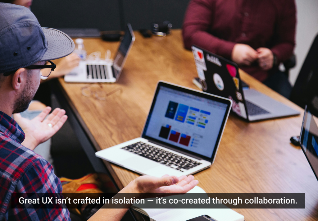
Allurent is the first company I’ve worked where it hasn’t felt like designers are throwing things over the wall to the developers. There’s a huge amount of back-and-forth between the development and design teams. We have some high-level developers who have worked on really complex backend e-commerce systems, as well as front-facing applications. During iterations, these developers can really help inform our design work. I’m constantly working with developers and tweaking transitions between different types of information, working on the fluidity of applications and how they feel.
It’s an interesting, exciting time. Like so many other designers who started out in print, leapt onto the Web, and are now immersed in rich interactivity, I feel lucky. The shopping niche is a corner of commerce where designers can step back and see their efforts realized through real-world success.
This article was originally published on the User Interface Resource Center (UIRC).