I have a three-year-old daughter going through a struggle at the moment. It’s time for her to give up the teddy bear that follows her wherever she goes. But we’ll hear a little more about her later, including what she can teach us about providing a richer user experience.
There is something comforting about knowing how to escape from a situation; knowing how to start again and knowing how to return home. Recall the famous in-flight safety demonstration you get each time you board a plane. What’s the most memorable line? “In case of emergency, your exits are here, here, and here.” As much as we mock the repetitive instruction, deep down we appreciate that if anything goes wrong at least we know how to get out alive.
Bringing it back to UX, a key to giving the user confidence in navigation is to help them know how to get back to the homepage. It’s similar to the back button but with superpowers. The homepage can be a safe haven and a place to regroup or explore, but let’s not give it too much credit. Sometimes going back to the homepage isn’t a comforting experience, it’s through pure frustration or defeat that you can’t figure out where you are or where you are going. Returning back home can be a last resort, similar to going on a 10-hour car journey, getting lost 9 hours in and then deciding to go home and start again.
In Steve Krug’s excellent book Don’t Make Me Think: A Common Sense Approach to Web Usability he writes: “Having a home button in sight at all times offers reassurance that no matter how lost I may get, I can always start over, like pressing a reset button or using a ‘Get out of jail free’ card.”
It may be comforting to users that they can return home, but do we actually want them to?
What’s the Value of Going Home?
Search engine optimization has resulted in the homepage losing its place as the single entrance to a website and in many cases is being bypassed more and more each year.
Gerry McGovern sums this up perfectly in his article “The decline of the homepage,” stating: “Many marketers and communicators think their homepage is a giant billboard or megaphone. They become obsessed with its redesign and with placing lots of happy talk and smiling faces on it. Your customers don’t want to get to your homepage. At best, the homepage is merely a series of signposts that will help them head in the right direction.”
Of course the homepage plays an important role in any website and should not be ignored, but an unbalanced promotion of returning home can work against you. Suppose the user has just filled out a form or signed up to a mailing list (therefore showing an interest in your services) and the most obvious route to them is to return home. You may even have added a new button to make it easier for them to do so. Is that really the best option?
How Many Ways Home?
Users have varying expectations of where to find the home button and what it will look like based on their level of web experience. That wasn’t always the case, have a glance at these original pages of some top sites when they were launched. It is difficult to see any consistency between the routes home on these original sites.
Today there are several standard ways to return:
- Home button with text “Home” or an icon of a house
- Clickable logo
- Breadcrumb trail
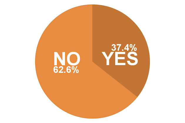
Research shows that a clickable logo isn’t yet a universally understood way of returning home even though it is widely used that way. Leaving out a dedicated home button in the navigation risks confusing many users, but that isn’t stopping the practice from gaining popularity. A study was conducted in 2011 by ProMediaCorp who looked at the top 500 websites (defined by Alexa) to determine if there was a home button in the site navigation. The results showed that 37.4% had a dedicated link and 62.6% did not.
So if many of the top sites are leaving out the home button, is it working? Here are the names of eight popular websites. Your task is to recall the main way to get back to the homepage. Answers at the end of this article (no cheating):
- Apple
- eBay
- Facebook (when logged in)
- LinkedIn (when logged in)
- Twitter (when logged in)
- YouTube
- Wikipedia
For sites where the homepage is a key feature, such as social networks, which can include a personalized news feed or act as a central hub for user activity, there are clear markers to direct you home. Over the past couple of years Facebook has even made some changes to the tool tip when you hover over the logo, reflecting a change in user understanding of how to get back home.
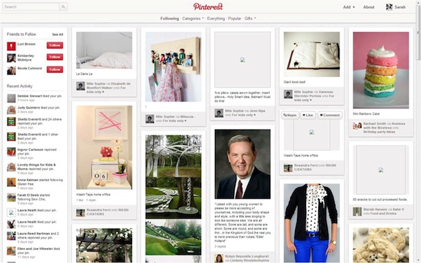
On the other hand, sites where the homepage is not the central hub of activity (such as eBay), the trend is to make the route home less prominent. One notable exception to this rule is Pinterest, in which the homepage is hugely important to the user but has no dedicated home button, only a clickable logo in the top center, and search in the top left.
Providing a Richer User Experience
Let’s go back to my three-year-old daughter. The new rule in the house is that the teddy stays in the bedroom, always there if she wants to go and see it, but it isn’t allowed to follow her around the house anymore as a constant companion. She initially found this difficult but it has introduced her to a new way of living and a richer experience. Some users will be in for a shock when they start to live life outside of the home button!
As UX designers, we have a responsibility to provide a rich user experience. By relying too much on sending the user back home, we limit the possibilities at every level and entry point of the site. Take a look at where you are driving your user base and decide if your user journeys rely too heavily on the homepage as the starting point. If you do not already know the behaviors and activities of your audience then consider using the Lean Startup approach and test your assumptions, then “pivot or persevere.” Maybe it’s time for a change.
If your audience is technically savvy, use it to your advantage. Make the navigation less cluttered, reduce the barrage of homepage routes, and instead enrich the user experience throughout. For those sites aimed at a less technically savvy audience, you may be forced to give up some real estate above the precious fold and provide an obvious way home, but you can still avoid this route becoming the be-all and end-all.
Let me know how you scored on the quiz and how you have chosen to employ the home button on your site. Share your viewpoint on whether the home button, whatever form it takes, should be active on the homepage itself. Apple and Google disagree. That’s a great one for filling an awkward silence on a first date …
Answers to the quiz (correct at time of publication):
- Apple: clickable logo – top left in the primary navigation
- eBay: clickable logo, no separate home button
- Facebook: clickable logo and home button top right (when logged in)
- LinkedIn: clickable logo and home button top left (when logged in)
- Twitter: home button top left (when logged in)
- YouTube: clickable logo, no separate home button
- Google: clickable logo, home button bottom left
- Wikipedia: clickable logo, no separate home button
Image of girl and teddy bear courtesy Shutterstock.