Save
For a long time it seems like we’ve argued that the old art-and-copy agency teams of the past need an injection of UX. We’ve seen UX become recognized and valued across digital projects, but the inclination is to dismiss experience design considerations when it comes to more traditional things like print projects and packaging. The case for UX in print and packaging may seem like a stretch when considered without context, but I think a couple of anecdotal stories will illustrate the need.
Irrelevance Can Be Costly
I sat in on a recent call that went over a brochure design with a few international clients. While the clients on the call commended the prose and art presented in the brochure piece, a larger more fundamental criticism threatened to derail a good bit of work that had already been done—pointing to the need for UX representation on the project. The piece was a patient brochure and the client criticism was that it included disease state information that was not relevant to the user at the point in their journey where they’d be receiving the brochure.
It’s become accepted that experience design concerns itself not only with on-screen interactions but also with the larger brand experience and customer journeys. In the case of the patient brochure the role of the UX person would be to consider where the piece falls within the patient journey, the role of that touchpoint within the brand ecosystem, the needed CTA, and the relevance of the communication within that context. In short, the UX person would have pointed out the client concern before it became a client concern, saving time, resources, and credibility. Add to this the fact that print pieces these days often include digital gateways such as QR-codes and URLS, which is to say nothing of the emergence of digitally infused interactive print.
Combing Out the Tangles
While the role of all touchpoints, including printed pieces, needs to be considered within the context of the consumer journey and brand experience, there’s also the matter of the usability of printed pieces and how users interact with them.
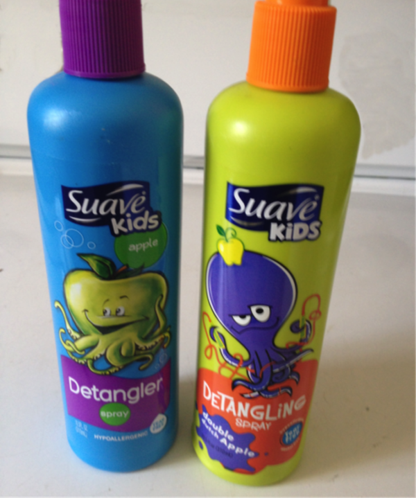
I have kids with unruly hair and frequent cases of ‘bed-head,” so detanglers have become a household staple needed to streamline busy school mornings. I often find myself staring at bottles of the stuff in my bathroom, but where the experience design elements of packaging design really comes into play is earlier in the journey, at the store. Below are two versions of the same product’s package design—one that may well have seen the benefit of UX recommendations.
The blue bottle is the newer design that seems to have benefitted from UX improvements. First the “Kids” identifier was converted from all caps to the more easily read initial cap/lowercase type. “Detangling Spray” was converted from a mixed upper and lowercase font to a simpler Helvetica style “Detangler” that is likely more easily seen and deciphered while surrounded by numerous products in a store aisle. “Double Dutch Apple” was simplified to “apple,” and the octopus concept was simplified and seamlessly combined with the apple. Instead of an octopus tangled up in a jump rope with an apple on its’ head now we simply see an apple-octopus—a single image instead of the combination of three disparate elements. With the apple-pus in place the green-apple color was moved from the background color to the featured creature, making room for a palatable blue bottle.
It would be interesting to know how the new packaging performs versus the old in terms of sales. I would suggest that any improvement in sales might be an indication of the ROI value of including UX in packaging design projects.
Conclusion
While UXers continue to fight the daily battle in some organizations to be included in the “creative” reviews covering design comps based off their interactive wireframes, leading organizations embracing UX more fully will be utilizing UX on all projects, from digital to the more traditional, such as print and packaging. Print pieces are more than art and copy. Everything the consumer touches is part of a brand experience and UX aims to improve it all.
Illustration of shopper looking at shampoo bottles courtesy Shutterstock
Tom Schneider
Tom Schneider is a former VP of The Usability Professionals Association (Philadelphia) and the UX Partner of UX&ART (www.uxandart.com). He is the creator of UserXman; the user experience super-hero, and is currently working on a new book, UX Alchemy: Transformational UX Design.
Tom studied philosophy and painting before he was hired at Boeing as an artist. There he was tasked with designing Boeing's first corporate intranet. He helped establish some of the first information architecture best practices used in Web design and continued as a Art Director, Web Designer, and user experience advocate. He has spent the past 12-plus years in the advertising industry serving clients in aerospace, transportation, hospitality, B2B, healthcare, and consumer products. While at Rosetta he helped standardize the practice of Program Architecture and experience design while focusing on personalized experiences and designing experience programs to drive users through the marketing continuum of awareness, engagement, conversion, loyalty, and advocacy.
Tom spent a year in Moscow where he wrote the first of several screenplays and recently has undertaken songwriting much to the dismay of his kids; Mack, Ava, and Lydia.


