Flag

We stand with Ukraine and our team members from Ukraine. Here are ways you can help

Get exclusive access to thought-provoking articles, bonus podcast content, and cutting-edge whitepapers. Become a member of the UX Magazine community today!

Home ›› Business Value and ROI ›› 6 Key Questions to Guide International UX Research ›› Usability Tip: One Main Call-to-Action Item Per Task

Usability Tip: One Main Call-to-Action Item Per Task

by Tammy Guy
2 min read
Share this post on
Tweet
Share
Post
Share
Email
Print

Save

Give your users one clear call-to-action for each task.

One of the best ways to learn what works and what doesn’t work when it comes to UI and usability is to look at as many samples as possible and test out pages, comparing and evaluating how certain elements are being treated.

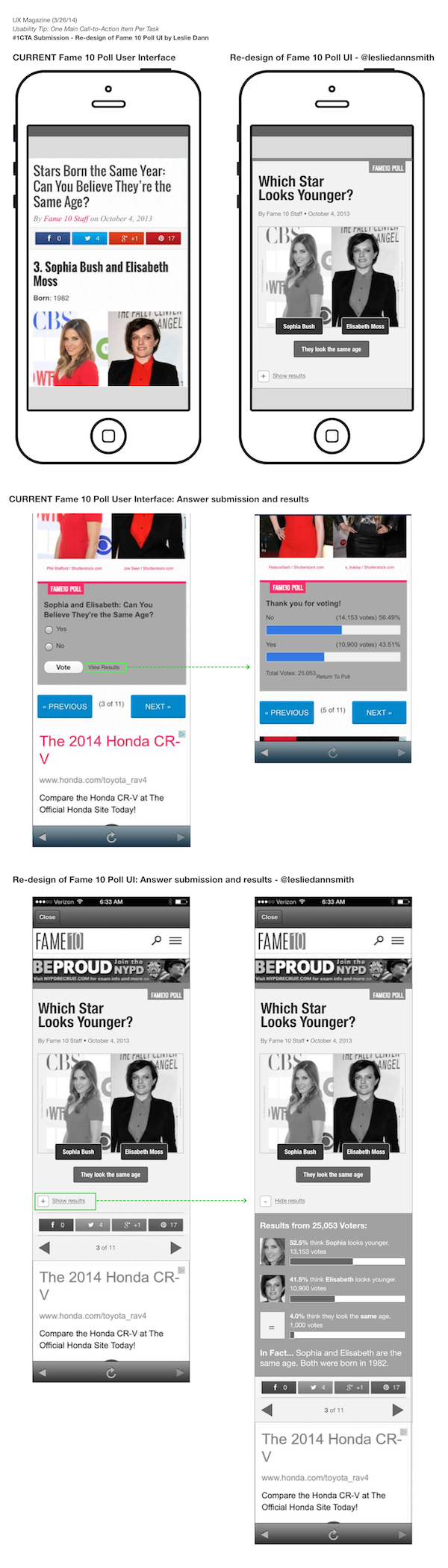
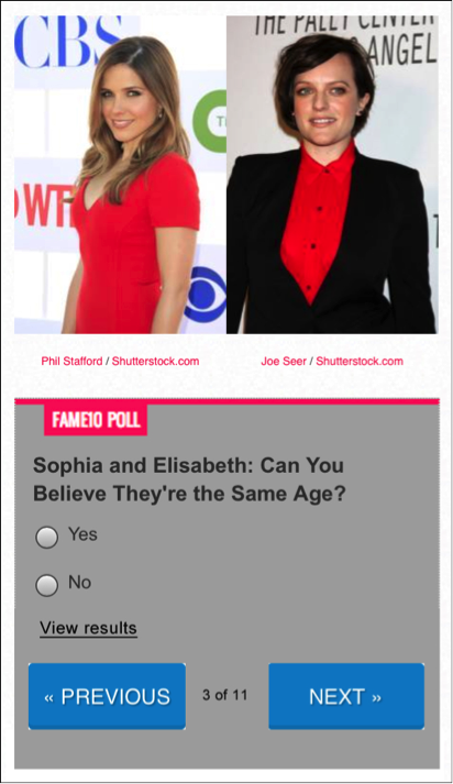
This online poll from Fame10 was linked to through the Fox News mobile app. In the survey, users are asked to submit their answers through radio button selections.

Search field on Menu Pages

The point is to go through the entire set of questions and vote on each. The problem is, there isn’t a clear call to action that handles both the submission of each response and moving forward to the next set of questions. Instead, users must take two actions, first Vote and then click Next in order to advance forward. To make matters more confusing, the Vote button leads users to the View Results screen (same screen users land on when clicking View Results link).

Cut Through Confusion

As a rule of thumb, the main call to action on a page should be heaviest in weight when compared to other buttons and/or links. All other action items should appear secondary in terms of color, placement, shape, and overall weight allocation. In this case, it seems there are two main call-to-actions which are both required in order to move forward.

  • The NEXT button is the one that stands out most. Its large size and bright blue color comes forward in the design, its letters are all capitalized, and it has a forward arrow icon on it.
  • The Vote button appears secondary, as it’s smaller. However, its placement inside the voting gray box indicates it is the main call to action for users who want to vote.
  • The View Results link is well designed as a tertiary level call-to-action and presented as a text link versus a button. The confusing part is that it leads to the same results screen that users see after placing their vote which means that users get to see the general poll results whether asking for it or not.

Search field on Menu Pages

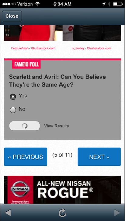
Selection of radio buttons and select Vote. Note: the form is being submitted but the page did not advance to the next set of questions. Search field on Menu Pages

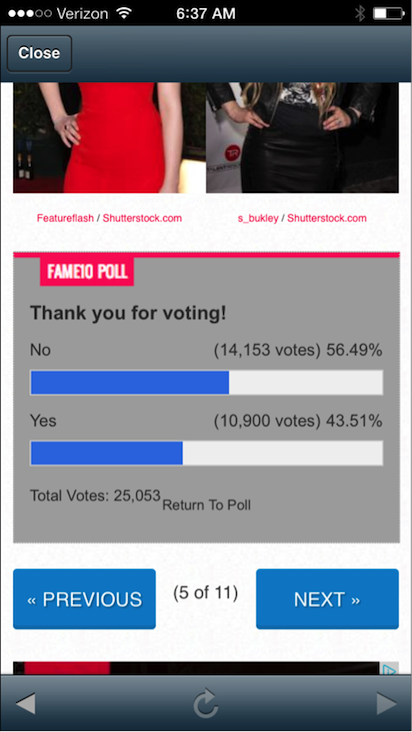
Results screen after selecting the Vote button.

Easy Fix

Reduce the number of main call-to-action buttons and allow users to submit and advance to the next screen with one click. Further, only display poll results when users ask for it, via the results link. This will allow a faster form completion, which will most likely lead to more questions being answered by users.

Search field on Menu Pages

Share your redesign solutions to this problem on Twitter, Facebook, or Google+ using the hashtag #1CTA. We’ll add our favorite submissions to this article abelow. (Image of finger in the air courtesy Shutterstock)


Search field on Menu Pages

Reduce repetition+clutter for quick engagement; Rewrite question to be direct+VISUAL; Add surprise to results”—@LeslieDannSmith

post authorTammy Guy

Tammy Guy
Tammy Guy is the founder of a visual design and usability consulting firm focused on strategic brand planning, creative direction and diffusion of user experience problems by applying design theory and usability best practices in a rapidly changing Web environment. Her firm provides consulting services (e-commerce solutions, mobile apps and tablet experience) to clients from various industries such as fashion retail, commodity retail, pharmaceutical, insurance, financial services, social networking and others. Services include product evaluation, strategy and planning, creative development and direction and usability consulting. With more then 16 years of experience, Tammy previously worked as the Creative Director at LivePerson, Inc. and was a Design Group Manager at the Hertz Corporation where she art-directed all aspects of graphical application development for all customer facing websites. In addition, Tammy has been a frequent guest speaker with the Nielsen Norman Group for the past few years, teaching visual design and usability workshops. She also teaches similar design and usability courses with General Assembly in New York City.

Tweet
Share
Post
Share
Email
Print

Related Articles

AI design tools are here, but is your team ready? This article shows how to integrate them into real workflows, boost early-stage momentum, and build the skills that will shape design’s AI-powered future.

Article by Jim Gulsen
Is Your Team Ready for AI-Enhanced Design?
  • The article explores how AI design tools can accelerate early-stage workflows like wireframing and prototyping without disrupting established team processes.
  • It highlights the importance of integrating AI thoughtfully into collaborative environments, using tools like Lovable and Figma Make as case studies.
  • The piece argues that teams should start small, build prompting skills, and treat AI as a momentum booster, not a full design replacement.
Share:Is Your Team Ready for AI-Enhanced Design?
8 min read

Forget linear workflows — today’s creative process is dynamic, AI-assisted, and deeply personal. Learn how to build a system that flows with you, not against you.

Article by Jim Gulsen
The Creative Stack: How to Thrive in a Nonlinear, AI-Assisted World
  • The article explores the shift from linear to nonlinear, AI-assisted creative workflows.
  • It shares practical ways to reduce friction and improve flow by optimizing tools, habits, and environments.
  • It argues that success comes from designing your own system, not just using more tools.
Share:The Creative Stack: How to Thrive in a Nonlinear, AI-Assisted World
7 min read

How is AI really changing the way designers work, and what still depends on human skill? This honest take cuts through the hype to show where AI helps, where it falls short, and what great design still demands.

Article by Oleh Osadchyi
The Real Impact of AI on Designers’ Day-To-Day and Interfaces: What Still Matters
  • The article explores how AI is reshaping designers’ workflows, offering speed and support across research, implementation, and testing.
  • It argues that while AI is useful, it lacks depth and context — making human judgment, critical thinking, and user insight indispensable.
  • It emphasizes that core design principles remain unchanged, and designers must learn to integrate AI without losing their craft.
Share:The Real Impact of AI on Designers’ Day-To-Day and Interfaces: What Still Matters
9 min read

Join the UX Magazine community!

Stay informed with exclusive content on the intersection of UX, AI agents, and agentic automation—essential reading for future-focused professionals.

Hello!

You're officially a member of the UX Magazine Community.
We're excited to have you with us!

Thank you!

To begin viewing member content, please verify your email.

Tell us about you. Enroll in the course.

    This website uses cookies to ensure you get the best experience on our website. Check our privacy policy and