Flag

We stand with Ukraine and our team members from Ukraine. Here are ways you can help

Get exclusive access to thought-provoking articles, bonus podcast content, and cutting-edge whitepapers. Become a member of the UX Magazine community today!

Home ›› Business Value and ROI ›› 6 Key Questions to Guide International UX Research ›› Usability Tip: Make it Easy to Get out of Panic Mode

Usability Tip: Make it Easy to Get out of Panic Mode

by Tammy Guy
2 min read
Share this post on
Tweet
Share
Post
Share
Email
Print

Save

Users like to be able to quickly abort noisy videos and the like when they open them by accident.

Reading through headlines on the CNN mobile app, I tapped one of the articles with a play icon next to it not realizing a video would start playing instantly (as opposed to first directing me to an article with an embedded video). I was out in public, and immediately tried to find a way to turn the video off, but missed the cancel button with my finger and the video started to play. Without paying attention to the actual content, I then tried my luck tapping aimlessly on the screen. Relieved I was able to put an end to video playback, I found myself on a Verizon page not knowing how I ended up there or how to get back to the article I wanted to read.

Trying to retrace my actions, I realized that, while in panic mode, I tapped the video during the first couple of seconds of a Verizon ad, which is how I ended up on the Verizon screen. I also realized I completely overlooked the X button in the bottom right corner, which would have brought me back to my article with the video embedded in it. Instead, I tried the Menu option on the top right. When I saw that it was all Verizon options, I ended up closing my app window and starting all over.

My Experience:

CNN Mobie App

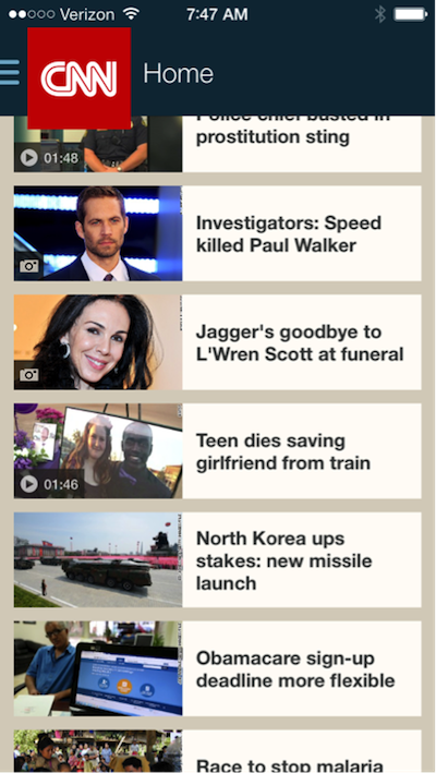
CNN mobile app home page

CNN Mobile App Video Loading

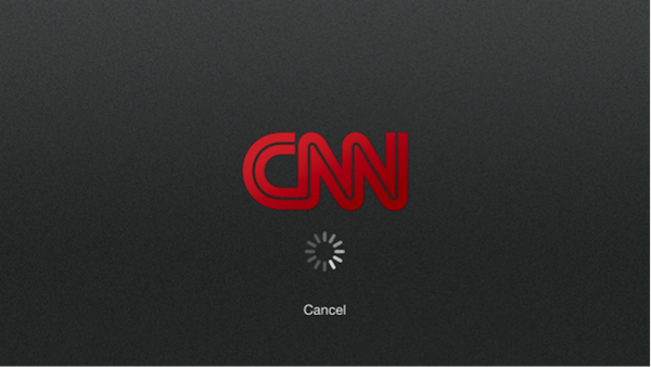
Video starting (this is where I missed the cancel button with my finger)

Verizon Ad

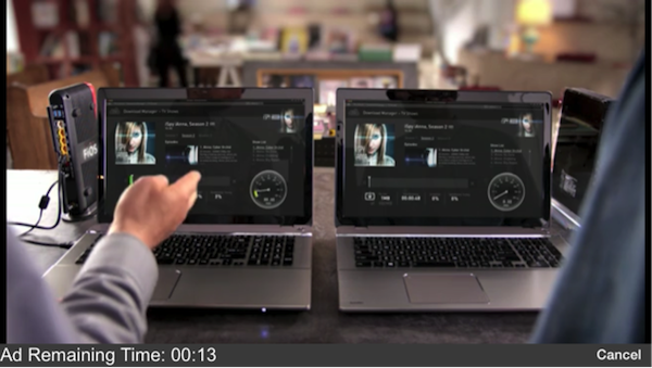
Video started to play with a leading Verizon ad

Verizon Ad in CNN App

Verizon ad within CNN application (with a hidden back button)

Feeling a little foolish for not realizing a video icon meant instant play, I looked back and realized there were multiple user interface solutions that could have prevented this usability issue.

  1. The cancel button on the screen where the video started to play could have been larger and could have read: “Stop video.”
  2. Adding stop or pause icons to the bottom of the video screen once the Verizon ad began could have been useful.
  3. Increasing color contrast for action items on the Verizon screen would have made it easier to locate them on the page.

If you want users to find their way around your site, primary and secondary action items must be visible—especially when a user is rushing and in a panic. Have you ever tapped somewhere on the screen only to launch yourself into panic mode? How easy was it to get out of the unwanted situation?

Primary and secondary action items must be visible—especially when a user is rushing and in a panic

Send us your samples and let us know how the user interface could have prevented a prolonged panic using the hashtag #UXpanic.


Image of panicked man on smartphone courtesy Shutterstock.

post authorTammy Guy

Tammy Guy
Tammy Guy is the founder of a visual design and usability consulting firm focused on strategic brand planning, creative direction and diffusion of user experience problems by applying design theory and usability best practices in a rapidly changing Web environment. Her firm provides consulting services (e-commerce solutions, mobile apps and tablet experience) to clients from various industries such as fashion retail, commodity retail, pharmaceutical, insurance, financial services, social networking and others. Services include product evaluation, strategy and planning, creative development and direction and usability consulting. With more then 16 years of experience, Tammy previously worked as the Creative Director at LivePerson, Inc. and was a Design Group Manager at the Hertz Corporation where she art-directed all aspects of graphical application development for all customer facing websites. In addition, Tammy has been a frequent guest speaker with the Nielsen Norman Group for the past few years, teaching visual design and usability workshops. She also teaches similar design and usability courses with General Assembly in New York City.

Tweet
Share
Post
Share
Email
Print

Related Articles

In an industry where clarity is key, why can’t we agree on the language to define what we do? Dive into the evolution of UX, UI, and Product Design — from pioneering generalists of the early web to today’s specialized roles — and discover how our industry’s struggle with terminology may be holding us back.

Article by Andy Budd
The Historical Context of UX, UI, and Product Design
  • This article delves into the historical evolution of UX, UI, and Product Design, tracing their journey from the early days of web design to modern hybrid roles.
  • It examines how the industry’s struggle with clear terminology has impacted its growth, potentially ceding authority to other professions like project management.
Share:The Historical Context of UX, UI, and Product Design
5 min read

The article discusses how we use maturity models in design and argues that “immaturity” frequently reflects smart strategic choices. Instead of trying to reach ideal standards, we should focus on how design aligns with business objectives.

Article by Andy Budd
Just Grow Up: Why Design Maturity Models Might Be Harming Our Industry!
  • The article questions how mature a design is. It states It states that some strategic decisions are called immature.
  • The piece uses budget airlines and luxury carriers as examples. These examples demonstrate that design decisions are based on business strategies, rather than universal standards.
  • The article says we should judge design based on how well it matches business goals, not by strict rules.
Share:Just Grow Up: Why Design Maturity Models Might Be Harming Our Industry!
3 min read

Discover how AI-powered gesture-based navigation is redefining app experiences, making interactions more intuitive and personalized. Explore the opportunities and challenges of this design revolution.

Article by Kevin Gates
Designing Serendipity
  • This article explores the role of AI in enhancing app navigation through gesture-based interactions, emphasizing a shift from traditional menus to intuitive, swipe-driven experiences.
  • It examines the intersection of AI and interaction design, highlighting how machine learning can support user discovery by anticipating needs and surfacing relevant content.
  • The piece critically assesses the potential of gesture-based navigation to improve accessibility, user engagement, and overall app usability, while addressing design challenges and potential pitfalls.
Share:Designing Serendipity
11 min read

Join the UX Magazine community!

Stay informed with exclusive content on the intersection of UX, AI agents, and agentic automation—essential reading for future-focused professionals.

Hello!

You're officially a member of the UX Magazine Community.
We're excited to have you with us!

Thank you!

To begin viewing member content, please verify your email.

Tell us about you. Enroll in the course.

    This website uses cookies to ensure you get the best experience on our website. Check our privacy policy and