Flag

We stand with Ukraine and our team members from Ukraine. Here are ways you can help

Get exclusive access to thought-provoking articles, bonus podcast content, and cutting-edge whitepapers. Become a member of the UX Magazine community today!

Home ›› Business Value and ROI ›› 6 Key Questions to Guide International UX Research ›› Usability Tip: Interfaces Need Rhythm

Usability Tip: Interfaces Need Rhythm

by Tammy Guy
3 min read
Share this post on
Tweet
Share
Post
Share
Email
Print

Save

Make sure your interface leads users along consistent and familiar beats.

The overall presentation of a site must be clean and professional in order to gain user’s trust. Consistent and easy-to-use interfaces help users concentrate on the content and flow through the rhythm of browsing. In e-commerce, when that rhythm stops due to any uncertainties, it can deter users who will in turn defer back to in-store or phone help—or give up on a business transaction all together.

I recently made an in-store purchase at Old Navy and opened up a credit card there. My store experience was very good; I was greeted by friendly face who told me all about the current sales and took me through a speedy card application process.

That experience was quickly uprooted and overturned, however, when I received my statement in the mail. Signing in to my online account, I immediately felt concerned that I was late with my payment. Trying to sift through the overwhelming amount of information, I had to work harder than necessary in order to get some answers.

Users have Physiological Reactions to Layouts

Crowded user interfaces, inconsistent styles, and unbalanced compositions will effect users’ interactions and alter their overall experience.

Old Navy account summary page

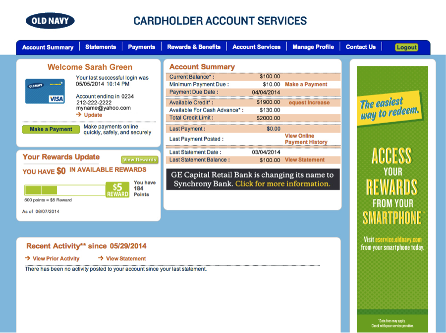
In the case of Old Navy’s account summary page, I had the following reactions:

  • The orange/red grid lines and links immediately made me feel I did something wrong.
  • The tight page grid, small copy, and lack of white space made me feel constrained, as if I was holding my breath while trying to make sense of the information.
  • Being “directed” by red color to the Account Summary on the right, I was left disoriented having to scan from right to left. I felt uncertain about what my next step should be.

(Note: all personal information has been replaced with sample content.)

Next, I clicked on Make a Payment and was faced with the task of adding my bank account information. What I thought would be a simple task, quickly made me feel irritated.

Old Navy bank verification

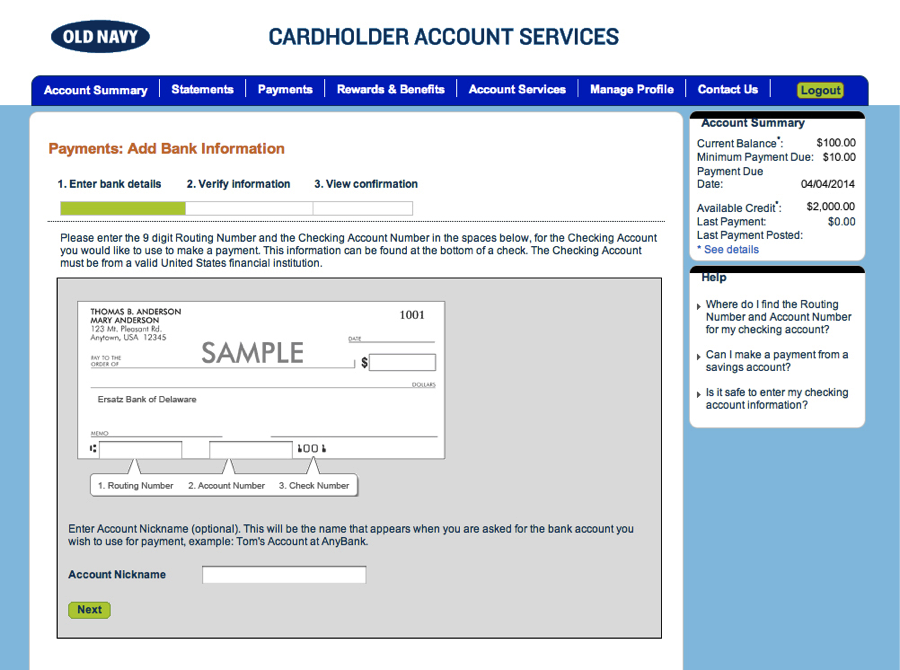
While I noticed the Account Nickname form field immediately, I completely missed the additional required fields on the page and received an error message once submitting the form. The Routing, Account and Check Number fields were uniquely placed in a banner format design versus a typical form presentation.

Old Navy bank verification detail

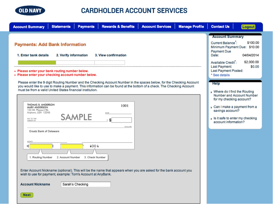
The rhythm was broken again. While this out of the box presentation is unique, it is violating existing global usability guidelines and in turn “hiding” important form elements. It would have been so much more simple and cleaner to present three form fields on the page with a tool tip icon for those of us who often confused between the routing and account numbers.

Rhythm helps users move forward and make progress

Rhythm helps users move forward and make progress. When designing web sites, picture your users sitting in front of their laptops listening to their favorite tunes. They are browsing, scanning, and moving forward—help them keep moving forward by removing obstacles from your pages to present seamless experiences.

Send us your samples of when and where your rhythm was stopped and how it affected your overall experience.


Image of Indian percussion artists courtesy Shutterstock.

post authorTammy Guy

Tammy Guy
Tammy Guy is the founder of a visual design and usability consulting firm focused on strategic brand planning, creative direction and diffusion of user experience problems by applying design theory and usability best practices in a rapidly changing Web environment. Her firm provides consulting services (e-commerce solutions, mobile apps and tablet experience) to clients from various industries such as fashion retail, commodity retail, pharmaceutical, insurance, financial services, social networking and others. Services include product evaluation, strategy and planning, creative development and direction and usability consulting. With more then 16 years of experience, Tammy previously worked as the Creative Director at LivePerson, Inc. and was a Design Group Manager at the Hertz Corporation where she art-directed all aspects of graphical application development for all customer facing websites. In addition, Tammy has been a frequent guest speaker with the Nielsen Norman Group for the past few years, teaching visual design and usability workshops. She also teaches similar design and usability courses with General Assembly in New York City.

Tweet
Share
Post
Share
Email
Print

Related Articles

Consistency in UI/UX builds trust and efficiency — without it, users feel lost. Learn how top brands maintain it and how AI can help.

Article by Rodolpho Henrique
Consistency in UI/UX Design: The Key to User Satisfaction
  • The article examines the role of consistency in UI/UX design for user trust and efficiency.
  • It showcases visual, functional, and interaction consistency in creating seamless experiences.
  • The piece warns about the negative effects of inconsistency, including confusion and frustration.
  • It promotes the use of AI and design systems to ensure consistency across digital platforms.
Share:Consistency in UI/UX Design: The Key to User Satisfaction
4 min read

If Mobile-First thinking has revolutionized the UX Design industry, AI-First is promising to be an even more spectacular kick in the pants.

Article by Greg Nudelman
The Rise of AI-First Products
  • The article explores how AI-powered operating systems are changing user interactions.
  • It covers AI-driven personalization, automation, and adaptive interfaces.
  • The piece discusses challenges like privacy, over-reliance on AI, and user control.
  • It highlights opportunities to design more intuitive and human-centered AI experiences.
Share:The Rise of AI-First Products
11 min read

AI is reshaping UX, and Figma may be sinking. As AI-driven systems minimize UI, traditional design roles must evolve — or risk becoming obsolete. Are you ready to adapt?

Article by Greg Nudelman
AI Is Flipping UX Upside Down: How to Keep Your UX Job, and Why Figma is a Titanic (It’s not for the Reasons You Think)
  • The article explores the fundamental shift in UX as AI-first systems minimize the role of UI, rendering traditional design tools like Figma increasingly obsolete.
  • It introduces the “Iceberg UX Model,” illustrating how modern AI-driven interfaces prioritize functionality and automation over visual design.
  • The piece argues that UX professionals must shift their focus from UI aesthetics to AI-driven user experience, emphasizing use case validation, AI model integration, and data-informed decision-making.
  • It warns that designers who remain fixated on pixel-perfect layouts risk becoming obsolete, urging them to adapt by engaging in AI-driven UX strategies.
Share:AI Is Flipping UX Upside Down: How to Keep Your UX Job, and Why Figma is a Titanic (It’s not for the Reasons You Think)
7 min read

Join the UX Magazine community!

Stay informed with exclusive content on the intersection of UX, AI agents, and agentic automation—essential reading for future-focused professionals.

Hello!

You're officially a member of the UX Magazine Community.
We're excited to have you with us!

Thank you!

To begin viewing member content, please verify your email.

Tell us about you. Enroll in the course.

    This website uses cookies to ensure you get the best experience on our website. Check our privacy policy and