“Nobody counts the number of ads you run; they just remember the impression you make.”
– Bill Bernbach
The operations team at Schiphol Airport in Amsterdam had a problem. No matter how many times a day the janitorial team made the rounds, the men’s urinals were always a mess.
As many a mother, partner, and bathroom floor can attest, men often lack “urinary precision”. In public toilets, the mess caused by hundreds of misses can be unsanitary and expensive to clean. Schiphol Airport solved their problem with a simple but brilliant solution.
They placed an etching of a fly inside each urinal bowl.

Source: Google Images
These tiny engravings were incredibly effective. The flies reduced spillage by 80% and total cleaning costs by 8%. As Klaus Reichardt, a member of the team who invented the solution put it:
“Guys are simple-minded and love to play with their urine stream, so you put something in the toilet bowl and they’ll aim at that.
It could be anything. I’ve seen a golf flag, a bee, a little tree. It just happens that at Schiphol it’s a fly.”
But why did such a simple solution work so well? It’s down to a behavioral science principle known as salience bias.
What is Salience Bias?
Salience describes how prominent or emotionally striking something is. If an element seems to jump out from its environment, it’s salient. If it blends into the background and takes a while to find, it’s not. Salience Bias states that the brain prefers to pay attention to salient elements of an experience.
Salience describes the prominence or emotional resonance of an element.
What makes something salient?
Salience works by creating what’s called cognitive ease. This concept means making it simple for people to process information. But to do that, we need to know what elements make an experience salient. For instance:
1. Luminance
The intensity of light emitted from an object. For example, a glowing effect around an element will make it stand out from the background.
Source: Giphy
2. Texture
Patterns that add more visual information. For example, fried chicken is more salient than grilled chicken because its crunchy texture draws attention. Any type of angular or interesting texture attracts attention.

Photo by Artur Tumasjan on Unsplash
3. Contrast
How different two colors are to one another. For example, black text on a yellow background is a combination often used for road signs. Yellow contrasts with the surrounding environment, and black contrasts with the yellow background. This results in a clear message, that’s also easy for drivers to notice.

Photo by Fritz Benning on Unsplash
4. Scale
The size of one element in comparison to another. In some cases, a client’s request to “make the logo bigger” is correct (at least when it comes to salience).

Photo by Chris Ensey on Unsplash
How to apply Salience to your experience
The purpose of an experience is to drive action. Here’s how the best brands use salience to shape their customer experience:
1. Apple: Keep it salient by keeping it simple
Ruthlessly product-focused, Apple stores set the bar for simple retail experiences. Rather than confusing customers with lots of information and options, Apple lets its products persuade.
Apple is a product-centric brand, so it makes products the most salient part of their experience.

Photo by George Beridze on Unsplash
The product-first strategy is also clear in Apple’s digital experience. Simple design and minimal information make it easy for Apple’s products to get 100% of the customer’s attention.
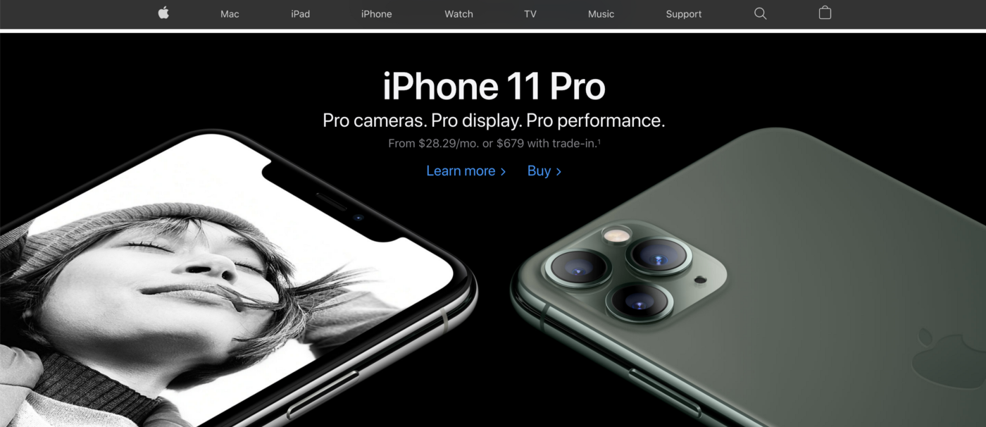
Source: Apple
2. Netflix: Create clarity from complex information
Customers love Netflix because they have lots of content, but having lots of content means it can be hard to find what you want. Netflix’s UX team has a difficult job — they have to turn this endless content into an easy-to-navigate experience. Here are a few ways they accomplish this:
- Content personalization algorithm: Research has shown that personalized content is more salient to customers. Netflix describes itself as “customer-obsessed” and strives to deliver a totally personalized experience. Their “Top Picks for…” category is a prime example of this philosophy in action. More than 80% of Netflix shows customers watched in the last two years have been as a direct result of Netflix’s recommendation engine. Not someone searching for a specific piece of content.
More than 80% of Netflix shows customers watched in the last two years have been as a direct result of Netflix’s recommendation engine.
- Top 10 lists: Netflix leverages the “Top-10 Effect” in its new, content ranking section. This effect states that people naturally group things into round-number groups, and everything outside of these groups is inferior. In other words, top 10 lists are incredibly salient for customers — they naturally grab people’s attention.

Source: Netflix
- Use pictures to tell a salient story: The picture superiority effect states that pictures and images are more likely to be remembered than words. Netflix lets images do the talking, with minimal copy and a focused UX that makes content the star.
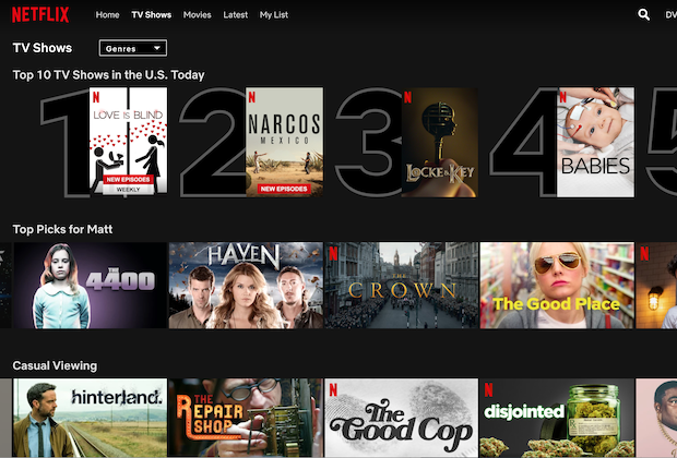
Source: Netflix
3. Google: Design for decision-making
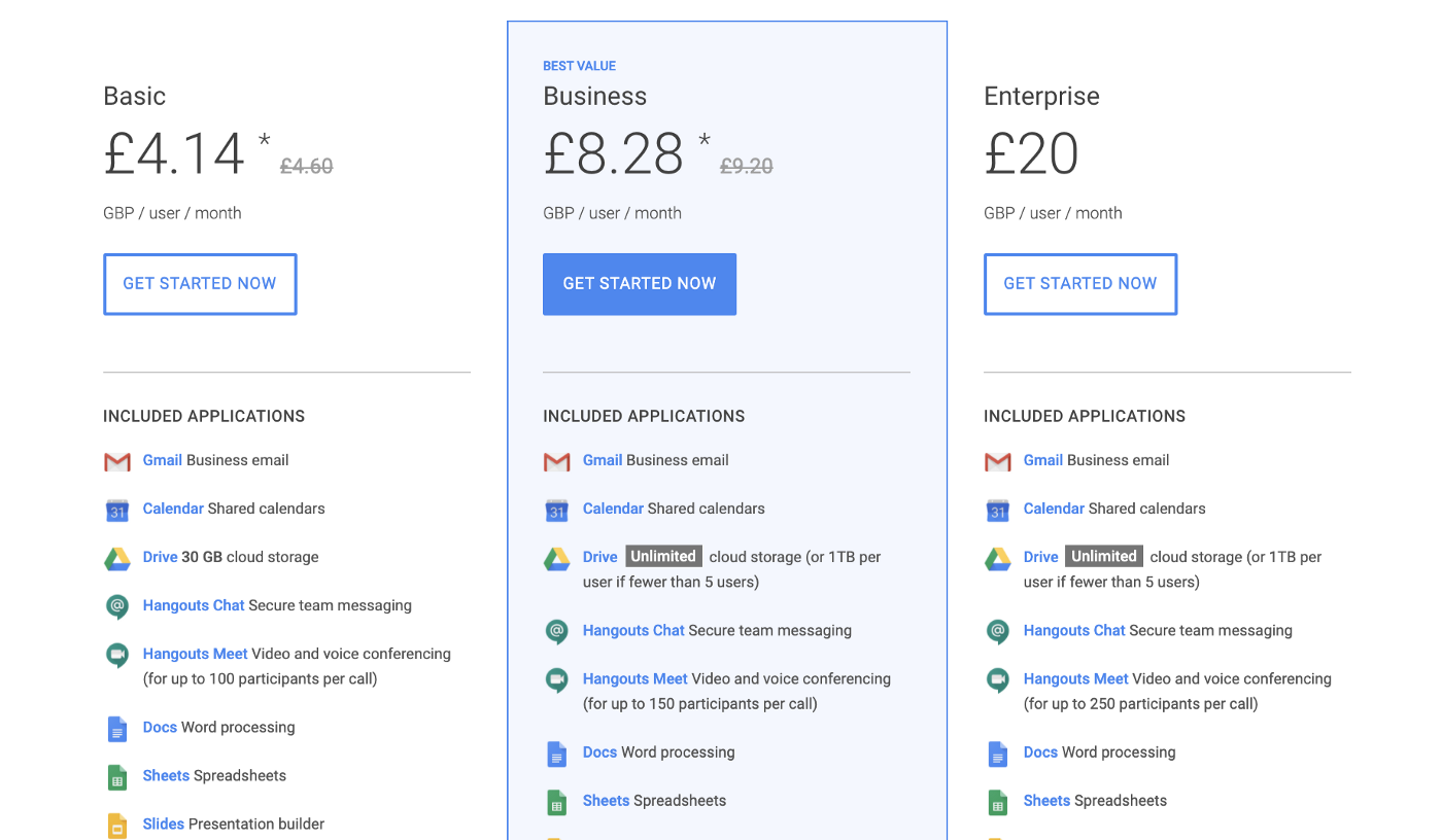
Which of the options below do you think Google wants users to buy?
Source: Netflix
If you said the G Suite Business plan, I’d have to agree with you. So how does Google use salience to make that strategy clear?
- Contrast: Google uses contrasting design elements to create distinctiveness from other products.
- The “Center Stage Effect”: This effect states that people are more likely to pick the middle option, even if it’s the worst option. By putting their preferred choice in the center, Google uses this user bias to create more salience for its Business plan.
The bottom line
Clearly, salience is one of the most important elements when designing customer experiences. We can use it to make better design decisions and create more effective experiences.
Ask yourself:
- In key moments in our customer journey, what’s the one action we want customers to take?
- What’s the context of our physical experience? Is it vying for too much of our customer’s attention?
- What’s the context of our digital experience? Do we have irrelevant information or too many design elements?


