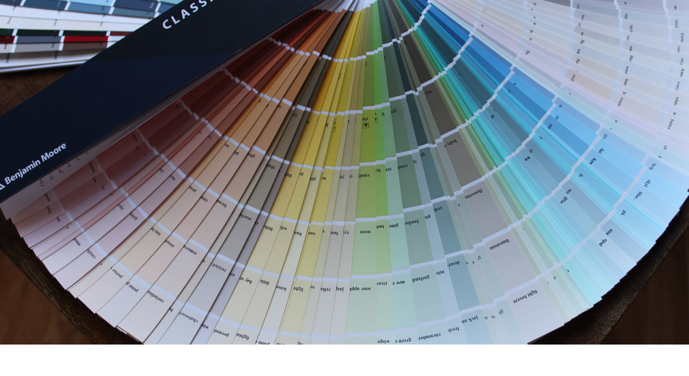
The greater the complexity or number of choices, the harder it is to make a decision.
Think about the times you visited a restaurant chain where you were handed a menu that contained 3–5 pages full of dishes to choose from. Though they probably had everything grouped according to meal type, dietary restrictions, etc. did you ever have a moment where you thought to yourself, ‘I can’t decide‘. You may have even done some sort of elimination process by choosing the things that sounded the most appetizing at the time, narrowing that list until you only limit yourself to a few options. This is normally where the decision becomes too hard to make and you have to rely on the input from the server or other’s at the table.
“Should I get the B.L.T., or the B.L.E.T., or the Spaghetti?”
Now think about the times you visited a more upscale restaurant or one that specialized in a specific dish and received a menu that was only a single page. Was it easier to make a choice? For the majority of us, the answer is , yes!
Ever heard of the term FOMO? Well that is exactly what your brain does when you are given a large selection of choices to choose from. Even after narrowing your choices down from a multi-page menu selection, there is still that, “fear of missing out” factor of feeling like you still made the wrong choice. The more choices you are given, the more indecisive you become and the more you feel FOMO. If your choices are minimal, you feel more confident in the choice you made — ‘My options are either steak or fish‘.
This is what William Edmund Hick and Ray Hyman proved back in 1952. The two psychology professors examined the relationship between the number of stimuli present and an individual’s reaction time to any given stimulus. What they discovered later became Hicks Law, or the Hick’s-Hyman Law, that several UX Designers still use today. The law proved that the more information you have at any given time, the harder it is to understand or make a decision. In simpler terms, 2 options are often times better than 20 options.
Examples
Pretend you don’t know what Amazon is or does. Would you be able to find that information just by looking at their homepage? There is a ton of information ranging from Whole Foods Market, playlists, video recommendations, and a navigation system that spans the entire length of the page. A user has a very difficult time understanding where to go or what to do to find any information about what Amazon is. Is it a search engine? Is it a media site? What products do they actually sell? How do I buy one?

Now, the minimalist design of Apple’s homepage makes it very clear what their company is and what they offer. Large images with simple text quickly let you know that they make and sell phones; Specifically, the iPhone 11 and 11 Pro. The two hyperlinks in each section are clear, I can learn more about this product, or buy it. The simple navigation in the header also lets you know that they offer a few other types of products.

Conclusion
Simplify, simplify, simplify! This is a phrase you will probably see me repeat over and over again.
- Reduce the number of choices in your navigation system, without making it too general.
- Cut down on the amount of information you provide a user on each page.
- Reduce the number of products you are showing at a given time.
- Minimize the amount of text a user has to read. (Users don’t read, they scan.)
- Try to only have 1 call-to-action per section.
You should always be asking yourself, ‘What is the primary goal I want a user to do on this page?‘ followed by, ‘How easily can they accomplish that goal?‘ Your designs should be centered around those two questions.
There is a lesson I once heard about a flower vase that I find very useful in helping me simplify my designs…
If I have 12 flowers in the vase and remove 11, leaving one flower left, is it still a flower vase? If a remove all the flowers, is it still a flower vase, or just a vase?
In other words,
How many flowers does it take to make a flower vase?
You don’t need a dozen flowers for a flower vase to be a flower vase but you do need at least one for a vase to become a flower vase. As a designer, you want to take out all the unnecessary information without having to compromise the true intent of your design. This will improve a user’s experience by reducing their cognitive load. Reduce the amount of information a user has to process at any given time by using Hick’s law.