
“Life’s not fair.” Your mother told you this. Actually, everyone’s mother told them this. And, as usual, Mom was right. Sometimes, despite our best efforts and intentions, things just go wrong. The key to succeeding is hidden in the corollary to this lesson: after each inevitable fall, pick yourself up, figure out why you tripped, and keep moving forward.
The e-commerce world is no fairer than the world your mother warned you about. Just like people, companies – even big companies – make mistakes, even serious mistakes. Yet hardcore e-commerce players know that success is about trial and error – with extra emphasis on the error part – and are not afraid to face them and move forward.
Everybody hates it when things go wrong. Following are four examples of truly Homer Simpson (Doh!) moments that dramatically (and negatively) impacted customer experience, and how our Fortune 500 customers quickly rectified them by intelligent use of customer experience insights.
Don’t You Just Hate It When…You Self-Promote Yourself Out of Business?
The North Face was looking to increase the conversion rate on their Shopping Cart page. Too many customers, they realized, were navigating to the Shopping Cart after adding items, but not clicking the Checkout button.
Obviously, something on the Shopping Cart page was hindering conversions. Using mouse-move and mouse-click heatmaps together with a review of individual session recordings and conversion funnels, they were able to pinpoint the source of the difficulty.
The conclusion? A large percentage of visitors were not paying attention to the Checkout button on the Shopping Cart page because they were distracted by a promotional banner above the button, inviting them to become North Face Rewards members. Keen to promote membership, The North Face team had underestimated the negative impact the banner was having on the main goal of the page: – getting visitors to click on Checkout! Beyond the business implications, The North Face was inadvertently creating visitor frustration, – leading customers away from their original intent, which was to purchase a North Face product.
To confirm this suspicion, The North Face ran an A/B test on the position of the banner and Checkout button (see below). Version A was the control with the Checkout button positioned below the banner, whereas Version B reversed it with the Checkout button above the banner.
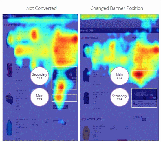
The results were dramatic. In the new version, with the Checkout button above the banner, there was an increase of 21% for the click-through rate on the Checkout button.
The lesson learned? Be careful that on-page self-promotion doesn’t distract customers!
Don’t You Just Hate It When…Visitors Don’t Play with Your Toys?
To make the most out of a recent holiday season, Walmart launched special Gift and Toy Finder tools on their web site. Initial results were promising: a 24% rise in conversions among visitors who interacted with the tools.
But when the Walmart team dug deeper into in-page analytics using scroll-reach heatmaps, they found something disturbing: 20% of page visitors were not even seeing the Finder tools because they weren’t scrolling down far enough on the page.
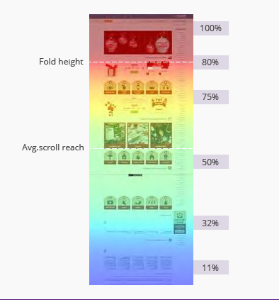
Even worse, by watching user session playbacks, Walmart found that visitors using the Finder tools were regularly encountering serious usability issues. After choosing search criteria, visitors did not intuitively click on the call-to-action button, confused by not receiving search results first. And when they did click on Go, a significant percentage encountered a JavaScript error that prevented them from receiving their search results.
Walmart had created a tool intended to simplify the customer experience, with the aim of lowering frustration during the high-pressure holiday shopping season. Owing to these technical issues, they were not only not alleviating confusion, they were actually raising friction. After correcting these mistakes, Walmart saw a corresponding rise in conversions, and in customer satisfaction.
The lesson learned? Watch your visitors closely. They’ll show you where the friction points are hiding.
Don’t You Just Hate It When…Your Brand New Website LOWERS Sales?
Operating since 1993, Tele2 is one of Europe´s fastest-growing telecom operators. Its website serves some 20 million unique visitors per month, and is central to the company’s business strategy.
After investing serious time and resources in designing and launching its new web site, Tele2 was shocked to see conversions drop significantly.
Quickly leveraging advanced form analytics tools and scroll reach heatmaps, Tele2 found a 27% form drop-off rate on a key conversion form. Digging deeper into session playbacks, Tele2 micro-examined form fields and pinpointed the validation bugs causing the problem.
Forms are sensitive touchpoints in the best of cases. Trying to make conversions easier for customers, Tele2 had actually degraded the experience and been the source of visitor discomfort. Once the issues were resolved, however, the company saw immediate growth in both conversions and revenues.
The lesson learned? The deeper you dig, the more you can find.
Don’t You Just Hate It When…Nobody Sees the ‘Buy’ Button?
When Lenovo Group, the largest PC maker in the world, launched its Yoga 3 ultrabook laptop, early online sales were far short of expectations.
Quickly concluding that sluggish sales were a result of a hidden user experience issue, the Lenovo team dug into the product website using heatmaps and session playbacks.
What they discovered was that the Buy Now button at the bottom of the page was consistently below the scroll boundary. Even if visitors wanted to buy, they couldn’t see the Buy button.
Online purchases of high-end consumer electronics are stressful, since the devices are relatively costly. Lenovo aimed to enhance consumer comfort during the purchase process, but instead caused frustration.
The good news: quickly rectifying this oversight, Lenovo saw a huge impact on conversions, which went up by a factor of nearly four.
The lesson learned: even seasoned professionals should always come back to the user experience basics.
The Takeaway
In the online commerce arena, the courage to examine our inevitable mistakes is not sufficient. It must be supplemented by the right tools and methodologies. Leveraging today’s advanced technology, it’s possible to more quickly identify and more effectively rectify user experience issues. And, since all of our mothers agree that life is not fair, it’s a good idea to be prepared to do so.