Flag

We stand with Ukraine and our team members from Ukraine. Here are ways you can help

Get exclusive access to thought-provoking articles, bonus podcast content, and cutting-edge whitepapers. Become a member of the UX Magazine community today!

Home ›› Business Value and ROI ›› 6 Key Questions to Guide International UX Research ›› Design for Experience: Promoting Empathy for Users

Design for Experience: Promoting Empathy for Users

by Steve Tengler, Design for Experience
3 min read
Share this post on
Tweet
Share
Post
Share
Email
Print

Save

A closer look at the Design for Experience awards category: Promoting Empathy For Users

As a judge for the international Design for Experience awards, I must forewarn you: I will have a very critical eye on anyone nominating an elevator in the “Promoting Empathy for Users” category.

Why? I’ve traveled within four continents and have yet to see an elevator truly designed for the user.

For example, why not provide an “undo” button? That’s a standard control on nearly every electronic interface on the globe except for elevator control panels. Having been in an elevator in the tallest hotel in the Western Hemisphere when an exuberant youth pressed every button, I know how frustrating that simple omission can be.

If an undo button costs too much extra money, why not at least allow me to press those buttons again and untoggle the selections? Because I had no way to reverse the button-pushing of that kid, I had to hop off that over-illuminated elevator and wait for the next lift.

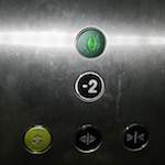
And then there’s the labeling of floors. This picture was taken at a mall just outside London and shows just two floors: “0” and “-2.”

I’ll grant you: the usage of negative floors is much more intuitive than the North American “B2,” where the user is never sure if that’s the upper of two basement floors or the lower basement level.

In this case, however, both floors were ABOVE ground so … huh? Why not make it “upper” and “lower” or “0” and “1?”

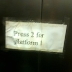
Or how about another lift I found elsewhere in Europe with handmade instructions to overcome a complete lack of empathy for the user: “Press 2 for platform 1.”

If a hotel really wants to show empathy for me, their user, and anticipate my needs: I’ve got a keycard for room 836. Why not have an RFID tag in the card that can summon the elevator and preload the floor (with the option to “undo”). There could also be an RFID tag in my work badge with the ability to preload the elevator for the floor where it knows my next meeting is located based on communications between servers. Now that would show real empathy.

I will give the elevators of the world one concession: the close door button. I seem to remember a statistic that 85% of those buttons are disabled, but they’ve been provided for impatient passengers so we feel like we have some semblance of control over our lives. I appreciate that. Other than my Fantasy Football team, I have few avenues of empowerment, so I’ll take what I can get.

As Steve has poetically illustrated above, the DfE Promoting Empathy for Users award recognizes products, services, and companies that have clearly put the best interests of their users at the fore, making empathetic design decisions on their behalf. A prime example would be the elevator design that goes the extra mile to make life easier for it’s guest, promoting empathy from the top (floor) down.

If you know of products, services, or companies that promote an empathetic vantage point of the end user, nominate them. If you think that your product, service, or company deserves DfE recognition, apply for this award right now!

Image of chihuahua and duck courtesy Shutterstock

post authorSteve Tengler

Steve Tengler
Steve Tengler is a Senior Director with the Honeywell Connected Vehicle group, where he oversees a global team of engineers, data scientists and designers working on vehicle monitoring solutions such as cybersecurity, prognostics, etc. Steve is a proven expert in the field of the connectivity and user experience with over twenty-five years of experience on some of the country's top automotive teams, such as OnStar, Nissan, Ford and Honeywell.

post authorDesign for Experience

Design for Experience

The core mission of Design For Experience (DfE) is to fuel the growth, improvement, and maturation in the fields of user-centered design, technology, research, and strategy. We do this through a number of programs, but primarily through our sponsorship of UX Magazine, which connects an audience of approximately 100,000+ people to high-quality content, information, and opportunities for professional improvement.

Tweet
Share
Post
Share
Email
Print

Related Articles

The “3-in-a-box” era is dead. In an AI-first world, hand-offs kill products — only Snowball teams that build, test, and code together will survive.

Article by Greg Nudelman
Snowball Killed the Dev-Star: Stop Handing Off, Start Succeeding in the AI-First World
  • The article calls for the “Snowball model”: cross-functional teams building, coding, and testing with real users together from day one.
  • It argues that in AI-first UX, “design is how it works” — requiring designers, PMs, and devs to collapse silos, share ownership, and even code collaboratively.
Share:Snowball Killed the Dev-Star: Stop Handing Off, Start Succeeding in the AI-First World
11 min read

AI isn’t replacing designers — it’s making them unstoppable. From personalization to prototyping, discover how AI is redefining the future of UX.

Article by Nayyer Abbas
AI in UX Design: How Artificial Intelligence is Shaping User Experiences
  • The article shows how AI enhances designers rather than replacing them.
  • It highlights AI’s role in personalization, research, prototyping, and accessibility.
  • The piece concludes that AI amplifies human creativity and drives better user experiences and business growth.
Share:AI in UX Design: How Artificial Intelligence is Shaping User Experiences
3 min read

Designing for AI goes beyond buttons and screens; it’s about building invisible connections of trust, understanding, and psychology between humans and technology.

Article by Anina Botha
Designing the Invisible between humans and technology: My Journey Blending Design and Behavioral Psychology
  • The article explores the shift from designing visible interfaces to shaping invisible psychological connections between humans and AI.
  • It emphasizes that trust, reliability, and understanding are more critical design challenges than traditional UI or UX elements.
  • The piece argues that AI design is less about predefined flows and more about building relationships grounded in psychology and human behavior.
Share:Designing the Invisible between humans and technology: My Journey Blending Design and Behavioral Psychology
4 min read

Join the UX Magazine community!

Stay informed with exclusive content on the intersection of UX, AI agents, and agentic automation—essential reading for future-focused professionals.

Hello!

You're officially a member of the UX Magazine Community.
We're excited to have you with us!

Thank you!

To begin viewing member content, please verify your email.

Tell us about you. Enroll in the course.

    This website uses cookies to ensure you get the best experience on our website. Check our privacy policy and