
These days, you can find a “best practices” article for almost anything: icons, colors, fonts, buttons, navigation, animation, alerts, gradients, and much more. While there are differences in opinions, it nevertheless appears that we have established a more or less clear framework for building a user-friendly website. Generally, as long you stick to the accepted practices, you set yourself on the right path to creating a usable product.
UX is now a requirement and is rightfully prioritized over creativity. After all, it doesn’t matter how beautiful your website is if it’s unusable. Although businesses still strive to express their brand online, they usually do so within the frames of what has already been tested and accepted.
There’s nothing wrong with that approach — in fact, it adheres to the Jakob’s Law and greatly speeds up the work. Indeed, there’s no reason to reinvent the wheel if that time can instead be invested into something more valuable.
And yet, sometimes you get to come across a purely creative website that doesn’t comply with the best practices and nevertheless, manages to create a delightful user experience. It happens rarely, which makes the occurrence even more special and memorable.
flatbreadcompany.com, a website for a local pizza restaurant, is the perfect example.
It doesn’t follow conventional patterns, which makes it a little challenging to navigate for the first time. However, once you find your way around, it’s hard not to appreciate the uniqueness of it.
Let’s explore this website in a greater detail. We will go through some common UX practices, see how they are typically applied, and then compare our findings to the Flatbread Company’s website.
Logo
It’s a widespread practice to place logo in the top left corner and link it to the homepage. This increases brand recognizability and helps users navigate around the website in case “they feel disoriented, have gone to deep into a site, or they’re ready to start a new task”.
Homepage (Oath Pizza)
As you can see from the screenshot above, Oath Pizza follows this pattern. Logo is always in the top left corner and clicking on it takes you back to the homepage.

Homepage (Flatbread Company)
In contrast, Flatbread places its logo in the bottom right corner and doesn’t use it as a homepage link. The logo is also not visually distinctive, which makes it hard to find in the first place.
(Note: I would have never spotted the logo had I not googled it. Initially, I thought that it was the flying tomato at the top. However, it’s just a button that links to the Locations page).
The logo in the bottom right corner is present only on the homepage. Once you navigate to the other areas of the website, it disappears (which might explain why it’s not a home link, after all).
Depending where you are on the website, there are a few different ways to get back home:

Menu page (Flatbread Company)
If you are on the Menu page, you can return home by clicking the large “Flatbread Company” sign in the top center.

History page (Flatbread Company)

Locations page (Flatbread Company)
Or, if you are on either History or Locations page, you can click use a navigation menu in the top left, where “Home” link is one of the options.
At first I didn’t even notice the explicit “Home” button because I was too focused on finding a way to return home implicitly, by clicking a company logo. Inability to locate a clickable logo made me feel disoriented.
Speaking of buttons, let’s move on to our next point…
Buttons
Buttons should look like buttons to help users spot interactive elements and they should remain consistent throughout the website to ensure users don’t miss any clickable items.

About page (Otto Pizza)
OTTO website follows these principles — their buttons are square, red, and they darken on hover. This consistent design makes it easy to quickly navigate the website.
We can’t say the same about Flatbread buttons. Their design varies across the website and at first glance, it’s hard to distinguish which element is clickable and which is not. Most of the buttons also don’t have a hover effect, other than a pointer cursor.
Some Flatbread buttons, for example, look like road signs:

History page (Flatbread Company)
And some look like leaves:

Locations page (Flatbread Company)
Some are one of a kind:

Yes, the garden on the bottom is also one huge (perhaps purposefully discreet?) button
And some, as seen before, are colorful flags:

Locations page — Georgetown (Flatbread Company)
While unpredictable button design sounds like a guaranteed way to annoy the user, I, on the contrary, had the opposite experience. Instead of feeling frustrated, I was captivated to figure out clickable areas of the website and discover new buttons. I have to admit though that I wasn’t in a rush and I realize that my reaction could have been way worse under different circumstances.
Menu / Navigation
Just like buttons, navigation should stay consistent throughout the website and look interactive. It should also be well-organized, placed in familiar locations, and user should always be able to tell where they are on the website.

Locations page (Oath Pizza)
Oath Pizza follows these guidelines:
- Menu is always at the top, where users expect to see it.
- Menu is located in the same spot, no matter where on the website you are.
- There’s a visual indicator to keep users aware which section of the website they are in (the color of the current section name changes to yellow).
- Menu links look interactive and change color when you hover over them.
- Link labels are understandable and familiar.
- Overall, menu is well-organized — everything you might need to access can be easily found in the main menu.
Flatbread navigation, however, is a bit disorganized.
On the homepage, we see a small main menu at the top with only three options — Home, History, and Locations:

Homepage (Flatbread Company)
Aside from the main menu, there are links for Company Store, Gift Card, Gift Card Balance and Online Ordering.
At the bottom of the page, there’s also a Job Application link, in addition to repeated Gift Card options and separate links for every location.

Homepage (Flatbread Company)
Once you navigate to one of the main menu links (in this case, Locations), navigation shifts its position to the top left corner and displays new links — Menu, Contact, Directions, and News.

However, Locations link is no longer present, which makes it impossible to visually indicate on the menu which section the user is in.
In addition, there’s a separate Mobile Oven link just a little bit below the main menu. Apart from it being difficult to spot visually, the link label is also unclear — it’s hard to tell whether “Mobile Oven” stands for “Catering”, “Online Ordering”, or perhaps, “Truck”. While it’s hard to deny that “Mobile Oven” is a cute name and surely adds to the character of the website, using it as a link label could be confusing to the user due to its ambiguous interpretation.
This isn’t the only example of unclear link labels on the website. As mentioned above, homepage has two similar sounding buttons, “Gift Card” and “Gift Card Balance”. While “Gift Card Balance” is more or less straightforward, “Gift Card” could be interpreted in a variety of ways. It becomes clear that it’s a button for buying a gift card only after you click on it. Therefore, it would make more sense to rename it to “Buy Gift Card”. We could also enhance the label for the first button by renaming it to “Check Gift Card Balance”.
This was a lot for navigation, so let’s summarize:
- While Flatbread main menu is located where users generally expect to see it, it shifts its position depending where on the website you are.
- Menu links change as you navigate around, so you can’t be certain that you always have access to all available options.
- For the most part, current section link isn’t shown on the menu, which makes it impossible to indicate user’s location via the menu. Even if the link is present (as it is the case with the Home button), there’s still no visual indicator.
- Some link labels are vague and can be interpreted differently.
- The structure of the website isn’t well-organized. There are important links that are not part of the main menu, which makes it hard to grasp the overall navigation hierarchy.
Whereas buttons, despite their unconventionality, lead to an enjoyable user experience, I can’t say the same about the menu. Whether it was structured intentionally or not, it was disorienting and made it challenging to get around.
Bonus — Locations
Obviously, not every website has a Locations page, so this one is rather specific to certain types of websites such as stores, gyms, and in our case, restaurants. While there is not much information available on designing a perfect Locations page, it’s not hard to spot some common trends.
Here are some examples from a few popular restaurants:

Locations page (Oath Pizza)
Oath Pizza has one page for all locations, which are organized in an accordion list. Clicking on a location displays info such as address, phone, hours and whether there’s online ordering, rewards, breakfast, and other features.

Locations page (OTTO Pizza)
OTTO Pizza is similar. The only difference is that instead of an accordion, there is a two-panel view — list of locations on the left and information about the selected restaurant on the right.

Locations page (Regina Pizza)

Locations page (Regina Pizza)
Unlike Oath and OTTO, Regina Pizzeria doesn’t have a separate page for all locations. Instead, the list of locations is in the main menu dropdown. Each location has an individual page, where you can find the address, phone, menus, and hours.
While the above examples may vary in their implementation of a Locations page, they aim to achieve the same goal. Their main purpose is to quickly give users information about a specific restaurant — where it’s located, ways to contact it, any features, etc.
Locations page, as we have seen before (Flatbread)
Flatbread, once again, is different. First, there’s a general Locations page as well as an individual page for each restaurant. Second, going to an individual restaurant page doesn’t display quick facts about the place right away.
Instead, there’s a unique illustration and, in many cases, a paragraph describing the selected restaurant:
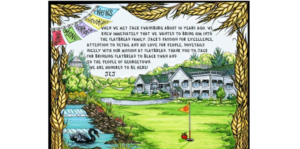
Locations page — Georgetown (Flatbread Company)
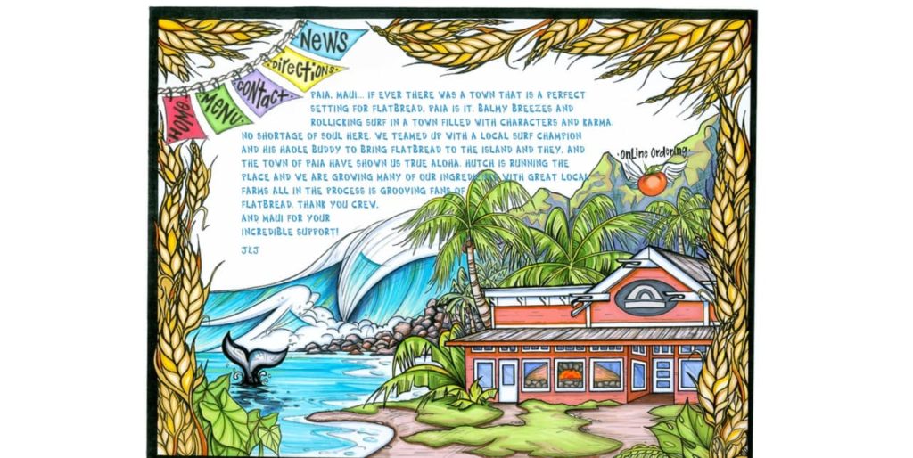
Locations page — Paia (Flatbread Company)
Pretty neat, isn’t it? I don’t think I have ever spent ~20 minutes browsing locations on a restaurant website. Like most people, I usually find info for the one I’m interested in and leave. Here, however, I was so charmed by the illustrations and descriptions that I ended up going through every single one.
I can imagine that drawing these illustrations and writing descriptions took quite a bit of energy and time. Even though they are objectively unnecessary for a functional Locations page, they are fascinating nevertheless. Nowadays, it feels like we are constantly rushing to only do the bare minimum, so it’s great to see that there are still examples out there showing us otherwise.
The purpose here is clearly different than that of the previous examples — it appears that the owners of the Flatbread Company strive to capture and pass on the atmosphere of the place, as opposed to simply writing out contact info and adding menu links.
Obviously, the contact info is still available— it just takes one extra step to get there. After you go to the specific location page, the menu in the top left corner displays “Menu”, “Contact”, “Directions”, and “News” options. (Yeah, some links don’t work and some link to the same page… We already know that the menu isn’t the best though).

Directions/Contact page — Providence (Flatbread Company)
On one hand, it could have been worth adding the general info on the first page to reduce friction. On the other hand, some friction might be beneficial because it compels the user to spend some time learning more about the place they are considering going to.
Conclusion
Best practices exist for a reason. They allow us to create usable websites faster and ensure that users will be able to accomplish their tasks with minimum effort and frustration.
For many businesses, this is enough and there’s nothing wrong about it. If all they are looking for is a reliable medium to pass information to their customers, then there’s clearly no reason to deviate from the established principles.
For some, however, a website becomes a further extension of their brand and helps them to connect with customers in a more meaningful way. Such is the case with the Flatbread Company — they risk breaking the rules in an effort to create a more human, personal connection.
And I think that they do it successfully.
Despite the fact that navigation could use some improvements, the overall experience is rather enjoyable. Their memorable website makes them stand out among hundreds of other restaurants, which is surely not an easy feat.
Thank you for taking the time to read this article! If you have a few more minutes to spare, I encourage you to browse around flatbreadcompany.com yourself as well (and then perhaps let me know what you think of it).
2/15/2020 Edit: Looks like Flatbread got a redesign! It looks pretty sweet, even though I’ll definitely miss the old one 🙂