As a regular Internet user I’ve noticed a significant increase in the presence of social networking buttons on websites. The belief appears to be that users will rejoice in your content so much they will want to share it with their friends, family members, or colleagues. Buttons, like Facebook Share and Like, Tweet, Pin, and g+, theoretically provide users with quick and seamless ways to share content at the click of a button. They also arguably help with search engine optimization, driving traffic from social media sites to your website.
But, quite frankly, depending on how these buttons are implemented, I often find them quite annoying—adding visual noise and getting in my face when I am trying to read content. This led me and a couple of my clients to ponder their value—conducting some usability testing and an online survey to find out how users most want to share. The short of it is, how users want to share content depends very much on the type of content they are sharing and their level of Internet experience.
I recently presented to about 500 people at the UX Australia in Brisbane and to the Brisbane UX & Interaction Design Meetup group. I asked both audiences to put up their hands if they would click on social networking share buttons on a range of sites including:
- A stockbroking website publicizing a share offer that you want to show to your partner.
- A travel website advertizing a holiday deal that you want to share with friends.
- An interesting UX article that you want to share with your peers.
- A fantastic new online game you have played that you want to tell your friends about.
- A really great book you have read with excellent character development (Fifty Shades of Grey).
- A funny image or joke that you found online that you want to share with your friends.
The audience responses were pretty comparable to our small online survey—the the results were validated by a show of hands from a few hundred attendees (fewer conference attendees put their hand up and admitted reading Fifty Shades of Grey).
Our research indicated that for targeted, serious, and commercial content, a large proportion of users preferred to share by copying and pasting the URL into an email as shown below in Figure 1. A few users also indicated they may click on an “Email” link within a page.
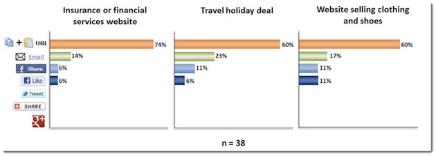
Figure 1: How users indicated they want to share targeted, serious, and commercial content
When it came to sharing knowledge and content from fun and entertaining websites, our users’ preferred method changed significantly. The use of social networking buttons such as Facebook Share* and Like increased significantly and even became the preferred method of sharing a funny picture or photo.
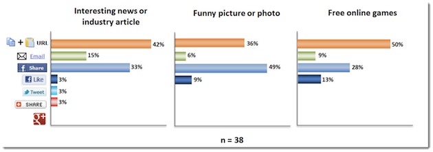
Figure 2: How users indicated they want to share knowledge, fun, and entertaining content
We also conducted usability testing for a financial services company and a retail travel agency chain—again testing users’ reactions to social networking buttons. This was primarily qualitative research, but the test results were pretty consistent with our survey results. Interestingly, eight out of twelve travel website test participants said they may click on a Facebook Like or Send button on a holiday deals page. However, when we probed further (as any good test moderator would) only four out of twelve said they had actually ever clicked on a Facebook Like or Send button on a website.
When it came to an insurance product that they wanted to share with their partner, none of the participants said they would use the social networking buttons. One user summed it up this way: “For things that will likely only be of interest to one person, I use email.” Another commented: “I would email things I definitely want people to see, and share stuff of general interest.”
But what about search engine optimization you ask? According to SEO experts (which I do not claim to be), the search engines have freely admitted that social signals are being included in their ranking algorithm. This means that, in theory, the more your content is shared via social networking sites, the higher the ranking it will receive on search engines.
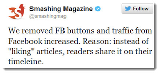
Still, the question remains: Which came first, the chicken or the egg? In his article “Do Social Signals Drive Traffic,” Dr. Pete raises the question of whether Facebook Likes drive unique pageviews, pageviews drive Likes, or if there is some mystery factor driving both Likes and unique pageviews? Regardless of the answer, I do find this recent tweet from Smashing Magazine interesting. In it, they claim that their traffic actually increased when they removed their Facebook buttons.
Here are my conclusions based on scant research data that requires much greater investigation and validation.
1) You need to balance SEO with UX. As a UX practitioner I will always give user experience more importance. If users have a good experience, they are more likely to look for a way to share the content.
2) Make it easy for all types of users to share how they want. Long URLs that wrap in emails (sometimes causing the link to break) don’t make it easy on less experienced users receiving the email. There are, of course, URL shortening tools available, but I would suggest that these are not widely known of by the average Internet user.
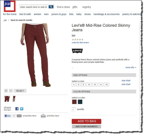
I really like the way JC Penny includes subtle sharing tools on their website below the product image. This makes it easy for users to share content how they want: through Facebook, Twitter, email, or even by using a printer.
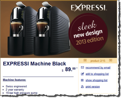
The ‘recommend by email’ link on Aldi’s product pages is another good example that allows even novice users to easily share content by generating an email form. This makes it easier for less-experienced users who may not even know how to copy and paste a URL.
3) Ensure share buttons are subtle and contextual.
- Only include share buttons on pages with content that users want to share—e.g. a specific product page. Don’t splatter them on every single page of your website.
- Related: don’t litter your whole website with heaps of social networking buttons that just clutter the page.
- Don’t include them below your H1 page heading. Give your poor users a chance to read something before they decide to share it. Shoving all the buttons in their faces is just likely to annoy them.
The social networking icons on Amazon include different options for sharing. They are subtle and out of the way, but are also clearly visible for those that might want to share.
4) Focus on great content and user experience. This quote from one of the great folks at 37 Signals is an old but good one that summarizes my thoughts:
“So think twice before badgering readers with ‘vote for me’ pleas. The hectoring is tiresome, it results in extraneous visual noise, it makes your site look cheap, and the benefits are dubious at best. Instead, focus on delivering great content. If you do, people will figure out how to spread the word just fine.”
* Note, Facebook actually launched its “Send” button in April 2011 but I included the Facebook “Share” button option in the survey conducted in mid 2012 rather than the Send button. I imagine that the result would probably be consistent if I had included the ‘Facebook Send’ option but this is worthy of further research.
Image of sharing hand courtesy Shutterstock.