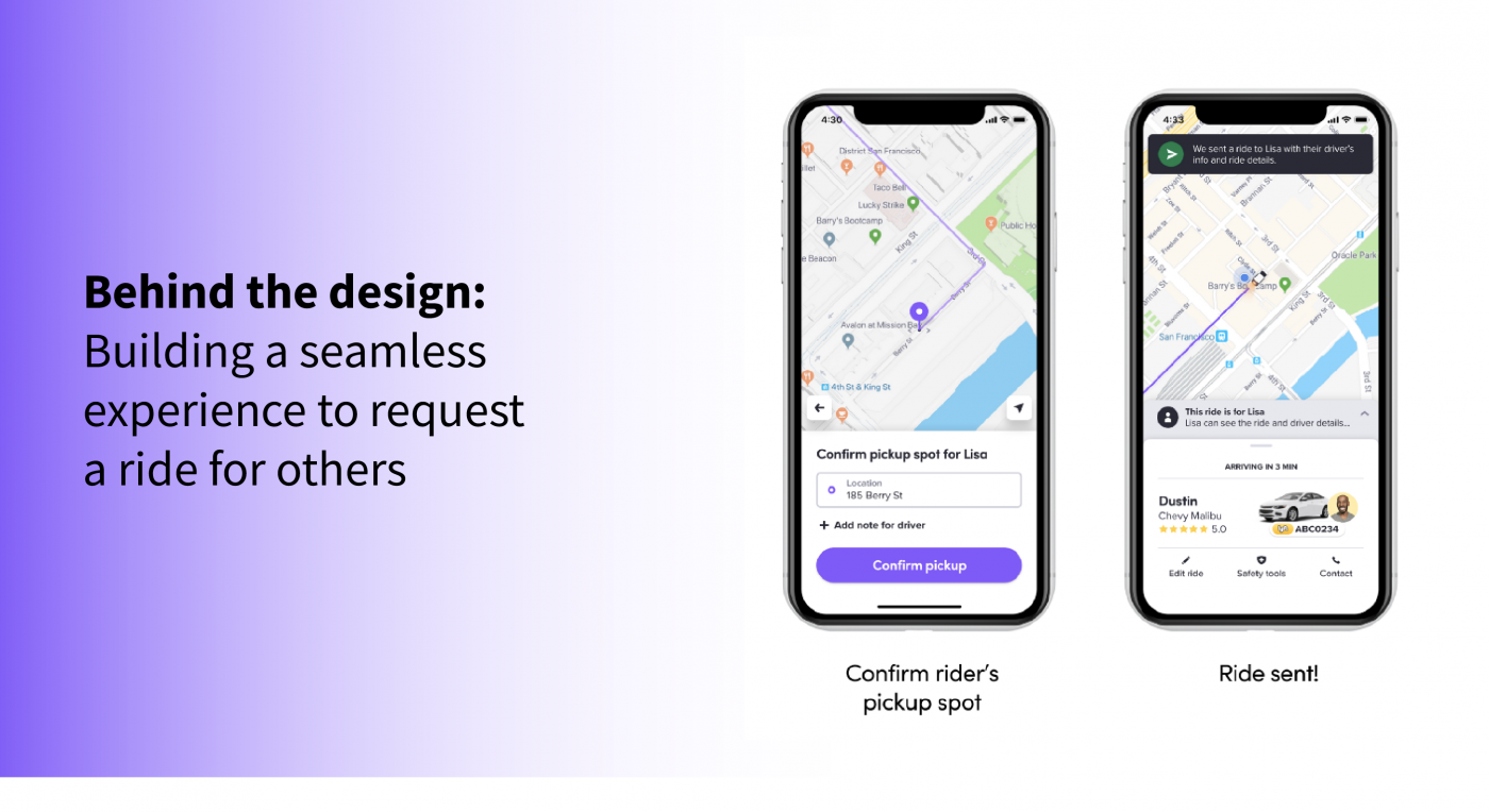
Behind the Design is a new series of articles by Design Lyft where I speak to members of the Lyft Design team who have recently launched a major project or celebrated a big milestone. I’m thrilled to kick things off by sharing my chat with Kyo Kim, lead Product Designer for our new Rider app feature that allows users to request a ride for a friend.
David: So first off, I wanted to take a moment to congratulate you on a big milestone… Happy 2nd Lyftversary!
Kyo: Thank you so much!
David: I thought we could jump into things by asking you to tell us about the area of projects you focus on for our team at Lyft?
Kyo: So I’ve been at Lyft for two years, and I’ve been working on things small to large. Rider and driver onboarding, login and authentication, and consumer and driver-facing things like profile and identity for riders and drivers — establishing the core frameworks, as well as the improvements and interactions around how both types of users represent themselves on our platform. Keeping riders and drivers safe is a key consideration across all of these projects. I’ve also done a lot of projects that prevent fraud and transaction breakage.
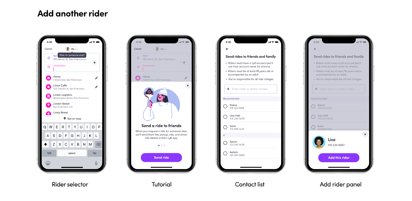
And now request a ride for a friend or others, which is what we call the ability for Lyft users to order a ride for someone else — not just the usual use case of ordering a ride for themselves. I’ve worked on it for almost 10 months.

The journey to product design
David: Before we go deep on the new request a ride for others experience, can you tell us a little bit about your journey into becoming a product designer? How did you arrive at this career?
Kyo: Before I came to the US, 10 years ago, I was in Korea doing film directing. I made some shorts, movie and commercial video and as well as I did some party planning.
David: From party planning to product design? Wow.
Kyo: I was doing the filming and party planning in Korea and I came here to learn more skills and potentially go to Hollywood and become a better director. But I found I had to study English since I didn’t study it at all prior to that time. So I went to the English school starting with things like “Hi, how are you? How was your day?” those things. And there’s like one school called Academy of Art University in front of the English school. I was curious about it as I’ve been doing art since I was six years old. So I got into the school and my student advisor recommended me to the film program. But I realized I was in the wrong major.
David: So you initially wanted to study film but encountered some roadblocks. You started to do more new media-type projects, and found you had a talent for it?
Kyo: Yeah. I started to realize that maybe this was more fun than film. Because when I was doing the film, I was so stressed. I had to think about team management, time, budget, location, but here I could sit in front of the computer and take care of my audience: the users. I think this is another way to make a good experience for an audience or “customer”. It was easy to shift my focus.
David: That’s awesome that things clicked over for you so clearly. How did you land your first internship? What was that experience like?
Kyo: I thought, I am studying this new field, maybe I should get an internship experience before I go back to Korea. I didn’t have a mentor or advisor, but I shipped some stuff out, and luckily, I got my first internship at Zillow. When I got there, it was not the experience I expected at all. I was amazed because when I was in Korea at my first internship in film, my job consisted of making coffee and copying things. And I thought that was the interns’ responsibility. I remember my first day at Zillow, I tried to make or get coffee for my manager. And she said, “You don’t have to do this. Why are you making coffee?” She was looking at me weird.
David: You had a very different perception of what the internship experience meant.
Kyo: I was shocked and confused. So I asked her, “What do you want?” and she gave me an actual project work to dig into. I remember the first project was redesigning a trash can icon — I know this is small and tiny, but I couldn’t imagine I could do that as an intern. From that moment, I built on my responsibilities, and my skills and confidence started to increase. So since then, I decided to stay in America — and followed that by working at Samsung and CapitalOne.
I still have a passion to make films someday, but I realize that’s something I can pursue on the side as my passion project.
David: It feels like your pursuit of storytelling in film has really suited you well in product design since convincing someone to get excited about a design direction is often based on the strength of the story: if the story isn’t strong, you can lose their attention. So I see it as not being this totally separate thing for you — it’s something that enhances your talents.
Kyo: Thank you!
Requesting a ride for a friend
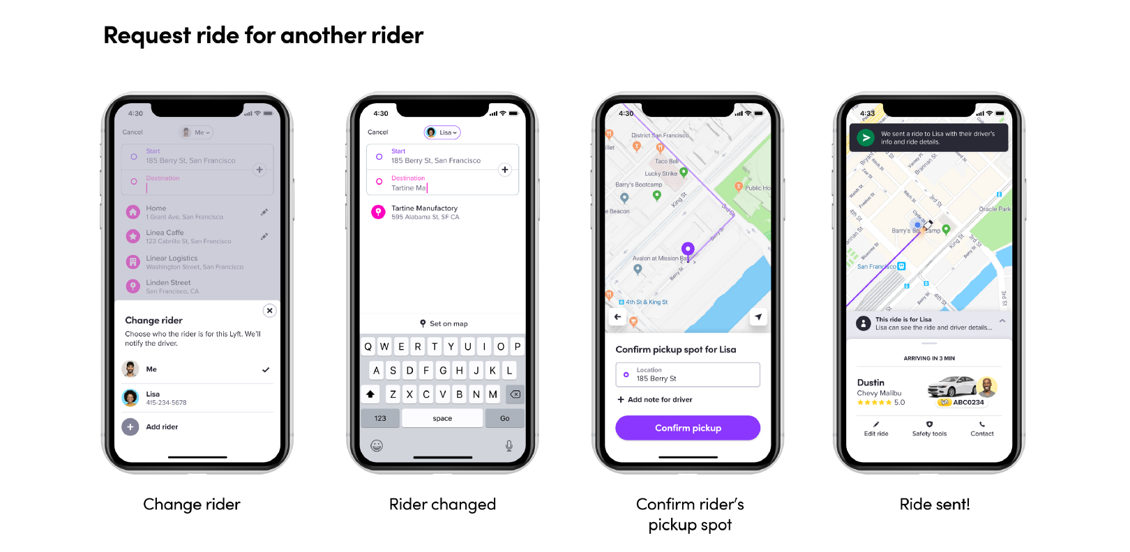
Previously, the only way to order a ride for someone else with the Lyft app was to overwrite your GPS-reported pickup location by manually editing the address and replacing it with the pickup location of the person you wanted to order a ride for. This created a scenario where drivers would go to pick up the rider — and find that photo and name of the actual person for whom the ride was ordered for didn’t match with the person getting into their car. The result? Confusion for both rider and driver. The new experience addresses this use case head-on and makes it simple and safe for people to order rides for their family and friends.
Design process: Getting started
David: Lets jump forward to Lyft, and your experience leading the design for the request a ride for a friend project. Can you tell us how you got things rolling? What user or business needs were you trying to solve for?
Kyo: The Identity team and I were doing sprint planning last year, and one of the important problems we wanted to solve was the identity confusion. We know there are many tickets related to identity confusion from both rider and driver side. We saw this as contributing to bad driver sentiment and safety. On the other side, riders could get lost in the middle of the street creating a bad safety situation for them as well.
In that situation, you can imagine this creates so many pain points. As a requestor, you have to be such a good coordinator between rider and driver. Driver is asking you about the rider’s location, driver is asking you about the rider’s location, and you have to share screenshots until the rider gets picked up safely. And the rider doesn’t have any information about the status of the ride. And they have no confidence about using their name because the driver might decline the pickup if they use their real name. So the rider has to use the name of the requestor. This is not a good experience for anyone.
So we started digging into that. How many people do this? Does it make a good or bad impact? We worked with the data scientists to figure out the amount of people impacted. And my researcher and I captured all the bad impacts: higher cancellation rates, longer pickup time, more phone calls from the driver.
David: I was shocked to learn that such a large percentage of existing rides were people ordering rides for someone else. And this was something you all discovered by looking at the data?
Kyo: Yes, we identified this based on the mismatch between the pickup location and GPS location.
David: What was your thinking in the beginning of the project with how to take the first steps into your design process?
Kyo: For me, the first thing is to make people understand the situation. As you know, this is a complex scenario happening for three users (rider, requestor, driver) in real-time and in the real-world which is always fraught with variables and surprises. Without all those moving pieces, it’s hard to build empathy for the the designs. I try to document all the context and data I know from my PM and engineering manager, and try to make the story understandable for others. Internally, I share that context along with potential solutions. I try to make people understand thru real stories of users in this situation, and I make that the key focus in the beginning. I have to do a lot of presentations.
David: You did a ton of presentations — all across the company — to make people aware of it. I call it planting the seed, and you did a bang up, sustained job of that.
Design process: Pushing through
David: Jumping forward, lets talk about the middle of the project. In many ways, I think this is the toughest phase. Because even though you’ve built awareness, interest, traction, there are so many teams you still have to collaborate with: rider, driver, safety, support and more. And where some of our projects sit more squarely in a single org vertical, this project was unique in that it’s part of the core “golden path” flow of both the rider and driver apps. Can you talk about how you maintain momentum and focus over a project effort this long and with this high volume of collaboration?
Kyo: I thought the problem and solution, initially, were simple. But as we went, I realized there were more touchpoints and steps across the golden path. I thought we had to solve for all of them at the outset. Am I setting my location in the beginning? Am I setting up the riders’ location in the beginning? I think the thing that keeps me going is the new learnings as we experiment through the process.
David: What are some of the techniques and tactics you use to socialize your work?
Kyo: I try to make a good storyline. Just like a film. If you make a two hour film, it’s easy to compress it to 1 hour, or even 1 minute, if you know what the key points are in the story to sell your idea. I try to share with the XFN partner. I try to convey the same story and same context with everyone. Whenever I meet with someone, I make it a point to spend 30-minutes with them walking them through the deck all of those key story points so they have the full-context.
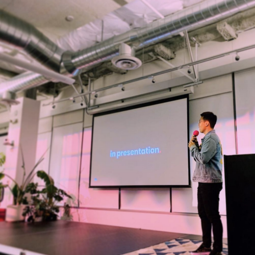
David: Another thing you do that helps is the strong structure that you have honed and perfected over time in your presentations. You refine and improve against that structure, but you’re not changing the structure from week to week. You keep the structure stable and sound.
Kyo: Thank you for noticing that! I think if the selling point is strong, I can keep refining and finding more data to support, adding more context, to make the story more delightful.
David: I also think your willingness to rehearse and practice is key. On the Thursday before your big presentation to DLT (Design Leadership Team) or ELT (Executive Leadership Team), we would do a practice “dry run”.
Kyo: I think practice is everything, and how you tell the story is important as what you’re telling. Sometimes when I’m designing the presentation, I think something is funny, but no one laughs; other times, I think something is boring, but everyone laughs. I note those reactions, and use that to enhance and refine. In filmmaking, I do the same thing, and sometimes play things back many times with an audience, note the reaction, and tweak in the editing. The goal is to make sure people enjoy the story as much as possible.
David: How did you work with research on this project?
Kyo: I think I talked to my research partner, Alison Marlin, on a daily basis. It’s a little hard to predict what research we need in the beginning, but in the middle of the process, data really helps raise new questions. If we’re seeing a negative impact in the data, I ask my researcher, “What tool or tactic can we use to gain the insight we need to take the design to the next level. Should we run a survey? Observational research?” She is very proactive, and gives me great suggestions and advice. For example, we learned that 10% of rides were happening as the Rides for Others use case, she suggested that we run a survey.
Design process: Wrapping up
David: What were some ways that design changed or evolved in the final stages of the project? I know we did an employee beta, user testing and observation. What were some things that surprised you?
Kyo: In general, I think the core design worked well for users. But one area that surprised me was the need for striking the right amount of communication between all the different parties in the experience: requestor, rider, driver. Earlier in the designs, at one point, we were sending 30 notifications including the requestor and rider sides: when the riders gets picked up, when driver is 5 minutes away, 1 minute away, and so on. Throughout the testing, I realized this was too much for them. I had to figure out what are the key moments in the journey that they need or want to know about. So we had to pare that down to the key moments that make sense. We had to narrow it down.
David: When the feature was in beta, did you have any other challenges or surprises?
Kyo: This was my first time working on such a high-profile, core flow-project, and it was exciting to get the feedback from so many people, especially during the employee beta — but I was overwhelmed! Everyday we got so much feedback! That was overwhelming in the beginning. But eventually I realized I needed to look for the trends and commonalities in the feedback, and respond to that — not at the micro-level. I also learned that you have to wait sometimes and be patient for the data to accrue to the point that you can safely make a pivot.
Mentorship, coaching, onboarding
David: You’ve really been a major force in Lyft Design, and our team specifically, in helping new designers (interns, new graduates) get up to speed, and be productive quickly. What are some of the ingredients for you in setting people up for success?
Kyo: My approach is that if the mentee is set up for success, the team and I will inherit the success. In the beginning, maybe I was wrong. I thought I had to work on a cool project always. But I realized this is not good for me, the mentee, or the company. I realized that by giving good advice and helping with the skillset push, we can grow together.
And also, in the beginning, I was struggling with the difference between mentorship and coach. We often ask them what they want to learn in the internship, and set up the right expectation. But sometimes, we don’t know. And they don’t know because they’re not embedded in the team yet. So I try to start with understanding their skillset, their expectations, their hopes and goals about where they want to be in 5 years. I think my job is about being responsive whenever they need me and available, and give them advice, or discuss anything about partnerships or presentations.
I also ask them on a daily basis and check in. “How are you? Is there anything I can do?” I think that makes the situation more natural.
David: I think it’s interesting what you’re describing here: it’s about striking a balance between having a plan for them based on the things that you know before they start (the OKRs, the long list of dream projects that we’ve discussed with product and engineering) and being flexible, organic, and empathetic, and not being afraid to evolve project focus and priority as you get to know them.
Kyo: Yes. And I think availability is the central key in the solid mentorship as well.
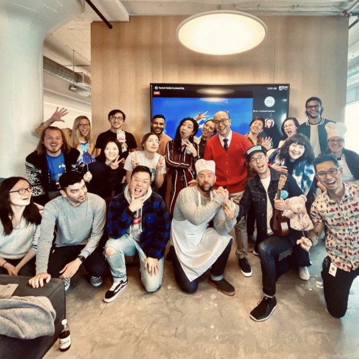
“This too shall pass”
David: One of the things that makes you so delightful to work with is the positive attitude you consistently radiate. It ripples throughout our team, our cross-functional relationships, and the design team as a whole. It also aligns with the company’s core values (“Uplifting others”). What is your secret for maintaining a positive outlook? Even now — when we’re living in such challenging times — you’ve managed to stay the course. How do you do that?
Kyo: I just try to become a good person to become a good designer. Even if I feel overwhelmed or challenged, I always think, “This too shall pass.” To be honest, when I was young, I was such a negative person –
David: I don’t believe you!

Kyo: I was so negative. My friends would tell me, “Why are you so negative? Be positive.” To be honest, being in the Korean Army was one of the hardest experiences in my life, and I needed a lot of patience to get through it. I realized that everything I’ve complained about in the past wasn’t actually a big deal. I can be with my friends whenever I want. I can eat whatever I want. How can you not feel good about that?
David: You do post a lot of food photography. I feel like every other Instagram story involves food.
Kyo: It’s true!
David: And now that I live near some good Korean BBQ, you keep triggering me to go out and eat.
Kyo: Haha, I eat a lot. I work out a lot. How happy I can walk. How happy I can eat what I want!
David: On that note, it’s almost lunch and you’ve driven me to hunger again. 🙂 Thank you for sharing your wisdom and insights with us!
Special thanks to the following people who played critical parts in building this product (in alphabetical order): Adam Cmiel, Ajay Andrews, Akshay Patil, Alex Dailida, Alice Zhang, Alison Marlin, Amanda Schroder, Amy Schultz, Andrei Stasevici, Anton Tananaev, Ashwin Raj, Bomee Park, Brad Ellis, Brady Law, Brian Ng, Byron Wilkes , Caitlin Osbahr, Carolyn Buehler, Chris Martin, Chuanxin Hu, Cooper Smith, Daniel Sumstine, David Kwan, Delphina Yuen, Denis Nekliudov, Elias Ramirez, Eunice Joung, Gabriel Lanata, Gerald Lee, Glen Robertson, Gonzalo Larralde, Harita Yenisetty, Harith Khawaja, JP Simard, Jaden Choi, Jason Bridgemohansingh, Jeff Hurray, Julio Carrettoni, Kang Lee, Kyo Kim, Lauren Frederick, Leo Jiang, Liuyin Cheng, Marcel Ortiz, Melissa Hamilton, Mengying Yang, Meredith Guo, Michael Lodick, Morgan Holland, Neil Shah, Nick Ung, Patrick Barry, Preet Anand, Rebecca Shields, Reza Mostafavi, Robin Chou, Scott Berrevoets, Sean Shi, Shawn Shaligram, Shivendra Kishor, Stephanie Carpenter, Suresh Pragada, Tak Cho, Tory Nelson, Xiang Long, Xinwei Gao, Yvonne Wong


