Flag

We stand with Ukraine and our team members from Ukraine. Here are ways you can help

Get exclusive access to thought-provoking articles, bonus podcast content, and cutting-edge whitepapers. Become a member of the UX Magazine community today!

Home ›› Business Value and ROI ›› 6 Key Questions to Guide International UX Research ›› Usability Tip: Intuitive Design Clears Confusion

Usability Tip: Intuitive Design Clears Confusion

by Tammy Guy
2 min read
Share this post on
Tweet
Share
Post
Share
Email
Print

Save

Make your processes intuitive and avoid confusing users.

One of the best ways to learn what works and what doesn’t work when it comes to UI and usability is to look at as many samples as possible and test out pages, comparing and evaluating how certain elements are being treated.

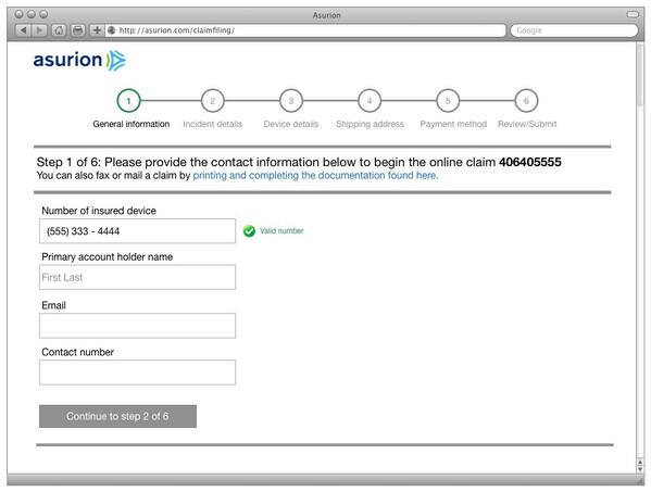
After the unfortunate dropping and breaking of my new iPhone, I was hoping for an easy process filing an insurance claim online with Asurion. Instead, I was faced with a process that was unintuitive.

The first set of general instructions directed me to write down the claim ID for future reference. However, only after reading the small copy underneath these instructions did I realize that the number was located in the “upper hand corner of this web page.”

Looking to the top right hand corner (where I would normally expect to find navigation buttons or log in/out functions) I did not see my number at first because the actual claim ID is neither centered nor aligned to the top right. Instead, it is placed as a white title far removed from the actual set of instructions. Why couldn’t they have simply given me the number next to the instruction copy?

Search field on Menu Pages

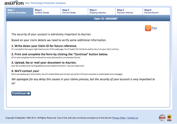
Screen shot of the first screen in the Asurion claim insurance process.

The second set of instructions said to print and complete the form by clicking the “Continue” button below. This was also confusing, as most continue buttons lead to the next step of a process not to pages for printing forms.

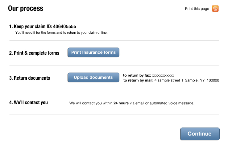
There are as many design solutions to one problem as there are designers, but all solutions need to follow some common usability conventions. Here are a couple of usability tips that tackle the issues above:

  1. Don’t hide important information. If the claim ID is important to have for future reference, place it next to the instructed copy to keep it and make it visibly heavier in weight so it stands out.
  2. Intuitive buttons help users know what to click on. A continue button should lead to the next page or step of a process. It should not be used to print forms. Intuitive language helps users identify available actions immediately without confusion.

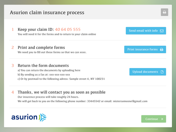
Here is my attempt at a redesign that displays a concise set of instructions with clear label buttons that will lessen the confusion and ease the claim insurance process.

Search field on Menu Pages

Try your hand at redesigning this page to make the process more clear and intuitive and share a screengrab on Twitter, Facebook, or Google+ using the hashtag #clearlyintuitive. We’ll add our favorite submissions to this article as part of a gallery. (Image of child using smartphone courtesy Shutterstock)

Search field on Menu Pages

I have a similar focus, though emphasise on points, ID & cat”—@skovpape

Search field on Menu Pages

from @mattgoodmanson

post authorTammy Guy

Tammy Guy
Tammy Guy is the founder of a visual design and usability consulting firm focused on strategic brand planning, creative direction and diffusion of user experience problems by applying design theory and usability best practices in a rapidly changing Web environment. Her firm provides consulting services (e-commerce solutions, mobile apps and tablet experience) to clients from various industries such as fashion retail, commodity retail, pharmaceutical, insurance, financial services, social networking and others. Services include product evaluation, strategy and planning, creative development and direction and usability consulting. With more then 16 years of experience, Tammy previously worked as the Creative Director at LivePerson, Inc. and was a Design Group Manager at the Hertz Corporation where she art-directed all aspects of graphical application development for all customer facing websites. In addition, Tammy has been a frequent guest speaker with the Nielsen Norman Group for the past few years, teaching visual design and usability workshops. She also teaches similar design and usability courses with General Assembly in New York City.

Tweet
Share
Post
Share
Email
Print

Related Articles

Take a hard look at the fine line between good design and digital dependency.

Article by Tushar Deshmukh
Designing for Dependence: When UX Turns Tools into Traps
  • The article reveals how digital products are no longer just tools. They’re engineered to keep you hooked, often without you realizing it.
  • It challenges designers to ask: Are we building products that serve people, or ones that quietly exploit them?
  • The piece highlights that ethical design isn’t about removing persuasion. It’s about being honest and giving users the freedom to walk away.
Share:Designing for Dependence: When UX Turns Tools into Traps
8 min read

Find out how design leaders can build a more inclusive digital world from the ground up.

Article by Pavel Bukengolts
Championing Accessibility: a Path to Inclusive Design Leadership
  • The article highlights that designing for accessibility isn’t about following rules. It’s about making sure no one gets left out of the digital world.
  • The piece explores how building accessibility from the start, with the help of AI and the right mindset, makes the result better for everybody.
Share:Championing Accessibility: a Path to Inclusive Design Leadership
4 min read

Discover how a simple comprehension test reveals if mobile content is too hard to read.

Article by Paivi Salminen
Why Reading on Mobile Is Uniquely Challenging
  • The article explains why mobile reading is harder: small screens and distractions make people miss information even when it’s there.
  • It introduces the cloze test, which removes words to measure real understanding: comprehension drops from 39% on desktop to 19% on mobile.
  • The piece argues that mobile content needs simpler language because the real question is: Does this make sense when life gets in the way?
Share:Why Reading on Mobile Is Uniquely Challenging
4 min read

Join the UX Magazine community!

Stay informed with exclusive content on the intersection of UX, AI agents, and agentic automation—essential reading for future-focused professionals.

Hello!

You're officially a member of the UX Magazine Community.
We're excited to have you with us!

Thank you!

To begin viewing member content, please verify your email.

Get Paid to Test AI Products

Earn an average of $100 per test by reviewing AI-first product experiences and sharing your feedback.

    Tell us about you. Enroll in the course.

      This website uses cookies to ensure you get the best experience on our website. Check our privacy policy and