Our experience as customers of a product or service is shaped by the various interactions that we have with it. Some of these touch points add value to customers while others do not.
For example, a doctor’s office may offer patients the ability to book appointments online, which likely adds value. However patients may find themselves waiting for an hour in the doctor’s office, clearly an instance of non-value added. From a business perspective, understanding these various touch points and their impact on customer experience offers useful insights.
The goal should be to eliminate or reduce all the non-value added activities to deliver an exceptional experience, and one tool for generating the required insights is a value stream map. Value stream maps identify and analyze each of the activities associated with customer experience holistically to determine if the activity is value added or non-value added.
Keeping with the example of a visit to the doctor, the customer might perform the following activities:
- Check-in at the front desk
- Wait to be called for further information
- Called to the front desk to validate personal and insurance information
- Wait to be called again to see the doctor
- Called to go to a room to see the doctor
- Wait for the doctor
- Speak to the doctor
Each activity in the value stream above either adds value (check-in, speak to the doctor) or subtracts value (wait to be called, wait to be called again). A value stream map is designed to capture the value of each activity and the impact it has on the customer’s experience.
With this information, you can work to reduce or remove the activities that are not adding value and improve upon activities that do—reducing costs while increasing the value of your product to customers.
Making the Map
The first iteration of the map can be created in low fidelity using sticky notes and then iteratively refined into a higher fidelity version.
Graphic by Russell Parish
Here are the steps for creating a value stream map.
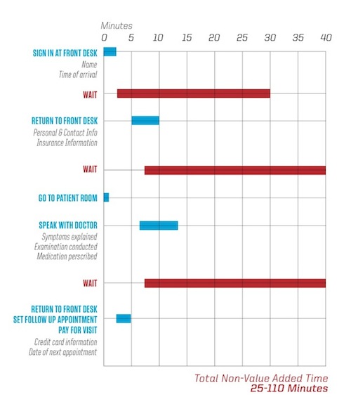
1. Map the entire experience from beginning to end from the customer’s perspective. Capture each activity and the duration of the interaction. The duration is an important metric since it allows you to compare the length of each activity. You also need to capture the duration of time between activities. For the patient, the time between activities is spent waiting.
2. Add information flows to the map—answering the question: What is needed to enable the customer to move to the next activity? For a patient in a doctor’s office to move from activity two to activity three, their personal, contact, and insurance information must be validated. Capturing information flows enables you to ask questions like: Is all of the information necessary? Can it be captured at another time?
3. Determine if an activity adds value for the customer or not. If you had an appointment to see a doctor a value added activity would be the time you spent with the doctor. A non-value added activity would be waiting for the doctor.
4. Draw timeline capturing each activity. Write in the time spent on the value added activities (seen here in blue) and non-value added activities (in this case the time spent waiting, seen in red). This will enable you to quickly differentiate the two types of activities. You can also compare value added time versus non-value added time throughout the duration of the experience.
5. Aggregate the time spent on all non-value added activities. This will give you an understanding of how much non-value added time is clogging the experience. More than likely there will be a range—looking at the map in our example, the total non-value added time is 25-110 minutes. Areas with a high range of time, like a wait of five to 30 minutes indicate bottlenecks where there are opportunities for improvement.
6. Look at the causes of non-value added time. In this case, what are the drivers that contribute to the patients waiting time? Why do patients have to wait from five to 30 minutes after they sign in at the front desk? Share the value stream map with employees to get additional information, trying to understand:
- The activity the customers are participating in
- Their pain points
- The waste in their activity
7. Determine which areas can be addressed. There may be factors such as time, budget, and employee skillsets that will influence which activities can be eliminated or changed.
Putting the “Value” in Value Stream Maps
Look to your map for incremental opportunities to improve. The goal shouldn’t be to have one “big bang” transformation but to rather create a culture of constant improvement. Once the current state has been mapped and the areas for improvement determined, it’s time to create a future state, which displays the value stream with the proposed improvements. This would show the doctor’s office with reduced or eliminated waiting time.
Value stream maps can be cyclical: capturing the current state, sketching out a future state, optimizing for incremental improvements, and tracking performance against incremental improvements creates the opportunity to use the future state map as the current state map for another round of research.
Conclusion
Value stream maps can create a culture improvement for businesses, enabling them to focus on delivering exceptional experiences to their customers. Looking for non-value added activities can reduce costs by eliminating extraneous steps in a process. It goes without saying that having a product or service that delivers as much value as possible for customers provides a real competitive advantage.
Image of idyllic Thai stream courtesty Shutterstock.