The gestalt principle of consistency has served designers well for generations. But today, the designer’s canvas is expanding to include entire ecosystems where digital channels such as web and mobile must work in harmony with physical channels, from print media to the natural environment. As our remit expands, we must revisit the principles that have made us successful in the past, and reinterpret them for the future.
The Merriam-Webster Dictionary defines consistency as the “agreement or harmony of parts or features to one another or a whole.” As designers, we have an intuitive understanding of how to achieve consistency. As we move from designing simple to increasingly complex systems, however, our intuition must be bolstered with a more systematic approach.
I suggest that consistency can be divided into two dimensions, which I call the realm of consistency and the nature of consistency. First, we’ll investigate each of these dimensions; then we can consider how a systematic approach can be applied to the design of cross-channel experiences.
The Realm of Consistency
When designing a website, we might consider whether one page is consistent with another, whether the colors of the logo match the rest of the page, and whether the typography of headings and body text is cohesive. In other words, we’re accustomed to thinking about consistency within the context of what we’re designing. As we move from crafting websites to designing far-reaching cross-channel experiences, however, we must consider consistency in a much broader and more varied context. I call this context the realm of consistency, and suggest three concentric levels in which consistency can be scoped:
- Internal consistency: Do the constituent parts of an object itself work together harmoniously?
- Local consistency: Does the object live agreeably with its neighbors in the immediate habitat?
- External consistency: Does the object work harmoniously with its allies in the wider ecosystem?
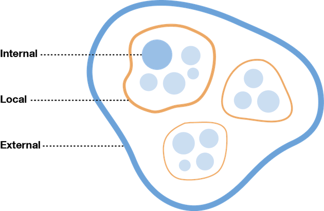
The three realms of consistency: internal, local, external.
Lets take an everyday example: your kitchen cutlery. A fork, for instance, is internally consistent if its handle and prongs fit together agreeably, and externally consistent if it is harmonious with the spoon and knife from the same set of cutlery. In addition, the fork is locally consistent if it possesses “fork-like qualities”—that is, the attributes shared amongst objects of the same class.
Here’s how we might consider the three realms of consistency for a retailer’s mobile phone app:
- Internal: Are the elements within the application consistent with one another?
- Local: Is the application consistent with other applications built for the same mobile operating system?
- External: Is the mobile application consistent with the other channels within the retailer’s ecosystem, such as their catalog, website, and store?
As we can see, these three realms provide very different contexts in which to think about consistency.
The Nature of Consistency
In addition to distinguishing between the several realms of consistency, we must also carefully identify the attribute being compared. It’s not plausible, for example, to question whether a website’s typography is consistent with the website’s organization scheme, or whether the color scheme matches the website’s functionality. This would be, as it’s said, like comparing apples and oranges. But what we can compare is the functionality, organization scheme, and colors of a website with the functionality, organization, and colors of a mobile application. This attribute of comparison is what I call the nature of consistency. There are three prominent elements:
- Function: The purpose of the object.
- Organization: How content is organized.
- Aesthetics: How the object looks and feels.
Returning to the kitchen cutlery drawer, we can see that the fork, spoon, and knife—each specialized for their own unique function of stabbing, scooping, and cutting—work together harmoniously. They may also be aesthetically consistent if the stem and terminal of their respective handles share like dimensions, curves, weighting, etc. And while organization may not be particularly applicable to cutlery, it plays a prominent role in designing coherent cross-channel experiences.
Here’s how we might think of the three natures of consistency within a cross-channel ecosystem:
- Function: The purpose of the channel. A retailer’s Android mobile app, for instance, might have the purpose of enabling users to shop when they’re away from their computers.
- Organization: The channel’s information architecture. For instance, a mobile app that uses the same organization of product categories as the retailer’s website, catalog, and physical store.
- Aesthetics: The visual style of the channel.
Now that we’re armed with a sharper, more precise understanding of consistency, it’s time to put the theory into practice.
Design Guidance
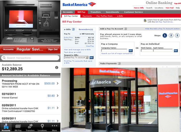
A few of Bank of America’s many channels: ATM (top left), website (top right), mobile app (bottom left), and physical branch (top right).
The deconstruction of consistency into its constituent parts allows us to bolster our commonsense understanding with a more rigorous, systematic approach. In reality, however, consistency is rife with tension as each realm competes for a greater share of each nature. When a given realm—such as a website—is designed in isolation, its function, organization, and aesthetics are oriented to its own advantage. When designing an ecosystem as a whole, however, the tension between internal, local, and external consistency must achieve a harmonious balance. While the ideal mix is unique to each situation, here are a few general guidelines:
- The function of a channel should be optimized for its own comparative advantage; in other words, what it has the potential of doing better than any other channel in the ecosystem. ATMs, for example, are efficient at helping people withdraw money from their account, but less capable of offering personalized financial advice.
- Organizational consistency should usually favor the external ecosystem over the local or internal. Using a consistent organization scheme across all channels of the ecosystem is one of the most important factors in delivering a seamless cross-channel experience. In the Bank of America example, for instance, we can see that the top three categories presented on both the website and the mobile application are accounts, bill pay, and transfers.
- Aesthetics has major implications across all three levels. Internal consistency should certainly be maintained. Yet there is again a tension between the local habitat and external ecosystem that must be carefully negotiated. While the aspects of the look and feel that involve branding should be consistent with the ecosystem, the overriding style of the user interface should match its local habitat. The Bank of America example demonstrates an effective balance of aesthetics: each channel is strongly branded through the use of color, while remaining true to the conventions of its habitat.
One method for thinking through these competing forces is to sketch a quick diagram that lists realms on one axis, and natures on the other. You can place checkmarks in the appropriate columns to capture which aspects of consistency take precedence over others for the channel in question. You can then jot down a note describing the rationale behind each priority.
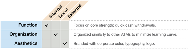
A consistency diagram.
In Summary
Achieving the optimum blend of consistency throughout an entire ecosystem is a daunting task that will take careful planning, hard work, and plenty of iteration to perfect. But the three realms—internal, local, external—and three natures—function, organization, and aesthetics—provide a useful starting point for framing this vital process.
Image of glowing fibre optics courtesy of Shutterstock