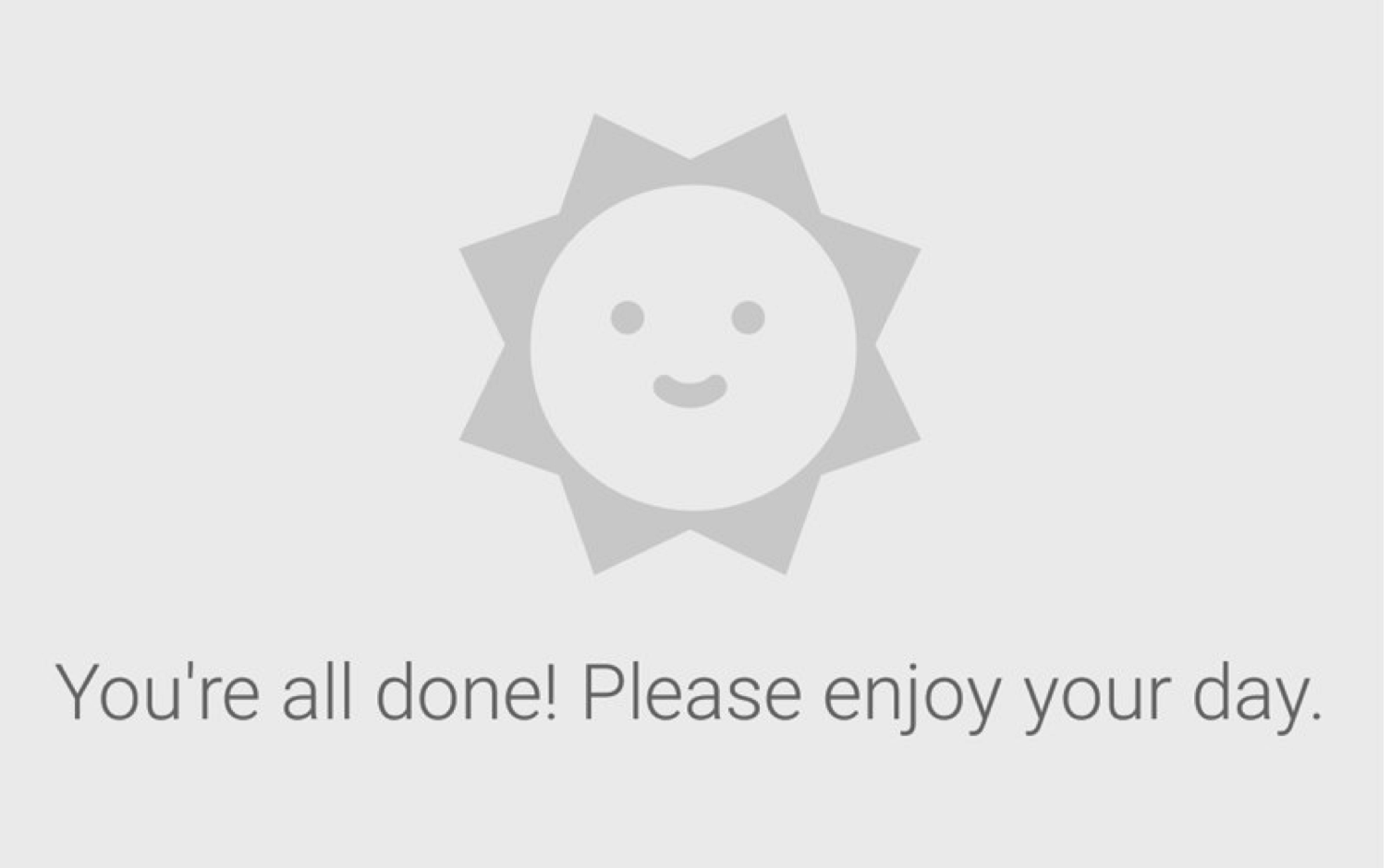
A simple experience that opened my eyes to new possibilities took the form of a 170px smiley face. After a stressful day, I attempted to clear my inbox as a last-ditch effort to ease my mind. I had just downloaded the Gmail app and decided to use it instead of the standard Apple Mail app I had been using for years. I sifted through my emails and when the last one was archived, a little smiley face sun appeared with the text, “You’re all done! Please enjoy your day.”
I couldn’t help but smile.
This was so simple and unexpected, and it made me realize that the tiniest detail, even an unnecessary one, can have a huge impact on a user. This detail surely came from designers who realized that dealing with a full inbox can be stressful. To counter this, they injected a bit of fun into the experience and rewarded me when a task was completed (clearing my inbox). They could have just showed me a blank screen or a simple “no emails” message. But they didn’t, they added that little something extra. And it made me happy.
At Slice of Lime, our motto is “Create Amazing Experiences.” On first glance, this seems relatively straightforward. But after thinking about it a bit more, I started to wonder, what makes something amazing? And how can I be better at setting my team up to create amazing experiences?
Functionality + Usability = Good Experience
The first step to creating an amazing experience is understanding what a good experience is. A good experience must serve the basic and immediate needs of your users. Understanding and applying UX research and design methodologies with care is a great way of making sure a product is functional and meets the needs of real users. As UX designers, we do a pretty good job of creating good experiences and that’s wonderful because a good user experience is key for a product’s success. In the case of the Gmail app, a good experience would be making sure the user can perform basic tasks expected of an email app: read, write, sort, send, etc.
Good Experience + Thoughtfulness = Amazing Experience
Whatever you want to call it, there is something that separates a good experience from an amazing experience. The words pleasurable and delightful are thrown around a lot these days. I’m not a huge fan of these words as they lend themselves to being interpreted as fluff; not a key element of an experience. Instead, I like to use the word thoughtfulness. Being thoughtful requires building real empathy with users and keeping the user’s emotional state in mind throughout the entire design process. The little smiley face sun was a thoughtful detail a designer added on top of a good experience.
It Doesn’t Need to Be Complicated
It’s important to point out that being thoughtful does not always take the form of humor or a clever detail — these are just obvious examples. Thoughtfulness can take any form, and is often very subtle. A great website dedicated to showing off these thoughtful details is Little Big Details. It’s often said that good design disappears because it’s not in the way. I would say that amazing design also disappears but peeks out every now and then to make someone smile.
Thoughtfulness can take any form, and is often very subtle
Why Amazing Experiences Matter
Does something as simple as a well-placed smiley face create lasting impact? Well, I’m still using the Gmail app and I look forward to seeing that smiley face every time I clear my inbox. These small but thoughtful details have a ton of power to motivate people, change behavior and turn an otherwise painful experience into an enjoyable one.
When a user has an amazing experience it means they’ll choose that product over others. They’re going to talk about it and recommend it to friends. It’s truly a win for everyone involved (product owners, designers, and users).
In addition to making a lot of business sense, striving to create an amazing experience is something that can fulfill both designers and product owners on a deeper level. It may sound simplistic, but amazing experiences make people happy and happy people make the world a better place. There are definitely exceptions to this statement, but you get the idea.
How Do We Set Ourselves Up to Create Amazing Experiences?
OK, a quick recap. An amazing experience consists of functionality, usability and thoughtfulness. As UX designers, we’re good at making things usable and functional, but what about making them thoughtful?
As designers, it’s our job to care about how people feel when they interact with something we’ve created. Having said that, being thoughtful can be really hard! We don’t always have enough time to fully understand our users before we need to boot up Photoshop. Sometimes the task at hand is so complex that our focus is completely consumed by understanding each possible scenario. Understanding edge cases and limitations does have value, but this type of thinking often lacks the human element that makes the user-centered design process so powerful.
Over the years, I’ve come across a number of simple techniques that help me remain thoughtful while tackling difficult problems. This is by no means a complete list and the suggestions below may not apply in every situation. Having said that, I hope you find a trick or two to put in your toolbox.
Plant the seed
Bring it up early! It can be difficult to shift gears in the middle of a project or sprint. Before you design or sketch anything, talk to key stakeholders about how thoughtfulness is a key design principle you’ll be focusing on.
Immerse yourself in the user’s world
In short, DO RESEARCH. Get away from the computer screen and spend some quality time with users. Don’t take everything a user says at face value. Pay attention to people’s tone and facial expressions. It helps to have more than one person involved to make sure you don’t misinterpret anything or place too much emphasis on one person’s opinion.
Use personas & “Design Personas”
There is an awesome section about creating personas for both your users and product in Aarron Walter’s book Designing for Emotion. A persona helps you understand your users and a “Design Persona” helps you understand the personality of the product you’re designing. A company’s branding plays a really large role in this. Make sure to include key stakeholders in these conversations. Learn more about “Design Personas” on Aarron’s site.
Understand the whole story
It’s easy to be so focused on what you’re designing that you forget what surrounds it. Whether you’re creating an experience map, a customer journey, or an empathy map, make sure to understand the whole story. This means looking at what comes before and after a user interacts with whatever you’re designing.
Understand how much power your decisions have
Throughout the project, take a step back and really think about how this product could help someone. Imagine the chain reaction that could be ignited by a simple, positive experience that you helped create. Designers play a major role in shaping our world. Respect that and do your part.
Imagine your Grandpa using the product
Think of someone you love who could actually use the product you’re creating. Put a picture of them on your desk and keep them in mind as you make design decisions. Don’t worry if your loved one does not perfectly match a persona. The goal is to make it personal and remind yourself that your persona represents real people.
Don’t be afraid to show some personality
Personality shows that an actual human was part of the design process. Don’t be afraid to add a bit of fun to your project; the people around you will let you know if it’s too much.
Put on your caring hat
Yeah, yeah, we all wear a bunch of hats. I hate this analogy, but it’s true. When we are working to solve complex problems we’re not always thinking about how the user is going to feel. Schedule a 15–30 minute meeting each day to review your current progress with your “caring hat” on. Ugh, I feel dirty. No more hats, I promise.
Identify key moments of feedback
One of the easiest places to be thoughtful is when you’re giving feedback to a user. Take the specific situation into consideration and give feedback as you would to a close friend, not a computer.
Identify empty corners
Most apps and websites have empty corners that can be utilized in a thoughtful way. Some common empty corners are error/success states, title bars, placeholder text, empty states, and footers. This doesn’t mean you should add something just because it’s empty. But, when you see an empty corner, ask yourself: “What could I add that may help the user?” or “What can I add here to make the user smile?”
Pat people on the back
When a user accomplishes something, acknowledge it and reward them! You can piggyback on top of their positive feelings and make the experience even more rewarding.
Simplify to let your thoughtfulness shine
When things are simple and uncluttered the thoughtful details become a more important part of the experience. There are plenty of great resources available to learn about simplifying and reducing features. A favorite book of mine is Simple and Usable Web, Mobile, and Interaction Design by Giles Colborne. If you want a quick read, check out the article “Minimizing Complexity in User Interfaces” by Tyler Tate.
Always be practicing
OK, so you’ve tried everything and you still can’t seem to find any motivation for being thoughtful. Not every project is going to be awesome and that’s OK. Instead of dragging your feet, focus on creating the best experience you can. Putting in as much effort as possible makes you more prepared to hit one out of the park when an amazing opportunity arises. Plus, when the day is over you can feel good about what you’ve done.
Conclusion
What it really boils down to is that using the right tools at the right time is important, but it’s not always enough. To better set ourselves—and others—up to create amazing experiences we need to remain thoughtful and aware throughout the entire design process. It’s important to take a step back and appreciate the opportunity we have as designers and product owners to make a positive impact on people and ultimately the world we live in.
Image of pensive orangutan courtesy Shutterstock.


