Web designers, it would seem, “ain’t afraid of no ghosts.” More specifically, they seem quite fond of the transparent buttons which bear the haunter’s namesake, and the sudden explosion of immaterial outlines across a number of high profile, aesthetic-heavy websites makes a compelling case for their use. The name of the game for this trend is aesthetic appeal. Perhaps a counterintuitive emphasis, since these buttons stunningly eye catching while simultaneously aloof. Moreover, their use usually accompanies some intense design know-how.
In the gallery below, you’ll find animations, interactive elements, full-page ambient video, luxurious hero imagery, and a defacto outline of everything you can do with negative space. Unsurprisingly, there are plenty of design firm home pages contained on display.
Before you move on to the visual buffet below, let’s examine the trend itself for a few moments. Just to see exactly how these apparitional navigation cues achieve their evocative effect.
Mashing Your Phantasmal Buttons
As much fun as it is to fall in line with herd behavior for no other reason than “everyone else is doing it,” one can’t help but speculate on the actual appeal of the bandwagon. This hot trend from 2014 is riding a wave of momentum into the new year, but the real question is: why? What is it about these ghoulish boxes that gets the blood running?
The advantages of ghost buttons are many and varied
The advantages of ghost buttons are many and varied. First, they pair well with the two most dominant trends: flatness and minimalism. Ghost buttons are great at keeping the eye focused on a webpage’s primary imagery and modestly drawing the eye elsewhere once the impact of the main graphic element takes full effect. Next, they’re powerfully versatile. These buttons can be implemented on any number of color schemes, as you’ll see when you get to the gallery. They’re also excellent space savers. Considering how important RWD has become, that’s a point that can’t be overemphasized.
Not only that, but their structure usually makes them extremely legible when juxtaposed to the contrasting colors of the background. The legibility, of course, can be obscured in a hurry with a poor font or font color choice. Nothing irritates the eye more than white text over top of a brightly lit background. That’s one of a very few pitfalls of putting a ghost button on the page. Finally, ghost buttons are easy to create using either HTML or CSS.
Now that you’ve got the basics, have a look at some of the examples.
1. Haruki Murakami
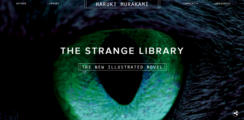
Acclaimed author Haruki Murakami immediately invokes an intriguing mystique with his website via stark white text over a close up of a predatory animal’s eye. The ominous atmosphere is complimented nicely by the ghostly navigation options that are surreptitiously animated to boot.
2. Born Group
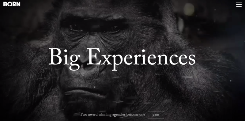
Announcing their recent merger, well to do content/commerce company, Born Group, takes advantage of the visceral reaction its users have to close up imagery of a scowling primate. This dignified beast fully illustrates their “Alpha” status as an unchallenged Silverback of IT dominance. The ghost button sits quietly below, in all likelihood praying it won’t be mauled by a 400 pound gorilla. In all seriousness though, this is a beautiful example of how a page can feature an important navigational cue without drawing attention away from its primary video imagery.
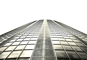
3. BigDrop
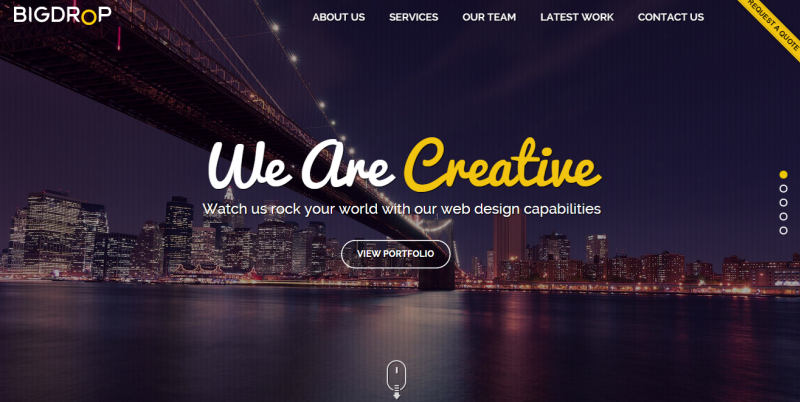
BigDrop, an award winning web design firm, prominently features a ghost CTA that pleasantly illuminates when the user hovers over, and even has another floating ghost mouse, which prompts the user to scroll. Really creative and attractive stuff that fits perfectly with the rest of the page’s color scheme and minimalist style. All of which takes a backseat in visual hierarchy to the picturesque NYC skyline, reinforcing their hometown loyalty and sophisticated appeal.
4. Bundlin
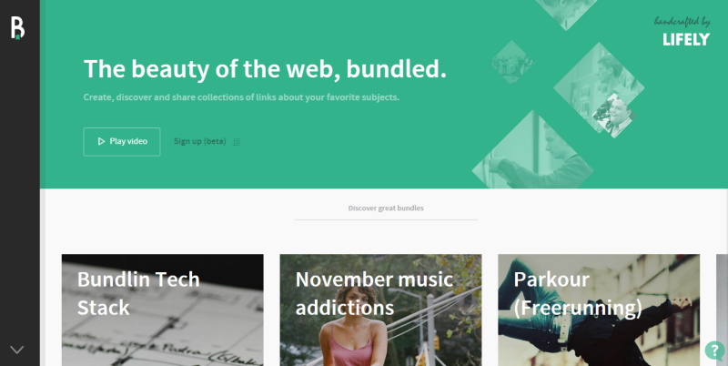
Bundlin is a Twitter-based content curation service with ghost buttons quietly interspersed throughout the site. Each button is used to capitalize a visual element as well as advertise a user flow. It’s a subdued example of the trend’s most common usage.
5. Nerisson
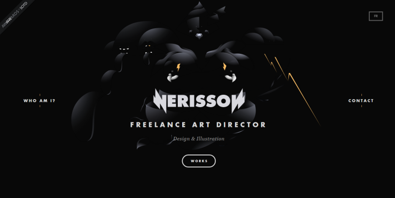
As you would expect from a freelance art director, Jimmy Raheriarisoa’s portfolio site is exceedingly stylized, and hip to the modern trend of transparent buttons. The first of which you’ll probably want to use is the English translation key at the top right. After that, feel free to look around. There are tons of interesting animations and at least one prominently featured ghost button on each page.
6. Parallax
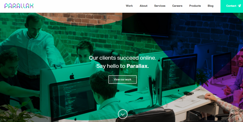
Brightly colored and expertly implemented, digital content agency, Parallax, has a web site that’s anything but subtle. In a competitive field where it’s advantageous to stand out, that’s not exactly a bad thing. The only subdued element on the page is the ghost button, which kindly eases the visual tension, and adds a sense of elegance and structure to the overall design.
7. The Distance
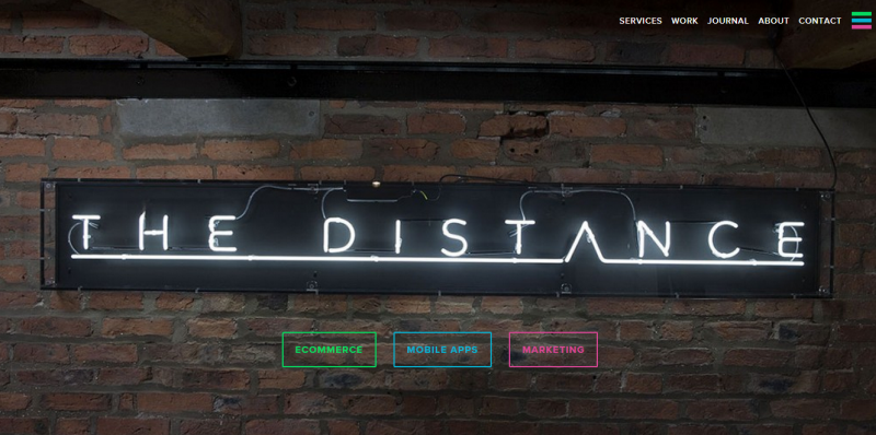
The Distance took their homepage in a decidedly different direction with a rather restrained background. The ghost buttons to add a bit of color to the offering, emphasizing the aforementioned versatility of ghost buttons. They can either relax or excite user attention as needed.
8. Powerhouse Company
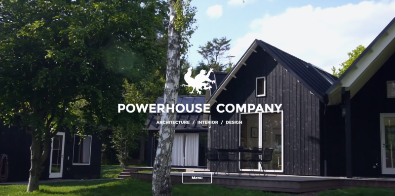
One would expect gorgeous exterior design to be the focus of an architecture firm’s website, and Powerhouse Company does not disappoint. The striking imagery put forward in the website’s ambient video is enough to make anyone stop and stare. By the time you wake from the trance, the video has looped, and you’re ready to look for an inconspicuous ghost button for further exploration of this exquisitely designed website.
9. Integra
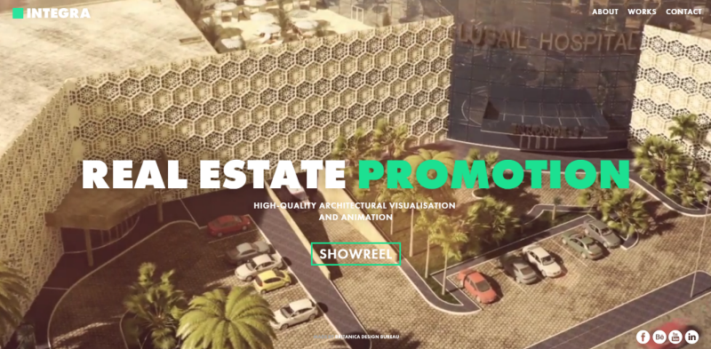
Integra’s Real Estate showcase is another visual feast infused with the popular wraithlike boxes, and a few eerie looking circles as well. The slightly less transparent social buttons still fall into the ghost category, and due to their small size and clever placement, they distract from the ambient video even less than the actual CTA.
10. Urban Influence
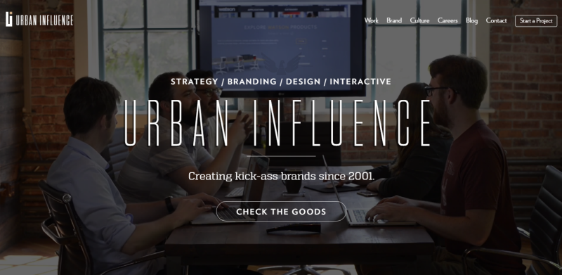
Digital branding firm, Urban Influence, makes the most liberal use of ghost buttons out of any other entry on the list, and the reason why is clear. They want you to focus on the personality that’s veritably overflowing from all of the video, snappy copy, and animations. The ability to build a unique persona is arguably the most important facet of a branding service, and a noisy CTA taking up important real estate is only going to distract from that. Thus the ghost button proves its utility once more, cuing the user in on where to go, without pulling attention away from the masterful visual storytelling that’s taking place.
11. Five Minutes
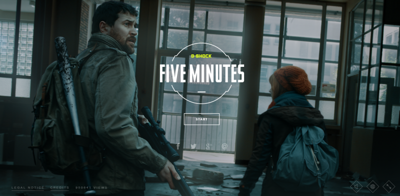
Five Minutes is an intensely immersive online zombie survival game. It relies on time sensitive, drag and drop style controls to keep your character breathing for the next few seconds. Adding to the immersion, various ghost buttons calmly illustrate your available actions with a HUD setup that’s vaguely reminiscent of films like Minority Report or Iron Man. They’re the perfect tool to give user’s easy control of their interactions, while maintaining the evolving narrative.
12. Budoucnost
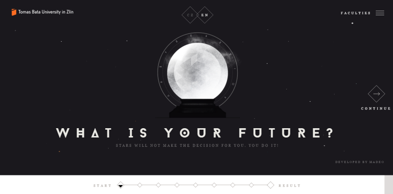
In case you were wondering if there was any corner of the internet this trend hasn’t penetrated, here’s an interactive quiz from a university in the Czech Republic. The quiz walks you through a series of questions determining whether you’re more left or right brained and then categorizes you accordingly. All the while, the ghost buttons sit in static diamond shape to help you navigate through the quiz, and to switch between English and Czech, should the need arise.
13. Panoptiqm
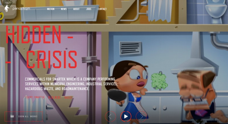
Digital motion specialists Panoptiqm have a website covered in colorful animations. The Ghost buttons work well with action-inducing, red outlines in order to encourage interaction from users—again—without interrupting the flow of ongoing ambient video.
14. Drygital
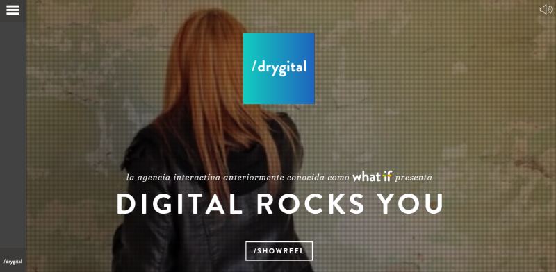
Drygital is a Spanish digital marketing agency that does something very interesting to expand on the ghost button trend. In addition to the standard ghost CTA, they’ve included an entire “ghost screen” that appears when you click on the navigation key. Their menu expands from the side to cover the rest of your screen with a violet filtered display that’s still mostly transparent. It’s an interesting indication of where this trend might be heading.
15. Rosewater Film
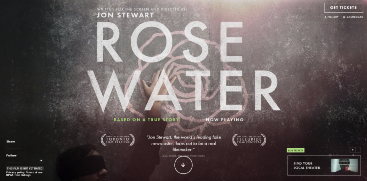
News satirist extraordinaire, Jon Stewart recently added “movie director” to his list of jobs and he’s got a stellar website to promote his newest effort, Rosewater. Along with the expected incorporeal button content, Rosewater’s website has an interesting addition: a transparent rectangle that also has an animation in one corner. Versatility proven once more.
Conclusion
As you can (sort of) see, ghost buttons have pretty well saturated the design world. They are used on any and every kind of website imaginable. The question now is whether or not it’s a lasting trend. What do you think? Will anyone still be talking about ghost buttons in 2016? Post your predictions in the comments.