Flag

We stand with Ukraine and our team members from Ukraine. Here are ways you can help

Get exclusive access to thought-provoking articles, bonus podcast content, and cutting-edge whitepapers. Become a member of the UX Magazine community today!

Home ›› Contests and Giveaways ›› What Does Design that Differentiates Look Like?

What Does Design that Differentiates Look Like?

by UX Magazine Staff
3 min read
Share this post on
Tweet
Share
Post
Share
Email
Print

Save

The winners of our How to Transform Your Ideas into Software Products giveaway share their favorite products that differentiate through design.

Last month we announced a contest with Poornima Vijayashanker to give away five copies of her new book, How to Transform Your Ideas into Software Products. To enter, we asked readers to give us their answer to the question: “What’s your favorite example of a product that differentiates based on design?” Below you can see the reponses from our winners along with comments from the author. You can also check out an excerpt about how to differentiate with design.

“I would say Facebook Messenger. The chat heads interface is brilliant, intuitive, and addictive. Paper might be better, though I can’t say as I haven’t tried it yet, because it’s not available in Europe.”—Viktor Jančík of Brno, Czech Republic

“Uber: they reinvented how to order a cab using existing technologies. I think that’s true innovation.”—Allard van Helbergen of Berlin, Germany

Wishbone 3 in 1 Bike

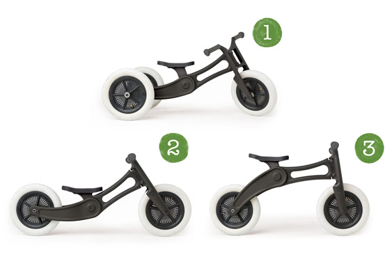
“The Wishbone 3 in 1 bike. It’s a beautifully designed kids’ bike that’s good for a child as he or she progresses from age one to five. This should be the standard for a child’s bike!”—Brian Mofford of Edmonton, Canada

For me, the design of the beer bottle (as a beer carrying product) with its neck, wins over the can a million times. Here’s why: the feeling of holding a bottle made of glass in your hand is way more beautiful than holding the metal can. Also, the long neck of the bottle establishes the perfect flow for the beer to enter your throat and it preserves the taste better.”—Kai Peters of Bielefeld, Germany

Will Odom Photobox

“My favorite example of a product that differentiates based on design is the PhotoBox by Will Odom. It is based on the Slow Technology philosophy and creates great experiences of anticipation, reflexion, and revisitation of digital pictures. An amazing object!”—Carine Lallemand of Pagny-sur-Moselle, France

Poornima Responds

It’s interesting that everyone has commented on design primarily from an experience stand point. While aesthetics do matter, each person commented on the experience the product produces.

For example, Kai mentioned the design of a beer bottle was preferable to a can both in terms of the experience of drinking and holding. While Allard loves Uber, and mentioned reinventing the process of ordering a cab—again another experience, albeit a positive one. Brian spoke about the elegance of a bike that has been designed to grow with a child.

Carine and Victor’s comments emphasized how thoughtful and in-depth a product can be, as a result it evokes a spectrum of emotions: anticipation, reflection, and admiration for the product itself in the case of Facebook Messenger. Their comments are very much aligned with what John Maeda talks about in the Laws of Simplicity, law number 7 is: “more emotions are better than less.”

Hence one aspect of differentiating based on design is to evoke emotions. The emotional response doesn’t always have to be a positive one, but products that produce no response are typically the ones that people are apathetic about. It might be a leap to say that these eventually get commoditized without data, but it seems like that could be a potential direction.

Image of beer bottle courtesy Shutterstock.

post authorUX Magazine Staff

UX Magazine Staff
UX Magazine was created to be a central, one-stop resource for everything related to user experience. Our primary goal is to provide a steady stream of current, informative, and credible information about UX and related fields to enhance the professional and creative lives of UX practitioners and those exploring the field. Our content is driven and created by an impressive roster of experienced professionals who work in all areas of UX and cover the field from diverse angles and perspectives.

Tweet
Share
Post
Share
Email
Print

Related Articles

If Mobile-First thinking has revolutionized the UX Design industry, AI-First is promising to be an even more spectacular kick in the pants.

Article by Greg Nudelman
The Rise of AI-First Products
  • The article explores how AI-powered operating systems are changing user interactions.
  • It covers AI-driven personalization, automation, and adaptive interfaces.
  • The piece discusses challenges like privacy, over-reliance on AI, and user control.
  • It highlights opportunities to design more intuitive and human-centered AI experiences.
Share:The Rise of AI-First Products
11 min read

AI is reshaping UX, and Figma may be sinking. As AI-driven systems minimize UI, traditional design roles must evolve — or risk becoming obsolete. Are you ready to adapt?

Article by Greg Nudelman
AI Is Flipping UX Upside Down: How to Keep Your UX Job, and Why Figma is a Titanic (It’s not for the Reasons You Think)
  • The article explores the fundamental shift in UX as AI-first systems minimize the role of UI, rendering traditional design tools like Figma increasingly obsolete.
  • It introduces the “Iceberg UX Model,” illustrating how modern AI-driven interfaces prioritize functionality and automation over visual design.
  • The piece argues that UX professionals must shift their focus from UI aesthetics to AI-driven user experience, emphasizing use case validation, AI model integration, and data-informed decision-making.
  • It warns that designers who remain fixated on pixel-perfect layouts risk becoming obsolete, urging them to adapt by engaging in AI-driven UX strategies.
Share:AI Is Flipping UX Upside Down: How to Keep Your UX Job, and Why Figma is a Titanic (It’s not for the Reasons You Think)
7 min read

Data visualization isn’t just about charts — it’s about telling a clear and compelling story. This article unpacks a wide spectrum of essential principles for making data easy to understand, honest, and engaging. Ready to transform complex numbers into meaningful insights?

Article by Jim Gulsen
The Ultimate Data Visualization Handbook for Designers
  • The article serves as a comprehensive guide for elevating visualization work, combining technical expertise with design principles to help designers transform raw data into meaningful insights.
  • It provides a point of reference for strategies, methods, and best practices to create more effective and impactful data visualizations.
  • The piece recommends tools and resources that design professionals can immediately implement to enhance the clarity and persuasiveness of their data storytelling.
Share:The Ultimate Data Visualization Handbook for Designers
23 min read

Join the UX Magazine community!

Stay informed with exclusive content on the intersection of UX, AI agents, and agentic automation—essential reading for future-focused professionals.

Hello!

You're officially a member of the UX Magazine Community.
We're excited to have you with us!

Thank you!

To begin viewing member content, please verify your email.

Tell us about you. Enroll in the course.

    This website uses cookies to ensure you get the best experience on our website. Check our privacy policy and