Save
One of the best ways to learn what works and what doesn’t work when it comes to UI and usability is to look at as many samples as possible, testing out pages and evaluating how certain elements are being treated.
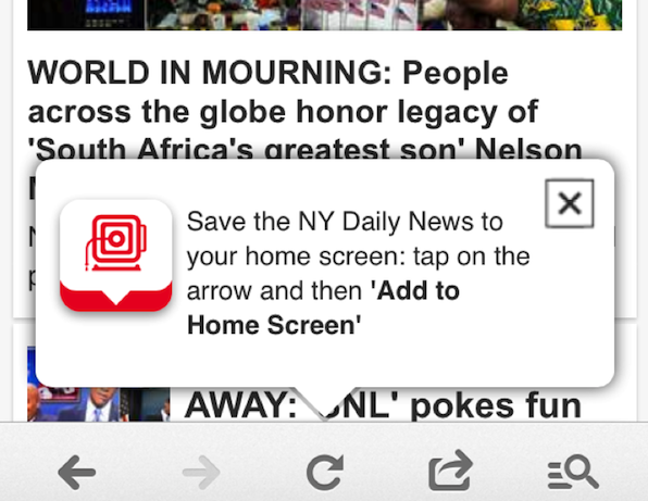
While on vacation overseas, I tried to check NYC local news and visited New York Daily News on my iPhone 5S. I immediately encountered a popup inviting me to save NY Daily News to my home screen, which I thought would be a great idea.
I went ahead and tapped the red icon on the left only to realize it was not a button. I then went ahead and read the full copy (which I admit, like most users, I didn’t do before) and found I had to tap on the arrow. I tried tapping on the down arrow of the actual popup bubble and nothing happened. I carefully tapped the down arrow of the red graphic on the left but nothing happened. I scrolled down looking for an arrow but the popup scrolled down with me. I finally X’d out (but not before taking my screen shot). When I tried to test this out again, I wasn’t able to receive the popup or the option to save to my home screen again.
This confusion scenario reinforces the following usability considerations:
- Users don’t read. Reduce instructional copy to a minimum. A simple “Add to home screen” button would have been sufficient in this case.
- Action items should appear clickable. The lack of a button in this case caused me to believe that the left icon would serve as an action item. Action items should be recognized immediately and users should not have to read instructional copy on where to click in order to do something.
- Allow easy access to previously offered options. Canceling a popup is normal user behavior as advertisements often display as popups. However, in this case, taping the X icon not only closed the popup but it removed the future opportunity of adding the New York Daily News to my home screen. Allow users to easily find functionalities offered throughout the user experience later in the browsing process.
Share your examples of calls to action that really work as well as popups gone awry on Twitter, Facebook, or Google+ using the hashtag #helpusersact. Include a brief explanation of why your example engages or fails to. We’ll add our favorite submissions to the gallery below. (Image of “click here” sign courtesy Shutterstock.)
Tammy Guy
Tammy Guy is the founder of a visual design and usability consulting firm focused on strategic brand planning, creative direction and diffusion of user experience problems by applying design theory and usability best practices in a rapidly changing Web environment. Her firm provides consulting services (e-commerce solutions, mobile apps and tablet experience) to clients from various industries such as fashion retail, commodity retail, pharmaceutical, insurance, financial services, social networking and others. Services include product evaluation, strategy and planning, creative development and direction and usability consulting.
With more then 16 years of experience, Tammy previously worked as the Creative Director at LivePerson, Inc. and was a Design Group Manager at the Hertz Corporation where she art-directed all aspects of graphical application development for all customer facing websites.
In addition, Tammy has been a frequent guest speaker with the Nielsen Norman Group for the past few years, teaching visual design and usability workshops. She also teaches similar design and usability courses with General Assembly in New York City.


