
In a recent post on LinkedIn, design system consultant Brad Frost referenced Google’s notoriously baffling 2020 changes to the icons for its popular apps, simply noting, “All this time later, I still consider this decision to be a big mistake.” Erica Hall, co-founder of Mule Design commented beneath: “Foolish consistency. I hate it.”

In 2020, Google changed the icons for their most popular apps from the ones in the top row to the ones in the bottom. Some confusion ensued.
I agree. The problem is Google’s updated icons are more consistent to a fault: You can no longer distinguish between them quickly at a scan.
I often refer to “the tyranny of consistency” (with tongue somewhat in cheek) in my UX classes. My takeaway there is this:
Consistency is an important but sometimes over-rated tool. It’s key in maintaining a coherent experience. But develop an eye to know when to break from it.
To be sure then, in principle, consistency does help contribute to maintaining cohesive user experiences, but we also need to recognize that forcing things to fit sometimes actually undermines usability. Spotting those moments and determining how best to articulate why they are a problem is its own skill.
I had been grappling with this dynamic when occasionally encountering situations with clients, where they insisted that something be changed in our designs “to be consistent,” though I knew that “consistent” in these specific situations was not congruent with “usable.” Sometimes, consistency becomes a blunt tool: Like trying to sledgehammer a square peg into a round hole.
“Consistency is a tool, not a rule.” — John Musci, Senior Content Strategist, Microsoft
I had been joking about this “tyranny of consistency” for several years. I even presented on it within a larger talk entitled “Everything Is Not Important” at SXSW in 2013. So I was much relieved to eventually discover that voices in design much greater than mine agreed.
For example, in Steve Krug’s wonderful book Don’t Make Me Think, he simply concludes that “Clarity trumps consistency.”
He explains this principle in some detail:
You often hear consistency cited as an absolute good. People win a lot of design arguments just by saying “We can’t do that. It wouldn’t be consistent.”
Consistency is always a good thing to strive for within your site or app. If your navigation is always in the same place, for instance, I don’t have to think about it or waste time looking for it. But there will be cases where things will be clearer if you make them slightly inconsistent.
That was my experience, too. When folks bring up consistency, they may deploy it as a conversation ender, as if they’ve just achieved checkmate. But, as Krug concludes, “If you can make something significantly clearer by making it slightly inconsistent, choose in favor of clarity.”
In 2018, Jared Spool wrote a whole piece on the topic, too. “Consistency in Design Is the Wrong Approach,” his title declared, which may have prompted some to catch their breath.
He explained his point, however, saying that rather than asking if something is consistent:
Instead, the right question is, “Will the user’s current knowledge help them understand how to use what I’m designing?” Current knowledge is the knowledge the user has when they approach the design. It’s the sum of all their previous experiences with relevant products and designs.
Jared used the example of Avis using asterisks on their site to highlight optional form fields instead of mandatory ones since optional fields accounted for only 10 percent of the fields on the site. This decision meant Avis labeled fields in a way that was “inconsistent” with other sites but made sense (and was consistent) in the context of their own.
As our above conversation on LinkedIn continued, too, I loved how John Musci, a Senior Content Strategist with Microsoft, summed up the topic: “Consistency is a tool, not a rule.”
A use case comes to mind.
Steve Krug used the placement of navigation as an example, and he’s right. You wouldn’t want to change the placement of your nav in different places on your site. That could prove very disorienting to visitors attempting to navigate the experience. But consider the appearance of individual nav elements: Do they all have to be consistent?
Back in the day, we used to design website dropdown menus with incredible consistency: We needed them to be the same width, maybe even the same length, and contain the same font sizes and colors. That made sense on a young(ish) web, where slow internet speeds prevented us from implementing more complex interactions and navigational styles on a site.
It’s not too uncommon to find this sort of navigation on the web. Here’s a fairly standard “old school” example from the current Nielsen Norman Group site, for example. It’s simple. It works. It’s fine.

Activated main nav dropdown on the Nielsen Norman Group website
A few years ago, however, we started to create what we then called “mega dropdowns” on websites, which could include much more helpful information, allowing visitors to a website, for example, to compare products within a navigational structure without even leaving the page they’re on. That meant that every dropdown also need not necessarily be laid out the same way, nor even have the same dimensions. That’s not to say they couldn’t still include some consistencies of font and color, etcetera, but different patterns within a navigation structure could offer different value.
Look at how these three dropdowns are laid out very differently on the Mercedes-Benz USA site, for example. The first one allows you to compare models at high level by appearance and starting price anywhere on the site without leaving the page you’re on.
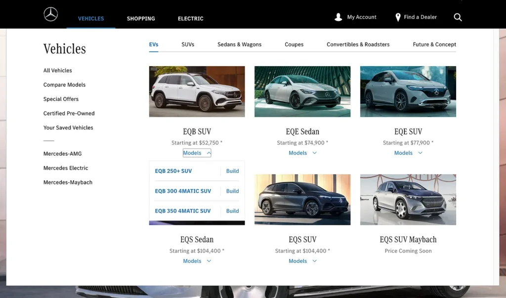
The Vehicles dropdown allows users to compare vehicles by price within a body style before continuing to Build a vehicle or review specific Models. Note the activated Models dropdown under the EQB SUV.
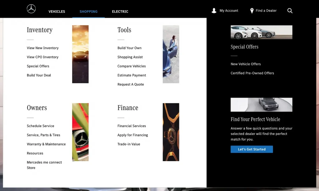
The Shopping dropdown lays out specific tools by category, which Mercedes-Benz wanted to highlight, plus promotions for special offers and to Find Your Perfect Vehicle.

The My Account dropdown differs from the other dropdowns in its dimensions, layout and background color.
Another place I’ve seen consistency become an issue is with screen templates. We should design such templates so they’re scalable to meet the needs of each screen, meaning that every module need not be used for the screen to go live. That means allowing for screens to not necessarily look precisely the same, just so they all look “consistent.” That seems pretty basic now, admittedly, but it’s still not uncommon to find websites or applications with empty modules acting as containers for missing data or coming content in order to maintain some sort of needless “consistency.” With that in mind, you certainly don’t want to labor to create potentially anemic content just to ensure every screen or element is “consistently” populated.
Remember: Tool, not rule!