Flag

We stand with Ukraine and our team members from Ukraine. Here are ways you can help

Get exclusive access to thought-provoking articles, bonus podcast content, and cutting-edge whitepapers. Become a member of the UX Magazine community today!

Home ›› Mobile Applications ›› The Power of Thoughtful Notifications in Apps: Less is More!

The Power of Thoughtful Notifications in Apps: Less is More!

by Pourav Raj
2 min read
Share this post on
Tweet
Share
Post
Share
Email
Print

Save

The evolution of notification strategies in digital apps.

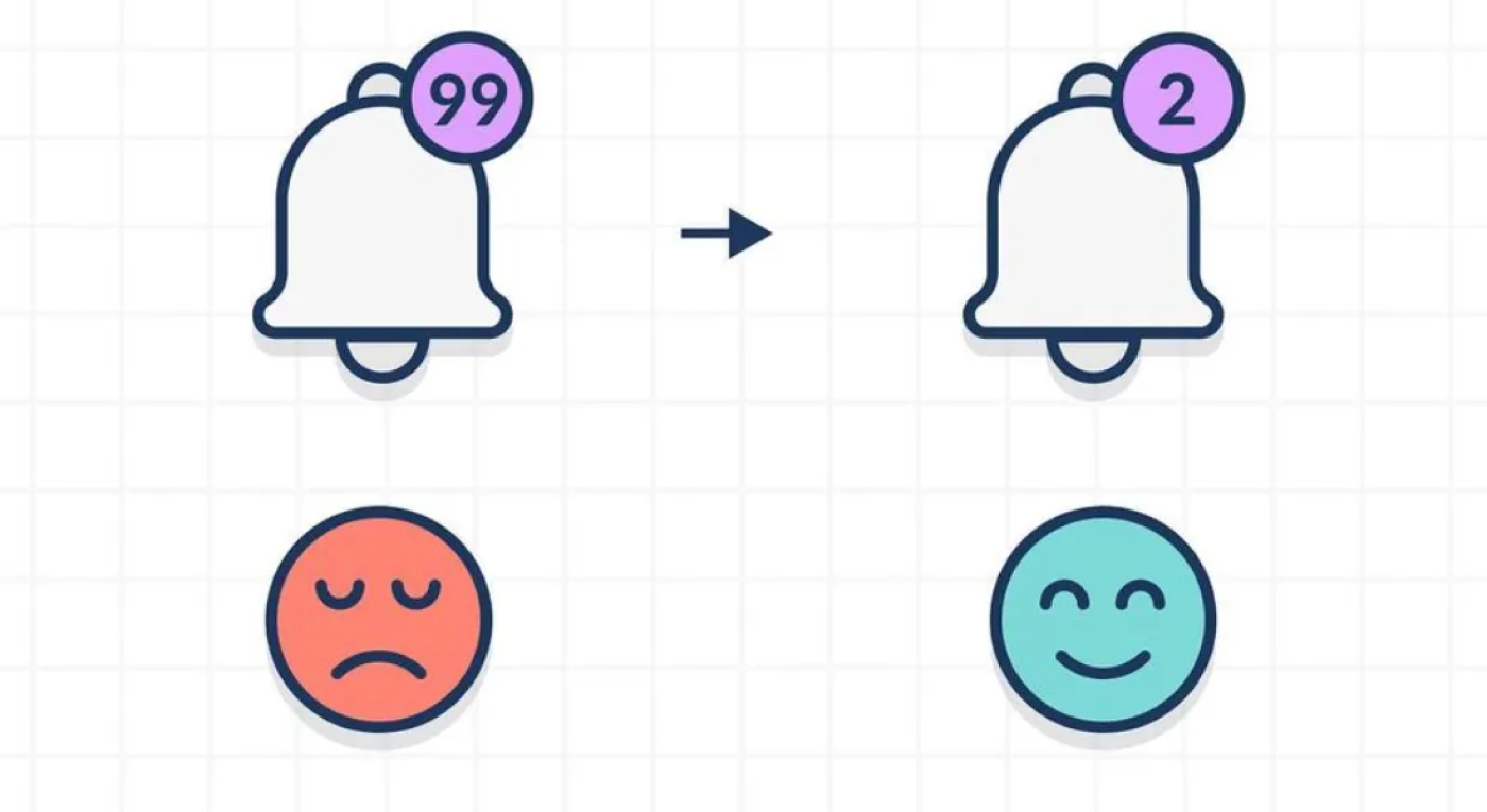
In today’s fast-paced digital world, where our smartphones seem to buzz and ping relentlessly, notifications play a crucial role in engaging users. However, have you ever considered why sometimes, less is actually more when it comes to notifications in apps?

Let’s delve into this intriguing topic by exploring how industry leaders like Meta (formerly Facebook) have redefined their notification strategies and why it matters.

Meta (formerly Facebook): A Case Study in Notification Evolution

Over the years, Meta has gone through a significant transformation in its approach to notifications. They’ve shifted from inundating users with every conceivable update to sending only the most relevant notifications. This strategic change has yielded remarkable results.

Instagram: A Subtle Notification Revolution

Another noteworthy example within the Meta family is Instagram. This platform introduced the “You’re All Caught Up” feature to signal when users have seen all recent updates. This seemingly small change has had a profound impact.

Twitter’s Journey with “Spaces”

Twitter’s exploration of live audio conversations with “Spaces” was accompanied by a notification strategy that required fine-tuning. Their receptiveness to user feedback led to significant improvements.

Why Less Notifications Can Mean More

Why should we aim for fewer notifications in our apps?

  • Enhanced User Satisfaction: Excessive notifications can lead to user annoyance and app abandonment. Thoughtfully curated notifications enhance user satisfaction.
  • Reduced User Overwhelm: Respect for users’ time and attention is paramount. Focusing on essential notifications ensures users stay engaged without feeling overwhelmed.
  • Quality Engagement: Quality over quantity leads to meaningful interactions. Users are more likely to engage with notifications that matter to them, thereby boosting retention and loyalty.

As Product Managers, striking the right balance is vital. By listening to users, understanding their preferences, and using data to refine notification strategies, we can create apps that provide a seamless, personalized experience.

In the ever-noisy digital landscape, remember that less can indeed be more. Let’s design apps that respect users’ time and attention.

post authorPourav Raj

Pourav Raj
For the past three years, I have been learning how to build products from the ground up, as well as at scale. Since my college days, I have been really into startups and have always been curious about how products are built and function. This curiosity has led me to become an inexperienced early founder, a designer, and now a Product guy.

Tweet
Share
Post
Share
Email
Print
Ideas In Brief
  • The article explores the evolution of notification strategies in digital apps, focusing on industry leaders like Meta (formerly Facebook) and their shift toward sending fewer, more relevant notifications.
  • The author underlines the significance of striking a balance in notification design and creating personalized, user-centric app experiences.

Related Articles

Unpack how dark patterns manipulate users, why they’re becoming a legal issue, and what ethical designers can do about it.

Article by Tushar Deshmukh
Dark Patterns: When Design Crosses the Line
  • The article makes a clear case: dark patterns aren’t accidents but deliberate design decisions that put business gains over people.
  • The piece reminds us that no short-term conversion bump is worth losing user trust for good.
Share:Dark Patterns: When Design Crosses the Line
7 min read

Learn about common Agile anti-patterns. Lessons from Laura Klein.

Article by Paivi Salminen
Unhappy Agile Teams Are Unhappy in Familiar Ways
  • The article makes a sharp point: struggling Agile teams love to think their problems are unique. They rarely are.
  • It breaks down the traps that quietly kill Agile teams, like endless feature shipping, siloed workflows, and design treated as an afterthought.
  • The piece reminds us that looking Agile and actually being Agile are two very different things.
Share:Unhappy Agile Teams Are Unhappy in Familiar Ways
6 min read

Take a hard look at the fine line between good design and digital dependency.

Article by Tushar Deshmukh
Designing for Dependence: When UX Turns Tools into Traps
  • The article reveals how digital products are no longer just tools. They’re engineered to keep you hooked, often without you realizing it.
  • It challenges designers to ask: Are we building products that serve people, or ones that quietly exploit them?
  • The piece highlights that ethical design isn’t about removing persuasion. It’s about being honest and giving users the freedom to walk away.
Share:Designing for Dependence: When UX Turns Tools into Traps
8 min read

Join the UX Magazine community!

Stay informed with exclusive content on the intersection of UX, AI agents, and agentic automation—essential reading for future-focused professionals.

Hello!

You're officially a member of the UX Magazine Community.
We're excited to have you with us!

Thank you!

To begin viewing member content, please verify your email.

Get Paid to Test AI Products

Earn an average of $100 per test by reviewing AI-first product experiences and sharing your feedback.

    Tell us about you. Enroll in the course.

      This website uses cookies to ensure you get the best experience on our website. Check our privacy policy and