Save
When Asana was announced, founder Dustin Moskovitz posed this problem: No matter how enthusiastically a company or team may adopt project management software (e.g. Basecamp, SharePoint, Pivotal Tracker), and no matter how purpose-built, how feature-laden it may be, the users inevitably end up resorting to such crude implements as Notepad and email. The reason, he speculated, is that those overloaded suites are just too complex, and present too much friction between the thought and the action. Notepad and email are just quicker and easier. How convenient it would be to have something as instantly usable as our perennial standbys but, you know, actually quantifiable.
Enter Asana.
Is there a stable middle ground between the structured, (read: limited) world of traditional project management software and the formless, limitless sandbox of Notepad and email? That’s what I set to find out. I was skeptical enough. Moskovitz comes from Facebook, a company not known for respecting its users. Fortunately, as it turns out, the product made the right impression on me.
Overview
Asana differs from its competition down to its DNA—its founder comes from a consumer software background and it shows. B2C idioms are conspicuously absent in the atavistic world of enterprise software. The difference is evident at first glance: Everything is intuitive and immediately usable without any sort of training, and the interface is completely devoid of those cheap-looking rough edges that characterize old school enterprise. In the old days, monolithic bureaucracies could impose dated and unpleasant software on their employees but those days are over and Asana seems to get that.
The driving force behind this ease of use is the fact that everything is one click or tab away—the entire experience feels 95% native, despite living entirely in the browser. See a piece of text? You can edit it by clicking and typing. That’s it. No separate edit screens or pop-up windows, not a single trace of markup. Everything is WYSIWYG to remove any sort of barrier between thought and action.
Asana’s information topography mapped for you… and only you!
In keeping with its free-form nature, Asana has a relatively straightforward—and extensible—information hierarchy.
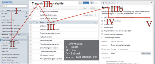
- Each user belongs to a number of workspaces (I). The default workspace comprises the user’s personal projects but the user can create new workspaces (companies, organizations, etc) or be invited to others.
- A workspace contains projects (II).
- A project is composed of tasks (III) which, in turn, contain optional subtasks (IV).
- Subtasks can contain sub-subtasks and so on (V).
That adds up to four default levels of information topography and an unlimited number more, should it become necessary. Tasks and all sub-levels can also be tagged.
The Experience
Moskovitz boasted of $10,000 stipends for each developer to create his or her own personal workstation simply to emphasize their focus on a potent product. Indeed, Asana contains miles of code poured into its user experience, and it shows. Asana piously adheres to nearly every UX idiom and best practice with abundant grab handles, subtle hover effects, and extremely contextual help cues unobtrusively sitting at the bottom of the screen. I found I was able to control practically everything with my keyboard, almost never resorting to my mouse. Power users will rejoice. After the short learning curve is mounted, the software is often a joy to use, with a paper-thin barrier between intent and action. Moskovitz may have come from Facebook, but he has thankfully taken an utterly different attitude toward the user.
While Asana scrupulously minds its Ps and Qs, it does make some missteps when tackling deeper usability issues. I mentioned the infinitely extensible information hierarchy earlier. This feature was added well after the product release and, without it, the entire course of this review would be different. However, as important an addition as it is, its deficiencies underscore a deeper problem in Asana, one not solved by following established UX guidelines.
It’s easy to get lost in the maze of subtasks
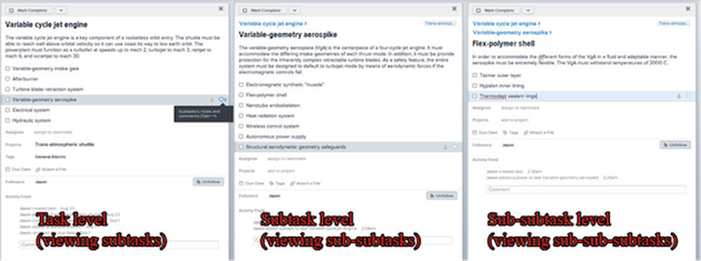
Originally the product had no subtasks. Projects were limited in complexity by this shortcoming, though tags could be pressed into duty as a sort of uncomfortable intermediate level. Now, however, the gloves are off. On a task, one can add subtasks. On a subtask, one can add sub-subtasks. Any level of complexity is possible. If you’re building an interplanetary spacecraft, you can coordinate the project on Asana. Unfortunately, navigating these subtasks is perilous. Asana’s experience takes place across three panes. The leftmost supports two levels of hierarchy (workspace and project), the center—by far the largest—supports just one (tasks), while the rightmost must support subtasks, sub-subtasks, and everything beyond. This is far from an efficient use of space, but even outside of that inefficiency there are other issues.
The hierarchy of information flows in a zig-zag manner, back-and-forth across the screen, but once it hits the task-level pane on the right, it ceases to move in two-dimensional space. Subtasks are visible, but any content in the subtasks and deeper levels of information is completely hidden. A task may have three subtasks, but there is no way of knowing how deep the rabbit hole goes, or which subtasks go the deepest and widest.
Indeed, the existence of task levels deeper than sub-task is obscure. Subtasks et al do not behave like tasks that can be viewed with a single click anywhere. On a selected subtask, a speech balloon indicates the ability to add comments and clicking it allows one to view the subtask the way they view a task, but accessing this view and subsequently lower level views is unintuitive and illogical. Meanwhile, in the middle of the screen, very little happens. The user can navigate tasks but cannot expand them in this pane; it has to happen on the right. On the right, tasks cannot be expanded tree-style either, which would go a long way toward unclogging this information traffic jam.
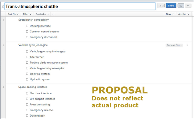
Adding a feature to collapse or expand task trees would go a long way to making transparent an opaque pile of information. Hitting the “+” button would expose another level down while the “-” button would hide the lowest visible level.
Deeper Issues
While the problem of navigating information hierarchy is not terribly hard to solve, it illustrates the issues behind the challenge that Asana has attempted to solve. The original problem statement was the tension between orthogonal approaches to project management—structured and limited versus free form and wild. Asana makes great strides forward breaking down the barriers between thought and action but it gets waylaid once the information structure of a project becomes complex.
Creating a happy middle ground inevitably entails avoiding creating an unhappy middle ground. The latter happens when you mix the weaknesses instead of the strengths of both sides. While Asana does draw from the strengths of both Notepad and project management software, it occasionally draws from the weaknesses of both. Even though the software trades on its free-form nature, its three panes become a prison. The center and right panes, where most of the action happens, cannot be resized so if the action starts to center around the subtasks at the right, there’s no way to make that section larger. Meanwhile, the function of the center pane is so limited and the function of the right so counterintuitive that the free-form data exploration is stymied.
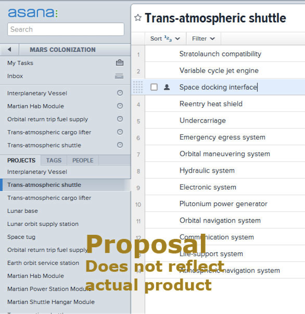
Conversely, Asana is equally hobbled by some of its misguided efforts to come across as less structured. The bland grey workspace punctuated by sparse flourishes of blue certainly conveys Moskovitz’s vision of Notepad-like neutrality, but it’s misleading. In the leftmost pane, recently-accessed projects and tags are not strongly separated visually from the complete list of projects. Colors are not utilized to correlate one pane to another. And in light of the fact that the program is not always as free as it would seem, the implicit neutrality of the color(less) scheme could cause cognitive dissonance to a user who wonders why they don’t feel as unencumbered as they should.
Even a subtle change like breaking a hole in the wall between the left and center panes goes a long way toward correlating linked elements.
The Takeaway
As of 2012, the general trend of web applications—possibly a side effect of the “lean” obsession—has been to reduce them to stultifying one-trick-ponies, completely idiomatically removed from the absolute freedom of the old school email and text editors we know and love. Facebook is attempting to shepherd its users away from open-ended email into their walled garden where the tenor of communication is seemingly dictated by Zuckerberg’s whims. In the world of UX, the potent and equally open-ended Adobe Illustrator is besieged by toys like Balsamiq, Axure, Mockingbird, and Omnigraffle. Everything appears to be moving in one direction—therefore it is amazing to see such trend-defiance from an ex-Facebooker.
If we ever want to see a return to the user-empowering sandbox tools of the good old days, current tools will have to amalgamate those timeless strengths with the advances of the last decade. This means frictionless inter-platform experiences, pervasively social workflow, and nonexistent thought-action gap. It takes a deft UX touch to establish a stable middle ground between the anarchy and totalitarianism, but in doing so, Asana could collapse the entire productivity category.
Given Asana’s continual improvement we can expect its problems to be solved sooner than later. But for those looking for a lesson here, it’s this: if you’re going to ride up the middle between two genres, you’re playing a dangerous game. Be sure to pull the best of both worlds and not the worst. With Asana that means not imprisoning users in three improperly utilized panes and using graphical cues honestly to convey freedom where it exists and structure where it exists in the form of constraints and affordances.
The other takeaway is that Asana is probably the best project management software out there, despite its shortcomings. Use whichever takeaway suits you.
Jason Gerard Clauss
Jason founded Clauss Concept, a UX and information visualization design consultancy, in 2011. Jason has previously designed UX for tech startups, and created historical archaeological and topographical maps for Harvard and University of California Press. Clauss Concept has worked with small startups, established web brands, and Microsoft vendors to design user interfaces, data dashboards, and analytic reports.


