Save
“If the Starbucks secret is a smile when you get your latte, [Netflix’s secret] is that the Web site adapts to the individual’s taste.”
– Reed Hastings
If there’s a company that’s synonymous with seamless customer experience, it’s Netflix. It has become the defacto entertainment source for many. So much so that 15% of the world’s web traffic goes to Netflix.
But when your experience is industry-leading, how do you evolve it without disappointing customers?
The answer lies in experimentation, built on proven psychological principles.
And because Netflix is a subscription service, you can quickly discover what’s working. Just observe how many customers cancel their service in response to your experiment and optimize from there.
3 psychological principles that Netflix uses to perfect their customer experience
1. The Reciprocity Principle
Reciprocity is a social norm of responding to a positive action with another positive action. It’s why you feel indebted when someone does you a favor.
Made famous by Robert Cialdini in his book “Influence: The Psychology of Persuasion,” Reciprocity can be summed by the saying, “You‘ve got to give to get.”
How does Netflix apply the Reciprocity Principle?
Netflix asked their customer base, “ What one thing would you like to know more about before signing up for Netflix”? The most popular answer (46% of responses) was “knowing all of the movies and TV shows available.”
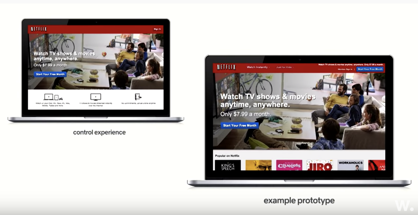
In response, Netflix experimented with showing customers available content on the home page. But their experiment revealed something interesting. Showing customers too much of the content was distracting. Many of them browsed but never signed up.
Failed Experiment: Let customers browse Netflix’s complete catalog
Source: Netflix via awwwards. on YouTube
So Netflix redesigned their experiment. Designers still used the Reciprocity Principle, but this time they used an image that hinted at an extensive catalog. But they didn’t let customers browse the whole thing.
Giving people a sneak peek — but not the total view — made customers more likely to sign up for a free streaming trial.
Winning Experiment: Give customers a sneak peek of the content

Source: Netflix via NirandFar.com
2. Cocktail Party Effect

Photo by Scott Warman on Unsplash
The Cocktail Party Effect states that people like to focus on information that’s relevant to them. But the Cocktail Party Effect also proves that if we go deeper, relevant content can drive incredible results.
In a recent study, Accenture found three personalization tactics that have a direct effect on buying behavior:
- Know my name: 56% of customers would rather buy from a retailer that recognizes them by name.
- Know my past: 65% of customers prefer to buy from a retailer who “knows their purchase history.”
- Know what I want: 58% of customers prefer to buy from a retailer that recommends options based on their past purchases.
How to apply the Cocktail Party Effect to your experience
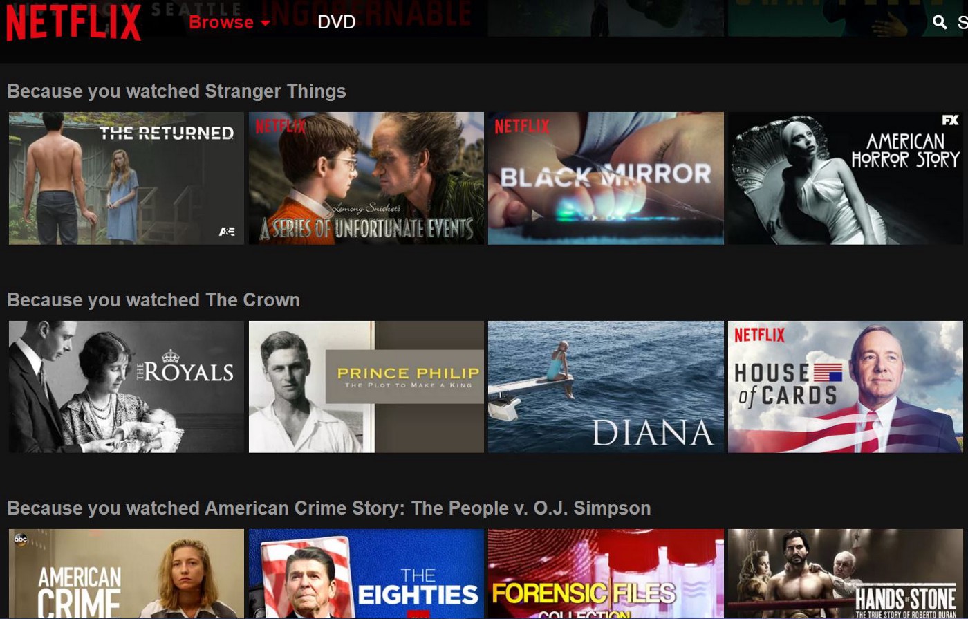
Netflix describes itself as “customer-obsessed” and strives to deliver a totally personalized experience. Their “Because you watched…” category is a prime example of this philosophy in action.
More than 80% of Netflix shows customers watched in the last two years have been as a direct result of Netflix’s recommendation engine. Not someone searching for a specific piece of content.
3. Idleness aversion
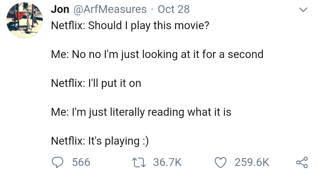
Source: ArfMeasures on Twitter
Recent studies into psychology, happiness, and customer experience have uncovered a principle called “Idleness Aversion.” It states that people are happier when they are busier, even if they’re forced to be busy.
How to apply Idleness Aversion to your experience
To keep people busy, give them information to engage with — animation, gamification, and visuals are ideal.
Netflix applies Idleness Aversion in an interesting way. Their experience forces you to watch trailers that auto-play when you dwell on the title.
This feature is a source of frustration for many customers, but the benefits of Idleness Aversion have clearly outweighed the costs for Netflix.
The bottom line
Source: ArfMeasures on Twitter
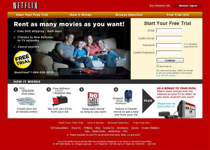
In the past decade, the Netflix site has undergone an incredible transformation. These changes and optimization were made possible because of a design culture built on the principles of “test and learn.”
Navin Iyengar, Lead Product Designer, described the Netflix testing philosophy this way (source):
A lot of the UX ideas we have are A/B tested, so we can understand what effect they have on member acquisition or satisfaction around the world.
The results of those experiments help keep us focused on the most important things to work on.
At the end of the day, we believe A/B testing yields the most reliable information for us to understand what people want out of our service.
It’s clear that a culture of experimentation is critical for psychological principles to be tested and optimized.
There’s no magic button you can press to make your brand experiment-driven. It’s a tough process that requires designers to work closely with marketing, product, IT, operations, and other digital teams.
But, if implemented correctly, the potential upside is huge. So instead of asking if you should focus on testing, the better question is, “How can we prioritize it?”
Jennifer Clinehens
I’m an evidence-based marketer who combines art and science to create impactful customer relationships with brands. Writing where decisions, design, and behavioral science meet. Author, CX That Sings and Choice Hacking.


