The UX community spent much of last year talking about error pages, reducing the form lengths, optimizing performance, etc. All valid points to improve user experience, yes, but is that all?
Of course not.
This year, let’s take a look at how to really optimize web content and web design for a better user experience and consequently, conversion rates.
1. Making Content Talk
Just because we are a generation of skimmers does not mean that website content ought to be disregarded or used as ‘filler’ for the rest of the design.
Problem:
Here’s a quick quiz. Identify the service type which lets you “Credibly optimize e-business best practices”.
Credit for the phrase goes to Corporate B.S. Generator.
Continuous testing is integral to better UX
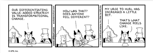
This is an extremely common mistake in B2B websites: Amateur marketers tend to believe that by using corporate jargon in their copy, they are presenting themselves as “professionals” in their field. There are three things wrong with that approach, namely, irrelevance, obfuscation, and pretentiousness. Let me tell you a story…
Example: A man has been shot in the chest on a sidewalk. His friend is panicking and feverishly looking for help while trying to staunch the bleeding at the same time.
You arrive on the scene, and say, “I got this.”
The friend: “Oh thank God! Are you a doctor!!? Do you know how to operate on gunshot wounds?”
You: “I am an amazing person. I am extremely smart and handsome, as you can see. Let me handle the gunshot wound.”
The friend: “Have you… tell me you have operated on gunshot wounds before! Just…oh GOD call an ambulance!”
You say: “But I told you! I am an amazing person. I am extremely smart and handsome. I am truly capable of handling the gunshot wound, believe me!”
The friend: “I don’t care, you idiot! I need a doctor or someone who knows what he’s doing! Now get out of my face before I break it!!”
You: 🙁
Replace “The Friend” with your visitor and the obnoxious person with yourself.
That’s what obfuscation feels like to professionals: Insignificant drivel filled with corporate jargon that provides no actual information.
Tip:
Here are some tips from Jakob Nielsen (slightly modified) that you can use to test content readability and relevance on your own:
- Write down the taglines for your website and three strongest competitors (without mentioning the company names). Look at them objectively and see if you can tell which company does what. Repeat this with other employees in your own company. Can they tell which tagline is yours?
- Jot down the phrases you are using in yourmain copy to describe your product/service and write their antonyms next to them. (“Flexible – Inflexible”, “Cost-effective – Worthless”, etc.). Would any company ever use phrases in the antonym list about themselves?
If you answered “no” to one or both of the above questions, you need to fire your copywriter(s) pronto and rewrite the content.
Only this time, answer one question every visitor will ask: What’s in it for me? Remember:
- Clearly state WHAT you do and WHY the visitor should care in the heading and subheading.
- Brevity is your friend. Be concise and specific, especially in bullets and headers.
- Don’t use superlatives unless you can back them up with evidence (“most cost-effective” (Are you the cheapest? Give a price comparison), “latest technologies” (How do I know? Show me the videos), “Highest-quality deliverables” (Highest compared to what, exactly?) etc…)
- Stay consistent: Keep your message and tone consistent across various marketing channels, online (blog, newsletters, advertisements, social media, etc.), as well as on other media.
- Use the F-pattern to write compelling copy and pay special attention to the content you’ll put in ‘red’ areas.
Source: Nielsen Norman Group
Design
2. Love at First Sight
Problem:
It takes less than 50 milliseconds for a user to decide whether they want to stick around your site or not.
Tip:
After thorough research on aesthetic judgments, Javier Bargas-Avila, Senior User Experience Researcher at YouTube UX Research, found that “users strongly prefer website designs that look both simple (low visual complexity) and familiar (high prototypicality).”
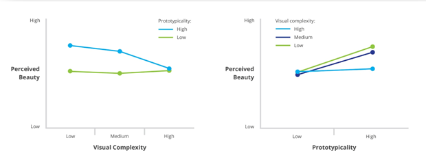
Source: Google Research Blog
This means that designs which look like they are difficult to wade through are perceived as less beautiful. Designers’ first priority is to ensure that the design enforces simplicity (ease-of-use) and familiarity (similarity with other designs). It is basic human nature: we are likely to pick familiar things over new ones. It’s called confirmation bias.
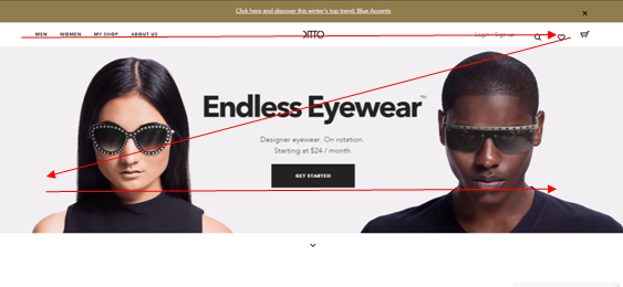
Essentially, as long as your design is easy-to-use and likable, you reduce the risk of distracting your visitors with unfamiliar (“alien”) clutter and improve their experience with cleanliness. Take a look at how Ditto follows the well-used Z-pattern on their home page:
3. Grab and Hold Attention
Problem:
Once you have put the users at ease with a simple and familiar looking design, you can then bring out the attention-grabbing design. And it starts with placement of elements.
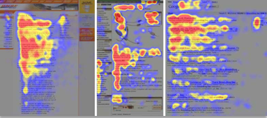
There are confirming that users spend most of their time looking at the immediately visible part of the screen:
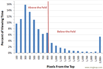
Yes, the fold exists and still applies to all device dimensions. The question is how best to use this valuable page real estate.
Tip:
Remember the purpose: your above-the-fold design needs to encourage scrolling.
Users take an extra action (like clicking a button, and yes, even scrolling) when they have a reason to do so. Since you cannot overload your visitors with information by putting everything above the fold, you need to entice users to scroll down.
- Grab attention (“Show”) with elements like large, high quality, relevant images. Write a brief, compelling intro.
What does “Show, don’t tell” mean? It’s a storytelling device that keeps users interested, used popularly in movies and literature alike.
*Disclaimer: Avengers: The Age of Ultron spoiler alert.
Recall the first 20 minutes of the movie, when Tony Stark is talking to Dr. Banner about Loki’s Scepter. They compare the Scepter’s core to code. And to help audience visualize this, they “show” J.A.R.V.I.S’s structure and Ultron’s side-by-side.

That’s how “showing” works. The “telling” comes after that as Dr. Banner and Tony Stark continue to discuss the implications.
End Spoiler.
That’s what it means to show and tell. The Above-the-fold space needs to “Show” (spark interest), and the rest of the page needs to “Tell” (quench curiosity).
See the rest of the page from Ditto:
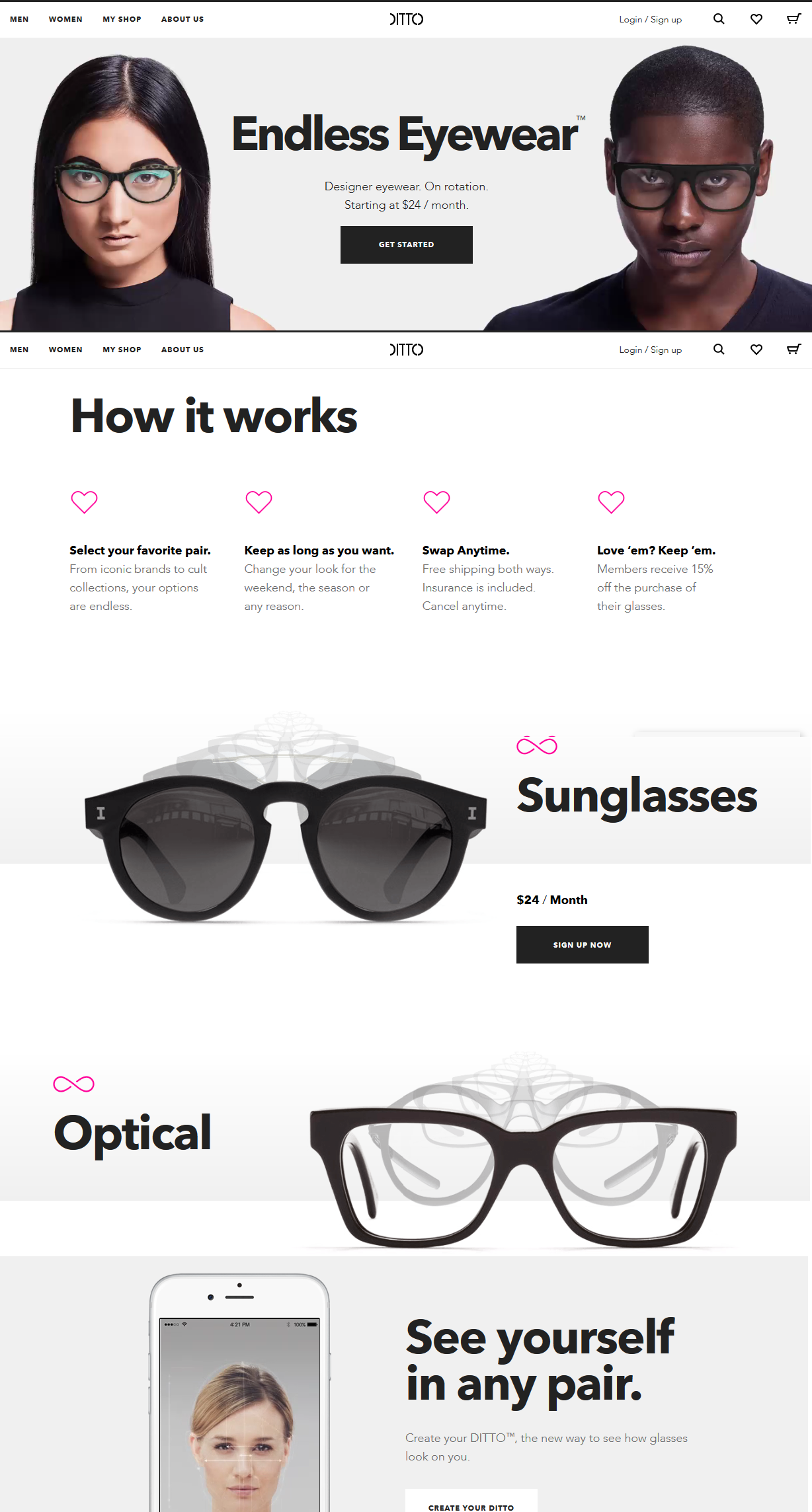
Large images and brilliant animations promote an offer on Ditto’s homepage (“Endless Eyewear”)
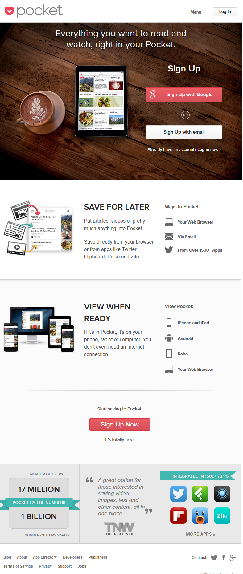
Another example, from Pocket:
This helps users stay interested in your content.
4. Social Proof and Trust
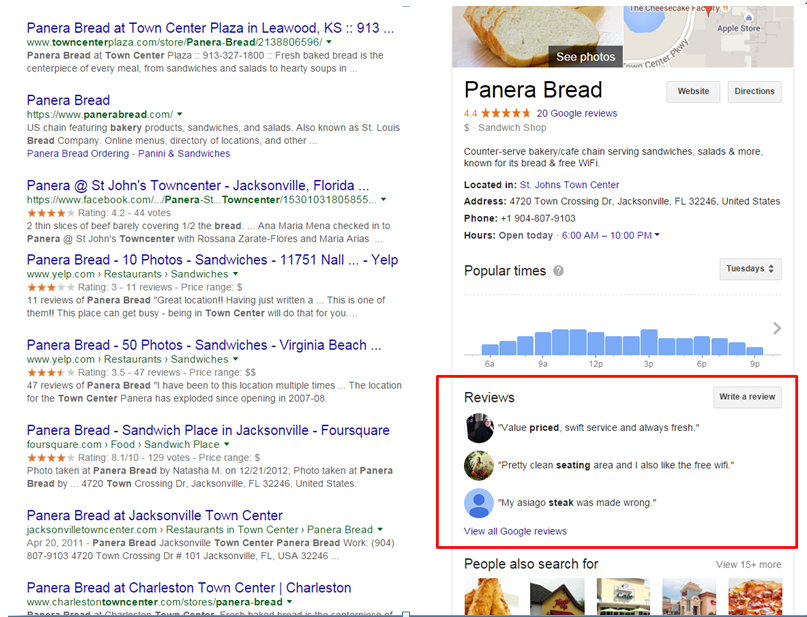
Online reviews/testimonials are trusted. Even the ones that aren’t “5 star recommendations” will help you gain trust.
Problem:
Businesses that are small and/or relatively unheard of tend to use sketchy-looking testimonials and unsatisfactory social counts in an attempt to show themselves as “authentic.” This can really hurt conversion rates.
Tip:
While over 79% people trust online reviews almost as much as personal recommendations, the key thing to remember is review authenticity.
Your prospects are more likely to trust reviews that you received on your Facebook (especially if you’re a B2C provider), LinkedIn (more suitable for B2B interactions), Twitter, Google+, or other review sites (Yelp, YouTube, niche (industry-specific) directories, etc.)
Link back to these reviews or embed them in your testimonial page to amp up your credentials and reduce anxiety.
You can set up Google Alerts, Social Mention and other services with relevant keywords (company name, location, industry, etc.) to get automatic email alerts whenever the bots come across them after searching through the whole web.
Also, keep in mind that:
- More ≠ Better. Just a handful of authentic reviews are enough to help your cred.
- Good reviews are stories written by customers. Customers will write about their experience working with you (or using your product/service) and what they got in return.
- Bad reviews (on Facebook, Twitter, Google, etc.) are not necessarily a bad thing: Don’t fret if you got a handful of bad reviews. You are not perfect and you can’t please everybody. Instead of immediately removing them, you should respond in time and offer reparations to the user. This way you can turn the whole incident to reflect positively on you.
- Stop rounding up: Look truthful about your visitor/customer count by adding a counter which updates in real-time.

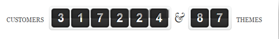
Source: WPMUDEV and Elegant Themes
5. Leveraging Mobile
Marketers realize that a large portion of their audience is now on mobile and are now using responsive websites and apps to reach them.
Problem:
The data show that despite comparable numbers of users, those on desktop are more likely to make purchases (aka convert) than those on mobile devices.
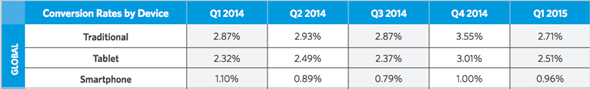
Source: Smart Insight
So, from a conversion standpoint, is it lucrative to invest time and resources in optimizing mobile UX?
Tip:
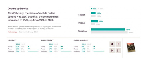
Yes, but it’s tricky. Make sure you research your target audience’s device preferences well.
Most people still have a mental block when it comes to making purchases or payments on mobile. The device itself poses a restriction over form fields and how much data you can show without killing legibility and usability. Another factor to consider is how your users are spending the time on mobile…
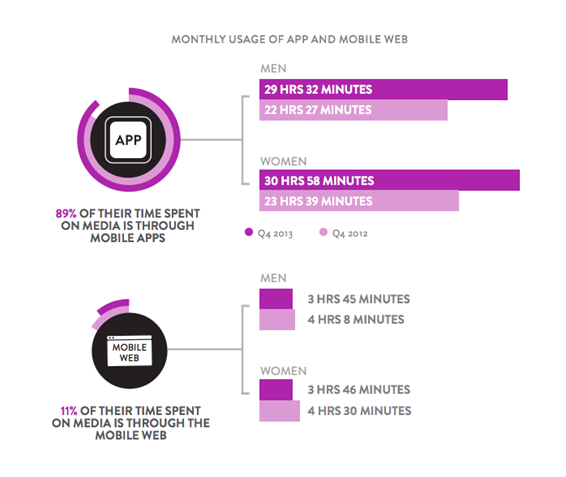
Source: Smart Insight
Since most people use mobile for researching, a good strategy is to use dynamic serving (responding with a different HTML (and CSS) on the same URL based on the user agent requesting the page) to provide a beautifully optimized landing page to mobile users, with a promise for more details (actual responsive website or app).
6. Experience After Conversion
A good user experience does not end with a click on the CTA. If a user trusts you or finds value in your content/offerings, he/she may find other things that could be of use to them.
Problem:
Marketers tend to forget this part.
Tip:
Engagement is part of the user experience, and it doesn’t end once the prospect makes a payment or fills out a form. Saying “thank you” is a good start and basic etiquette.
This is also a good time to give rewards (shopper points, freebies, etc.), or offer more content/products/services to the user as to encourage referrals and social shares etc.
Here’s my favorite “thank you” page of all time:
7. Test Smarter
There’s absolutely no denying the fact that continuous testing is integral to better UX.
Problem:
Sometimes, test hypotheses can come from designers’ whims and fancies rather than having any actual basis in fact.
Here’s what conversion Optimizer Craig Sullivan has to say about testing UX:
Unless there is a clear hypothesis, driven by user insight, data and inspection techniques, it’s just moving deck chairs around on the Titanic.”
Tip:
Identify issues by knowing what to track: Comprehensive analysis isn’t the solution you think it is. Below is a list of some metrics that will give you a more realistic and straightforward idea of problem areas:
- Bounce rate
- SEO traffic
- Engagement with interface elements (heatmap and clickmap)
- Usability (with groups of 10-15 people who match your ‘ideal customer’ persona)
- Cart abandonment rate,
- Competition analysis
Prioritize tests: You have a limited amount of time and traffic, so prioritize tests and conduct those with higher uplift potential. For example, engagement is a higher priority for sites with more interactive elements, while high cart abandonment rates mean you need to test the cart and checkout process before anything else.
Endnote: Drop the ‘Best Practices’ Assumption
No one can make sweeping generalizations about what to change or how to optimize conversion rates. But if you go in with an open mind, you can learn a whole new set of things you didn’t know before.
Remember that one man’s best practice can be a huge conversion killer for another. As long as you are learning, implementing, testing, and perhaps even debunking some of these guidelines, you are on the right track.