Save
The content strategy movement has captured the hearts and minds of Web practitioners everywhere. For many (and I count myself among this camp) content strategy (CS) represents a vital next step in the evolution of what we do and how we provide value.
At Teehan+Lax, we’ve started to formalize a practice and dedicated role around CS. But here’s the catch: when we mapped out what we needed and compared this to the standard definition for CS, we realized there was a gap.
Let me explain what I mean. Here’s how one of the leading advocates for CS, Kristina Halvorson, defined the discipline in 2008:
Content strategy plans for the creation, publication, and governance of useful, usable content.
Necessarily, the content strategist must work to define not only which content will be published, but why we’re publishing it in the first place.
I like this definition. It speaks to the multifaceted nature of CS and asserts its central role in defining the core purposes for a Web project. At the same time, my sense is that it doesn’t go far enough: it helps us plan for the upfront questions of “what” and “why” (i.e., what is the actual content on the site and why will users care), but it doesn’t adequately address the ongoing question of “how.” How will content live and flow in a dynamic system that changes over time? More importantly, how will users engage with this content and derive value from it?
Answering this question of “how” isn’t something you plan for—it’s something you do. It’s not an input to the design process, it’s an outcome. Content strategy needs to develop its own modes and techniques for defining and designing interactive content systems.
Here are a few examples of what this could look like:
Context Maps
Often an explicit goal in a website redesign project is to better integrate content. The idea is to promote lateral exploration and discovery by displaying related content in ways that are contextually relevant.
In order to make this happen, we need to have an awareness of what the major groupings of content are (i.e., the contexts), and how they map onto one another. And here’s the rub: we often don’t know what these contexts are ahead of time. They’re part of the interactive system we’re designing.
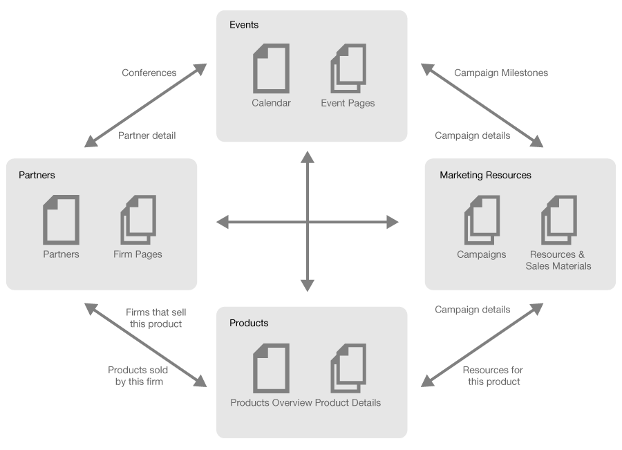
Something we’d love to see content strategists do is collaborate with information architects (IAs) during the design process to create contextual models and mappings for a website. Here’s an example of one such model.
This diagram captures the major contextual groupings of content and shows how they map onto one another. Designing a website that integrates content now becomes a much easier. Contextual areas (rounded rectangles) help to define the sections for the site, while the connectors (directed paths) define the various “related resources” modules and relational navigation that will appear in each section.
The point to remember is that both content strategy and UX design need to leverage and inform one another throughout the design process.
Content Flow Diagrams
In the past, operational, technical and workflow considerations related to content were (at best) an implicit byproduct of interaction design. We’d design screens and tell our clients in passing, “For this module to work, you’re going to need someone to curate, users to generate, or a system to aggregate, content X, Y and Z.” When we were feeling really ambitious, we’d add a quick annotation somewhere in our documentation to capture these hidden requirements.
The content strategy folks have rightly called us out for being so naive and haphazard. They argue that we should develop our content management and channel distribution strategies upfront. We’d start with a plan for content creation, publication, and governance, and then we’d design the user experience for and around this plan.
This is a great step forward—but for more complex, dynamic, and social experiences, I’d argue that it doesn’t go far enough. Again, what we need is a content-centric discipline that is fully enmeshed in the design process. And in order to get there, we need tools and techniques to help us design how content lives, flows, and is governed within a strategic content system.
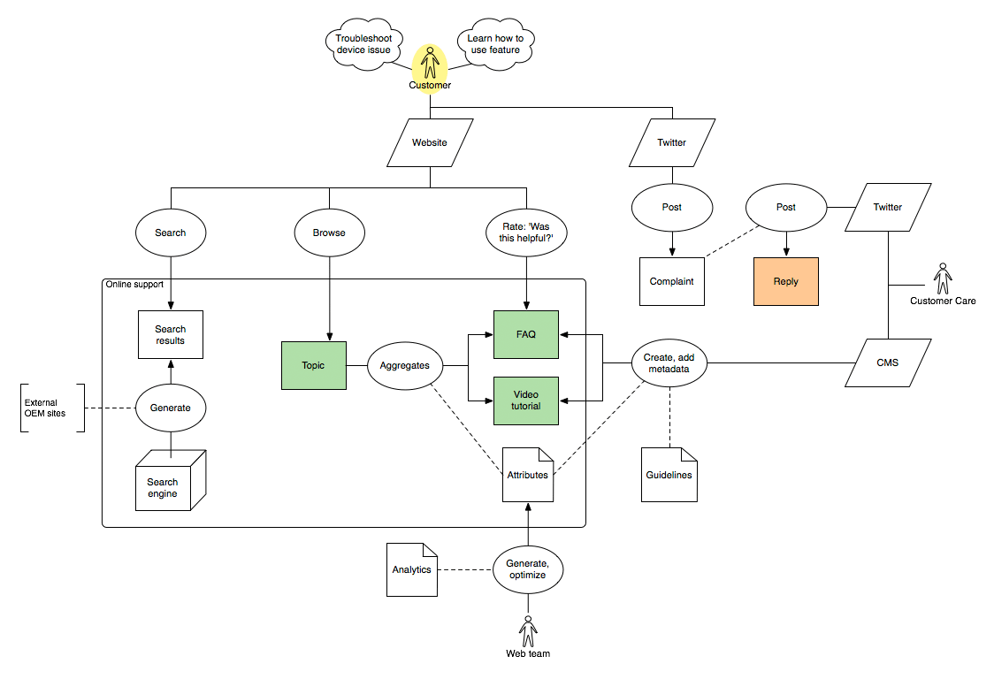
The content flow diagram (CFD) is one such tool. Here’s an example of a CFD for a multifaceted online customer support strategy. Notice that by visualizing the various elements and processes that make up the overall system, it becomes easy to spot workflow and system requirements that might otherwise slip through the cracks. For example, teams responsible for engaging with social media or generating metadata are identified explicitly within the model.
You can read more about CFDs and how to use them in a blog post I wrote on the subject, and also download the OmniGraffle stencil.
Conclusion
Context maps and content flow diagrams are just two possible ways to integrate content strategy and UX design—which is really the goal. Content strategy needs to develop its own brand of design thinking and action in order to truly come into its own as an essential part of a holistic UX design process.
What are some other ways that content strategy and design can inform and influence each other? Sound off in the comments and let us know what you think about this topic!
David Gillis
David Gillis is an Interaction Designer at Teehan+Lax, a Toronto-based
company that helps clients define and design great user experiences in
the digital channel. There, he's done award-winning information
architecture and design work for clients like AOL, AIR MILES, John
Hancock and Virgin Mobile.
David's passion for interaction design has been informed by a wide
range of interests and experiences, both academic and professional. In
school, he took a multi-disciplinary approach, combining studies in
communication, cognitive science and systems design. He holds Bachelor
Degrees in Math and English, and a Masters Degree in Information
Systems and Knowledge Media Design.
Areas of ongoing interest and investigation for David are
evidence-based design (how can designers strike a better balance
between intuition and formal inquiry), participatory design (how can
designers better engage their clients and end-users in collaborative
processes), and holistic design (how can we better design experiences
that span across multiple modes, touch points and platforms).
David is a regular contributor on the Teehan+Lax blog and you can follow him on Twitter @davegillis.


