Save
Emergent Themes in Designing for Inclusive Product Experiences
Products fail us every day. For some reason, though, we tend to blame ourselves for those failures—for our inability to perform adequately, our lack of understanding, and, sometimes, our unsafe practice. A product’s physical/visual form needs to communicate to the user on an immediate and intuitive level what the product’s purpose is and how it should be used. Without this communication, a gulf or disconnect can develop between what a user is trying to do (his intent) to do and what he actually does (his action).
This disconnect—caused by complexity, physical configuration, and/or poor information mapping—can prime a hazardous scenario, lead to misuse, foster product abandonment, or induce personal injury. This problem is especially pronounced for elders suffering from age-related physical, cognitive, and sensorial changes, for whom product-related accidents, unsafe practice, and personal injury are common.
Addressing this disconnect between intent and action—this “connectile dysfunction“—can be a key approach for developing products for at-risk populations. It encourages safe practices and enhances the quality of users’ experiences. In this sense, designers can have a positive impact in peoples’ daily lives.
Designers can play a pivotal role in empowering elders toward sustained autonomous living through improving the communicative properties of everyday products.
This article introduces emergent themes for designers developing product experiences for an aging population, with a specific focus on major home appliances. I recently coordinated an industry-sponsored design research project by Carnegie Mellon School of Design, Pittsburgh, PA for General Electric Appliances (GE). The study illustrated key approaches in designing product forms to shape user experience and highlighted some opportunities for universal/inclusive design strategies in addressing generational/cultural issues for the aging population. The study included an inquiry study of elders living autonomously in their own homes, as well as a concept development process to gain first-hand insights.
The study illuminated the vast landscape of universal/inclusive design, and identified opportunities for GE to reshape their current home appliance strategy towards transparently assistive physical and digital interaction. I use the findings and outcomes of the study as examples in this article to support a key theme for interaction designers: that form (visual and physical) must inform interaction and must follow in service of the role a product plays in someone’s life.
The methods and approaches I describe in this article are generalizable learnings that can be extended to applications and design activities beyond those for an aging population.
Inclusive design is often confused with assistive design, which focuses on marginalized or specific qualities of a population (for instance, physical disabilities). But true inclusive design is aimed at reaching the broadest of audiences in the most transparent way. In a sense, inclusive design is just really good interaction design.
The Shifting Landscape of Aging: A Design Opportunity
The key challenge in designing for a continually aging population is that the target user group changes with each generation. In 2014, all Baby Boomers (born 1946-1964) will have celebrated their 50th birthdays, with the upper tier hovering somewhere in their late 60s (Dychtwald, 1999). According to U.S. Census Bureau projections, a substantial increase in the number of older people will occur between 2010 and 2030, after the first Baby Boomers turn 65 in 2011. The elder population, those aged 65 and older, in 2030 is projected to be twice as large as in 2000, growing from 35 million to 72 million and representing nearly 20 percent of the total U.S. population (He, 2005).
Whether they live independently, in nursing homes, or in assisted living facilities, all elders deal with age-related physical, emotional, and cognitive changes that result in the need for increased support. Elder-care facilities currently cannot meet the increase in numbers of those in need—a reality that may continue to worsen (Atchley, 1997) in the coming years.
The “aging in place” trend is a hot topic for older Baby Boomers who are approaching retirement. While the current elder population exhibits greater propensity to transition into assisted care facilities or elder communities, the Boomers demonstrate stronger preference to remain in their own homes. A recent surge in the home renovation and construction in the United States from 2001-2008 (before the economic downturn) reflected the desire to establish long-term roots, with preferences for open floor plans with robust kitchens.
While Boomers and current elders differ socially and economically as populations, one can expect that Boomers will experience similar age-related changes in their physical and sensorial abilities. As they make long-term investments to support their independent living into older age, the Baby Boomers represent a key market for new products designed to respond to the changing abilities (and needs) of an aging population.
One of the most fertile areas of opportunity and potential impact in product design is in designing specifically for this aging population. For decades, we have operated with a very narrow, shortsighted view in product development that excluded elders and only served younger, able-bodied users. To address this issue, Carnegie Mellon School of Design has been working with General Electric Appliances to study the best ways to address autonomous living for elders through home appliance design (the GE Autonomy project).
As design research, this work is inherently interdisciplinary in nature, relying upon expertise in communication design, interaction design, and industrial design, and employing methods from ethnography to understand the aging population. This work considers the changing roles appliances play in peoples’ lives, making each appliance a valuable, enjoyable, usable, and meaningful part of how people function throughout their daily routines.
Our research project with GE leveraged the UX and human-centered concerns to position people (users) at the core of all design considerations. The resulting body of knowledge and product concepts have proven instrumental in mapping the landscape of aging to identify new design opportunities and to reveal the critical role appliances can play to enable elders to meet their daily needs and maintain quality of life.
Designing for Impact = Designing for Experience
People expect great things from their products; value is not only associated with materials, styling, technology, and functionality, but also with the ability of a product to emotionally connect with and engage its user. This requires a different approach to product design: rather than designing objects and systems, product designers are designing engagement (interaction) and experiences, and products are service providers rather than simply goods or possessions.
To break from the historical product development paradigm in the home appliance industry, the design of a refrigerator might now be thought of as the design of an organizational system for cold storage, placing emphasis on the activities and interaction. The focus shifts from the appliance-centric viewpoint to a behavior-centric view (i.e., what a person does with this product or what role this appliance plays in his life).
All design disciplines are concerned with people’s experience of interacting with products, systems, spaces, and of receiving information through active engagement. Through visual and physical interaction, information is received, interpreted, and acted upon. Designing objects that express meaning through a built-in sense of their form and that have a realtionship with their context can provide greater sense-making during interaction and provide for a better user experience.
From an industrial design perspective, interaction is a key consideration today in developing products to shape user experience. In contemporary industrial design education, many academic programs now focus on the role of design in shaping user behavior. They address situations where it is necessary for a product’s form to communicate meaning and serve as a facilitator for interaction. While user experience has always been a consideration for industrial designers, but it wasn’t until the dialog shifted toward human-centered design that it became an explicit focus or primary concern. This was a radical shift from decades-old practice of most designers serving primarily as visual stylists with little or influence on functionality and usability.
This practice of broader thinking and product strategy shares common ground with the relatively new and distinct field of interaction design. It illustrates the continual shifting and articulation of the design landscape, revealing exciting opportunities for the convergence of design disciplines and practice. At the heart of design practice and teaching at Carnegie Mellon is the idea that the products and systems we create are intended to enhance the lives/experience of people, directly or indirectly, and that the discipline of design is fundamentally charged to have (positive) impact on people’s lives. The products and systems we devise to have this impact are the embodiment of an equal emphasis on aesthetic value (the reaction to an object/image/system based on preference and experience) and social value (the intrinsic need for such an object/image/system).
Understanding Experiences of Elders From Their Perspective
To gain some understanding of age-related physical and sensorial changes, we employed existing techniques and developed customized methods to enable our team to best understand how elders and boomers experience the world. In particular, we were interested in how elders’ capabilities were significantly different to those of the designers themselves. Through traditional and novel user studies, our design team developed empathy for life as an elder before pen was put to paper to develop product ideas.
The most senior researcher on our design team was only 44 years old (a young Baby-Boomer himself) and the student researchers were in their early to mid 20s. For the elder perspective, we employed a gerontologist specializing in managed care and home and community-based services from Presbyterian SeniorCare (Pittsburgh, PA) to advise on the project. She brought insight from her experience helping elders adapt to their environments and cope with age-related changes. All faculty and student researchers engaged in “geriatric sensitivity training” a series of novel empathy-building exercises conducted by our gerontologist advisor.
We simulated the elder experience by limiting physical movement, visual acuity and sensorial abilities through a variety of debilitating eyewear, gloves, and restrictive apparatus. In these simulations, able-bodied individuals had difficulty in completing pill sorting tasks, dexterity activities, and mobility tests. Viewing the world from a disabilities standpoint enabled the researchers to be more conscious of individual needs and more sensitive to issues observed during field studies and contextual inquiry. These empathetic methods have now been included as part of design team training exercises at GE.
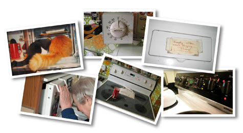
Contextual inquiries are a traditional user-centered design (UCD) research method used widely in design and HCI practices. Their goal is to gain a deeper understanding and first-hand observational experience such that one can approach designing from a more informed perspective. For the GE Autonomy project, we conducted field research with approximately 30 representatives from both the elder and late Baby Boomer populations in their own homes to understand the daily challenges they face with their appliances in completing ordinary tasks. Conversational interviews in context were based on a framework of questions targeting past appliance experiences, current usage scenarios, preferences for features, and projected future needs. Interview sessions and observations ranged from 45 minutes to two hours, and included a videotaped description of appliances simulating typical use. The goal was to enable participants to construct honest opinions of their appliances, to identify positive and negative features, and to engage with the researchers in an open conversational way. (Figure 1.)
Through personal interviews and contextual inquiry, we found that elders tend to blame themselves for failures with new products. While the Boomers were willing to call manufacturers for assistance and had user manuals on hand to reference, current elders seemed to only use the features they were familiar with. Many of their appliances had more features than they needed, which added complexity and visual “noise” to interaction. The Boomers, on the other hand, perceived appliances with more features (even ones they never used) as more desirable and valuable (Baskinger, 2007). This indicates one challenge in designing simultaneously for these two different populations: elders use fewer features and value simplicity, and Boomers value features, complexity, and technology.
Figure 1. Inquiry + User Studies: Contextual inquiry revealed a variety of interesting living practices among elders and Boomers including a range of hand-crafted reminder notes, customized marking dots on controls and displays, and willingness to live with product failure. One couple fed their cats in their wall oven so they wouldn’t hav to bend over to fill the bowls. One woman used the freezer handle to steady her balance when reaching into the fridge despite repeatedly striking herself in the forehead as the door swung open. In another scenario, an elderly woman relied on a 40-year-old manual timer because she couldn’t figure out how to set the timer on her stove—the same stove top she used to store her mail and sort her pills.
From our research with participants in their own homes, and through personal experience with colleagues, neighbors, and family, we found that Boomers are not only more feature-oriented, but they also value high-tech components and digital interfaces like soft keys and touchscreens. Current elders, on the other hand, preferred tangible interaction with dials, knobs, and switches.
We observed some elders continuing to use underperforming 20-year-old microwave ovens because they preferred the de-featured physical interface and large physical knobs, and were unable to find something comparable on the market today. In another context, we met an elder in her mid 80s who heated her tea water in the microwave in sequential 2-minute increments until it reached the desired temperature because she did trust the “beverage” button and keying in a particular time setting was too troubling.
Some key findings related to the design of appliance interaction:
- Boomers tend to place more trust in their products and appliances and prefer one-touch pre-set options in dishwashers, microwave ovens, and washing machines.
- Elders expressed a desire to have more direct control and feedback during food preparation, laundry, and dishwashing, and tend to keep a watchful eye on appliances while in operation.
- Elders and boomers had varying opinions on tangible vs. digital controls that aligned with their acceptance of and proficiency with digital technology (Baskinger, 2007).
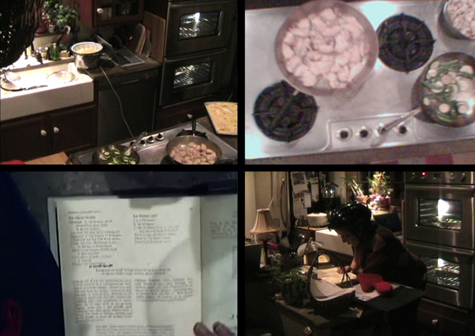
Figure 2. Task Analysis + User Studies: Contextual inquiry was conducted through direct observation, interviews in context, and video recording. This 4-screen image set shows what the participant is doing relative to food preparation activities and appliances. Shown are images of one moment in time captured from 4 different view points. Top Left: the cooking area. Top Right: the cooktop. Lower Left: Helmet-cam first-person view point of cook book. Lower Right: Participant reading cookbook next to the cooking area; note the appliance manuals under the hot mit.
Through task analyses conducted with volunteer participants cooking familiar multi-course meals in their own kitchens, the research team learned that issues raised by participants in previous conversations and appliance tours were also evidenced in practice. To record the cooking process, multiple video cameras were installed in key locations within each kitchen to capture activity simultaneously from the user’s perspective, the appliance’s perspective, and an overview of context. These recorded views were synchronized and formatted into a video matrix to show what the participant was doing in relation to context, activity, and appliance. (Figure 2.)
Instances of product miscommunication, misinformed feeback, and visual information displays that contributed to user mistakes, confusion, and delay were also observed. During these sessions, we found that participants commonly made mistakes, especially with digital controls. We found that those who had new appliances kept the factory manuals handy at all times and referenced them frequently. This was especially noted with washing machines, ovens/stoves, and dishwashers. We also observed that some who have owned their appliances for two years or more still had these manuals accessible, commonly stored in with their cookbooks.
During conversations with participants, some stated, “I know where everything is in my kitchen,” or “I know exactly how my microwave works and I wouldn’t change a thing.” However, recorded video revealed otherwise, with brief moments of confusion, disorientation, and searching for the operation manuals. When the video was played back to the participants in later interview sessions, many were very surprised by their performance and offered suggestions for how they might improve appliance interfaces and kitchen configurations to be more effective for them. One woman was clearly frustrated by her new dishwasher and stated during the session that she would have put individual controls for settings rather than pushing buttons multiple times to cycle through settings. She also emphatically stated that she would never make the mistake of buying an appliance without somehow trying it first. When she saw the video, she was surprised at how angry she sounded and said that when you’re in the middle of cooking and cleaning, you just expect these appliances to work easily.
Understanding the Preferences of Elders Through Co-Design
Once the research team became proficient at synthesizing behavioral observations with explicit user desires and criticisms, we conducted modeling exercises to provide participants a chance to mock-up their ideal appliance configurations. As participants became comfortable in critiquing their products and reflecting back on their own behavior, this exercise provided the opportunity to brainstorm ideas and to qualitatively compare mapping, features, and physical form.
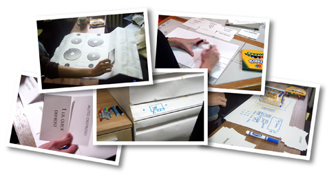
Each portable modeling kit contained a set of paper-based knobs, switches, controls, screens, and components that could be combined into a variety of configurations for various appliances. (Figure 3.) Participants were asked to identify preferred features, arrange them, then simulate simple operational tasks. The exercise was informative in identifying preferred functions, sequences of common actions, and mapping of controls, and revealed preferences for unique features, levels of complexity, and amount of technology. In general, conversations with participants revealed a preference for controls to be located up front and easily accessible with larger knobs and more surface area for interfaces and visual feedback. Of the 15 participants, none seemed to prefer to reach over hot boiling pots to access control knobs on their stoves, or to lift heavy grocery items to the top shelf of a refrigerator.
There were still important differences between Boomers and elders. Elders preferred simpified appliance forms with fewer features, while Boomers preferred more one-touch novelty features like popcorn buttons and baked potato settings for microwave ovens. Discussions with each participant reinforced the design team’s earlier observations that current elders prefer more tangible control during food preparation and place equity in their own actions, rather than trusting the appliance to do the work for them. Boomers, on the other hand, tended to rely on pre-set one-touch automated functions (Baskinger, 2007). These co-design exercises provided a basis for product design concepts that employed the logic, preferences, and desires of the user population.
Figure 3. Modeling Exercises: Participatory modeling sessions were conducted with elders and Baby Boomers using a portable generative modeling kit for appliance configurations. Shown are images from the various acitvities, noting that the participant is positioning the display above the cooking surface in which she positioned controls next to each burner.
Integrating Interactivity Into the Product’s Form
Integrating form, interactive components, and function provides for better—or “richer”—interactions. Physical and visual form is a communication vehicle that can impart comprehension of its functionality to guide users’ interactions with the product. Digitally interactive products and appliances present new opportunities and challenges for designers. Joep Frens wrote in his PhD dissertation, “Rich Interaction” (2006), that this is a new paradigm for interactive consumer products that aims to unify form, interaction, and function through tangible interaction and information-based affordances (Frens, 2006).
Richer interactions can be achieved by integrating interfaces and controls within the product form and finding an appropriate balance between tangible and digital controls. Frens’ digital camera prototype is a good example of combining the digital and tangible to engender new interactions for a fairly ubiquitous object:
Appliance design today suffers from a disconnect between “stuck-on” interfaces (panel, handle, knob, etc.) and the product form itself. The product form and interfaces are often designed by different people, teams, or business units, but it’s necessary to view the appliance holistically to avoid awkward, confusing, and dysfunctional interactions. (Figure 4.)
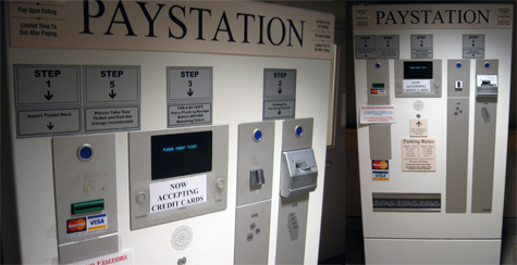
Figure 4. Integrated or Not: The steering wheel controls are grouped, organized, and positioned as integral elements on the wheel that can be easily understood by the hand as well as the eyes. Conversely, the stove knobs are crudely attached to the interface panel. The info-graphics located below each knob are obscured by the knob position and by the user’s hand during interaction. Integrating the interactive components into the product form creates a functional unity that can improve user experience. When controls/interfaces are treated as appendages, the visual disconnect created by the physical differentiation may have unintended adverse effects.
Unified product forms and intuitive interactions can have a dramatic effect in enabling elders with cognitive impairment to more easily understand and interpret product form and behavior. One may view physical product forms as the neutral ground to present distinctive interactive elements. (Figure 5.) There must be a harmony among these integrated elements to explicitly communicate interaction through structuring shape, size, contrast, position, hierarchy, order, and color.
Figure 5. Conceptual suite of home appliances developed by Carnegie Mellon for GE Appliances. This suite uses simple, clean-lined geometry to place emphasis on the integrated interface panel. Each hybrid tangible/digital touch-sensitive interface contains similar information, graphics, controls, and language to unify and simplify interaction with simple forms that emphasize the interactive features.
Noted author Del Coates wrote in his book Watches Tell More Than Time: “An old aesthetic maxim states that good art always displays variety within unity and unity within variety” (Coates, 2003). In a sense, he is talking about the balance between simplicity and complexity, noting that the balance is achieved through the proportion of complexity within the field of simplicity. Designer Dieter Rams stated, “Design is the effort to make products in such a way that they are useful to people…One of the most significant design principles is to omit the unimportant in order to emphasize the important.” In an integrated model, form is the outgrowth of the information necessary for interaction. This embedded information, or semantics, must be clear and concise, and intuitively resonate with the user.
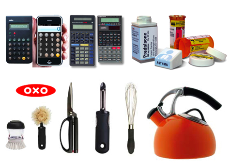
In the three example sets shown in Figure 6, elements of form are structured to guide interaction and shape behavior. The calculator comparison reveals that shape, size, color, and configuration of buttons present opportunities for mapping and understanding functions within an interface panel. The Apple iPhone calculator is inspired in color and mapping by the seminal form Braun introduced decades ago, while the Radio Shack calculator with the red buttons exhibits little information hierarchy and reads initially as more complex. The Texas Instruments model also draws inspiration from the Braun color scheme, but does not map the color to controls in the same intuitive way.
While the two sets of calculators differ in functions and capabilities, the presence of a mapping through color and shape creates organization and hierarchy necessary for users to gain an immediate understanding of the interface. The medicine bottle concept (which I designed in 1999–2000) and OXO Good Grips house wares are good examples of embedding visual information into the product form. The squared medicine bottle presents individual information panels with interpretive graphics to help a user understand, organize, and index, and also provides visual feedback when the cap is not securely tightened as the offset corners will reveal the misalignment. The OXO products, designed to ease physical stress for arthritic hands, use soft materials, color, and weight to help guide the hand into a more natural and empowering position.
Figure 6. Braun Pocket Calculator, iPhone virtual calculator (photo credit: Gizmodo) share similar formal qualities that are simple and ordered in appearance; the Texas Instruments and Radio Shack models lack an obvious and intuitive organization, visual hierarchy, and formal qualities. The prescription medicine bottle concept includes interpretive graphics and panels to promote organization and safe practice. Oxo GoodGrips guide interaction through integrated material, color, and surfaces to empower better grip and usage.
Situating the Interaction Within the Context
Designing for experience considers the entire product-user-context relationship. Akin to urban planning, kitchen design must first consider the functions and activities that the environment must support. Too often, spaces are designed arbitrarily from a functional perspective, with decisions based solely on aesthetic appeal. For appliances to fully live up to our expectations, designers must consider their relationship to their context and situate (integrally position) the interaction. Historically, the “work triangle” concept has been employed to optimize placement and configuration of appliances to place the refrigerator, range, and sink in proximity to promote mobility (Panero and Zelnik, 1989).
Appliances are ordinarily installed in various locations throughout a kitchen space, mostly sitting directly on the floor, which can present some challenges for access. The fact that an elder (or anybody) must reach over hot boiling pots to reach burner controls or must bend over to load heavy beverage containers into a refrigerator presents potentially hazardous scenarios. An effectively planned kitchen will incorporate a work triangle, but will also consider the vertical space and installation of appliances at heights more conducive to access.
So the question must be asked, “Why not bring the appliances closer to the primary activity?” Rethinking the conventional positioning and physical configuration of appliances in the vertical space enables new forms designed around behavior to be integrated into the context in new ways. The GE Autonomy project focused on physical reach limits and optimal working spaces around each appliance, designing within current standards of American kitchen cabinet architecture and considering the reach of a 50th percentile woman.
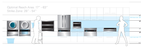
We developed the concept of a “strike zone” to preserve the counter top as the major work surface in the kitchen and to maximize access into and around each appliance. (Figure 7.) The strike zone defines a vertical space of 28″ from floor to 18″ above a 36″ high counter top, determined to minimize excessive stooping, bending, and reaching. Each appliance was configured to reduce encroachment into the walking path in their primary open configuration to 13″, which enables greater access for assistive mobility devices. The strategy here was to open up the space around each appliance to make room for assistive walking devices and to reduce the risk of accidental collisions at the hips or shins (Baskinger, 2007).
Figure 7. Situating the Interaction: The “strike zone” is a term adapted from baseball. In the context of appliance configuration within the kitchen, the strike zone defines an optimal vertical workspace to place most activity and interaction within a range that limits excessive bending and reaching for most adults. The optimal vertical workspace in this concept ranges from 17″ above the floor to 63″, which includes the strike zone at 28″ – 54″.
Expressing the Interaction Through the Form
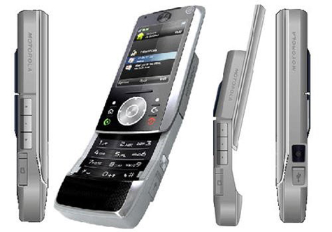
The behaviors of moving components within a product can either be poetic or completely unpleasant. Gestural interfaces, like the iPhone or the multi-touch trackpad on a MacBook, play on graceful, elegant movements that simulate tangible actions. The Motorola RIZR Z-10 phone incorporates a secondary hinge to emphatically fall into the cradle of the hand. This expressive movement enhances the feeling of this phone as a tool, semantically signifying a firm, yet elegant hold. (Figure 8.) Expressing the interaction through the product form happens in two ways: first, parting lines and visual cues are structured to identify moving parts providing some hint towards the movements; and second, the moving parts demonstrate an obvious physical change between static and dynamic states.
Figure 8. Motorola RIZR Z-10: Various angles of the handset showing the transformation between monolithic static closed form that is brick-like and expressive dynamic form in its operational state. (Photo credit: iTech News Net)
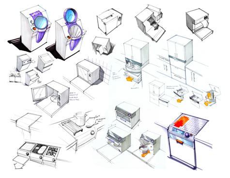
Within the GE Autonomy project, we focused on sliding, folding, turning and loading as key appliance behaviors. Designing for the semantic qualities of these forms to express interaction resulted in innovative features that encourage safer practice and provide for a better user experience. (Figure 9.) Testing of volumetric models by representatives of a wide range of ages verified these advantages that may improve appliance experiences for all.
For example, the drawer dishwasher concept has a turntable dish rack enables access from three different combinations of movement (Figure 10.):
- the drawer can be opened to full 13″;
- the lid can be lifted and stowed below the counter line to allow 13″ of access from the top only;
- the drawer can be extended 13″ and lid opened fully to give 26″ of access.
Moreover, the wall oven is positioned at the counter line to provide easier transition of hot dishes. The key advantage in this configuration is the bi-fold door that mates the hot interior surfaces when opened to reduce chances for accidental burns. (Figure 11.) A modular counter-depth refrigerator has a separate beverage center with Lazy Susan turntable storage that places heavy gallons of milk and beverages close to the counter line to minimize lifting distance and to enable elders to use the unit or counter for leverage. (Figure 12.)
Figure 9. Select sketches of appliance forms with expressive movement.
Figure 10. Drawer Dishwasher: The dishwasher concept is a 19″ tall and 30″ wide under-counter pullout drawer, with turntable dish rack and counter level hide-away lid. Dishes are accessible through the top lid or the drawer can be pulled out a few inches to gain further access but not encroach completely into the walk area to provide access for assistive mobility devices such as wheelchairs and walkers.
Figure 11. Wall Oven: The wall oven concept uses a split horizontal folding door to enable hot interior surfaces to mate (exposing only the cooltouch glass), thereby minimizing reach-over distance and accidental burns. The door opens at the counter line to provide a transition surface.
Figure 12. Modular Refrigerator: A counter-depth fridge unit above the counter line, and a separate counter line beverage center/convertable freezer with Lazy Susan turntable storage places heavy gallons of milk and beverages close to the counter line to minimize lifting distance.
In these three examples, the way the appliances open and grant access expresses the idea of containment and safety without being stigmatizingly assistive. Large swinging doors with hot or wet surfaces present risky situations that promote imbalance through excessive reaching, bending, and stooping. However, bringing the appliances up to the counter line—a more natural and enabling height—with built-in features that promote safe practice is a conisderable improvement in this industry. Moreover, these safety features are transparently integrated into the product forms, much like the OXO Good Grips or the prescription medicine bottle concept described earlier, which makes them universally applicable for a very broad range of audiences.
Structuring the Narrative of Interaction
Narrative structures in product interfaces enrich the product experience by providing a running visual dialog of information, processes, and events over time. Some of the most compelling and engaging narrative experiences are organized across a linear sequential continuum with key markers for a beginning (to attract the user and provide a schema for interaction within a context), middle (the interaction that engages the user in an activity with the device), and end (the conclusion that draws the interaction to a close).
Storytelling, a form of narrative, is one of the oldest experiences known to humankind that remains powerful today. The most important characteristics of successful narratives, like stories, are that they are authentic and relevant to the audience in a “voice” (verbal, written, or visual) they intuitively understand. Hence, these narratives incorporate a particular, and often personal, perspective to portray a sequence of actions relative to the real time scenario around an experience. In this sense, narratives serve as vehicles to make abstract or obtuse concepts, instructions, or information more accessible by depicting at the entire episode through sequential steps and events along the way (Baskinger, 2007). Extending the idea of story-telling or narrative structures to appliance interfaces, provides a at-a-glance visual to enable users to gain a meta-level sense of machine behavior and processes with at-this-moment machine status. With these two levels of communication, a user can better forecast and coordinate his actions relative to the activity.
Figure 13. Simple digital narrative interfaces: The header tabs in TurboTax provide an overview of the tax filing sequence by reading left to right – it’s easy to understand that you need to move through each tab to complete your taxes. Start/Stop buttons on new cars present a clear beginning and end to driving by turning the engine on or off. (Photo credits: about.com and bmw.com).
Noted author Donald Norman states that design, by its very nature, should “make it easy to determine what actions are possible at any moment; make things visible, including the conceptual model of the system, the alternative actions, and the results of the actions; make it easy to evaluate the current state of the system; and follow natural mappings between intentions and the required actions, between actions and the resulting effect, and between the information that is visible and the interpretation of the system state.” (Norman, 1988)
Lack of meaningful feedback and physical expression of activity and information is a common contemporary problem with major appliances. The interfaces are often cluttered with information that compromises readability, or touch points for interaction are obscurely located, arbitrarily shaped, or configured in confusing ways. (Figure 14.) Through user studies, our team learned that disconnects in interaction often occurred when the appliance failed to illustrate critical information about itself and provide feedback about its status. Therefore, our design strategy for GE centered on making interaction more intuitive, and on building user competence through visual cues and visual narratives.
This approach incorporated digital and physical interaction and more obvious mappings of controls to physical configurations of each appliance. To structure communicative properties into appliance form, we made a conscious effort to omit the unimportant details and features and to limit what some might argue is visual “noise” (Baskinger, 2001). With this approach, the goal was to span the divide between elders and Boomers to create a pleasant, more effective relationship between people and their appliances and to position the appliance to take on a more active role in empowering elders to address their daily needs of cooking and cleaning.
Figure 15. Lack of Hierarchy: This Maytag control panel interface for a freestanding stove (cook top/oven) reduces visual clutter by making all of the soft touch keys the same. Without clear visual hierarchy or distinction, one is forced to read the light gray condensed type on the glossy reflective surface. Many appliances suffer form poorly structured interfaces, which ultimately have a detrimental effect on the quality of interaction.
Since the capabilities of the aging population (elders and Boomers) are extremely varied, designing for key moments and critical points of interaction helps to inform user behavior through a cause and effect relationship: if I do this, then the machine will do that. Like chapter headings of a book, these markers represent the high-level touch points for interaction that can remind an elder of their position within the large process while simultaneously forecasting their next move.
For extreme instances of severe visual debilitation and cognitive impairment, these structures may have to be enhanced or adapted to suit special needs and requirements (Baskinger, 2007). Scripting and designing specific interactive moments into product interaction through cause-and-effect sequences can provide a more effective series of smaller interactions throughout the product experience to empower a variety of users (Baskinger, 2007).
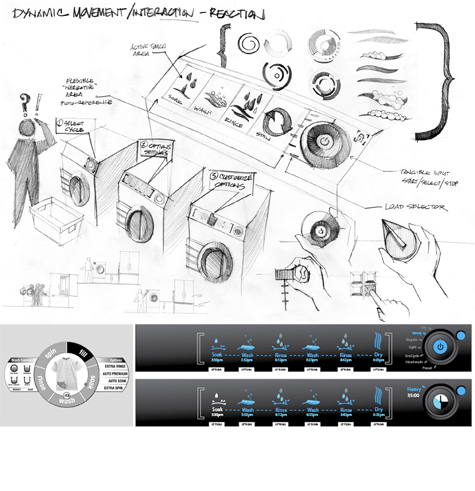
Figure 16. Narrative Interface Concepts: (Top) A concept sketch for a linear, narrative washing machine interface that combines tangible and digital interaction. (Bottom) An interface sketch by Robert Hirsch designed for GE in 2002 as a graphic narrative interface that leads the user through various wash cycles and visualizes washing preferences (left). Linear narrative interface concept (right) developed for GE to illustrate wash cycles with simple linear animations and to clearly communicate the various steps in the wash sequence.
The visual language of product components has the capacity to simplify, clarify, and inform interaction. Large, graphical information display systems on all appliances that relied on pictographic representation to support and clarfiy text-based communication were the basis for appliance interaction for the GE project concepts. We also created design concepts to explore adaptive interfaces that could present pertinent information at decision points in a scalable way. For instance, a reminder that the cooking timer has expired seen on your washing machine interface as you removed laundry. Further thinking explored software selections where an appliance can be featured-up or featured-down for particular audiences—in other words presenting an abridged-functionality version for inexperienced users.
In most current washing machine interfaces, all of the cycles and settings are displayed to a user all the time; even new digital touchscreen interfaces cram their screens with choices, pathways, and settings that require both keen attention and translation. This complexity can obfuscate interaction and cause confusion. In some cases, designers have attempted to simplify interfaces by making all button the same shape and color, but this creates a lack of clarity and distinction among components. (Figure 15.)
To provide some sense of order and to build consistency in interaction across appliance lines, we sequenced the first decision point (generally the cycle setting) to be initiated in a mechanical way through physical movement or tangible interaction. Subsequent preferences and modifications to that setting would then be selected through digital touchscreen interaction. The appliance would be actuated to begin its work cycle through another physical interaction, thereby closing the loop of interaction with tangibility and signifying that this chapter of the story is complete. (Figure 16.)
The combination of digital and tangible interaction elicited positive feedback from participants and reviewers (Baskinger, 2007). This approach may also be key to resolving issues of “connectile dysfunction” for elders as the physical activity of pushing buttons and turning knobs provides some sense of kinesthetic memory.
Summary
Designing for user experience can position products to be integral components in shaping (not prescriptively dictating) behavior and in having real positive impact. Understanding that a communication breakdown, or “connectile dysfunction,” can have serious implications during interaction is a key motivator to look more broadly at the product ecosystem and to design to shape experience. Focusing on visual language to promote interaction shifts the design emphasis from visual form as an attractor, to visual form as a communicator. Expressive form language can center attention on activity, working process, and decision/action points during interaction, rather than being purely aesthetic and potentially distracting. The flaw in many major home appliances is their focus on visual form as a market differentiator that often yields arbitrary, ineffective configurations that can impair interaction. Therefore, it is the duty of a product to clearly express its functionality, placing emphasis on visual form as the scaffolding to create affordances and contraints, directions and pathways, and options and choices.
The GE Autonomy project concepts focused on expressive form and the interpretive qualities of the interface to provide visual/physical cues to shape user experience by guiding interaction with a narrative interface. From this perspective, the communicative qualities of product forms are vital in enabling users to make intuitive interactive decisions and to bridge the gap between their intent and the action they take. This work identifies some emergent themes of integrating the interaction into the form, situating the interaction in the environmental context, expressing the interaction through physical/visual form, and narrating the interaction to constuct the story of the product experience.
The project also highlights some opportunties for universal/inclusive design strategies in addressing generational/cultural issues for the aging population in the United States that extend beyond appliance design and are aimed at empowering all users. Focusing on disabilities can address issues for fringe elder populations at the risk of developing solutions that can be stigmatizing. Transparently integrating assistive features, as shown in the prescription medicine bottle concept and the OXO Good Grips housewares, emphasizes shared abilities and the true spirit of human-centered design.
The pervasive nature of major home appliances provides the opportunity for great social impact. Production runs of 200,000 units for each model within a brand is fairly common, meaning that design decisions scale enormously and can impact thousands of people on a daily basis. At this scale, major changes in appliance design can have real impact. From a society perspective, there is fertile ground to explore the correlation of appliance design and enabling elders to live longer in their own homes. If appliances can help elders meet their daily needs easier and more effectively, they may be able to live autonomously in their own homes longer thereby improving their quality of life and easing the strain on the assisted living communities.
Their emphasis on broad transgenerational appeal with multi-modal functionality has positioned GE to address age-related issues in a transparent and universal way, and sets the precedent of putting people at the center of new product development strategies.
References
- Atchley, Robert C. (1997). Social Forces and Aging. New York: Wadsworth Publishing Company.
- Baskinger, Mark. (2001). Visual Noise in Product Design: Problems and Solutions – In: Jim Kaufman (Ed.), Proceedings of IDSA National Education Conference (pp. 33-42). Dulles, Virginia: Industrial Designers Society of America.
- Baskinger, Mark. (2007). Experientializing Home Appliances to Empower the Aging Population for Autonomous Living. In: Proceedings of the Design for User Experience Conference 2007 (DUX07). Chicago: AIGA.
- Baskinger, Mark. (2007). Autonomy and the Aging Population: Designing Empowerment into Home Appliances. In: Proceedings of the 3rd European Workshop on Design and Semantics of Form and Movement (DeSForM 2007), Northumbria University, UK.
- Baskinger, Mark and Bruce Hanington. (2008). Sustaining Autonomous Living for Elders Through Inclusive Strategies for Home Appliance Design. In: Patrick Langdon, John Clarkson and Peter Robinson (Ed.), Designing Inclusive Futures. London: Springer-Verlag.
- Coates, Del. (2003). Watches Tell More Than Time: Product Design, Information, and the Quest for Elegance. New York: McGraw-Hill.
- Dychtwald, Ken. (1999). Age Power: How the 21st Century Will be Ruled by the New Old. New York: Jeremy P. Tarcher/Putnam.
- Frens, Joep. (2006). Designing for Rich Interaction: Integrating Form, Interaction, and Function. PhD Dissertation. Netherlands: Eindhoven University of Technology, Department of Industrial Design
- He, Wan etal. (2005). Current Population Reports Special Studies: 65+ in the United States: 2005. Washington DC: U.S. Government Printing Office.
- Norman, Donald A. (1988). The Psychology of Everyday Things. New York: Basic Books, A Division of Harper Collins Publishers.
- Panero, Julius and Martin Zelnik. (1989). Human Dimension and Interior Space. New York: Watson-Guptill.
- Rams, Dieter. (1989). Omit the Unimportant. In: Victor Margolin (Ed.), Design Discourse: History, Theory, Criticism (pp.111-114). Chicago: The University of Chicago Press.
- Rheinfrank, John J., William R. Hartman and Arnold Wasserman. (1992). Design for Usability: Crafting a Strategy for the Design of a New Generation of Xerox Copiers. In: Paul S. Adler and Terry A. Winograd (Eds.) Usability: Turning Technology into Tools (pp. 15-40). New York: Oxford Press.
Mark Baskinger is an associate professor in the School of Design at Carnegie Mellon University who teaches courses in industrial design with an emphasis on form & interaction. His interests include exploring new paradigms for interactive objects and interpretive environments, and methodologies of design drawing and visual thinking to promote collaboration. He has published papers and articles on the language of designed artifacts, inclusive/universal design, visual “noise” in product design, tangible interaction, and methodologies of visualization.
Baskinger currently serves as a researcher with the Quality of Life Technology Engineering Research Center through Carnegie Mellon University and the University of Pittsburgh; he is a core faculty member in the Master of Tangible Interaction Design program through Carnegie Mellon’s School of Architecture (mTID), is an affiliate faculty member of the Human-Computer Interaction Institute (HCII) at Carnegie Mellon and collaborates with the /d.search-labs at the Technische Universiteit Eindhoven, The Netherlands (TU/e).
An international speaker and workshop leader, Mark also conducts Drawing Ideas®: A Field Guide to Visual Thinking courses in conference and business contexts where he makes design drawing methods and visual thinking techniques accessible to a broader audience and demonstrates strategies for using sketching to foster collaboration in design processes. His work has been featured in design publications and international magazines, and has been exhibited in numerous galleries and museums, including the Museum of Modern Art (New York), I-Space Gallery (Chicago), the Krannert Museum (Illinois) and the Regina Gouger Miller Gallery (Pittsburgh). His work is also included in the permanent art collection of the University of Illinois.
He has won numerous design awards from ID Magazine and the Industrial Designers Society of America (IDEA) and personally holds multiple product patents. Prior to joining Carnegie Mellon, Baskinger was creative director at Corchia Woliner Rhoda in New York City, and was the lead designer at the Central Park Zoo - Exhibits and Graphic Arts Dept. He also held a visiting faculty position in the School of Art and Design (https://art.uiuc.edu) at the University of Illinois (UIUC). Parallel to his appointment at Carnegie Mellon, he co-directs The Letter Thirteen Design Agency, and is a founding member of the EcoDesigners Guild of Pittsburgh.


