One of the major features of e-Commerce sites is ‘Compare’. Gone are the days of asking a sales person to explain the differences between products. The Internet gives customers the ability to compare products with many sites providing side-by-side comparisons. In the past, this has often been via an awkward add-on which involved searching high and low for the ‘Compare’ button—something that simply didn’t meet shoppers’ expectations. Sites are now increasingly providing a better comparison experience.
Comparing is a natural part of the purchase journey, especially when buying something that can be configured, or that has complex specifications. So how do online retailers help consumers compare products as part of a smooth and natural interaction in the purchasing journey?
Using the scenario of looking for a 3D TV as an example, we looked at how sites accommodate the desire to compare. Electronics were chosen because the product features are complex and the terms used to describe them often need explanation. 3D TVs were chosen as they are relatively new to the market, and many shoppers are keen to investigate the product’s features before making a purchase.
We found three common approaches to comparing complex products.
Approach 1: Select and Compare
The traditional way is a two-part process:
- Select two or more items to compare, and
- Click the compare button
There are three problem areas with this option.
First, you need to remember to select the items to compare as you browse and, too often, you’re halfway through a list when you realize the offering is complex enough that you need to compare products in the first place.
Second, it needs to be easy to select the items you want, but there is often so much competing information about a product that you can’t determine how to select the item.
Third, it’s difficult to find the compare button. It’s often a painstaking search up and down the page—unless the button really stands out, it can seriously interrupt the flow.
The Implementation
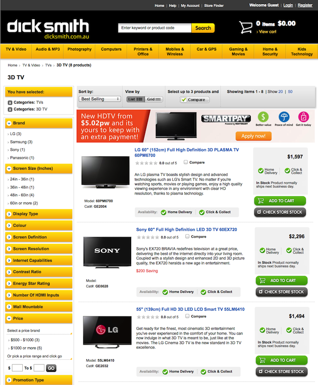
Dick Smith uses the ‘select and compare’ approach. Having found the right page for a 3D TV, it takes a truly dedicated shopper to scan the product list and find the compare checkbox in the product listing. The checkbox appears to be the only item in the larger box not given a design treatment.
Further complicating matters, the availability options—‘Home delivery’ and ‘Click and collect’—are repeated in the product info and the right side column, taking up precious space. The ‘Compare’ button is relatively easy to find, at the top and bottom of the list, but its clickable even if you have not selected an item.
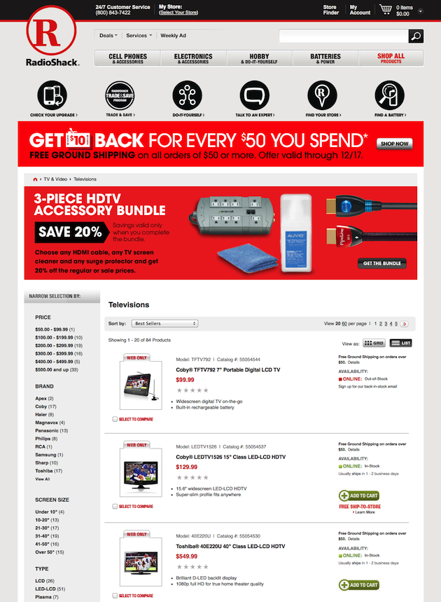
The compare checkbox is easier to spot on the Radio Shack product list page, where a checkbox with the text ‘Select to Compare’ in red font rests underneath the image of the product.Still, it’s not exactly slick, and having found the compare checkbox, it is impossible to find the compare button … because there isn’t one! After several attempts, I finally figured out that I needed to click the red text next to the check box in each product listing to compare the products. Some shoppers would almost certainly be left hanging, hunting around for the compare button.
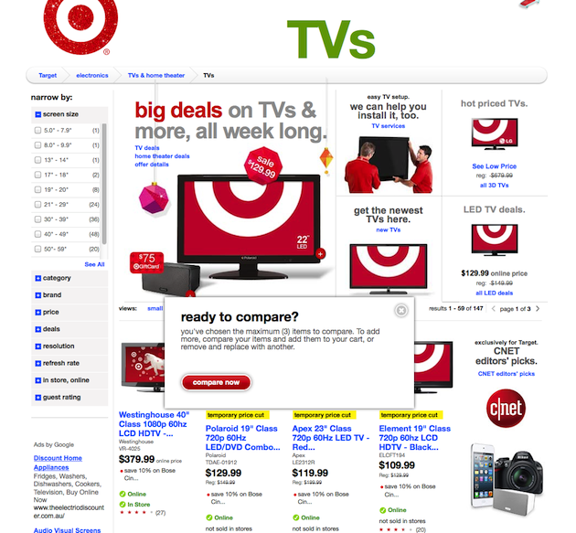
Target has solved the problem of finding the compare button by supplying a pop-up when you have selected three items, the maximum number you can compare. This is a nice way of doing two things—intuitively letting the shopper know that three is the maximum, and putting the compare button front-and-center.
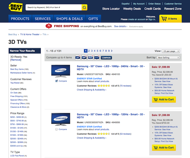
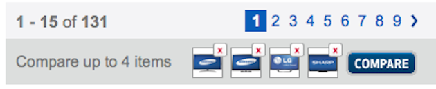
Best Buy also has a nice feedback feature—comparison bars located at the top and bottom of the product-listing page. As you select items for comparison, the boxes on the bars are populated. The instructions and contrasting compare button are nice and obvious too.
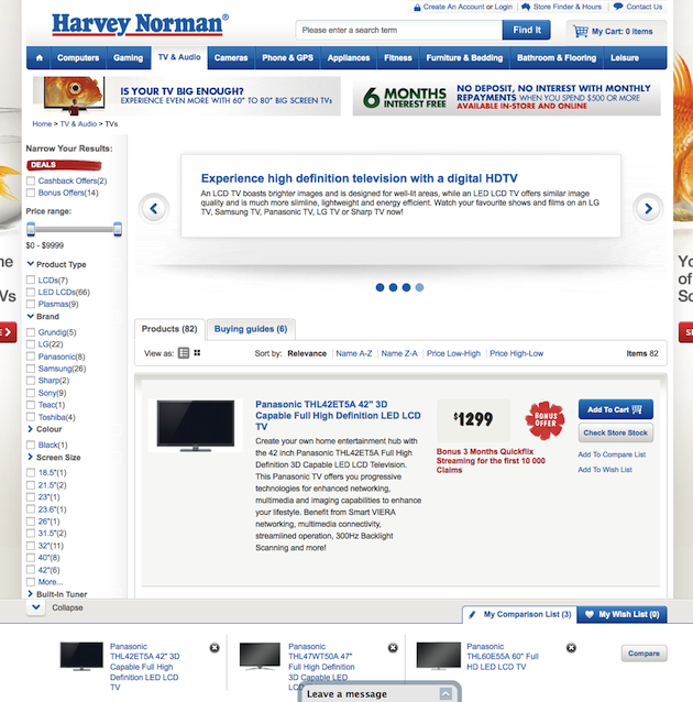
Harvey Norman has taken the compare feature seriously. As the shopper selects the items to compare, they display in the fixed navigation bar at the bottom of the page. Nice system feedback! The downside is that upon clicking ‘Compare’, the comparison page is displayed in a new window—breaking the shoppers’ flow through the site, and increasing the likelihood that they will lose their sense of orientation. The other downside is that there is no specific page for 3D TVs, nor a filter option to narrow the results to 3D TVs only—so we didn’t actually find any.
So, you’ve selected your items and found the compare button—what happens next? Well, hopefully you land on a good comparison page. It should display a regular table, neatly rendered, which is easily read from left to right, with a row per data item. The ability to remove an item from the page is nice too.
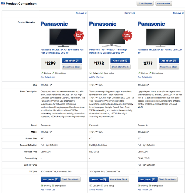
Harvey Norman does a decent job on the actual comparison page, and when you add something to your cart, that pop-up window closes and the shopping cart displays.
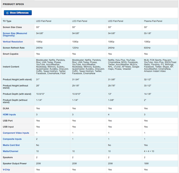
Best Buy does a great job of presenting the product specs in a neat table. Their killer feature is the ‘Show Differences’ button, which highlights the rows where there are differences in the selected products. This shopper is happy!
Approach 2: Filter and Compare Product Listing
A second way to accommodate the desire to compare is to build it into the design of the product category pages themselves. While not strictly a compare feature, with careful design of the product list or grid view, you can compare on a category page without the clunky two-part process. This is easier when you are comparing apples with apples, and there is no excuse for messing it up.
With complex products such as electronics, using the product listing can work well if the product filter allows you to narrow down your choice. So it’s really a filter-and-compare process. If the product information is well laid out, the data is easy to scan.
The Implementation
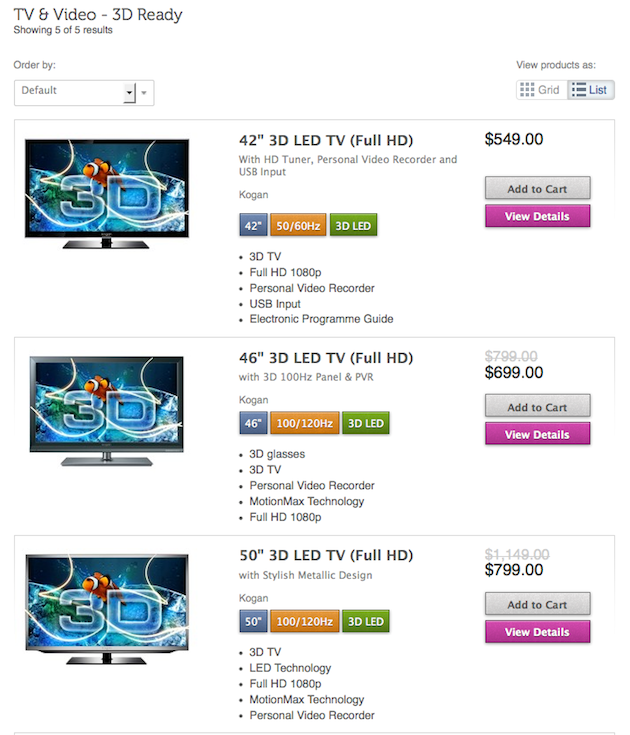
The 3D TVs are easy to find in the mega-navigation menu at Kogan. The list view shown here has key features highlighted and color coded for quick scanning. If you know nothing about 3D TVs, this tells you the important aspects to compare. And interestingly, the site has no separate compare function.
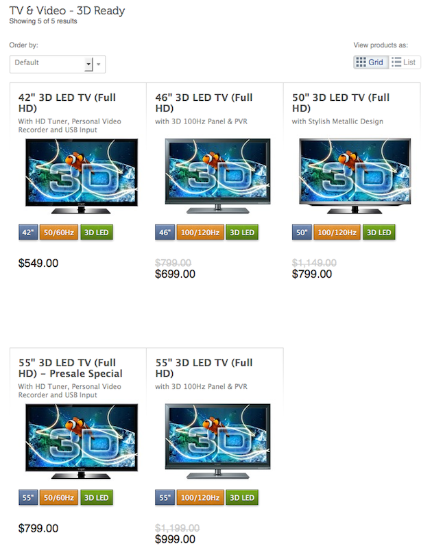
The Kogan grid view, also color coded, makes it easy to compare more items in a small area. And it’s nice to see that there are labels on the List/Grid views, accommodating the less experienced shopper. However, those looking for more specs to compare may be disappointed.
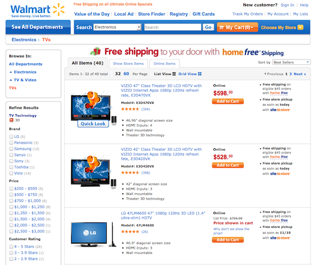
Walmart has no separate compare feature, but the features of the TVs are listed in dot points, in the same order. This allows comparison, but it’s definitely clunky feeling going back and forth, to and from the product page to compare the details.
Approach 3: Having a Ready-Made Comparison Page
A third way to compare is the ready-made comparison page. This approach also works best when comparing apples with apples, so, not surprisingly, this is a feature of product manufacturer and comparison sites—such as in the Apple and Volvo examples below. It’s not often employed on retail sites, where product descriptions are provided by an array of manufacturers, making comparison less straight-forward.
Implementation
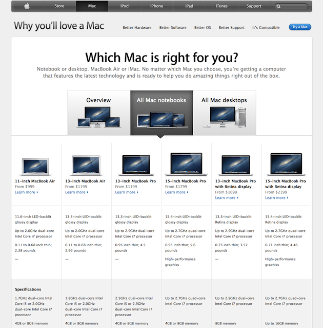
On the Apple site, the ready-made comparison page ‘Which Mac is right for you?’ uses layout to make specs comparable, although the addition of rows to distinguish between data would make it clearer.
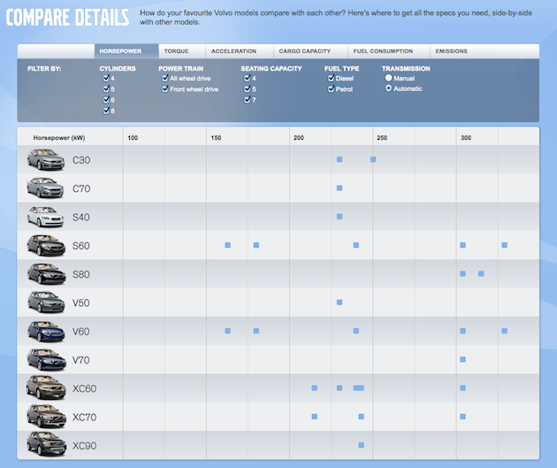
Volvo’s ‘Compare Details’ page is accessible from the dropdown menu. The idea is good–the tabs across the top change the parameters displayed. However, the table does not work—the squares in the table represent different types of cars along a scale and require a lot of work by the shopper to interpret. A bar graph would have been easier to understand.
What Works Best
To summarize:
- Standardize data using dot points in the product list as much as possible.
- Color code similar data to improve scanability of the list.
- Don’t crowd the product list with too much content.
- Label views ‘Grid’ and ‘List’. Icons are cool, but let’s make it easy for the inexperienced shopper.
- Provide feedback when shoppers select products to compare.
- Make the compare button obvious.
- Learn from the manufacturers—if possible, provide a ready-made comparison page to assist decision-making.
You really need design carefully for compare to satisfy savvy shoppers, especially when the products are complex. Online retailers that haven’t done so already need to shape up and provide easy-to-use comparison tools and tables to support shoppers in their decision-making process. Surely, retailers would rather keep shoppers on their site to compare and buy than have them leave to compare elsewhere.
Shopping couple image courtesy of Shutterstock